Agent-built demo / Before audit
Tallybook
SaaS dashboard · Nov 8, 2026
3 measured views. Local app. Design grades compare the actual screen with published product references. N/A means there was no applicable sample. Unverified means evidence was insufficient.
Product specificity and generic signals · F
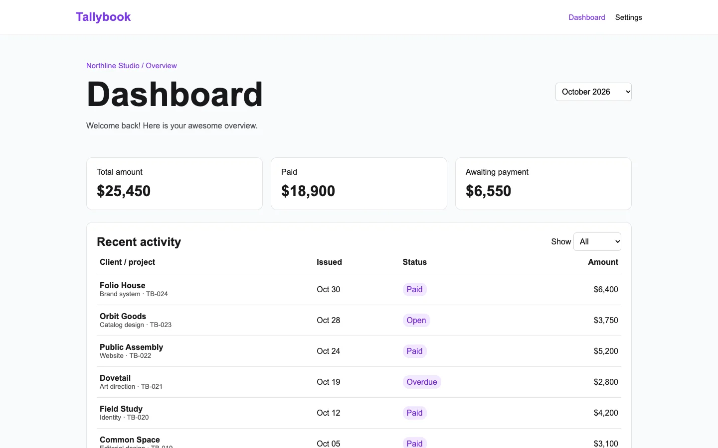
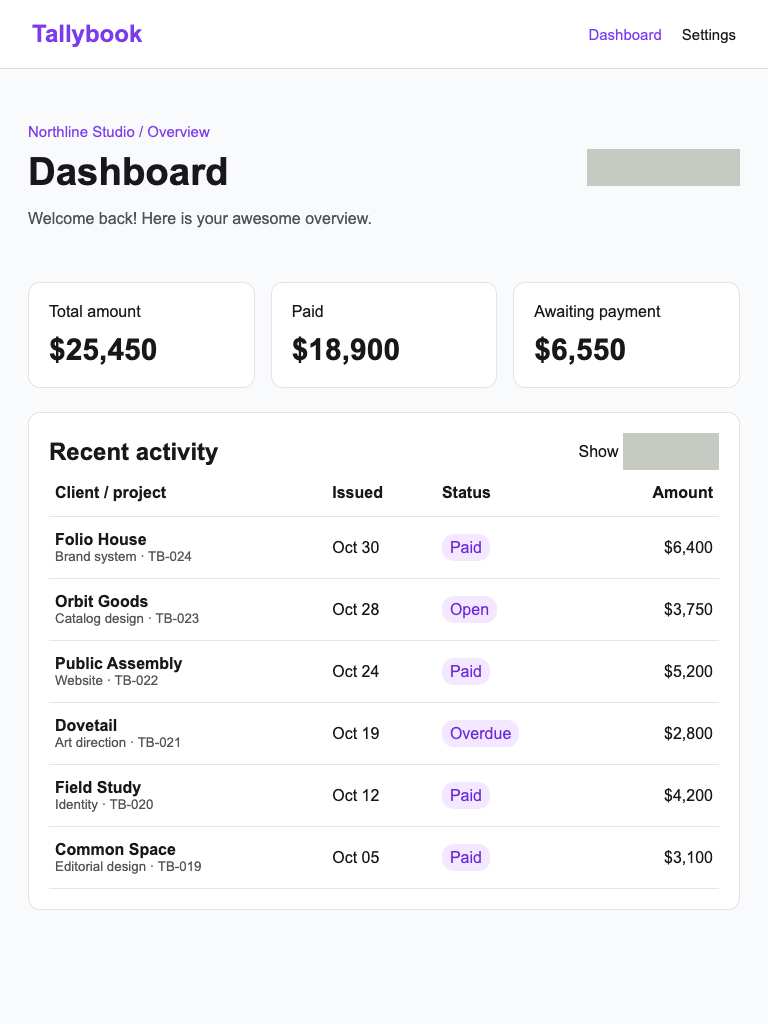
Both widths show client/project records, TB identifiers, payment states and amounts, making invoice tracking recognizable. Generic welcome copy, a generic Dashboard title and no readable record action weaken the opening task and consequence. (/dashboard)
Visual specificity before deductions C. Weighted design base C. Distinct signal deductions 3.
Product specificity supplies 55% of the base, and the five visual design dimensions share 45%. Round the base to the nearest letter. Each distinct verified generic signal lowers it by one letter, down to F. Foundations are reported separately. The detector ceiling is D. Vision reviewed 1 of 1 measured routes.
- Template copy · −1
- “awesome overview” does not identify a product task or outcome. (/dashboard, 1440 px, Detector and vision.)
- Gradient hero · not observed
- No instance was identified in the reviewed views.
- Emoji bullets · not observed
- No instance was identified in the reviewed views.
- Default shadcn grays · −1
- 4 separate visible panels repeat the same near-default neutral border, fill, width and corner treatment. (/dashboard, 1440 px, Detector and vision.)
- Purple on white · −1
- A prominent purple action or heading sits on a white surface. (/dashboard, 1440 px, Detector and vision.)
- Centered everything · not observed
- No instance was identified in the reviewed views.
Compared with the 2026 references
- /dashboard · Like the reference’s scalar cards, Tallybook uses heavy numerals and fine outlines for quick metric scanning. Its missing decision is which invoice to address: especially at 390, the summary stack delays the overdue record. Three observed generic signals each require a one-letter commercial deduction; the schema provides no aggregate grade field. Metabase · scalar cards

Visual design
- Hierarchy
- C
- At 1440, the oversized title dominates compact invoice rows; overdue receives no additional priority. At 390, three stacked totals push the attention-worthy record beyond the capture. (/dashboard)
- Typography
- C
- A visible text label renders below 12 px. (/dashboard, 390 px.)
- Spacing
- C
- At 1440, cards and table columns have orderly spacing. At 390, the large gap above the totals and their vertical stack consume substantial opening space, delaying invoice inspection. (/dashboard)
- Copy and labels
- C
- Paid, Awaiting payment and client/project labels are useful at both widths. “Here is your awesome overview” adds no task guidance; the gray action and filter areas have no readable labels. (/dashboard)
- Imagery
- N/A
- This invoice overview requires no illustration or photography.
Foundations · A
Contrast, responsive layout and keyboard reach are sampled separately. The foundations grade is the lowest verified result in this group.
- Color contrast
- A
- At least four opaque text samples per view passed the contrast threshold. Verified across 3 measured views.
- Responsive layout
- A
- All sampled viewports fit without horizontal overflow and contained readable text. Verified across 3 measured views.
- Keyboard access
- A
- Tab reached two visibly focused controls and Shift+Tab returned to the first. Verified across 3 measured views.
Fix these first
- Name the object, action and result in the heading.Product specificity · /dashboard · 1440 px
- Give the primary task, supporting information and actions distinct visual roles.Product specificity · /dashboard · 1440 px
- Choose an action color grounded in the product and separate it from status colors.Product specificity · /dashboard · 1440 px
- Increase the label size and check its wrapping at phone width.Typography · /dashboard · 390 px
Evidence from the screens
Gray blocks conceal form values or sensitive text. Numbered outlines identify measured issues.
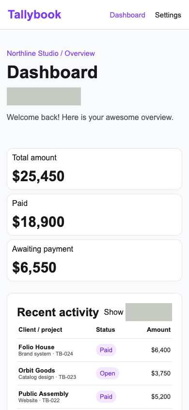
- A visible text label renders below 12 px.
- “awesome overview” does not identify a product task or outcome.
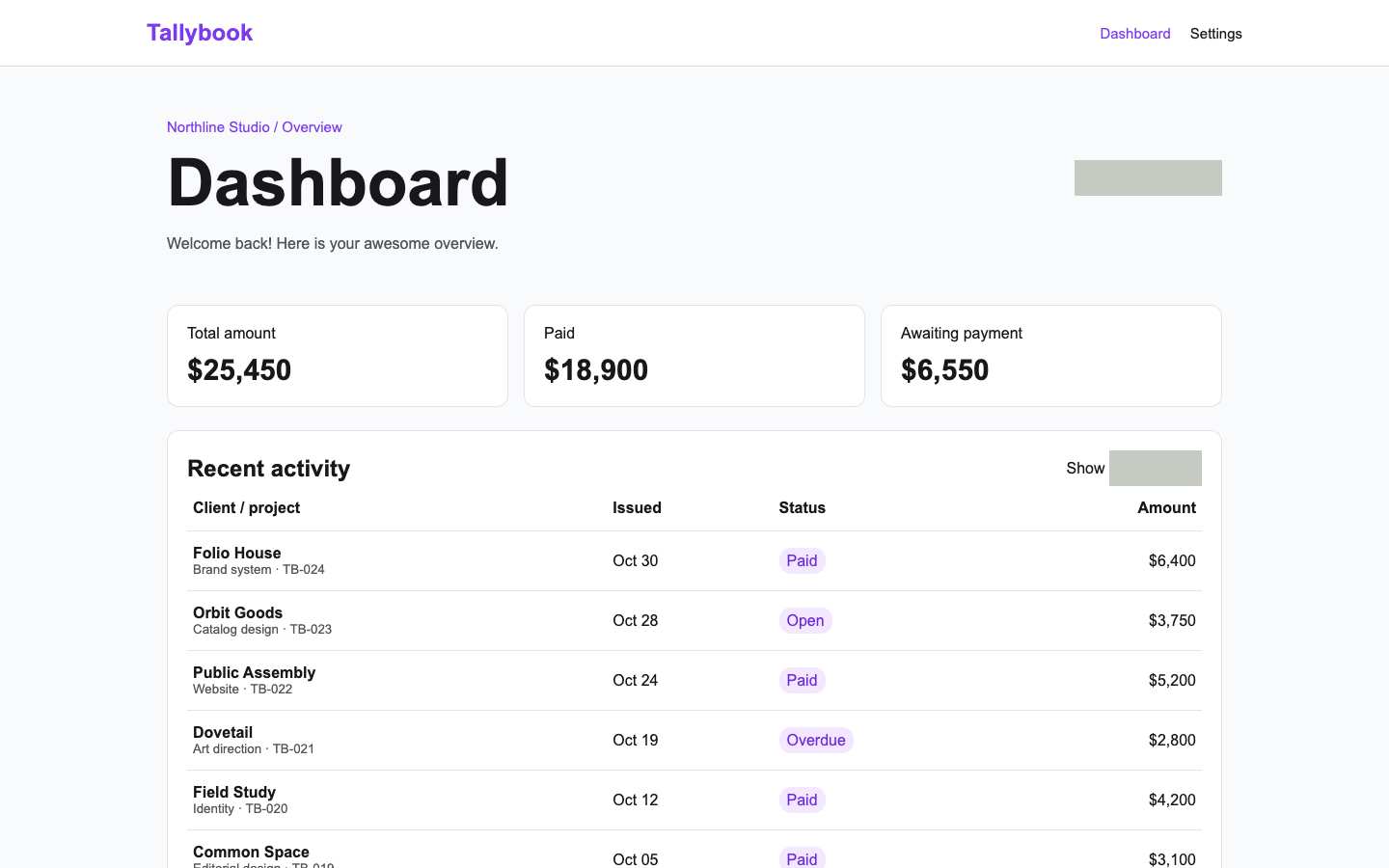
- A prominent purple action or heading sits on a white surface.
- 4 separate visible panels repeat the same near-default neutral border, fill, width and corner treatment.
- “awesome overview” does not identify a product task or outcome.
- “awesome overview” does not identify a product task or outcome.
Independent task review
The reviewer assesses each route against its user task using desktop and phone evidence. Its task grades describe the interaction evidence available for that route.
/dashboard
Audit /dashboard, the Tallybook working interface, at 1440×900 and 390×844. Find the invoice needing attention: Dovetail, TB-021, overdue for $2,800. The next step is to inspect that invoice; no clearly labeled invoice action is visible.
Reviewed at 1440 × 900 and 390 × 844.
- Task hierarchy
- C
- At 1440, Dovetail’s overdue invoice is visible but receives the same purple badge treatment as Paid and Open. At 390, it falls below the captured viewport. The large Dashboard heading and summary cards precede the actionable exception.
- Landing message
- N/A
- This is an internal invoice overview, not a public acquisition page.
- Interaction feedback
- Unverified
- Neither width includes a recorded activation and outcome. The screenshots cannot establish invoice opening, filtering, confirmation, persistence or retry behavior.
- Access and recovery
- C
- Both checks report a visible Tab target, without identifying it or establishing full keyboard reach. Gray rectangles lack readable labels at both widths. At 390, Issued dates disappear and the overdue record requires scrolling. Recovery was not exercised.
- Release evidence
- Unverified
- Two local renders and checks establish one primary heading, five visible controls and one visible Tab target per width. They do not establish a completed invoice workflow, production deployment or recovery behavior.
First action
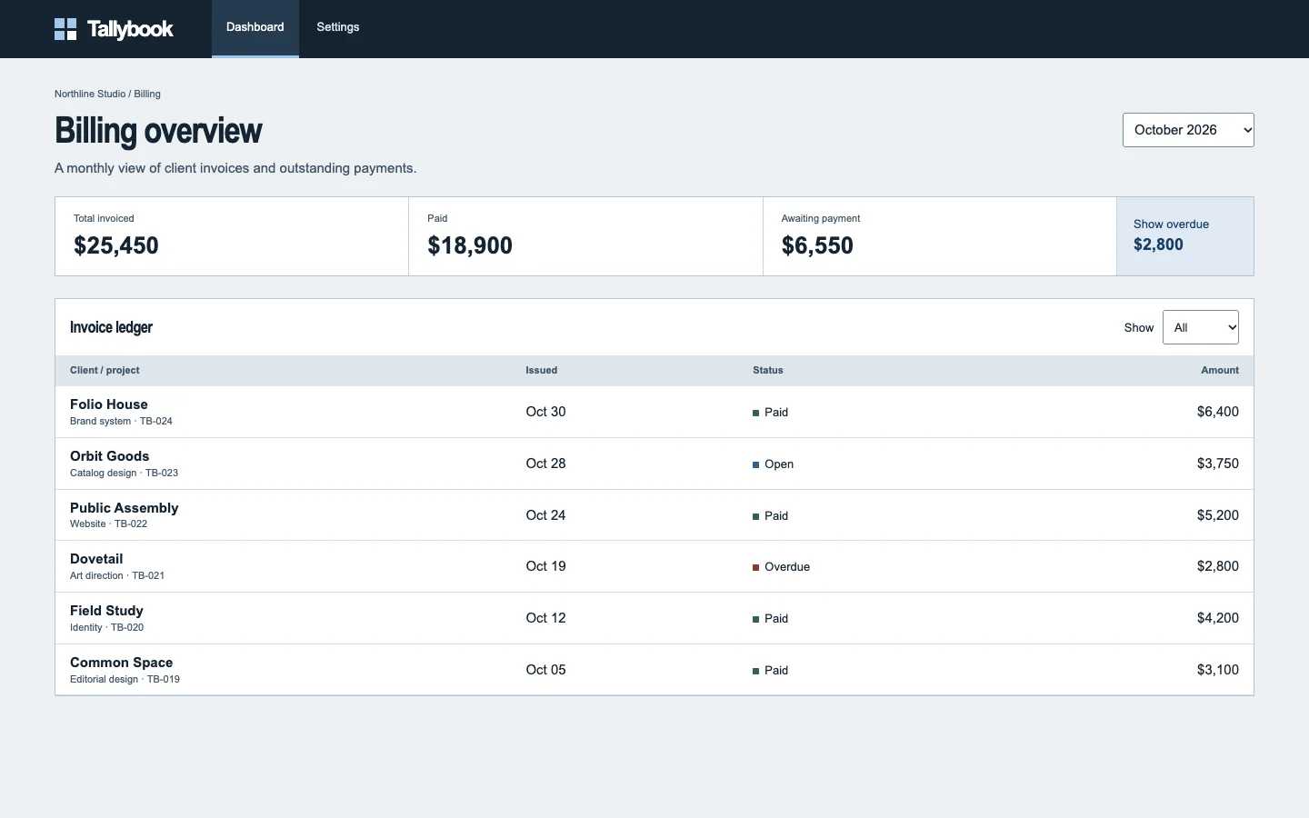
Make overdue invoices directly discoverable: add a labeled “View overdue invoices” action beside Awaiting payment and give Overdue a distinct visual treatment. Its result should expose Dovetail TB-021, $2,800, with a labeled way to open it.
How to verify At 1440×900 and 390×844, activate “View overdue invoices” by pointer and keyboard; confirm Dovetail TB-021 appears and opens the matching invoice. Check focus through all controls separately. Contrast remains unmeasured; mobile stacking is observed, but complete responsive behavior and recovery remain unverified.
What a repair could look like
Tallybook is an agent-built billing dashboard demo. Both captures show the same task.