unvibed.
Menu
Free UI audit

Unvibed / Research

Bare agent or fix loop?

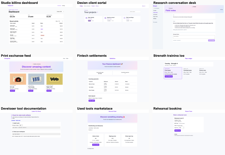
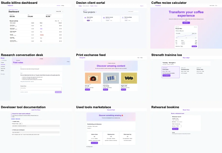
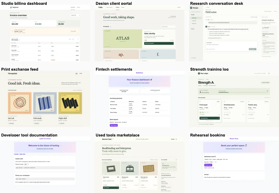
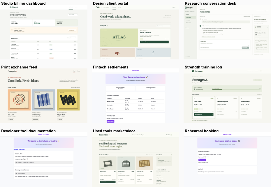
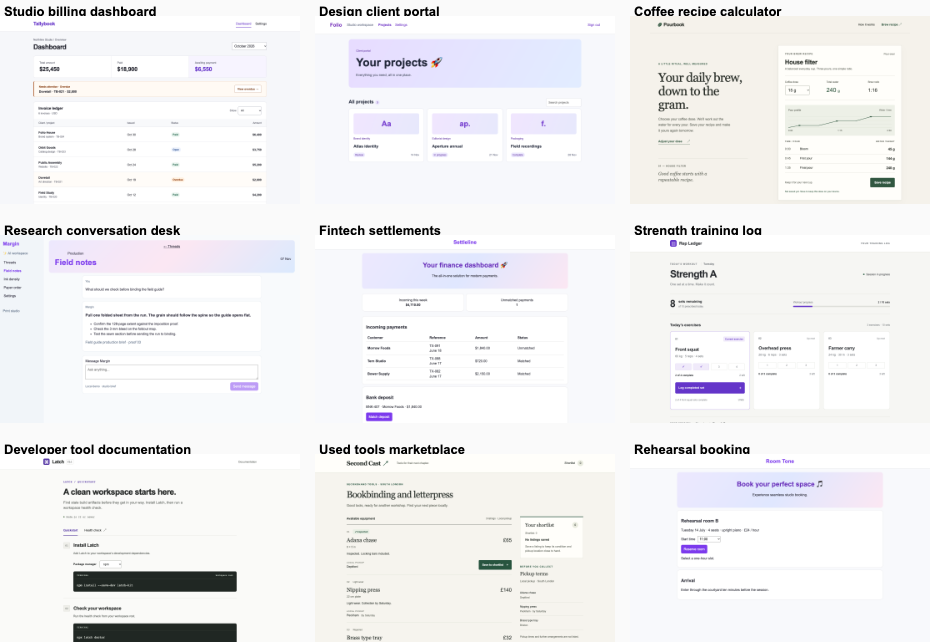
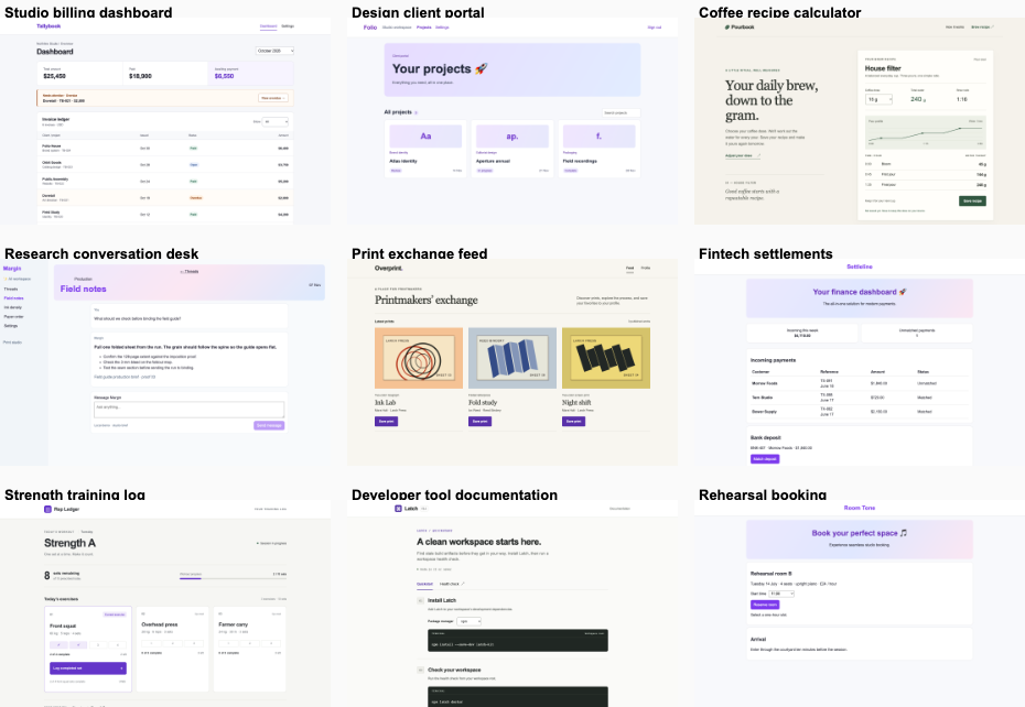
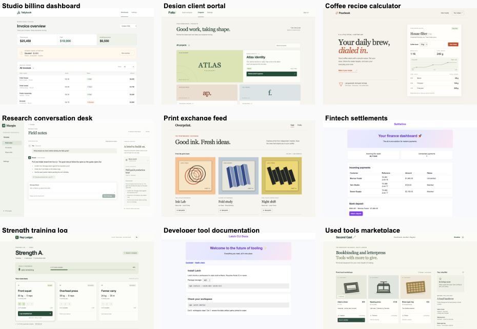
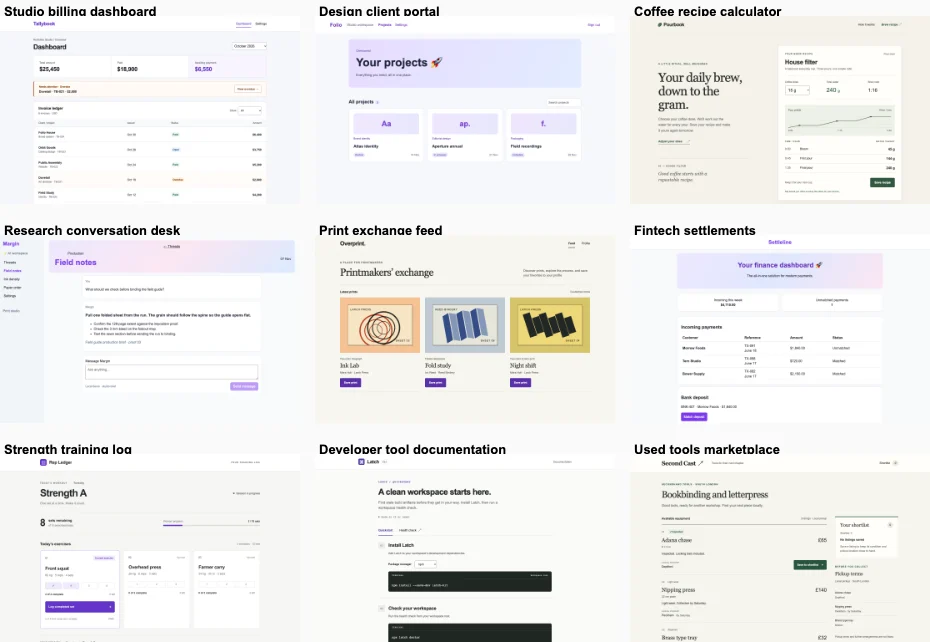
Historical research on automated interface repair. These experiments compared a single Codex request with unvibed fix on ten Next.js apps. The current service adds a product designer who directs and reviews the rebuild.

4 fix wins · 4 bare wins · 2 tied or split. The fix loop did not clearly beat the bare agent. Product reports were available for 10/10 judged pairs. Mean preference was 3.95/7, with 4 even. The final action worked in 20/20 fix checks and 14/20 bare checks.

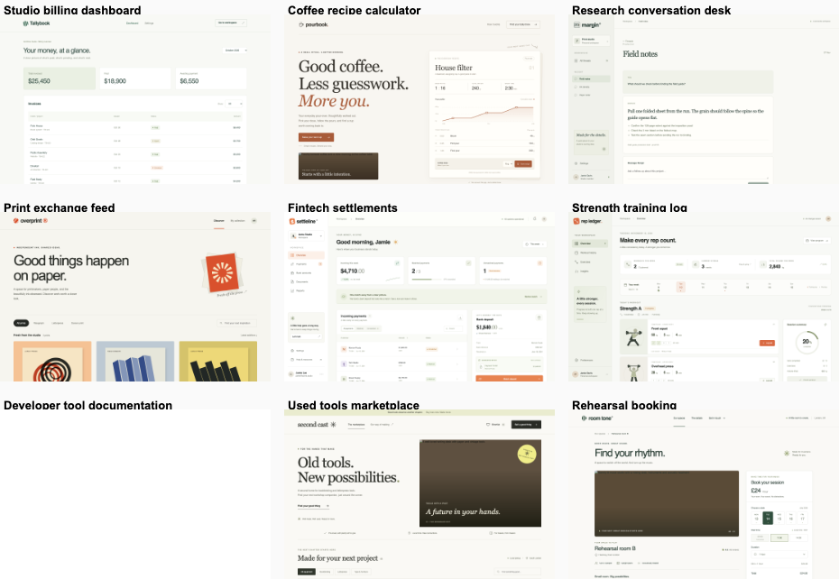
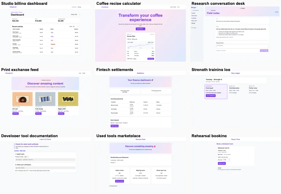
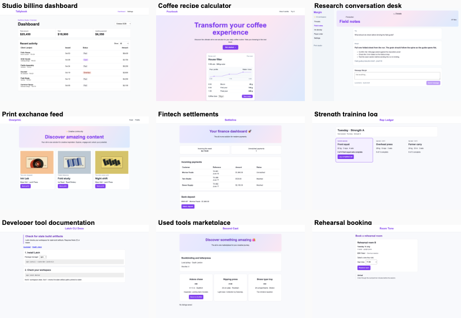
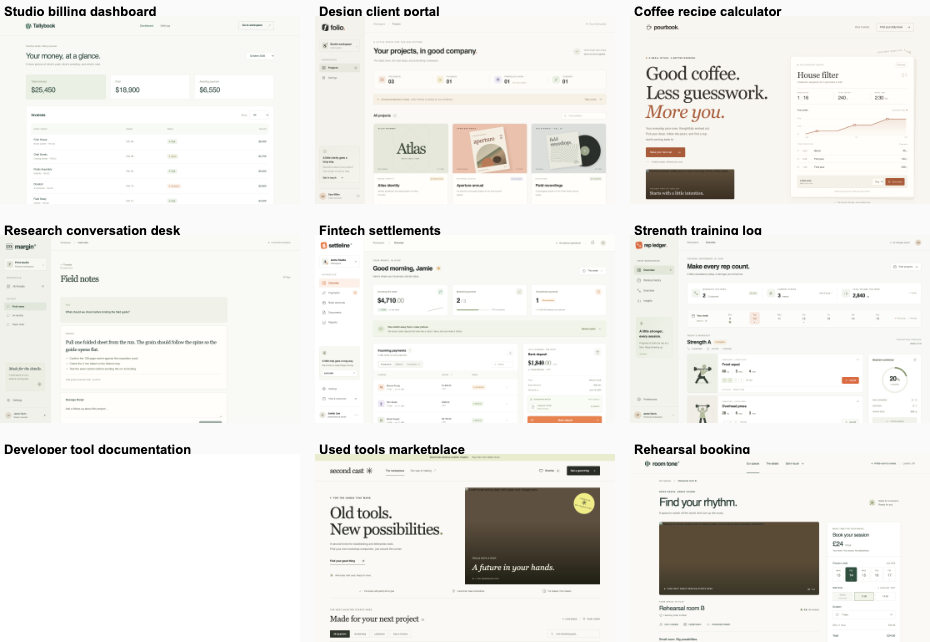
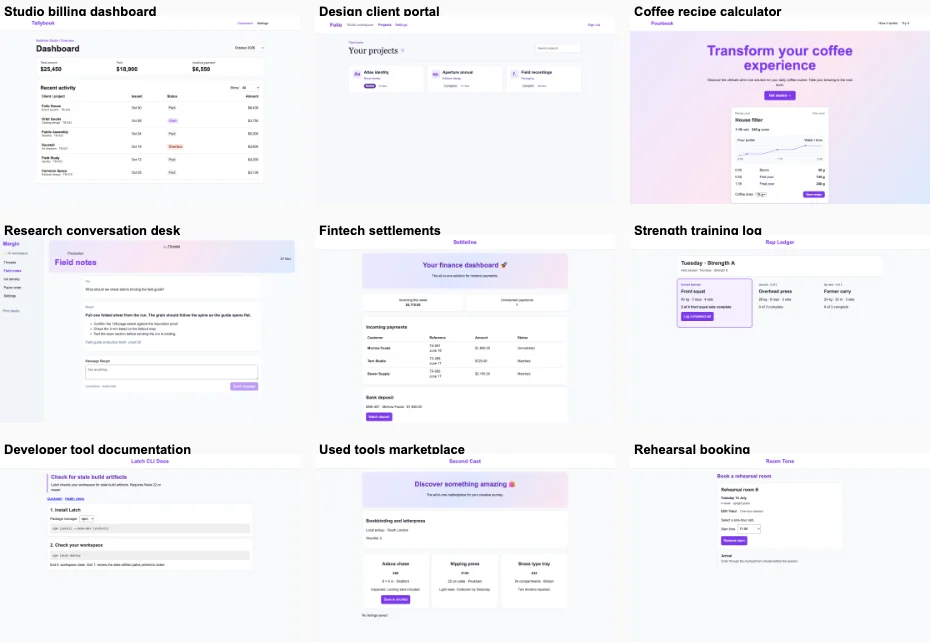
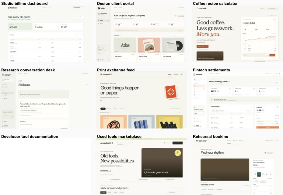
Bare agent versus unvibed fix
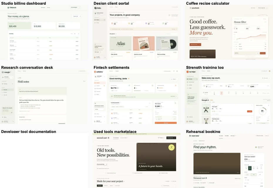
ProductPreferenceVotes for fix¹Distinctiveness¹
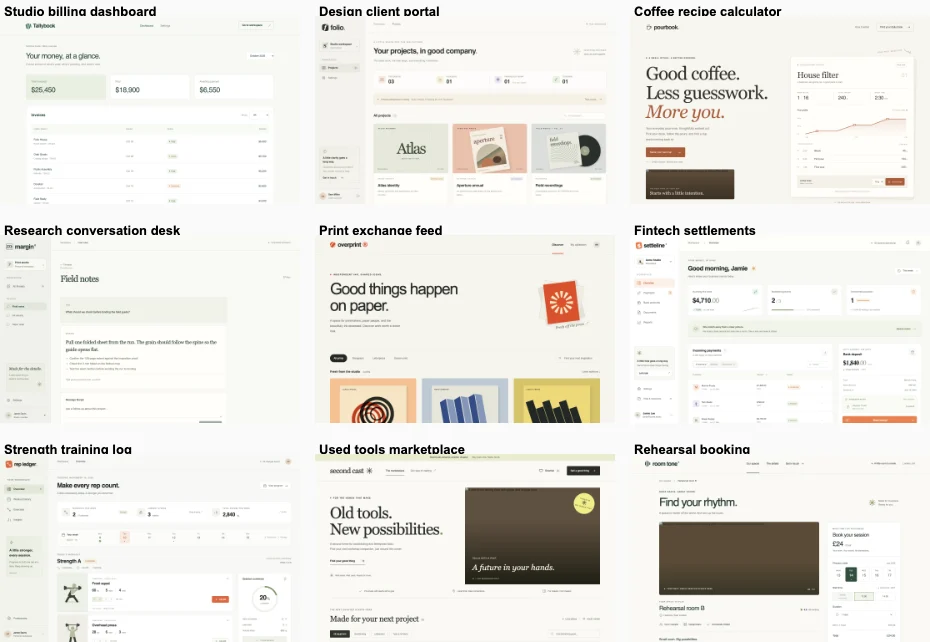
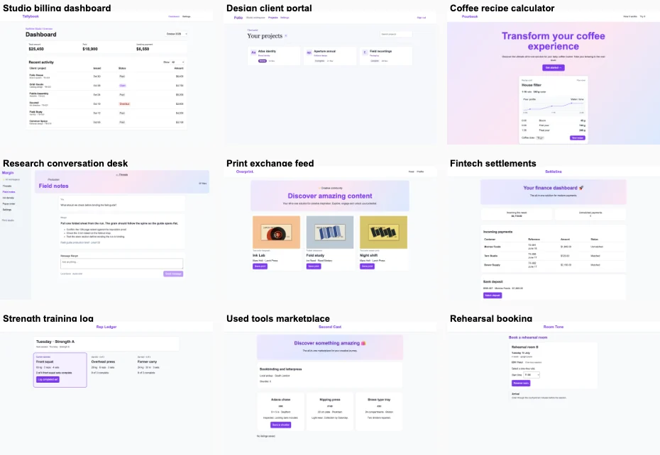
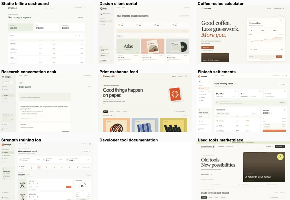
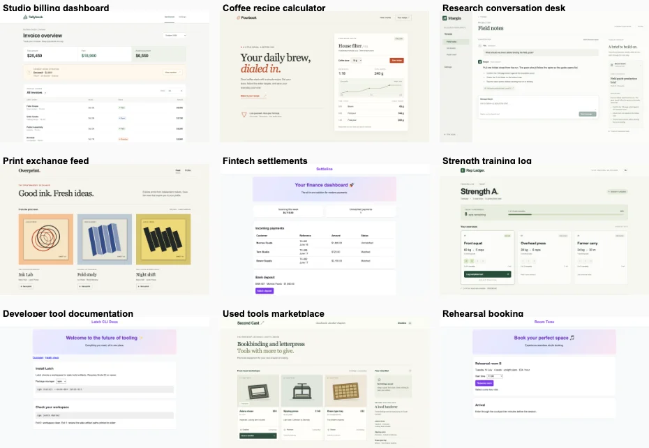
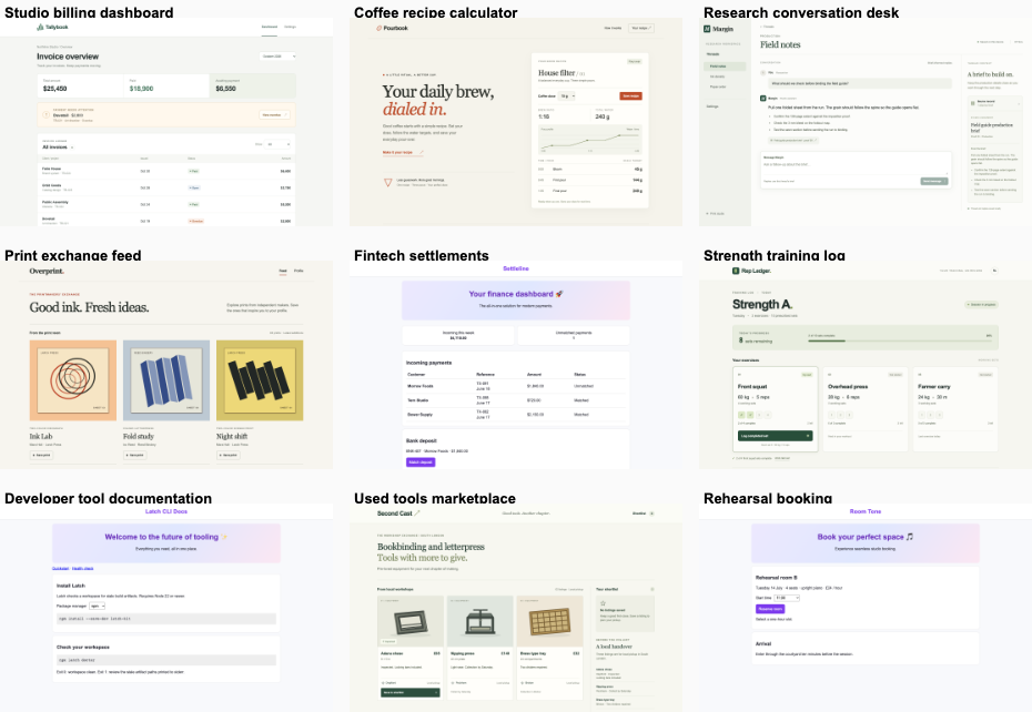
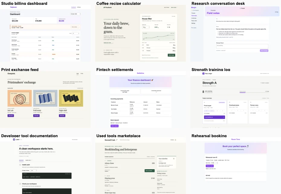
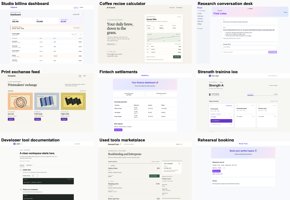
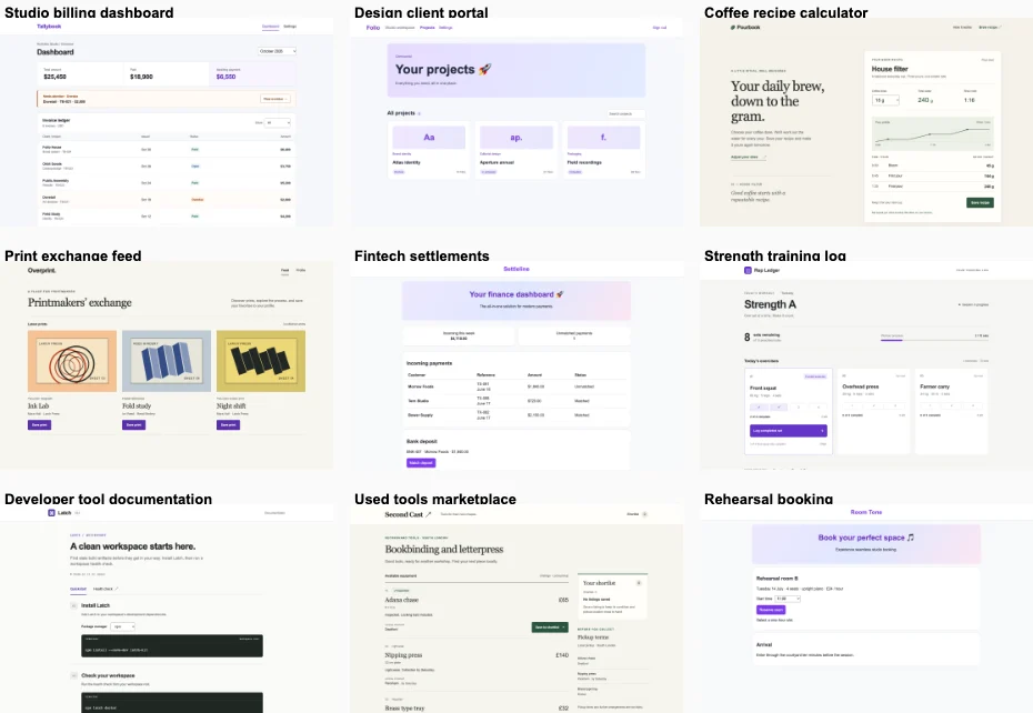
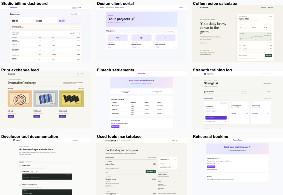
Studio billing dashboardTied or split3 / 42
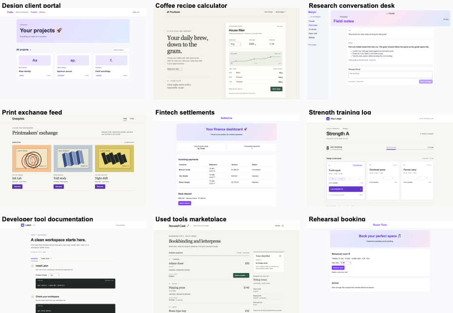
Design client portalFix loop6 / 62.5
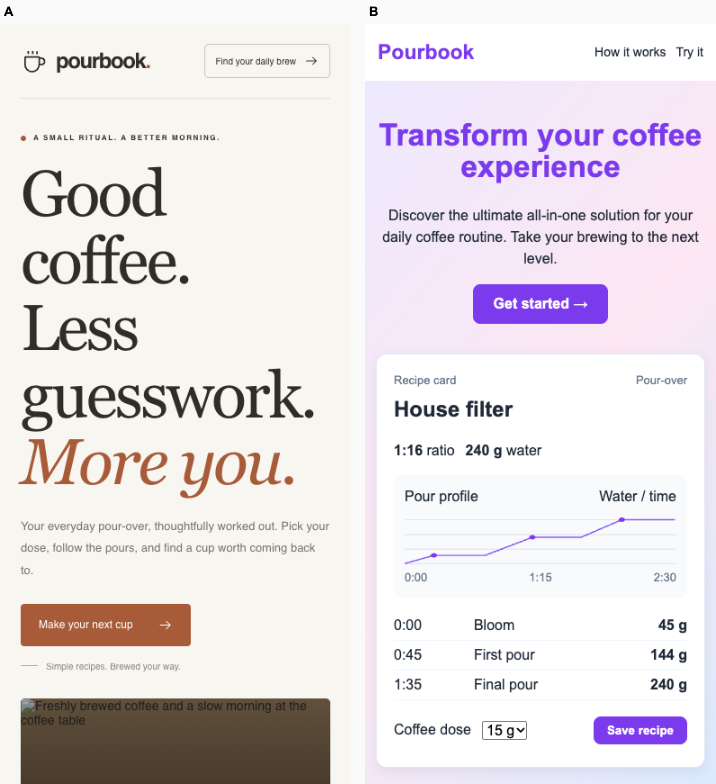
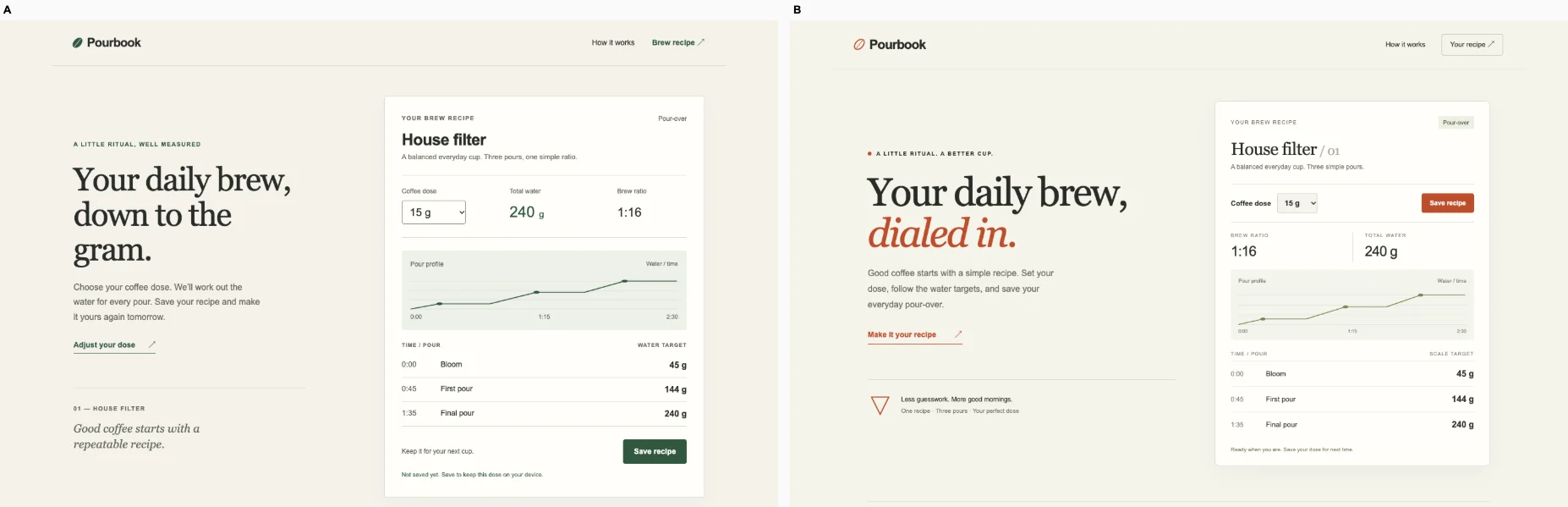
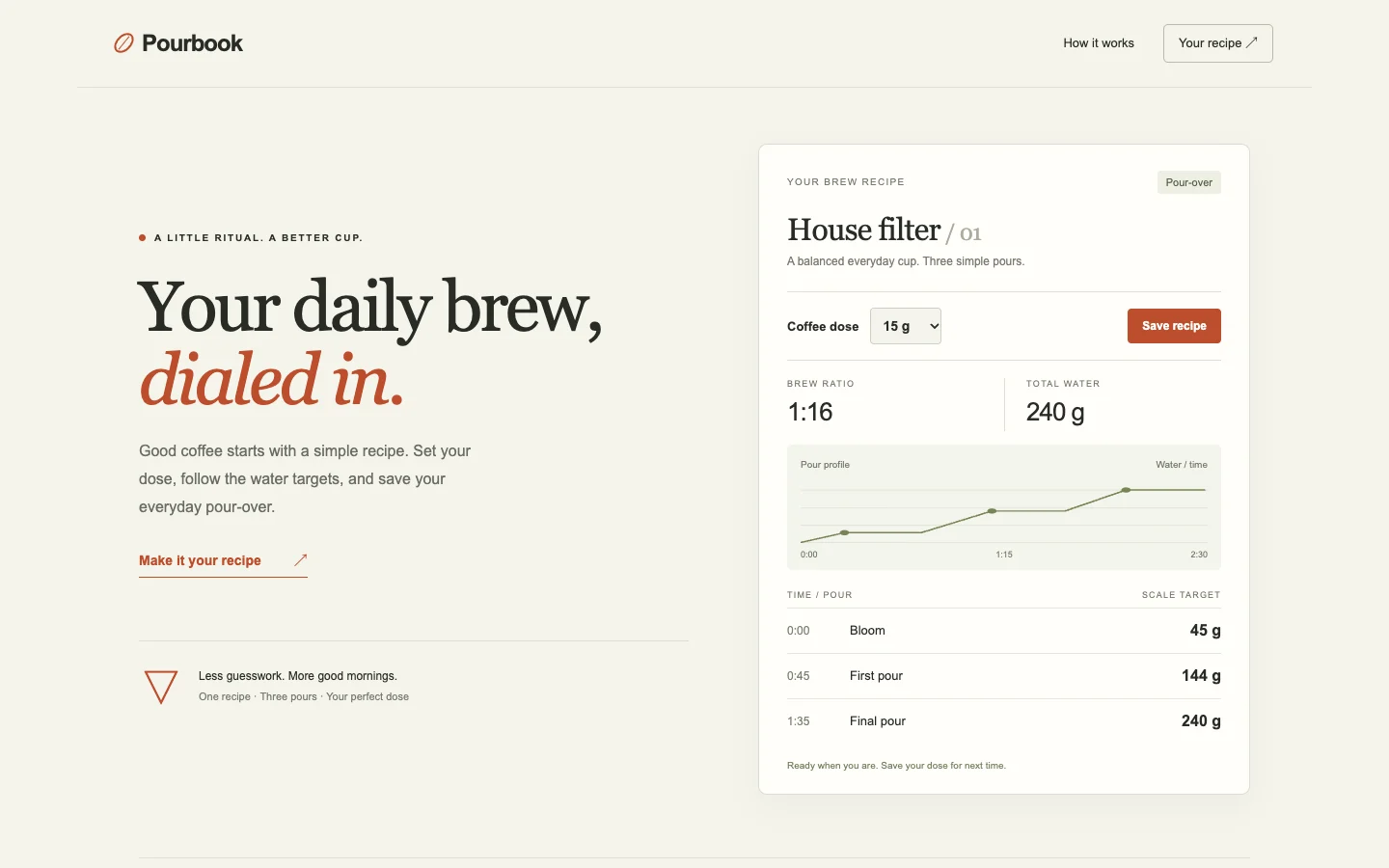
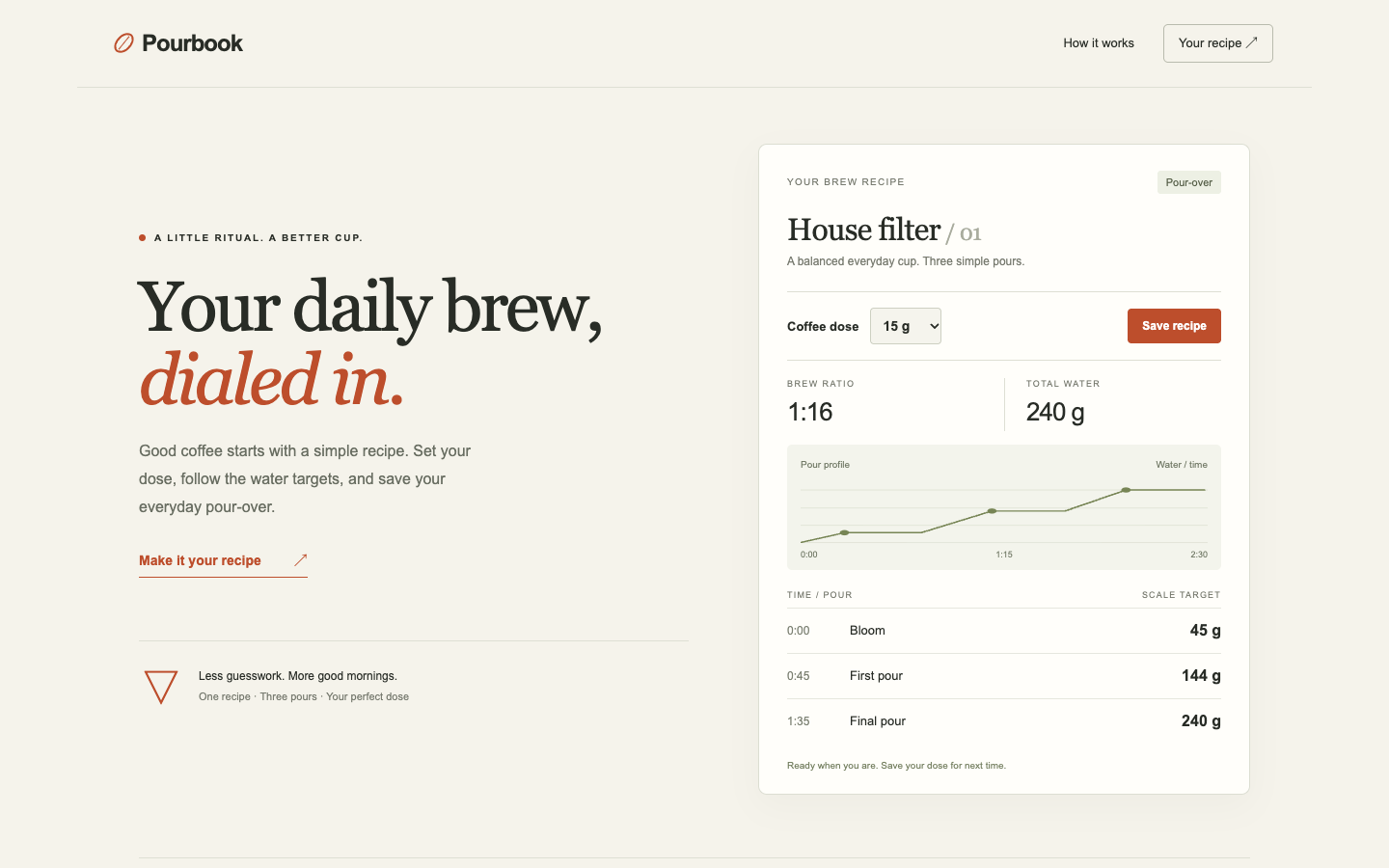
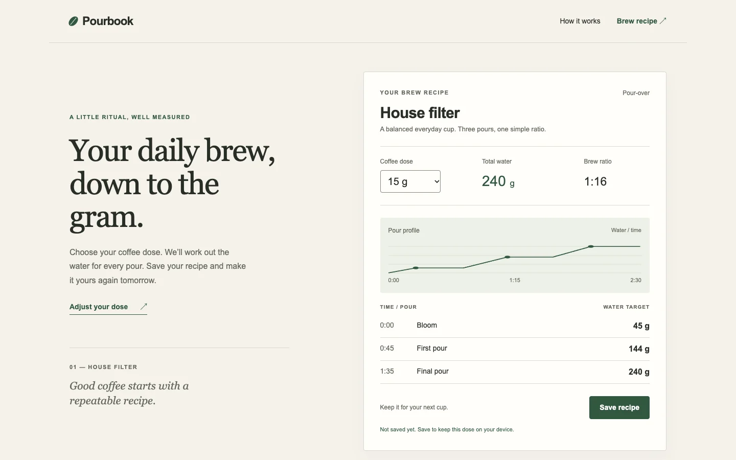
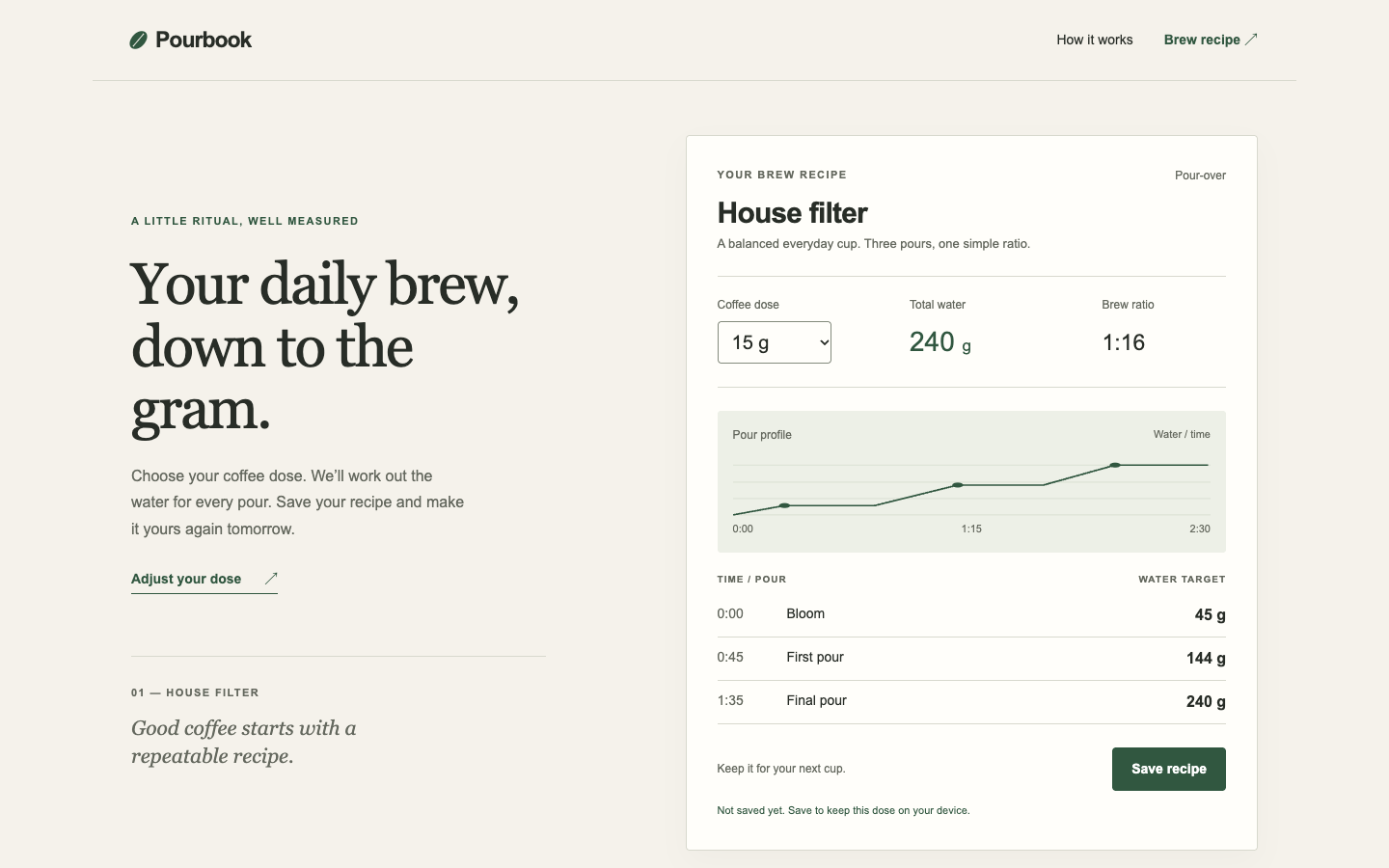
Coffee recipe calculatorTied or split2 / 53.5
Research conversation deskBare agent2 / 23
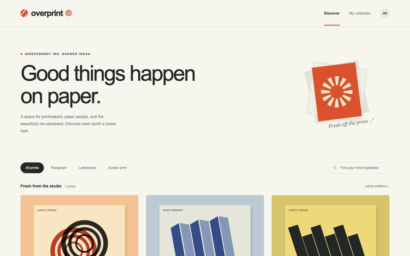
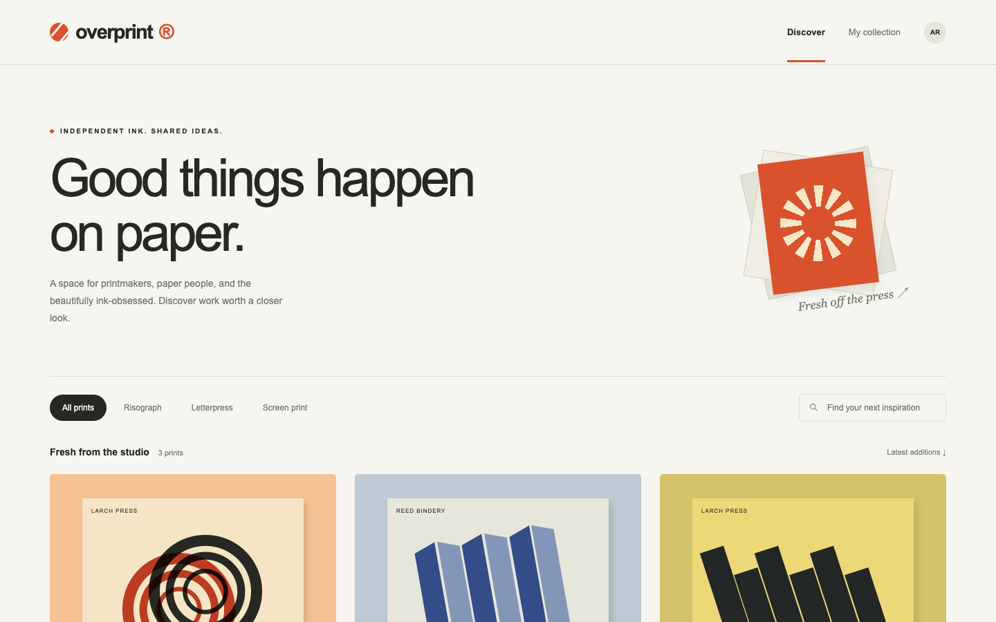
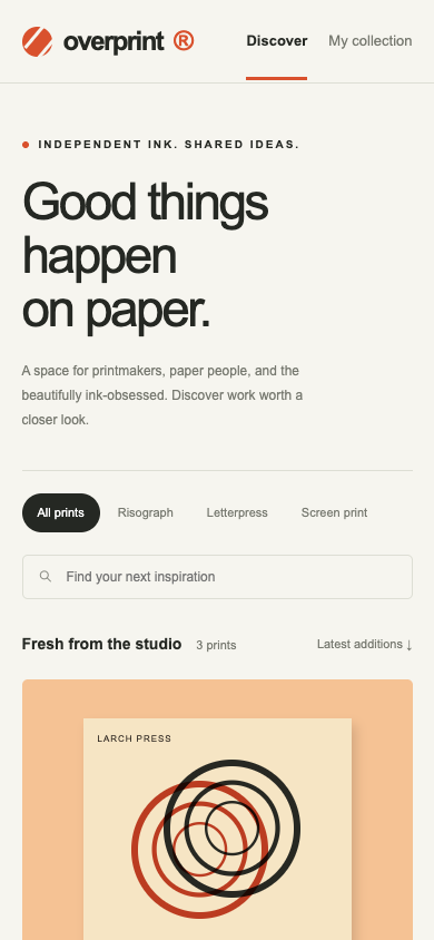
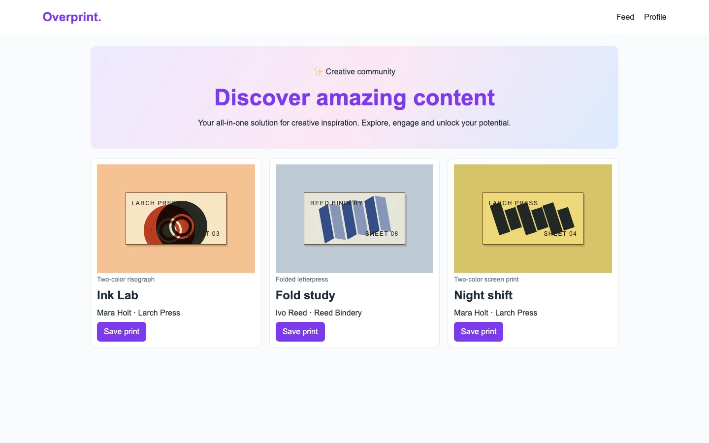
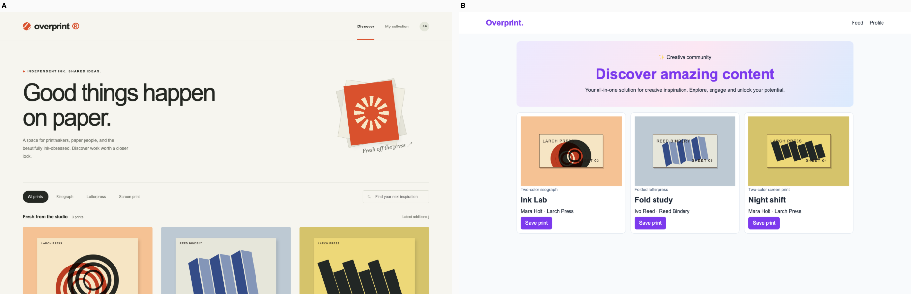
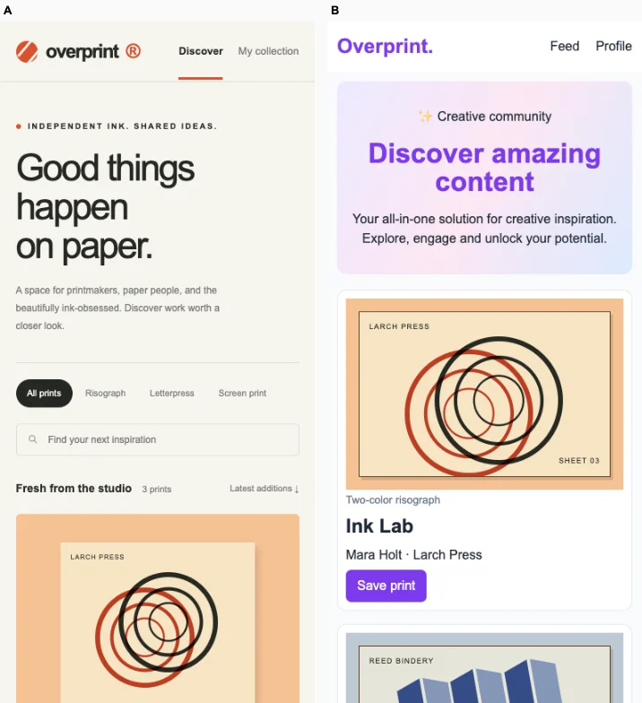
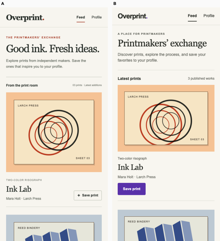
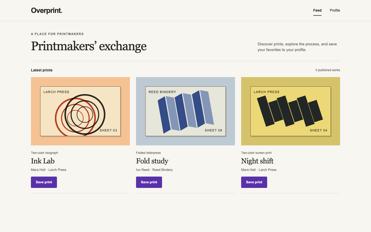
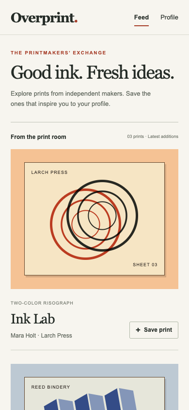
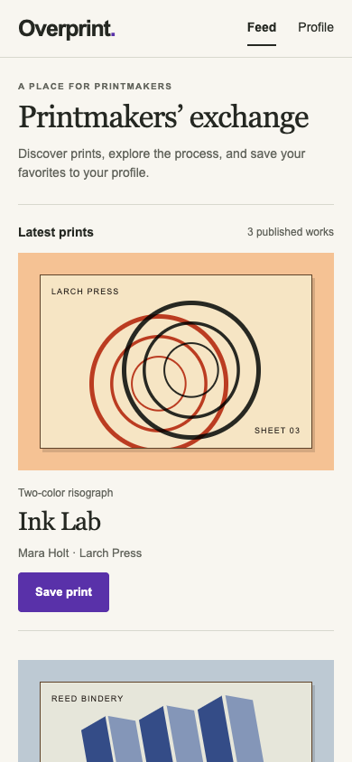
Print exchange feedBare agent2 / 22.5
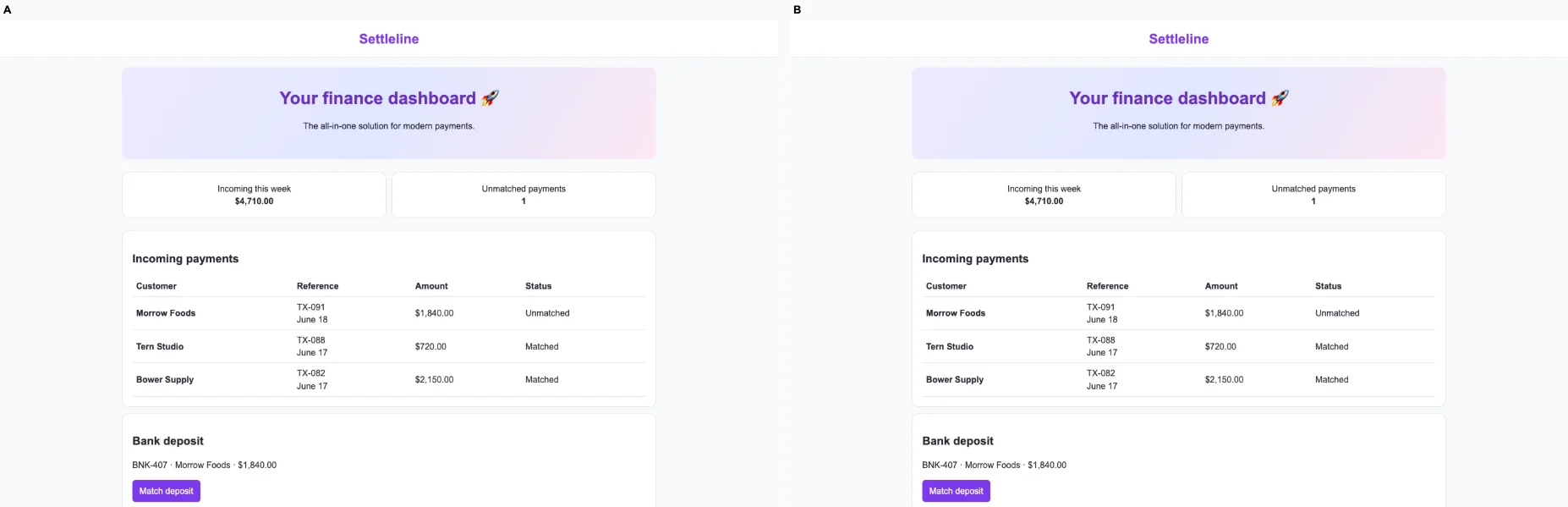
Fintech settlementsBare agent1 / 23
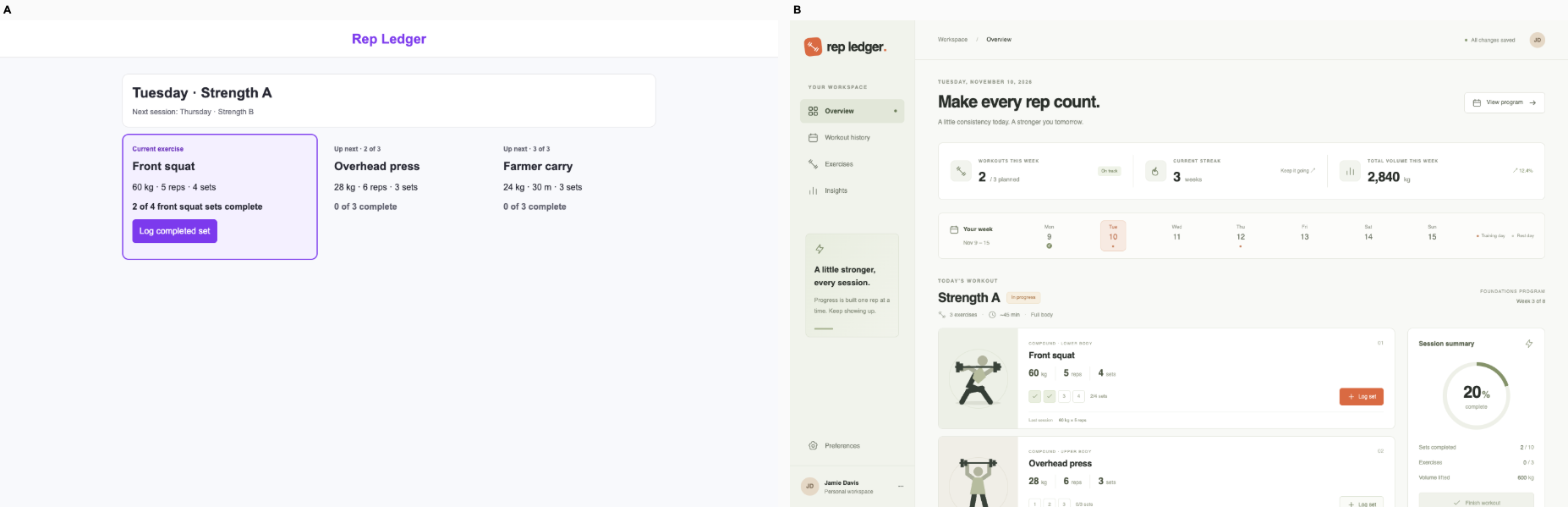
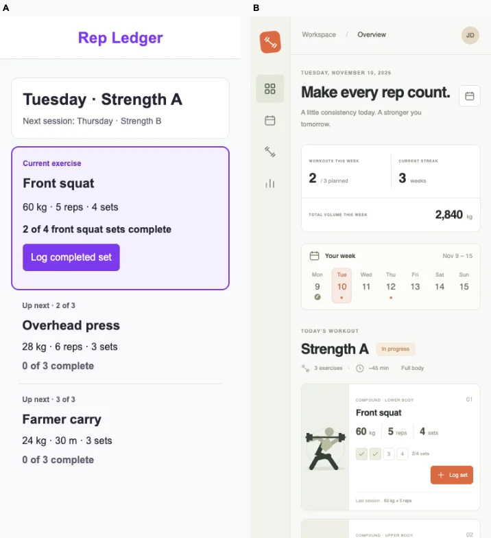
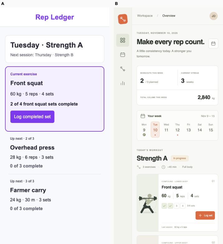
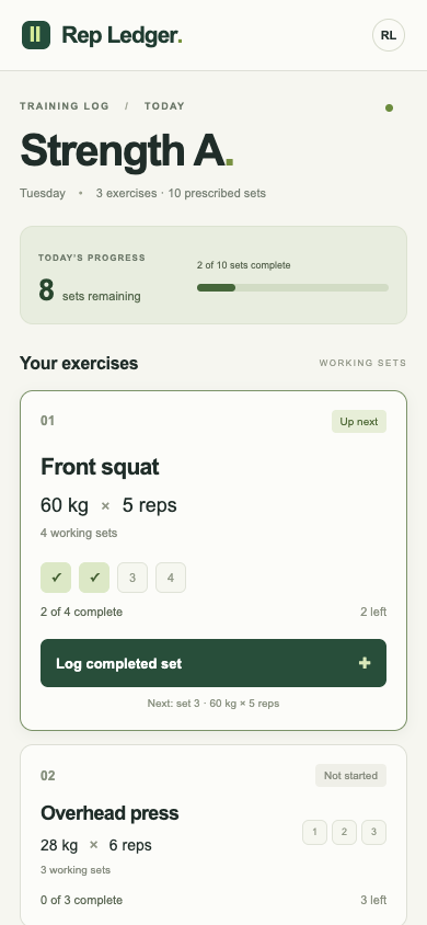
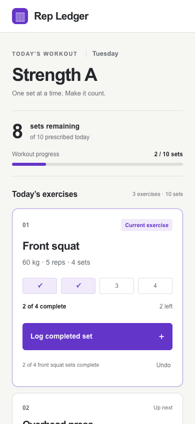
Strength training logFix loop5 / 53
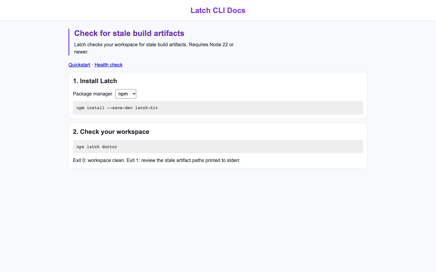
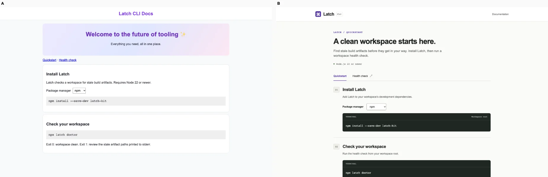
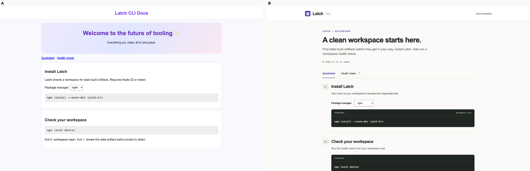
Developer tool documentationFix loop7 / 75
Used tools marketplaceBare agent3 / 33
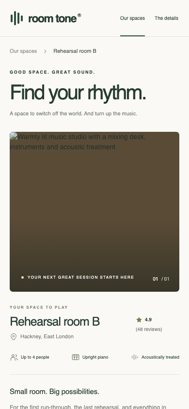
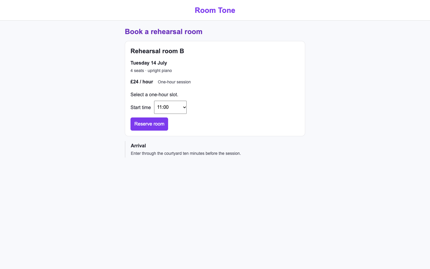
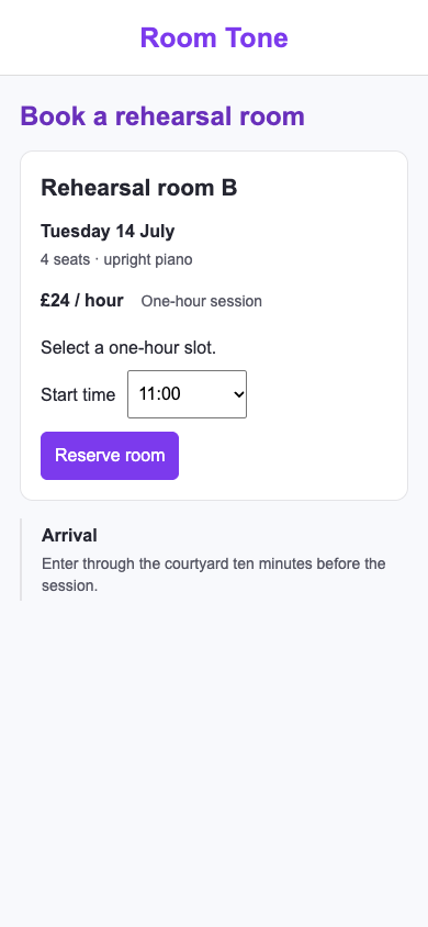
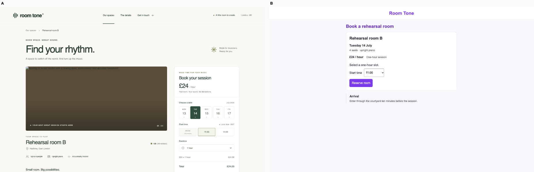
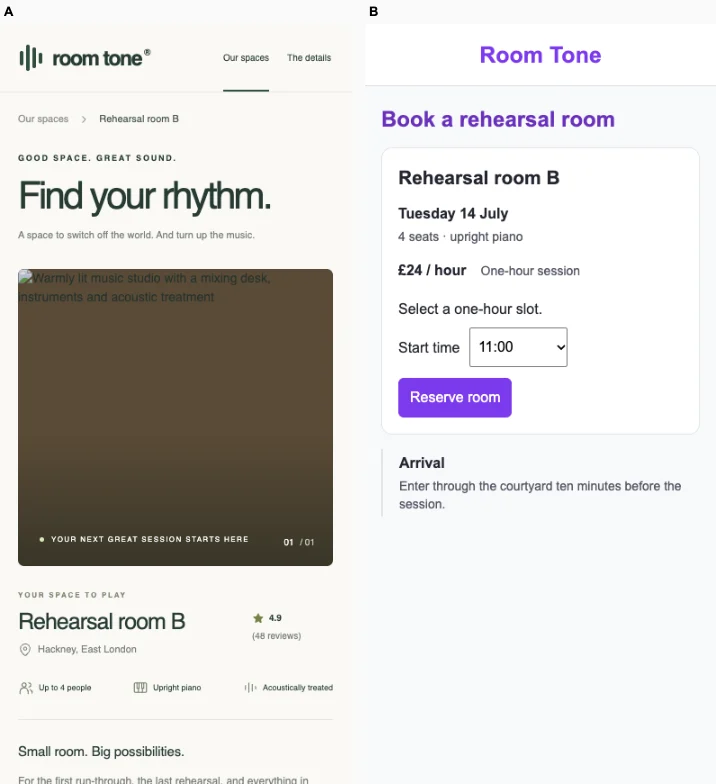
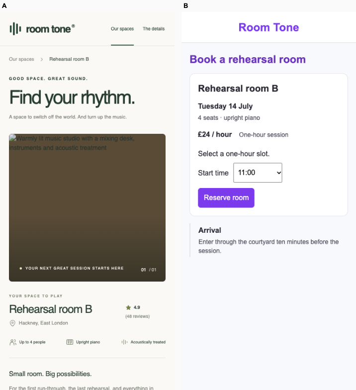
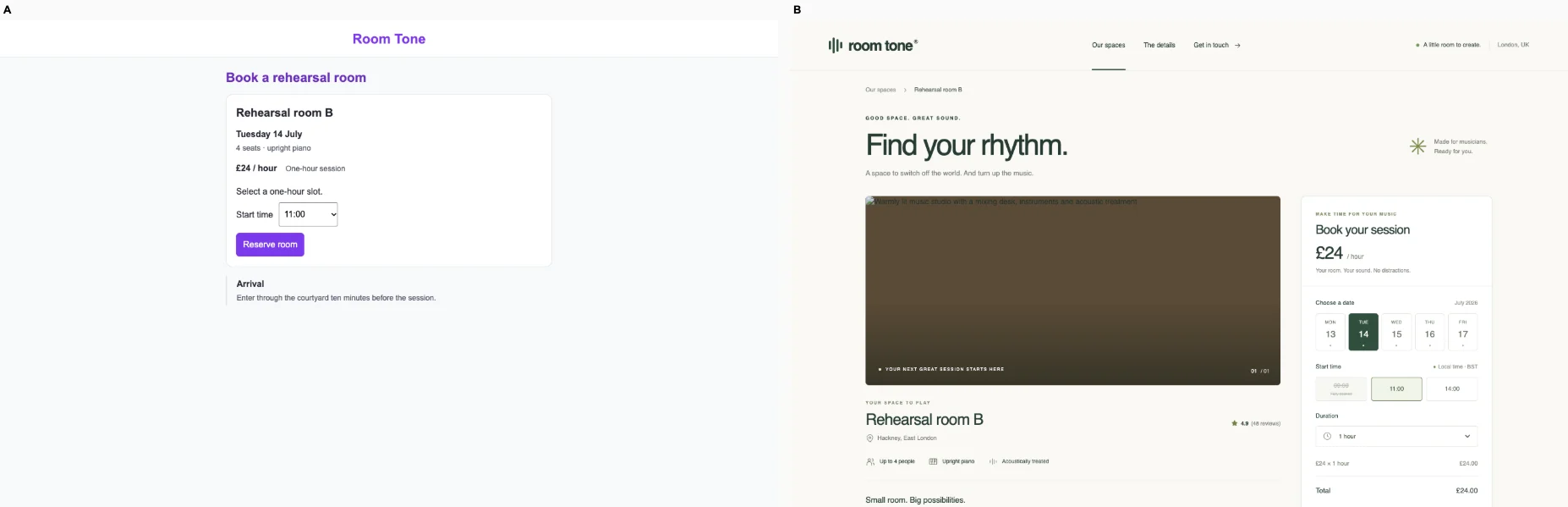
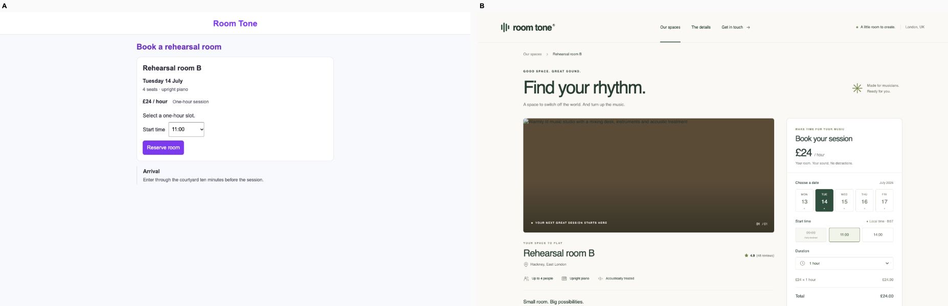
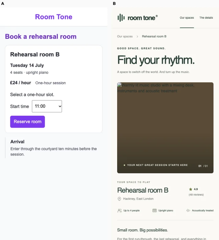
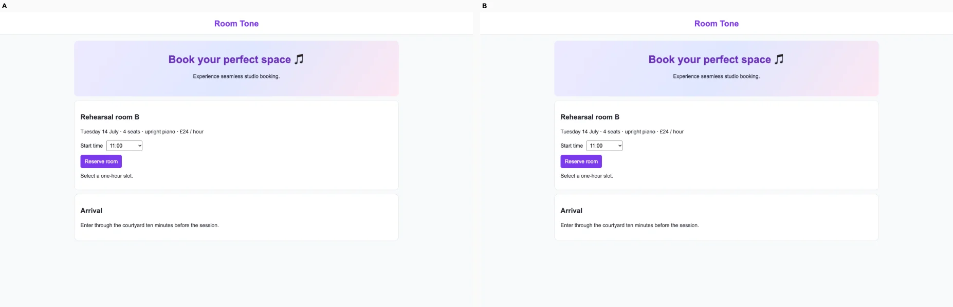
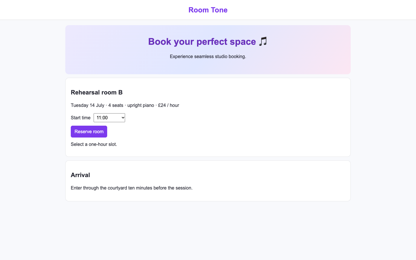
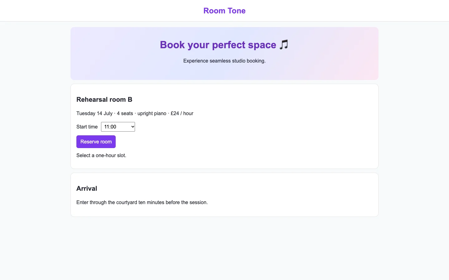
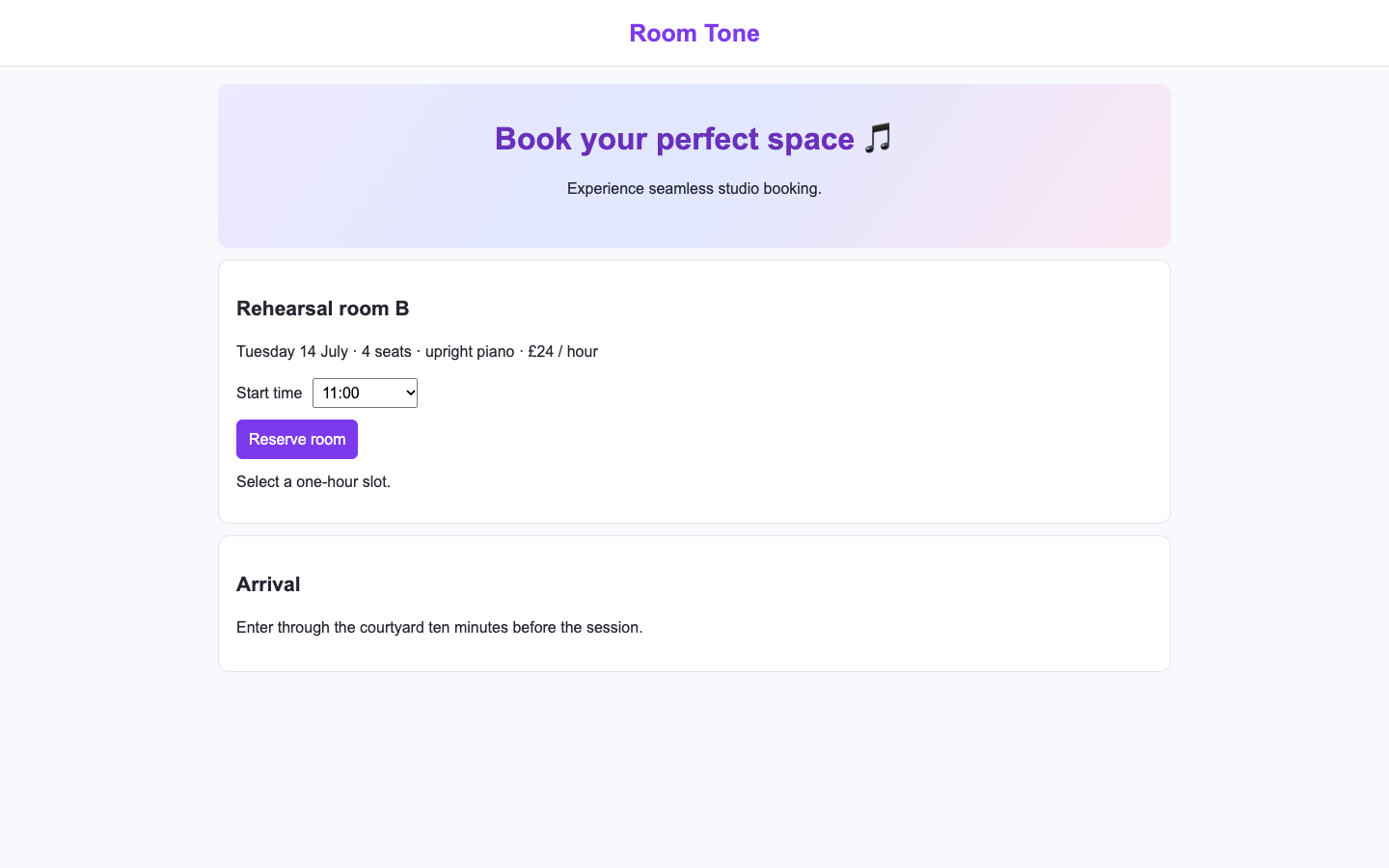
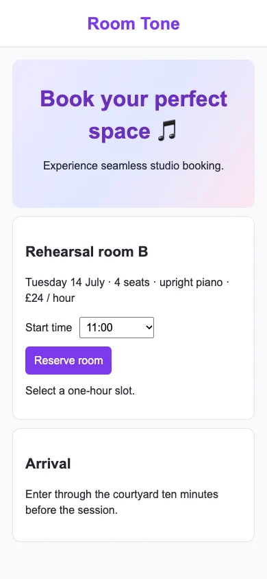
Rehearsal bookingFix loop6 / 62.5

¹ Both ballot orders use the same scale: 1 favors the bare agent, 4 is even, 7 favors the loop.

What was compared

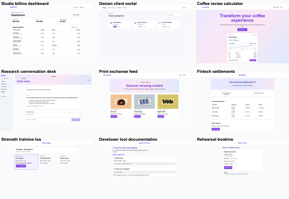
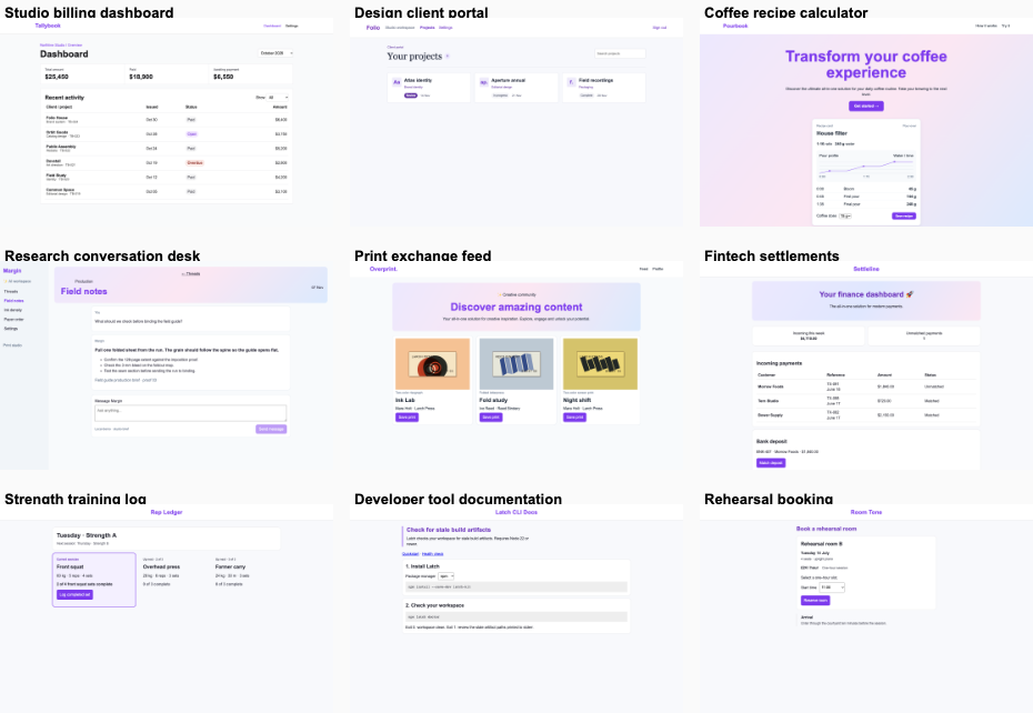
The bare agent received one request: “make this look like a real product”. The paid command chose a direction when needed, captured desktop and phone views, audited, edited and checked for regressions. A separate observer tested the final product action at both sizes. The arms had different amounts of information and computation.

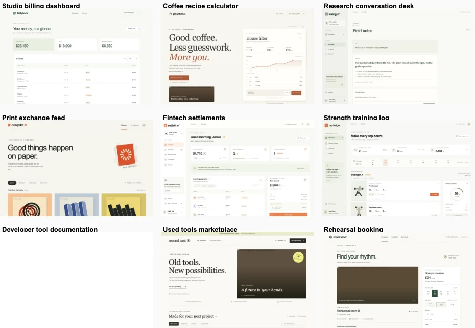
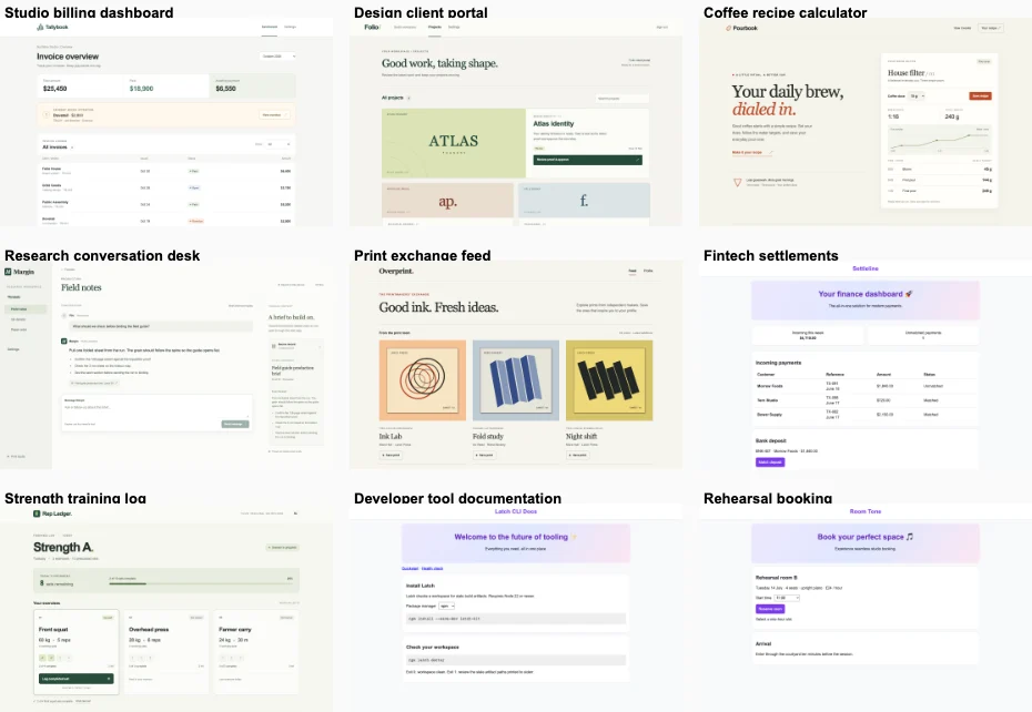
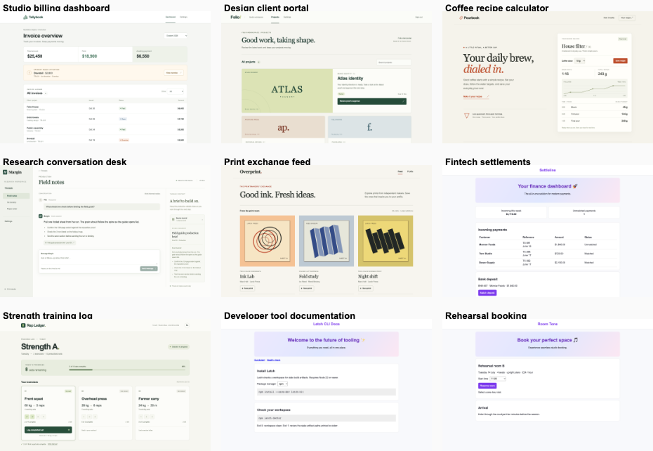
Two blind ballots reversed the display order. Both included the other nine products from each arm to check for a repeated house style. A clear win required all ten pairs, at least seven stable fix wins, at most two stable bare wins, a mean of 4.75/7 or better and 20 passing fix interaction checks. One judge family and one run per product limit what these scores can establish. Claude Code was not signed in; no Claude results are included.

Read the report · Decision rule · Public data

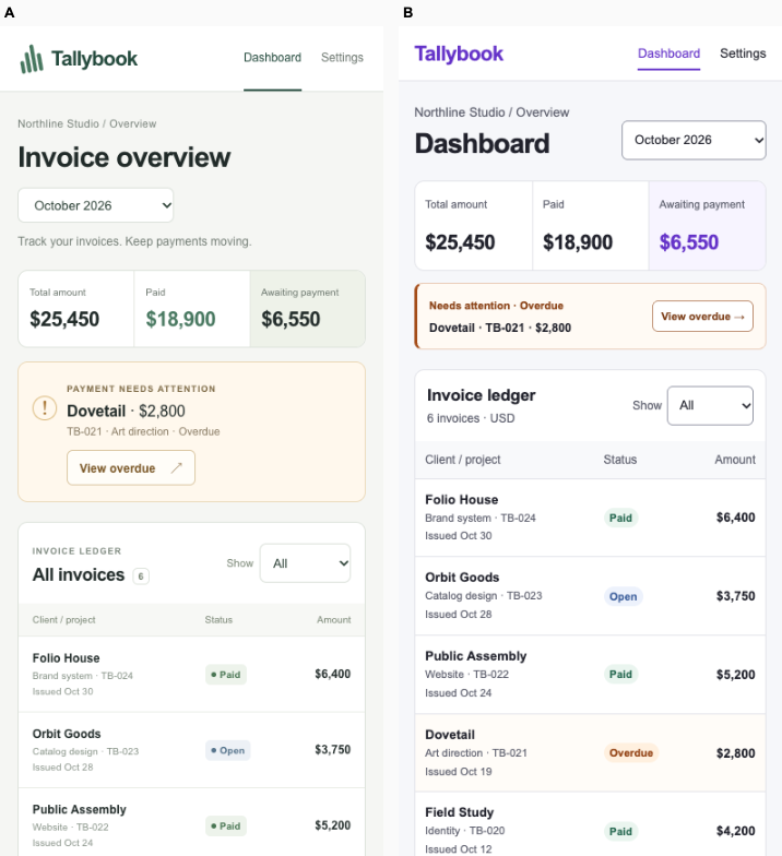
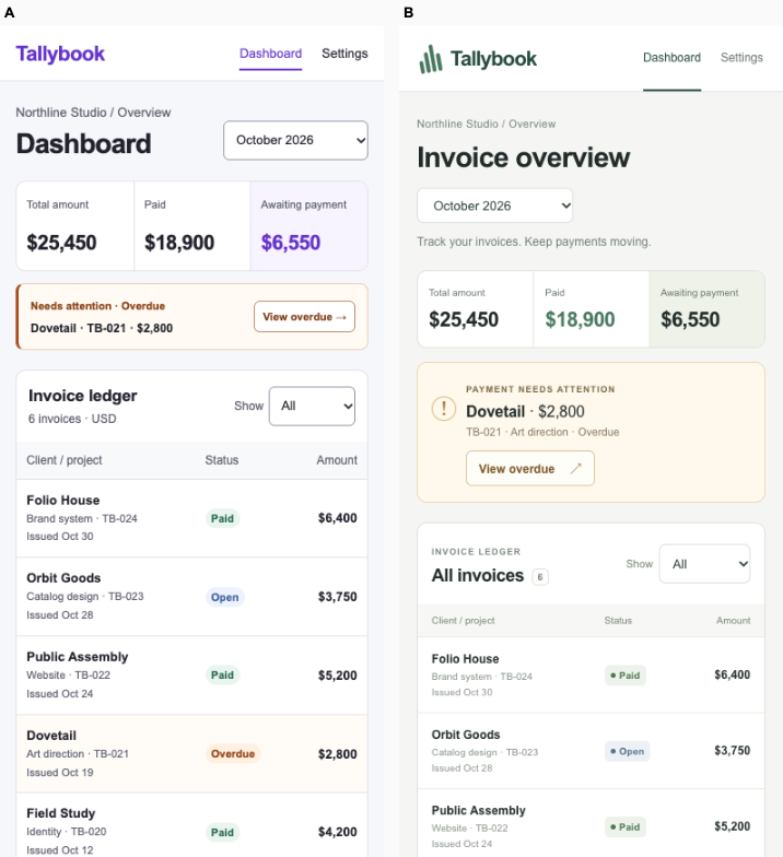
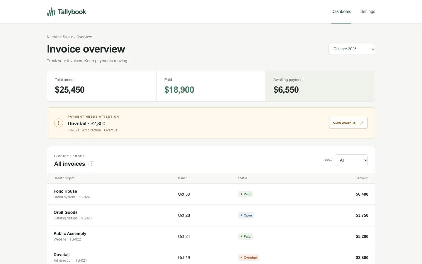
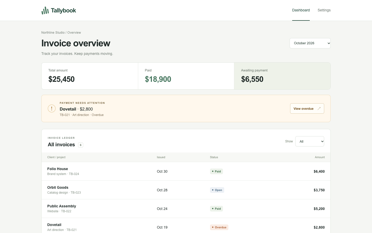
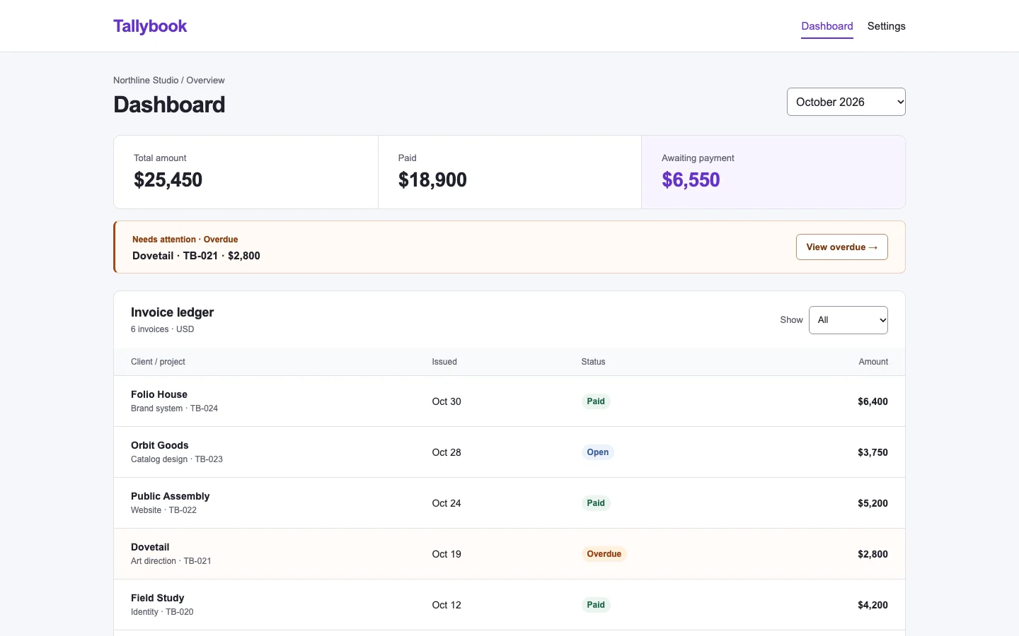
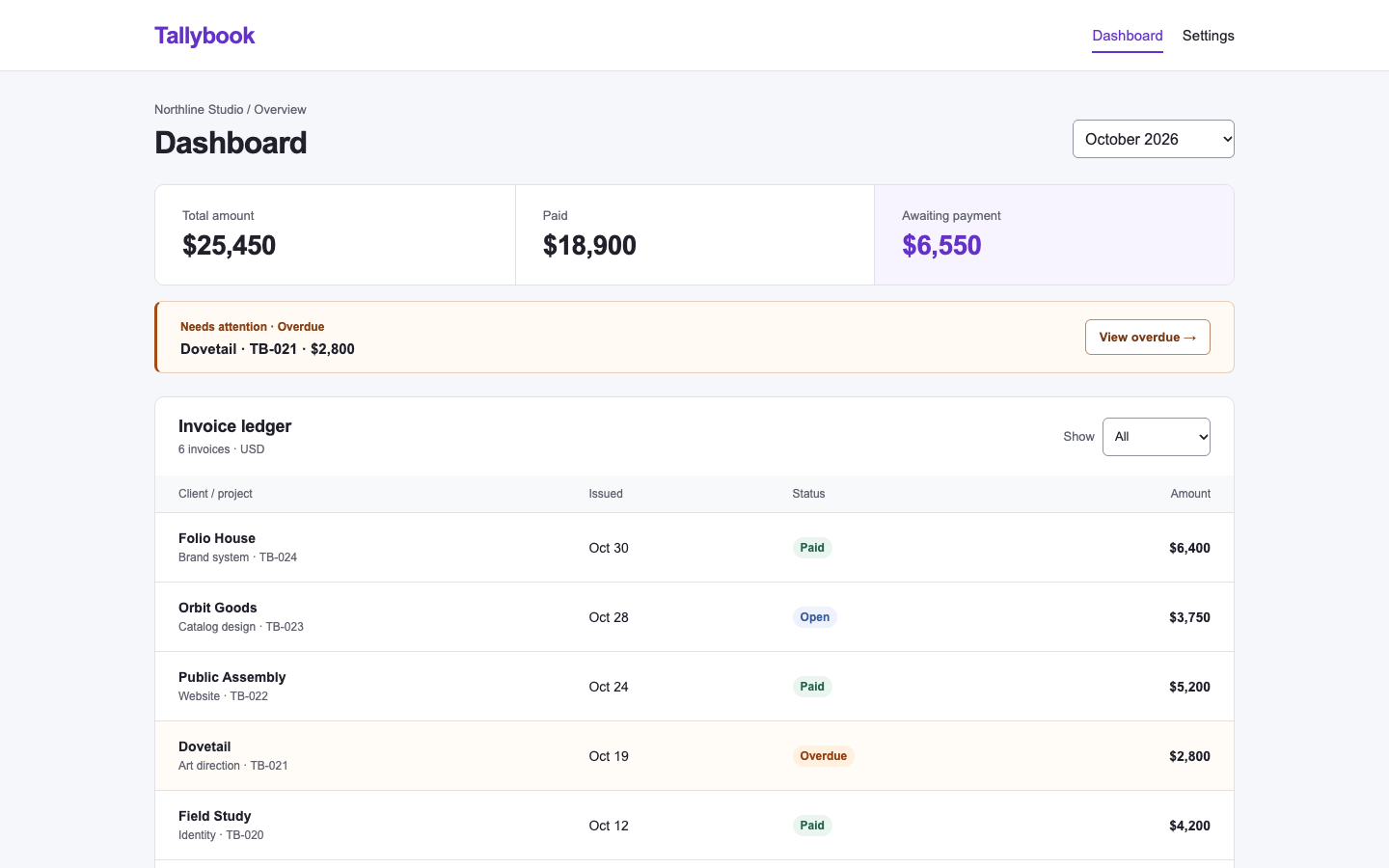
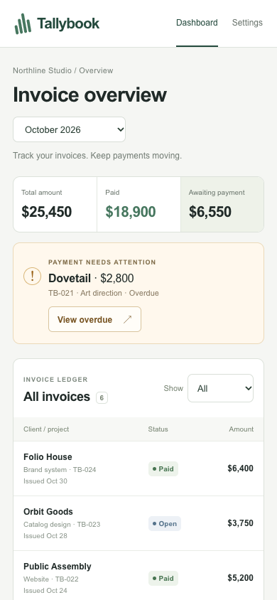
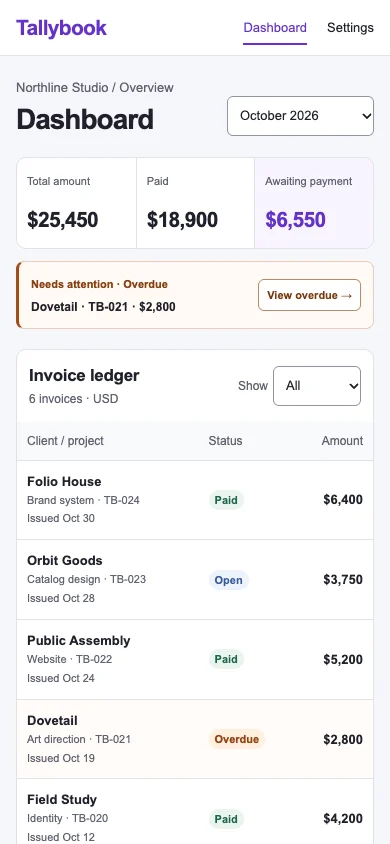
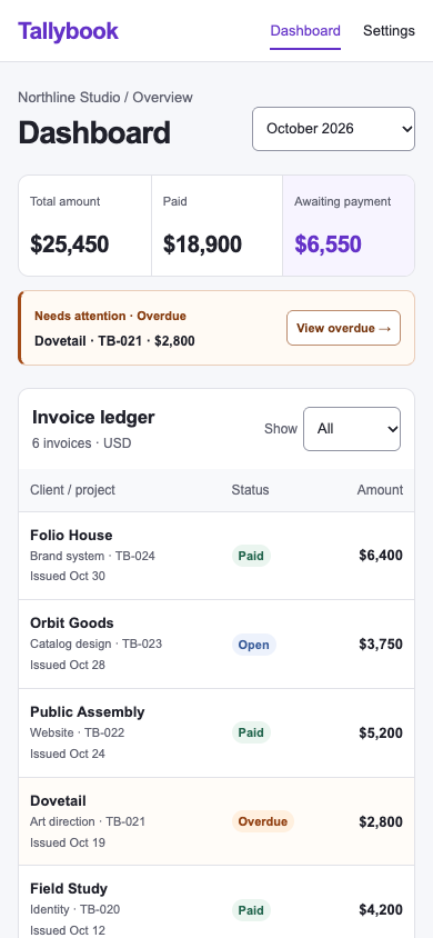
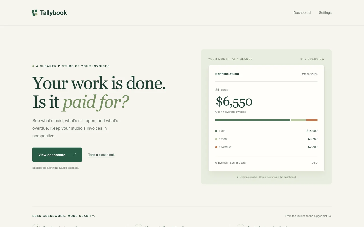
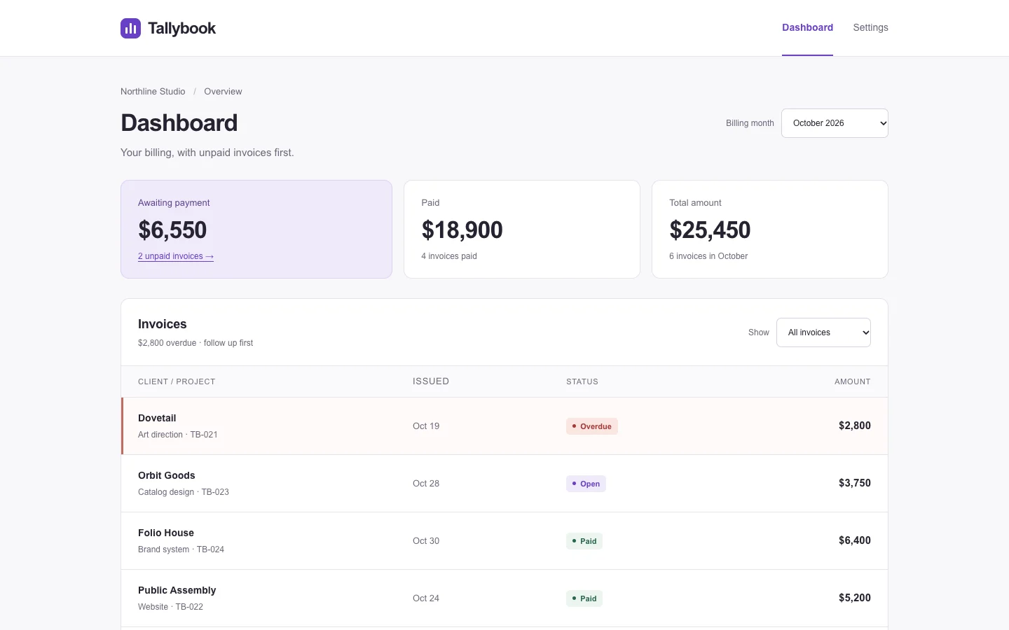
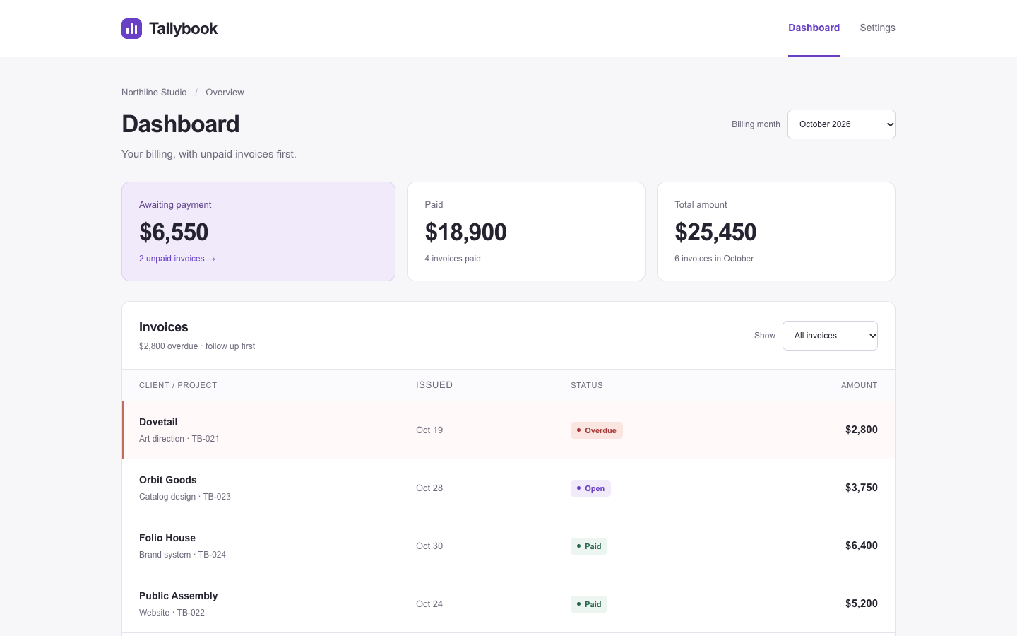
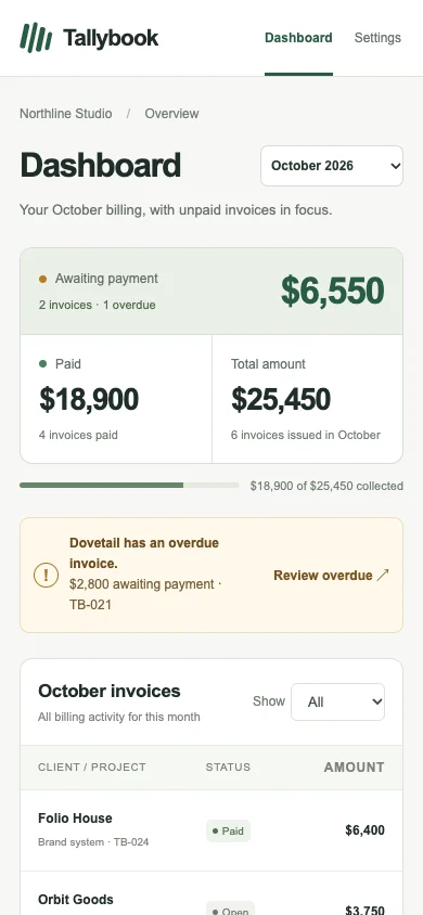
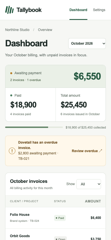
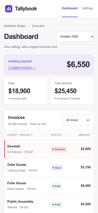
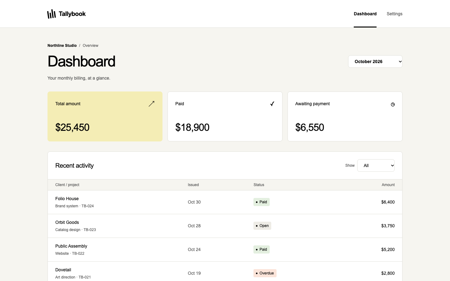
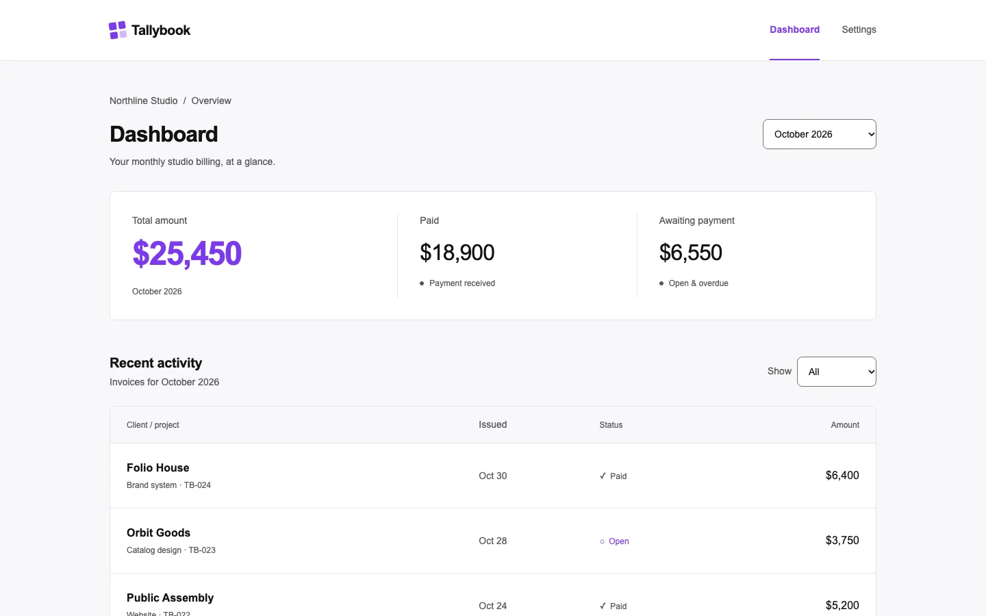
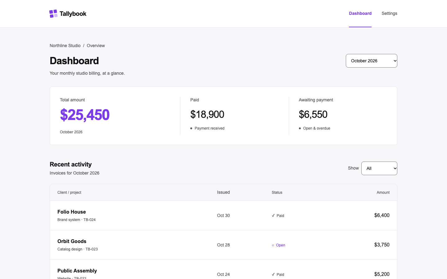
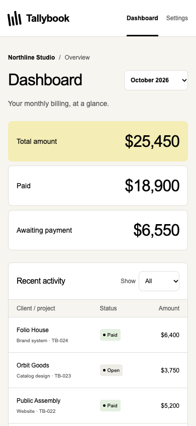
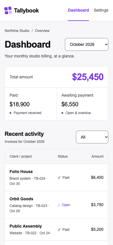
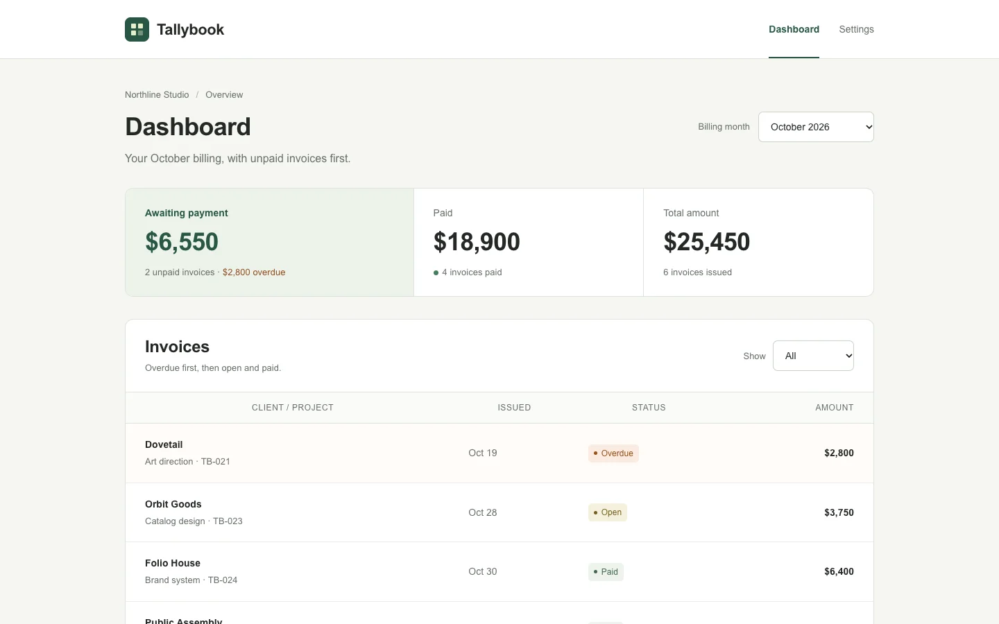
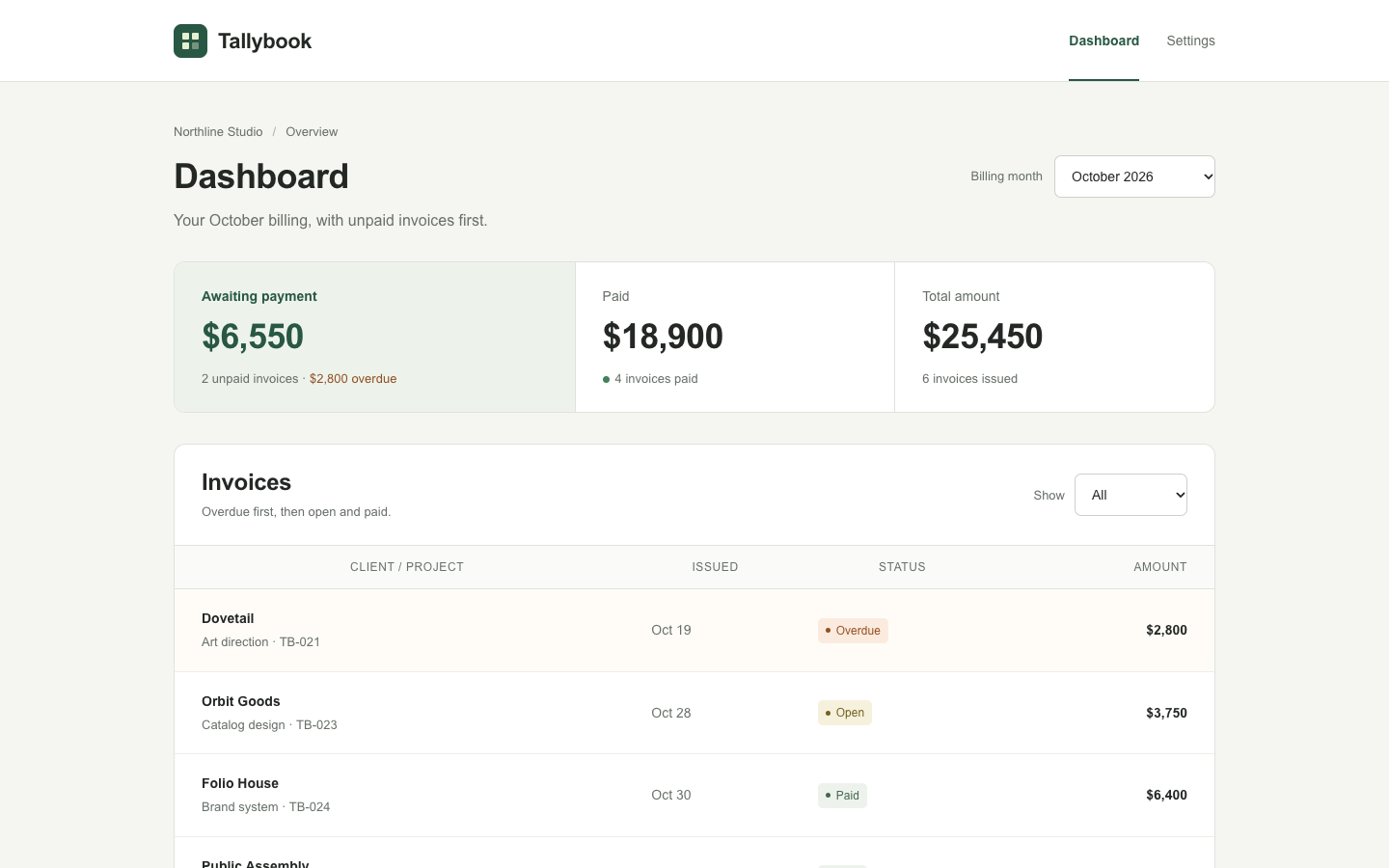
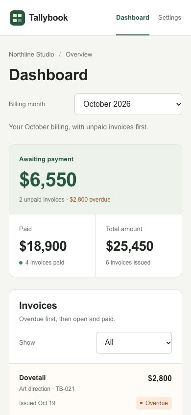
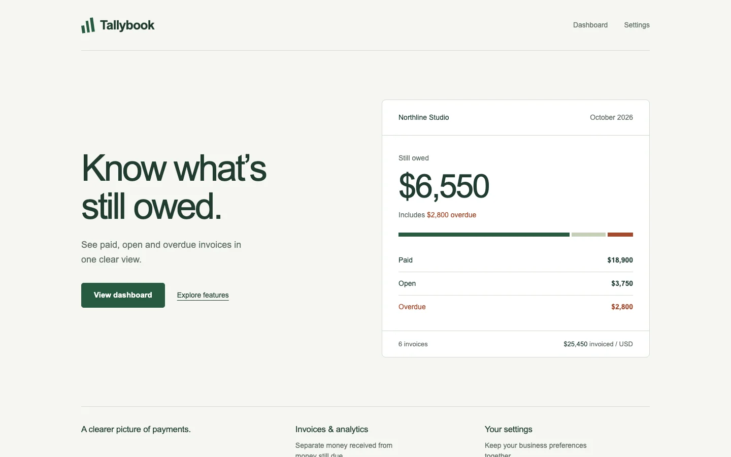
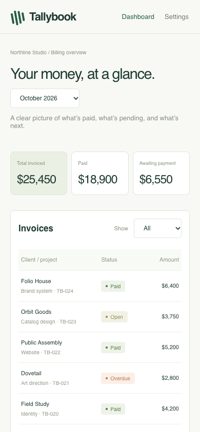
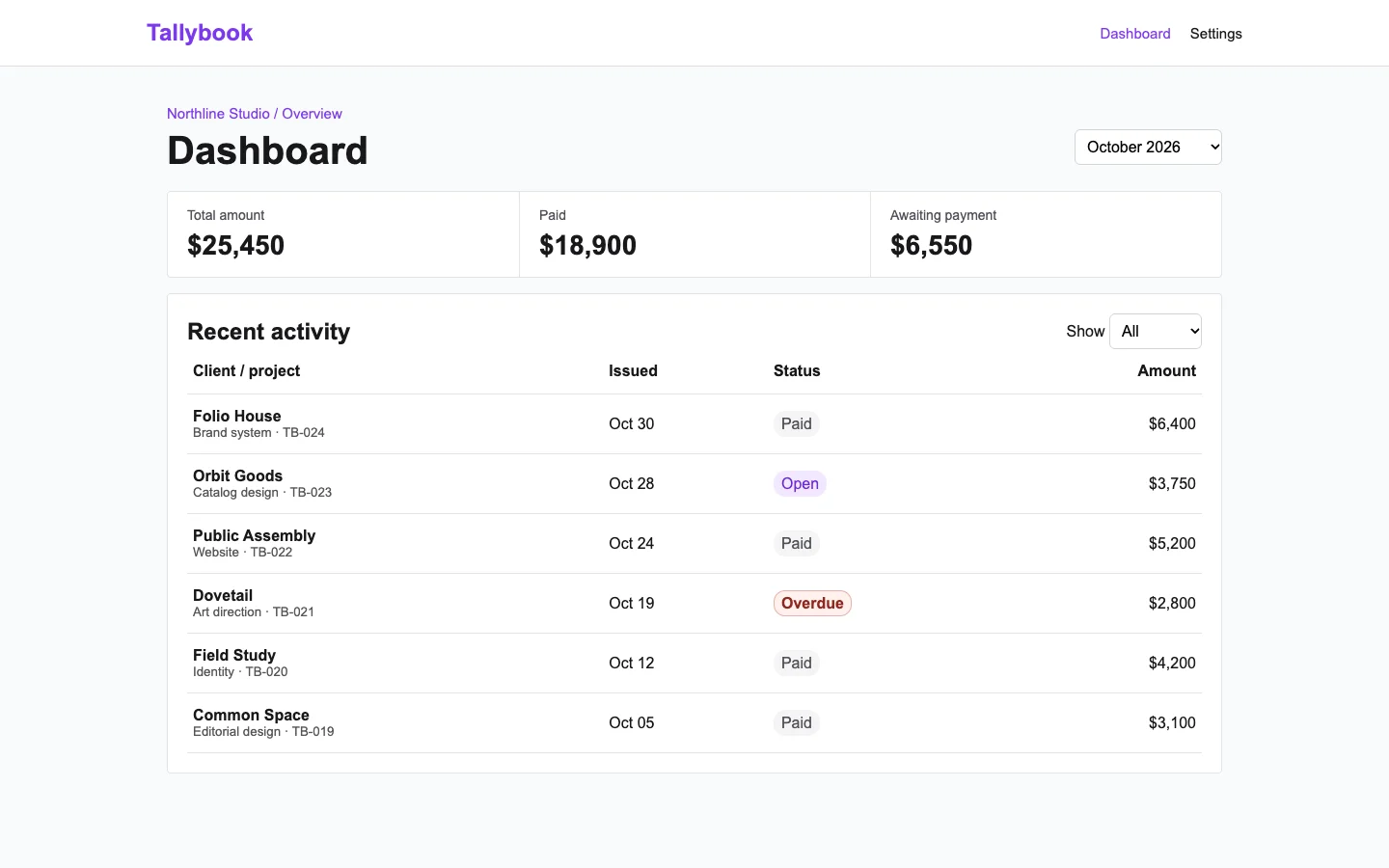
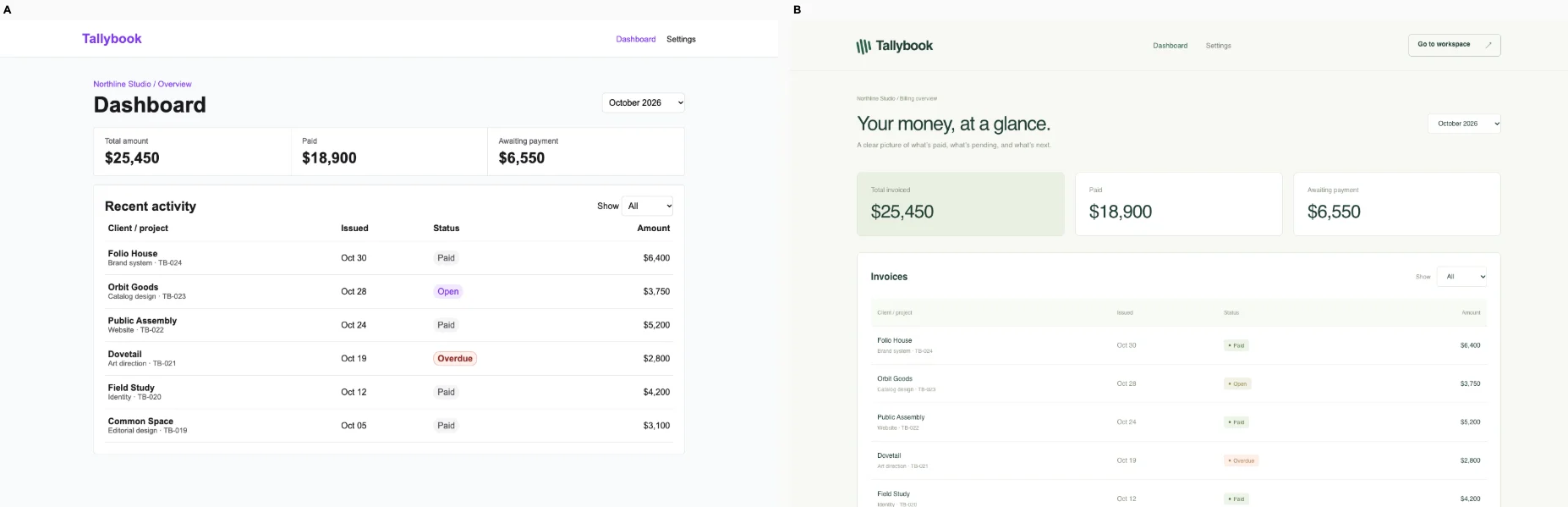
Studio billing dashboard · Tied or split

/dashboard · Identify the outstanding invoice and filter the ledger by period and status. Keep its exact invoice records and totals.

Bare agent. One request completed. Source changed. Desktop (original PNG) · Phone
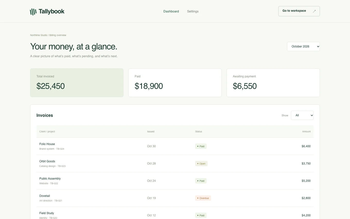
desktop: pass. September / Overdue shows zero invoice rows. mobile: pass. September / Overdue shows zero invoice rows.

Fix loop. blocked: No verified edit task; see the unverified checks in the audit.. Source changed. Desktop (original PNG) · Phone
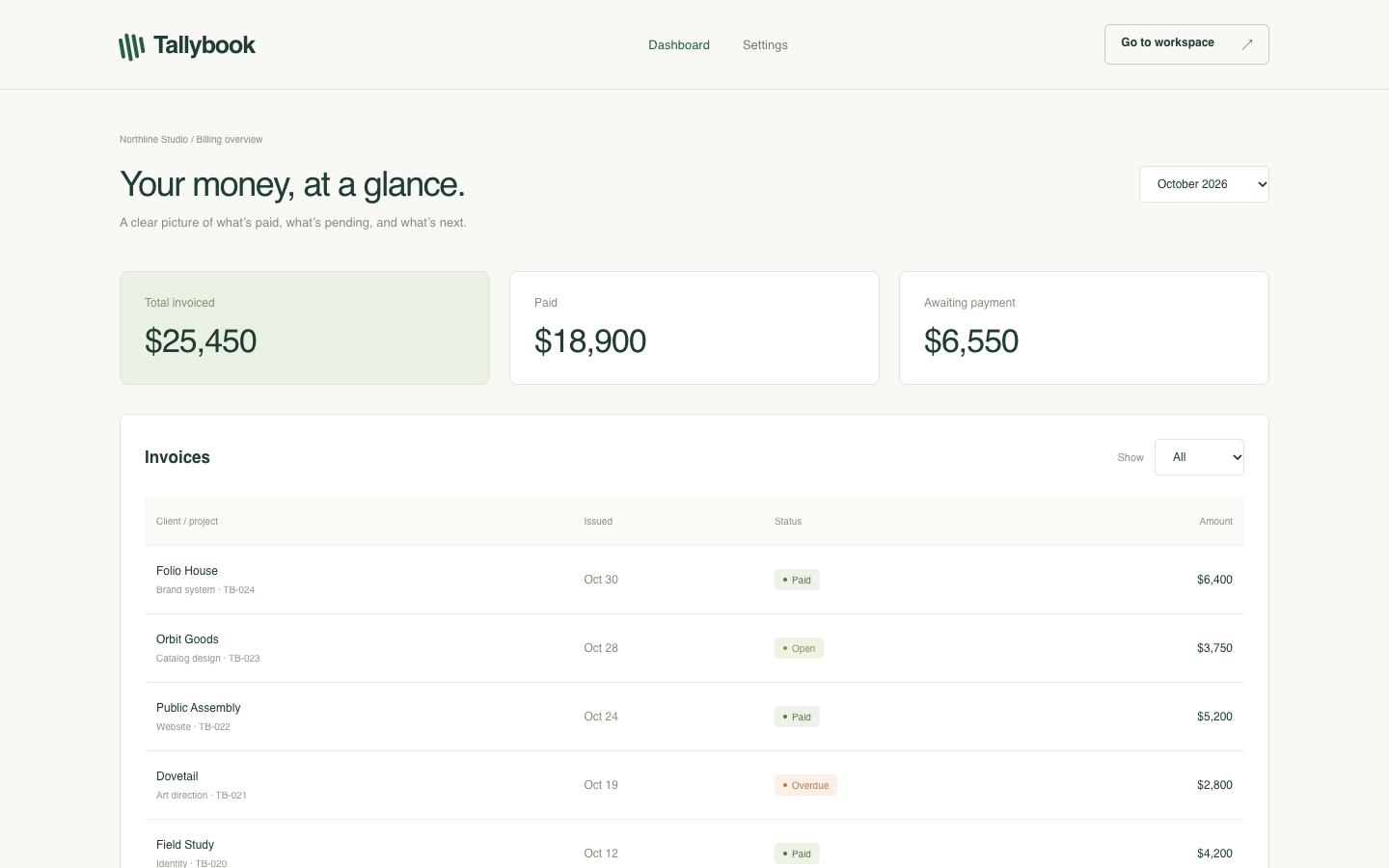
desktop: pass. September / Overdue shows zero invoice rows. mobile: pass. September / Overdue shows zero invoice rows.

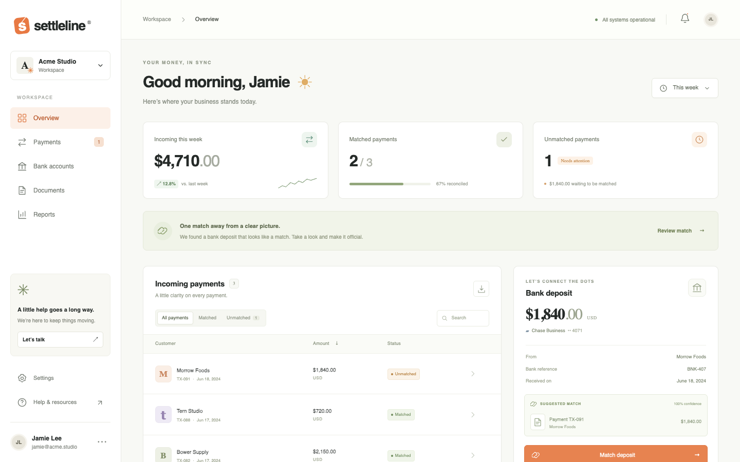
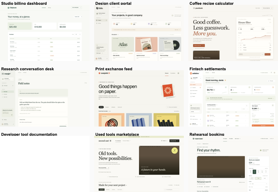
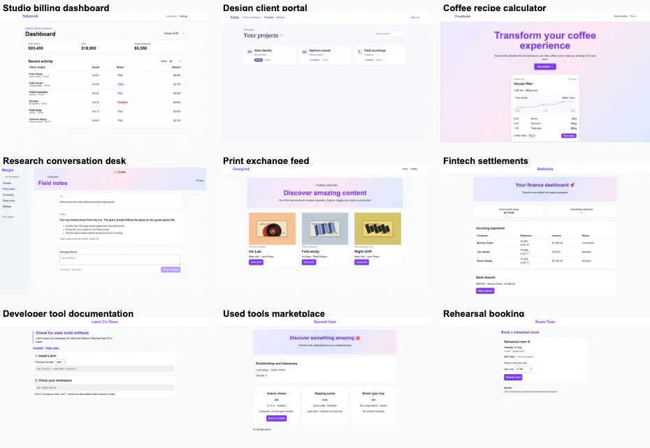
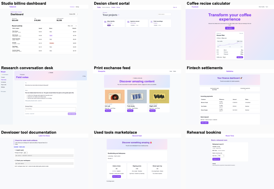
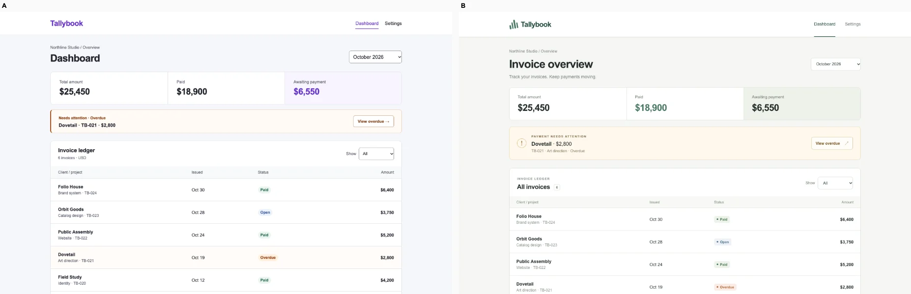
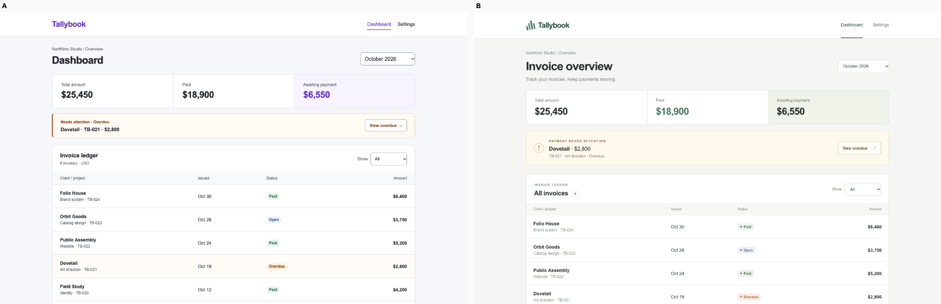
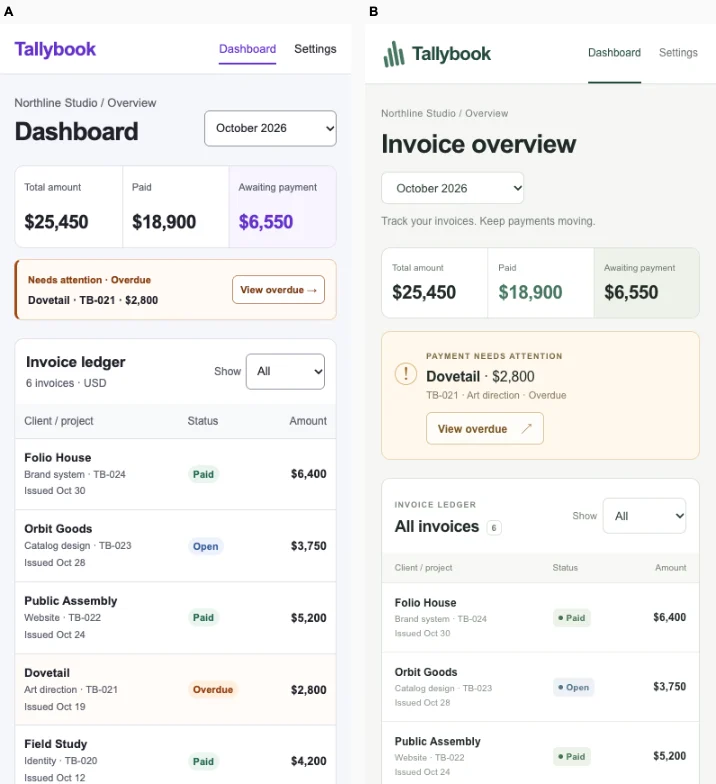
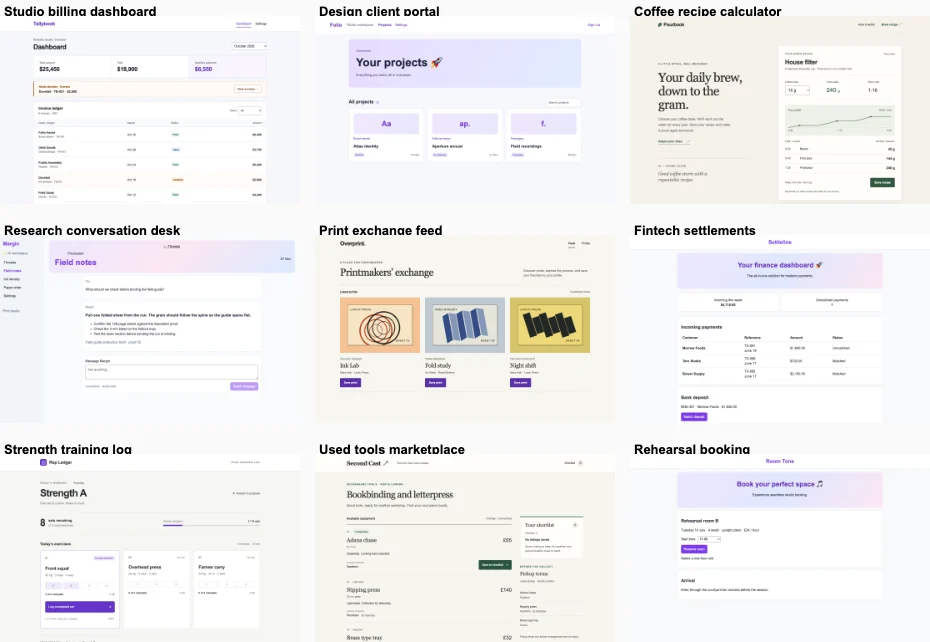
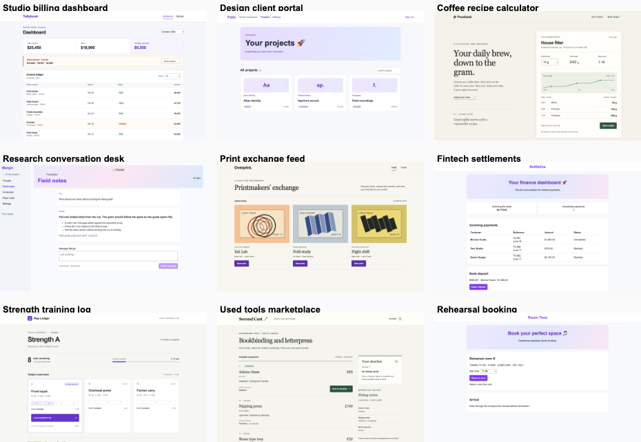
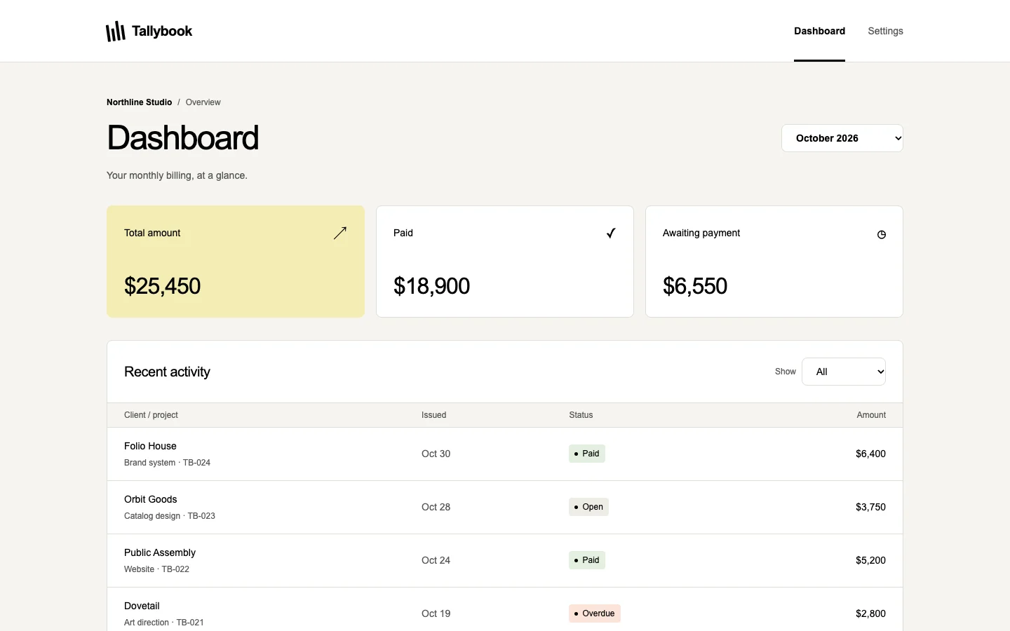
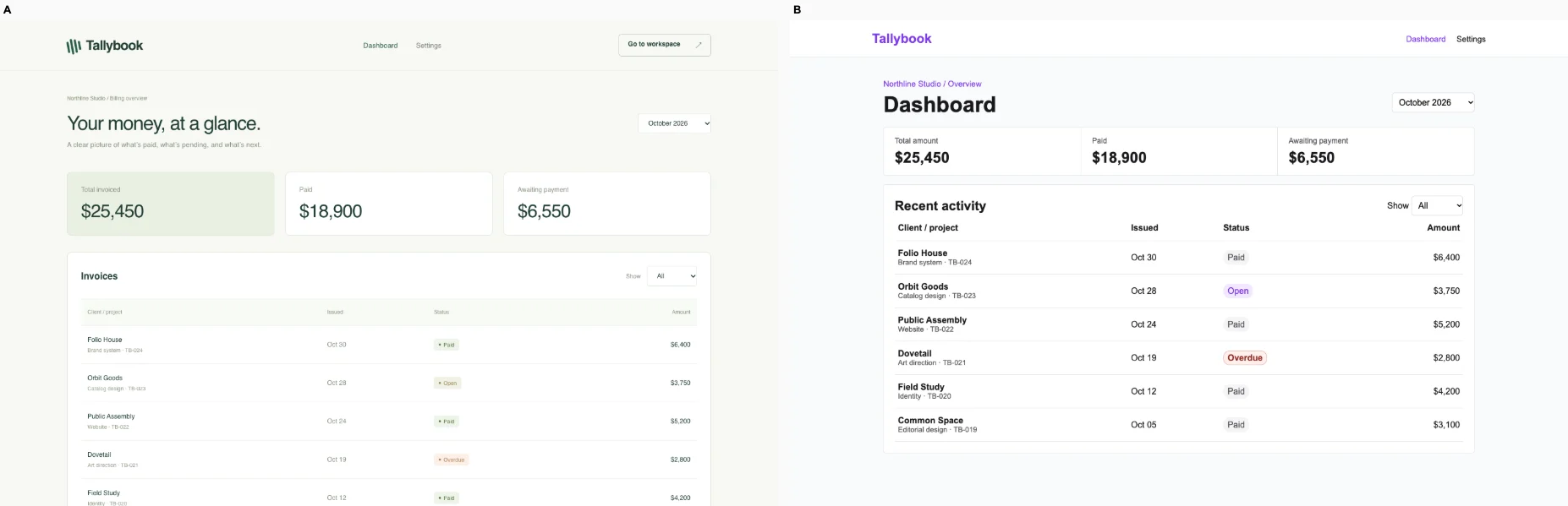
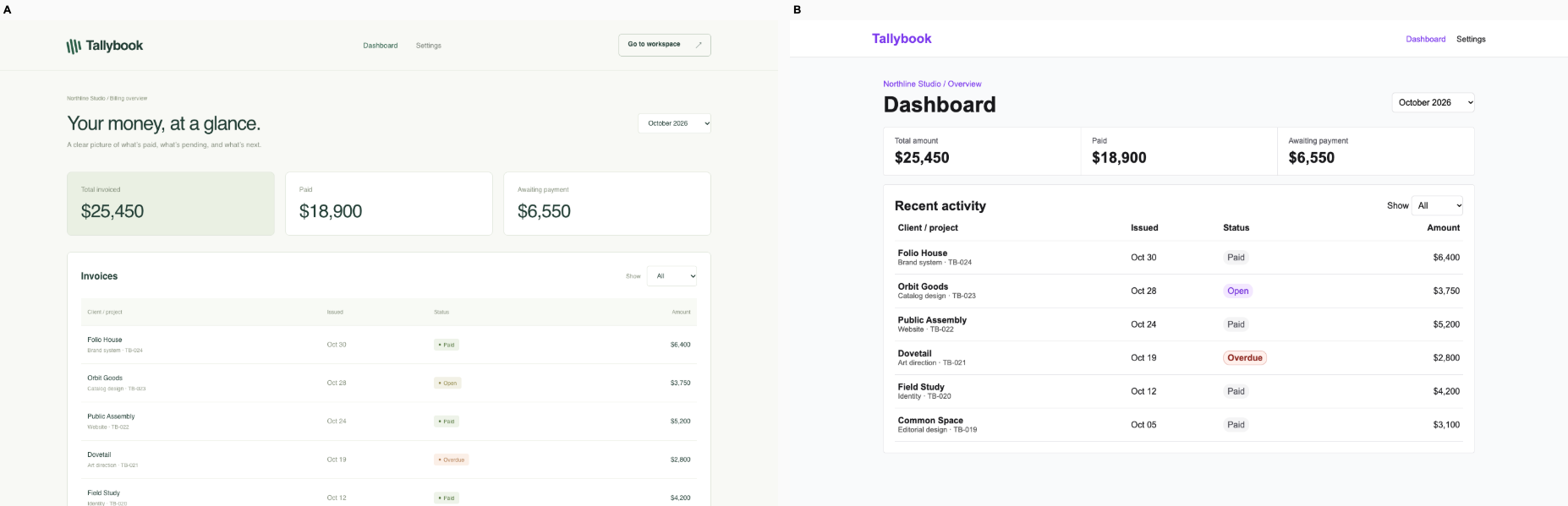
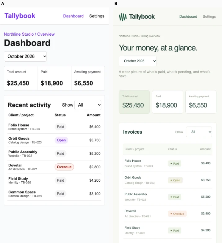
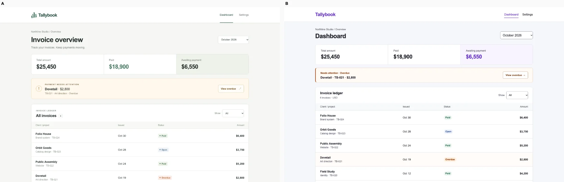
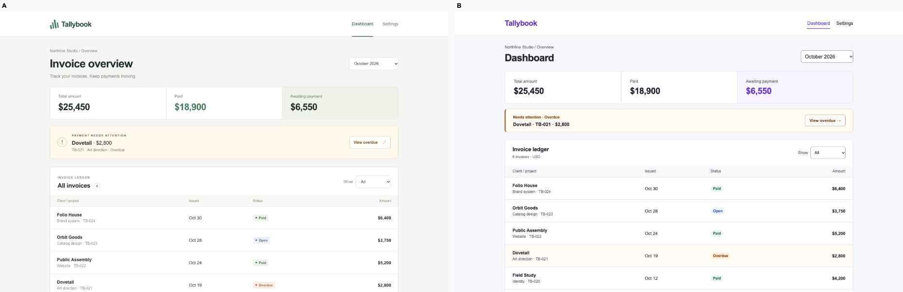
Ballot 1. 3/7 toward fix. Left: bare, right: fix. A narrowly wins through invoice-specific framing, restrained green styling and purposeful copy. Both preserve the displayed totals ($25,450 invoiced, $18,900 paid, $6,550 awaiting payment) and invoice records. B makes the ledger easier to scan with larger text, stronger amounts and a clearer red Overdue state for Dovetail’s $2,800 invoice; its phone view also shows all six records. A’s desktop table is excessively small and faint. Both successfully filter September / Overdue to zero rows on desktop and mobile, so behavior provides no advantage.

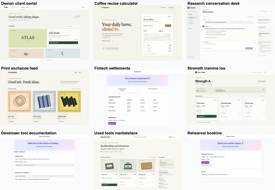
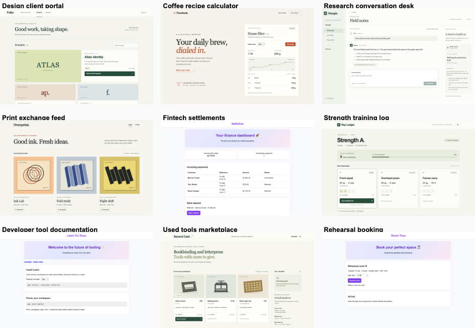
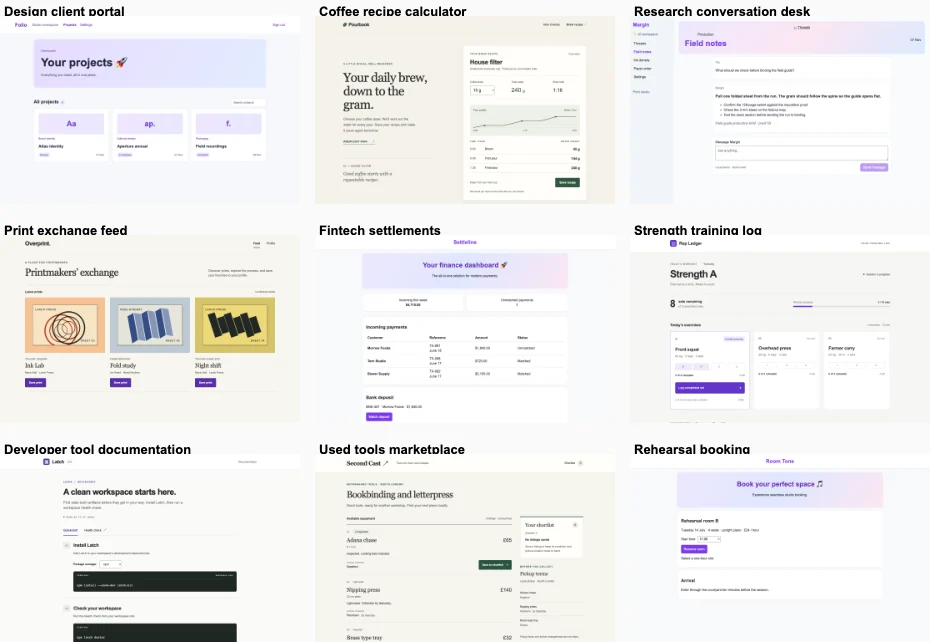
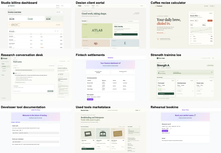
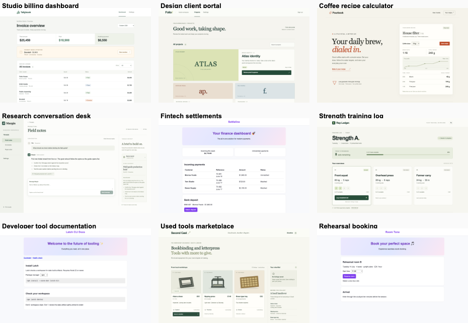
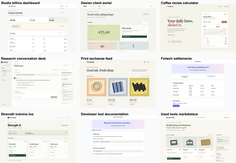
B closely repeats its cohort’s purple branding, pale backgrounds, outlined cards and generic dashboard treatment, although it avoids their promotional gradients and slogans. A shares its cohort’s muted colors, fine borders and generous whitespace, but its green financial summary, invoice terminology and ledger composition give this product a more specific identity. That advantage is modest because A’s cohort also repeatedly uses summary cards and spacious panels.

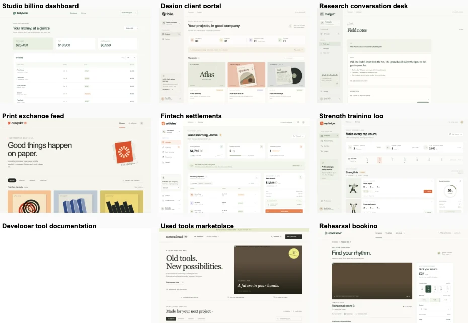
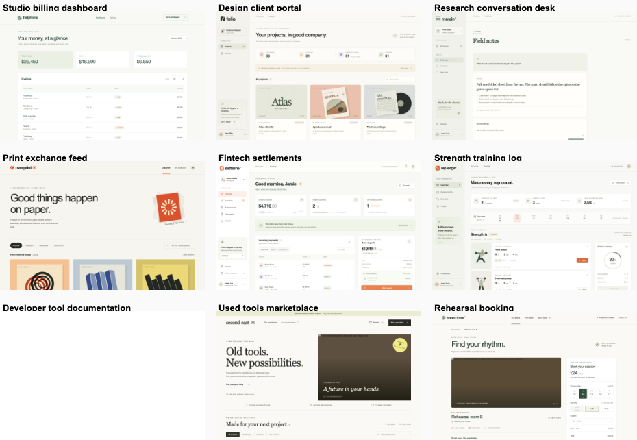
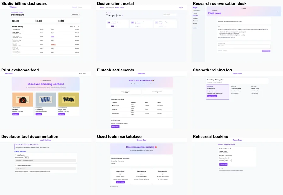
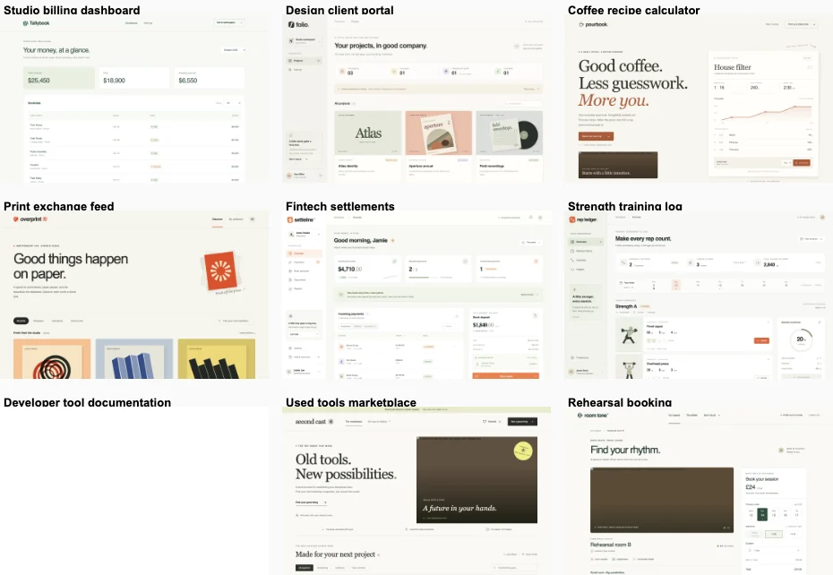
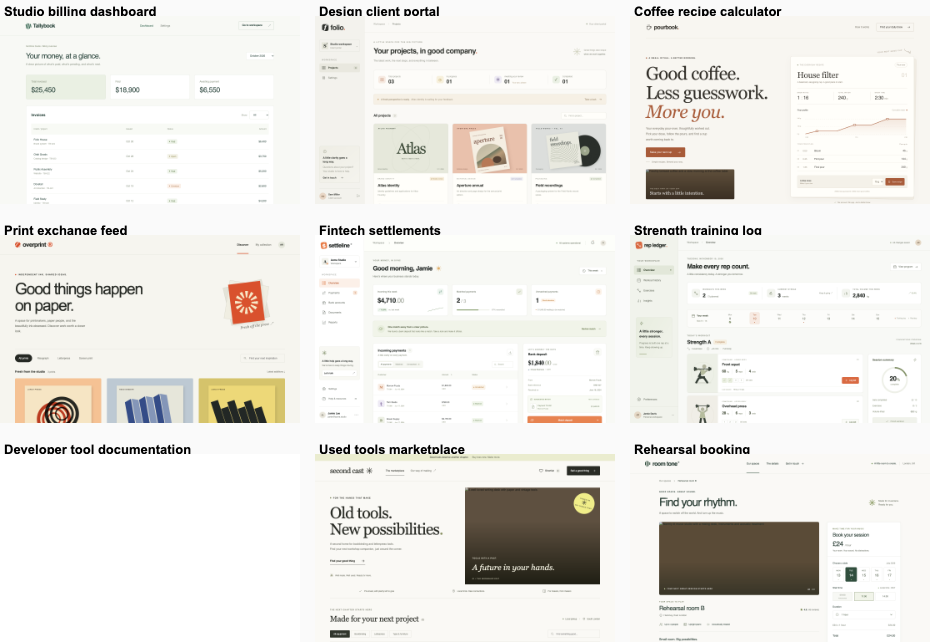
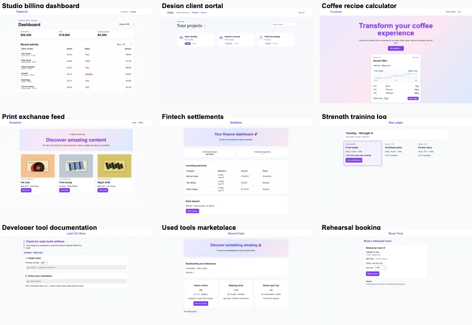
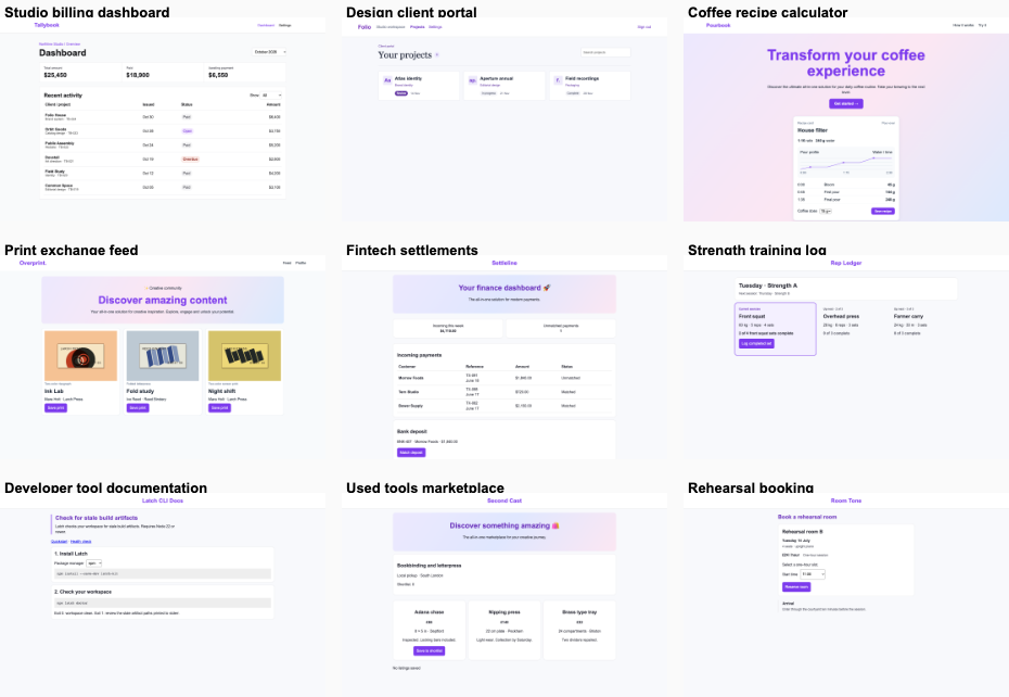
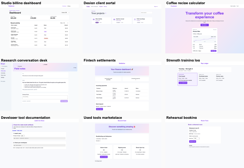
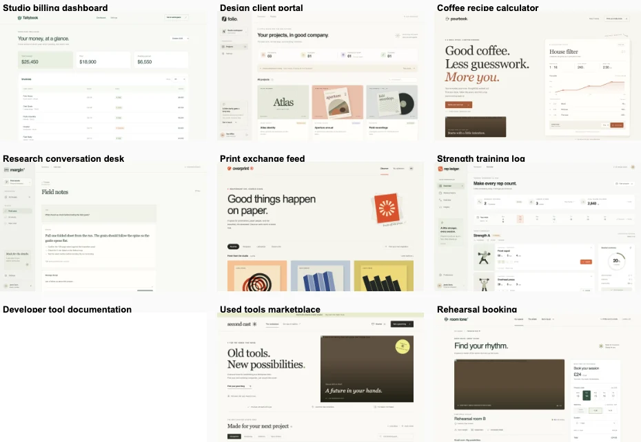
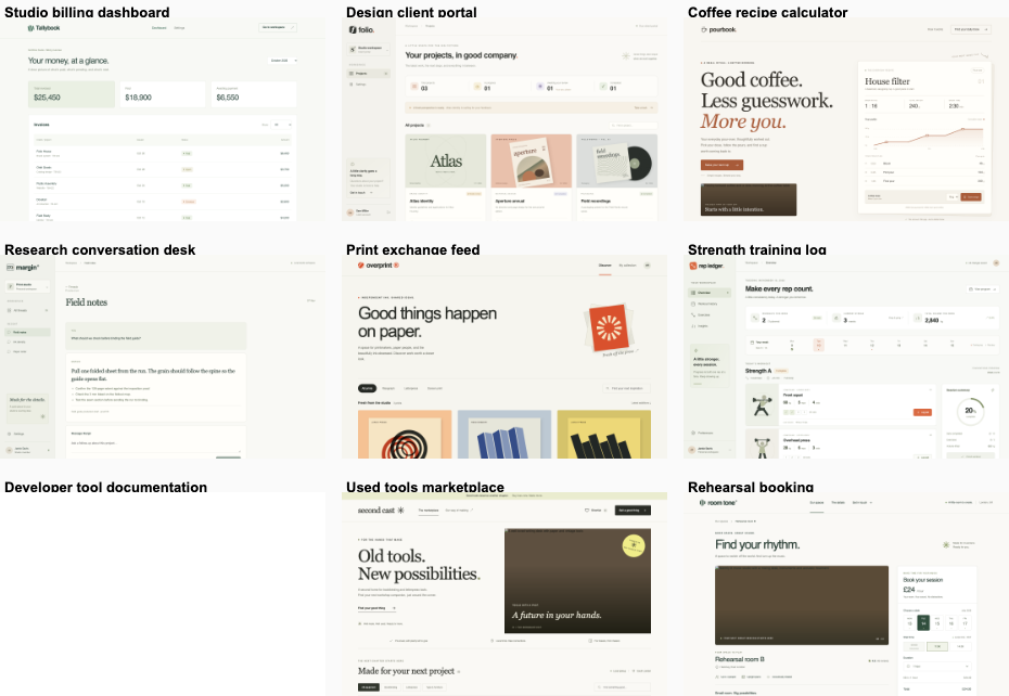
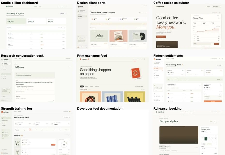
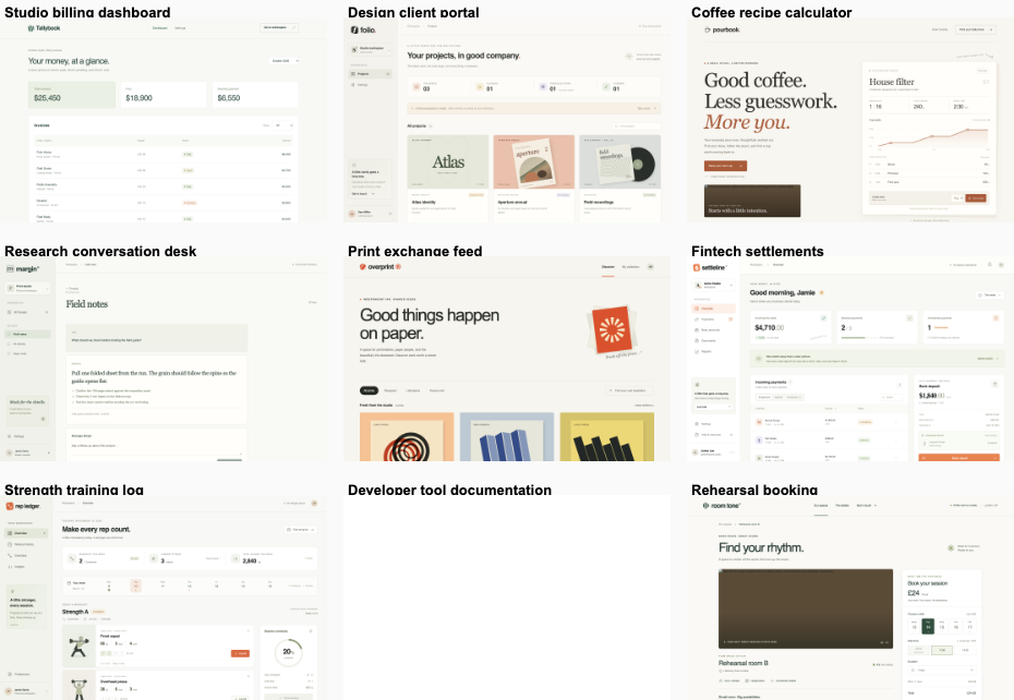
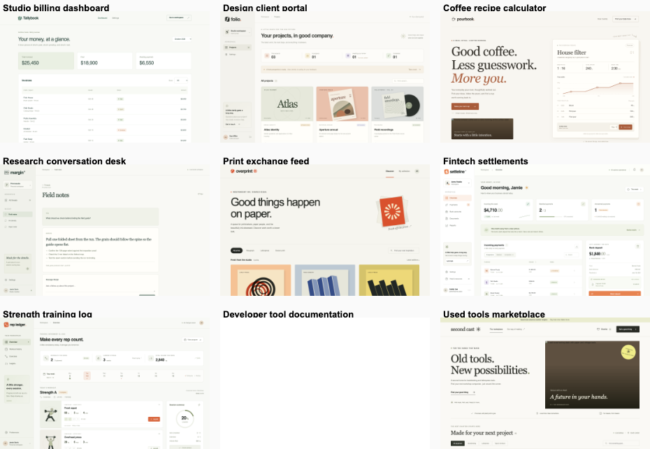
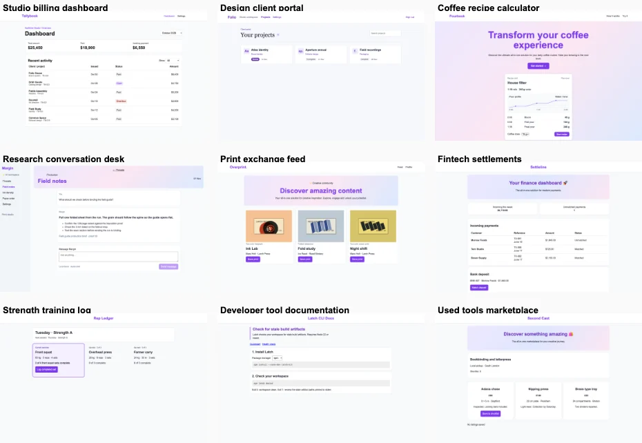
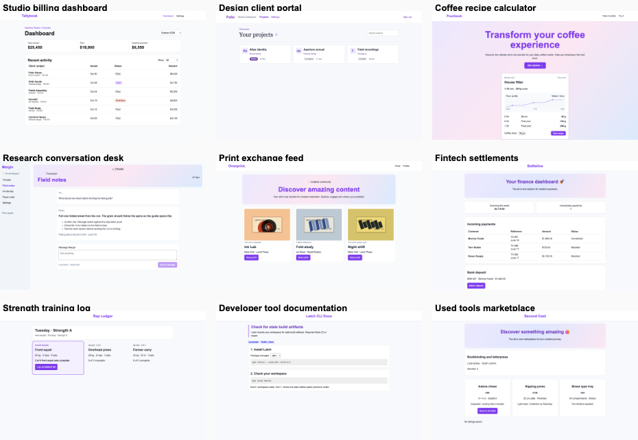
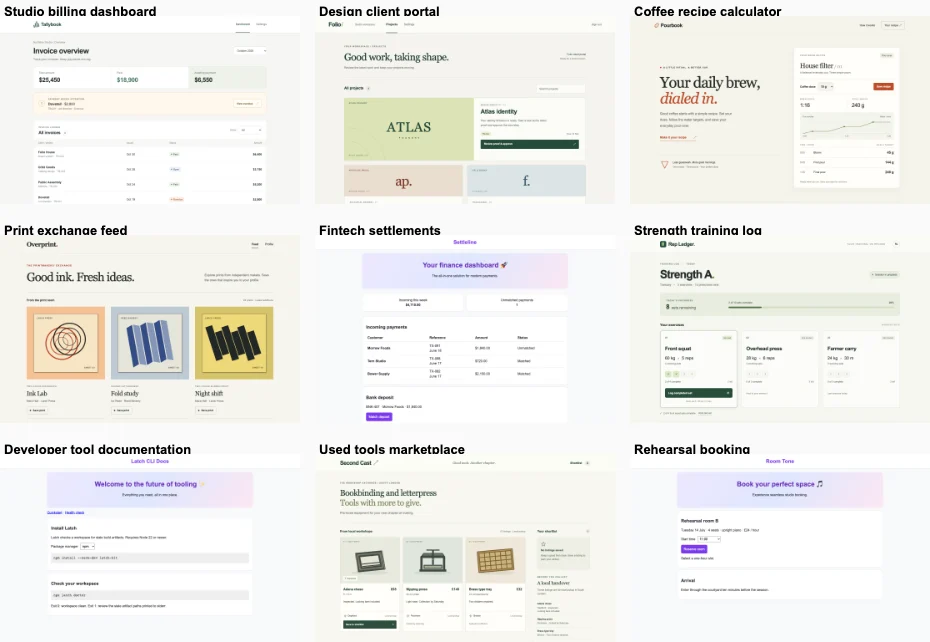
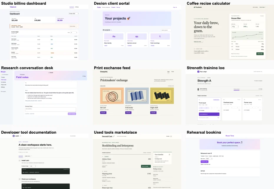
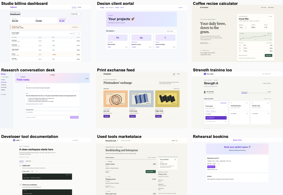
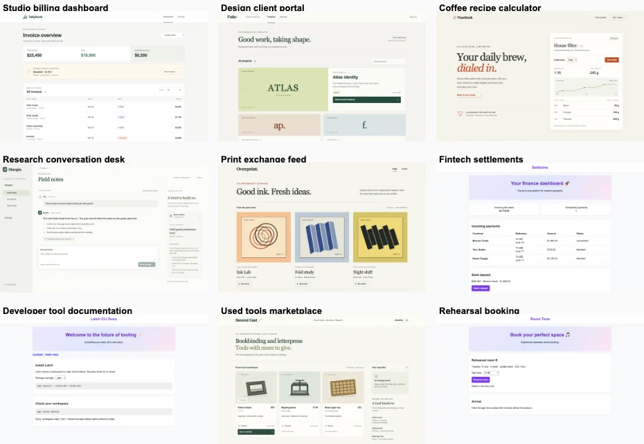
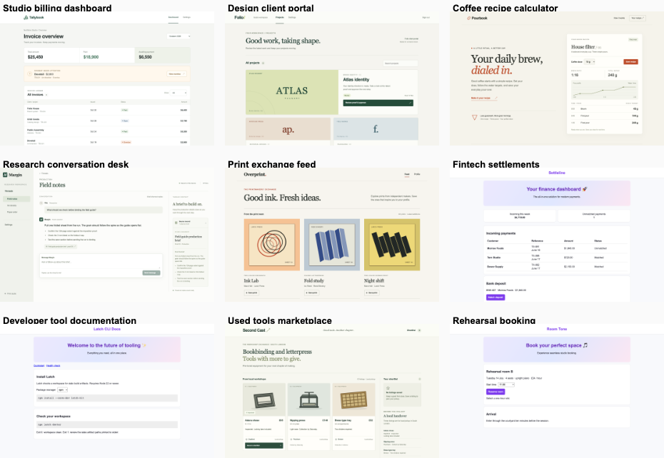
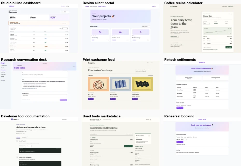
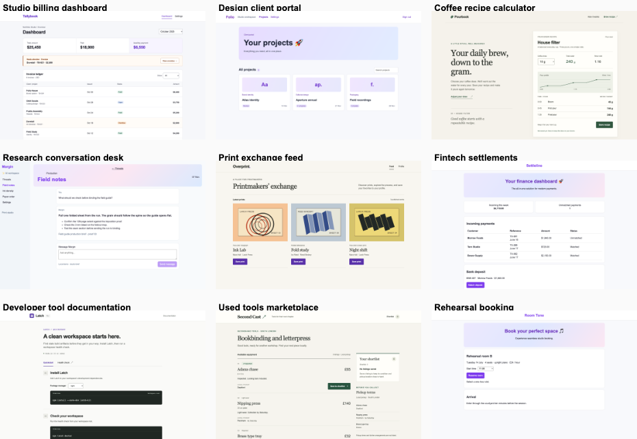
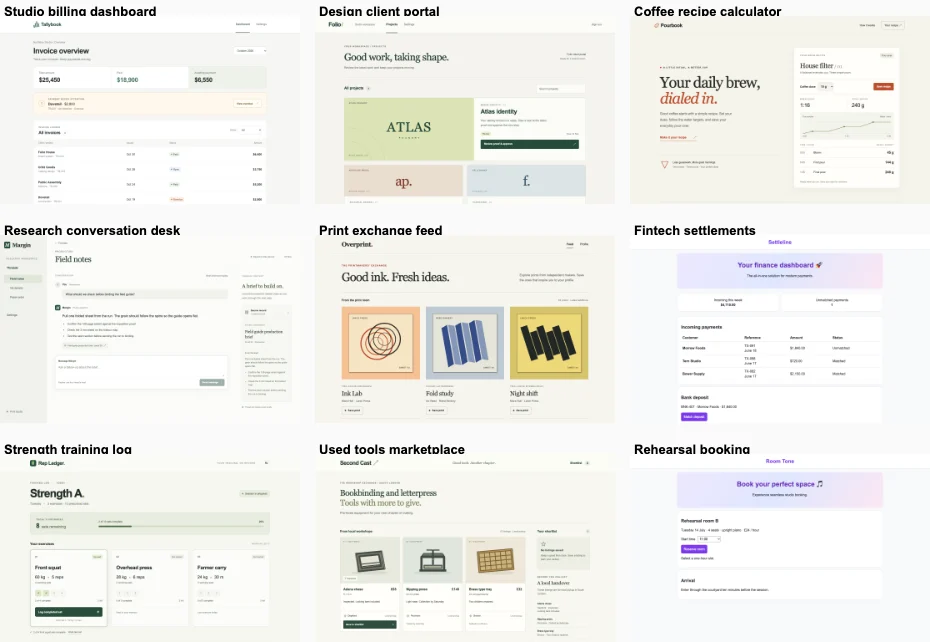
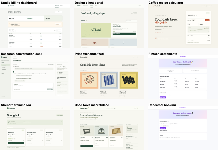
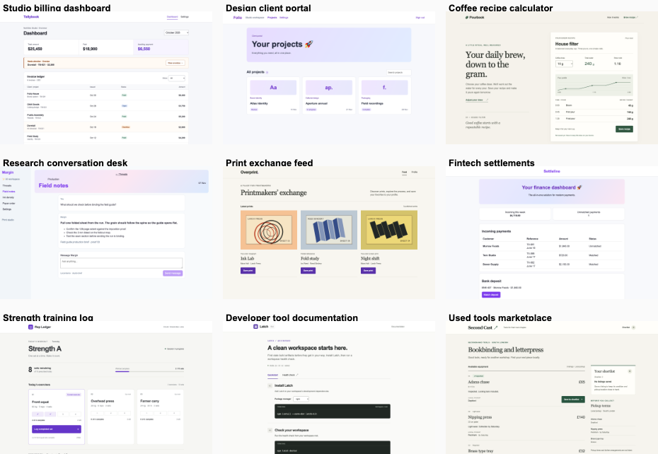
Desktop pair (original PNG) · Phone pair (original PNG) · Other left products (original PNG) · Other right products (original PNG)

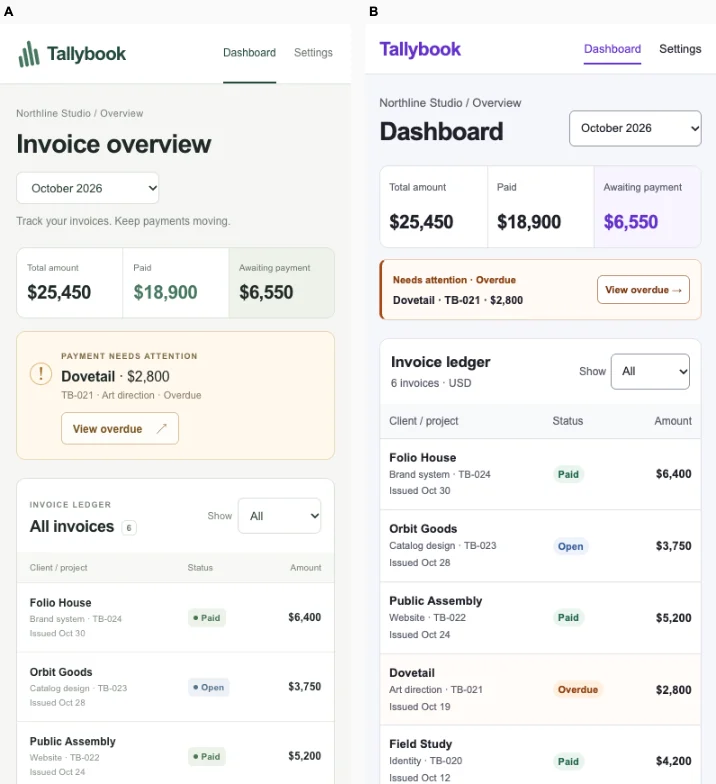
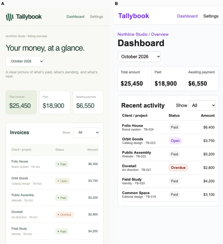
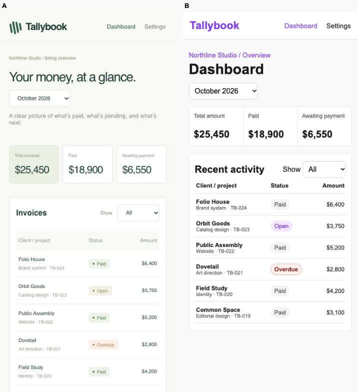
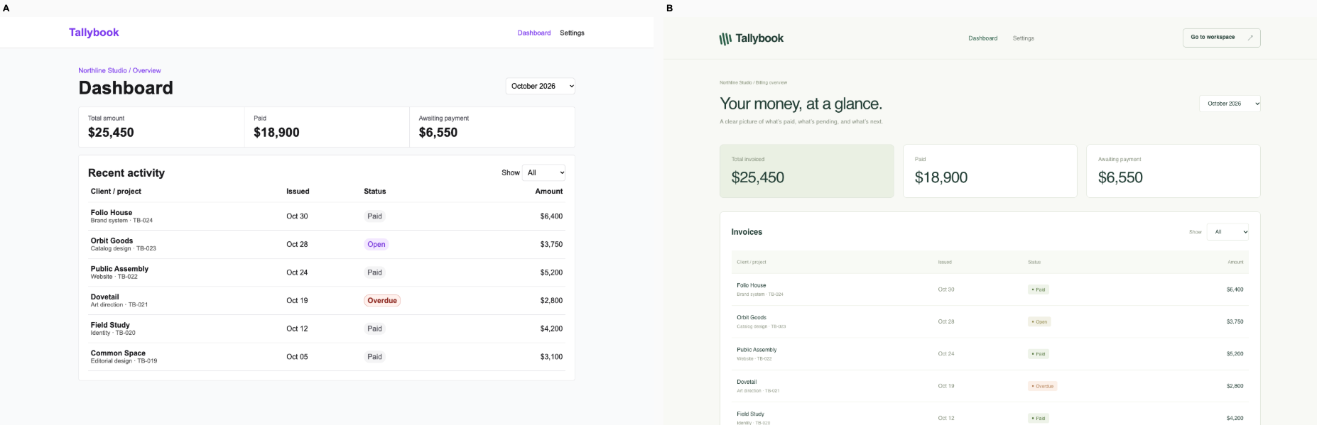
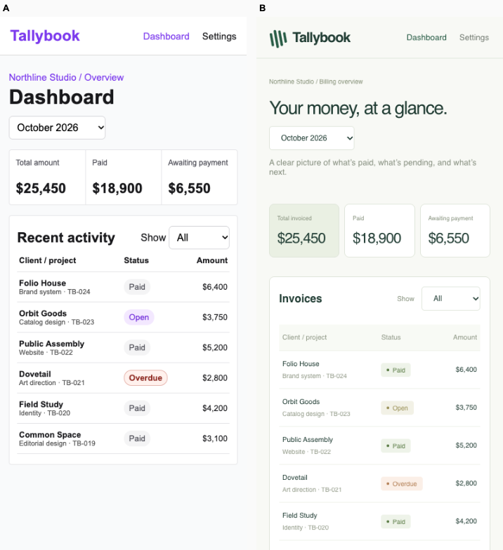
Ballot 2. 4/7 toward fix. Left: fix, right: bare. A makes invoice review faster with larger ledger text, tighter spacing, clearer overdue contrast and all six records visible on the phone. B offers more deliberate branding and restrained color, but its large introduction and generous spacing push ledger content down; its small, muted labels weaken scanning. Both preserve the displayed totals and invoice details, expose period and status filters, and passed the verified September / Overdue empty-result interaction on desktop and mobile. Neither prominently surfaces the outstanding invoice. The period controls do not demonstrate the calibrated two-line comparison pattern.

A repeats its cohort’s purple branding, pale gray backgrounds, plain white cards and basic navigation across unrelated products. B shares muted cream and green tones, fine borders and quiet labels with its cohort, but the Tallybook mark, sans-serif financial presentation and ledger structure distinguish it from the editorial coffee and marketplace pages and the sidebar-heavy work tools. B has the stronger identity, while A retains better task density and legibility.

Desktop pair (original PNG) · Phone pair (original PNG) · Other left products (original PNG) · Other right products (original PNG)

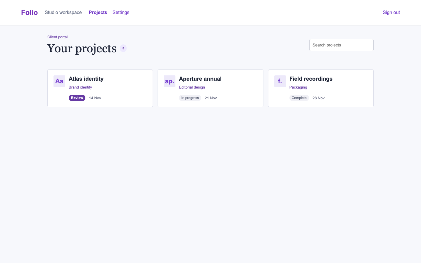
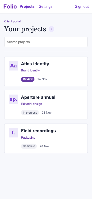
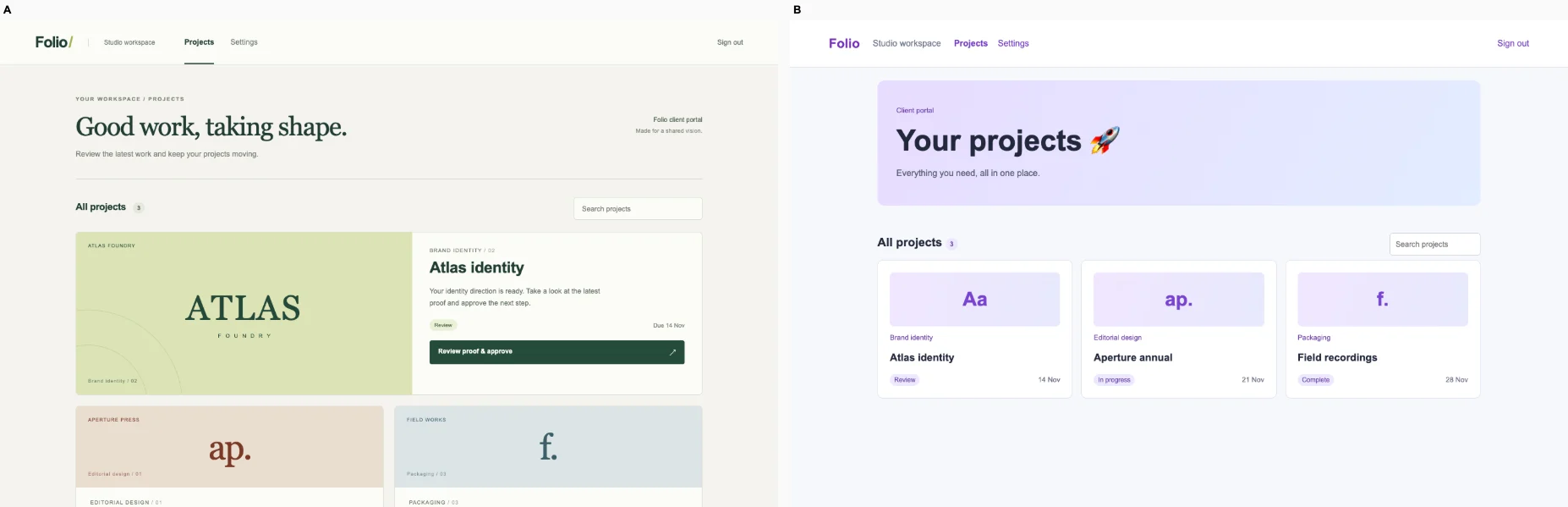
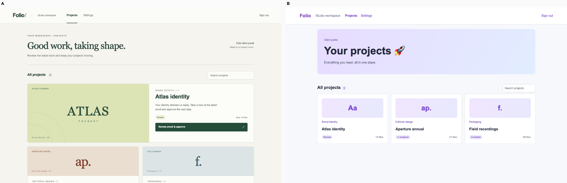
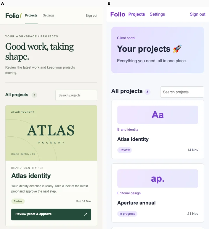
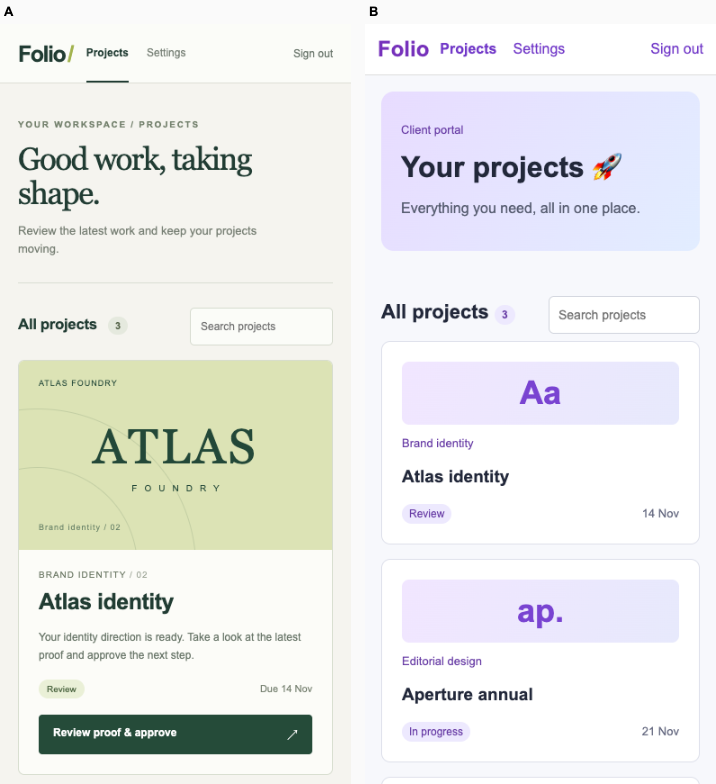
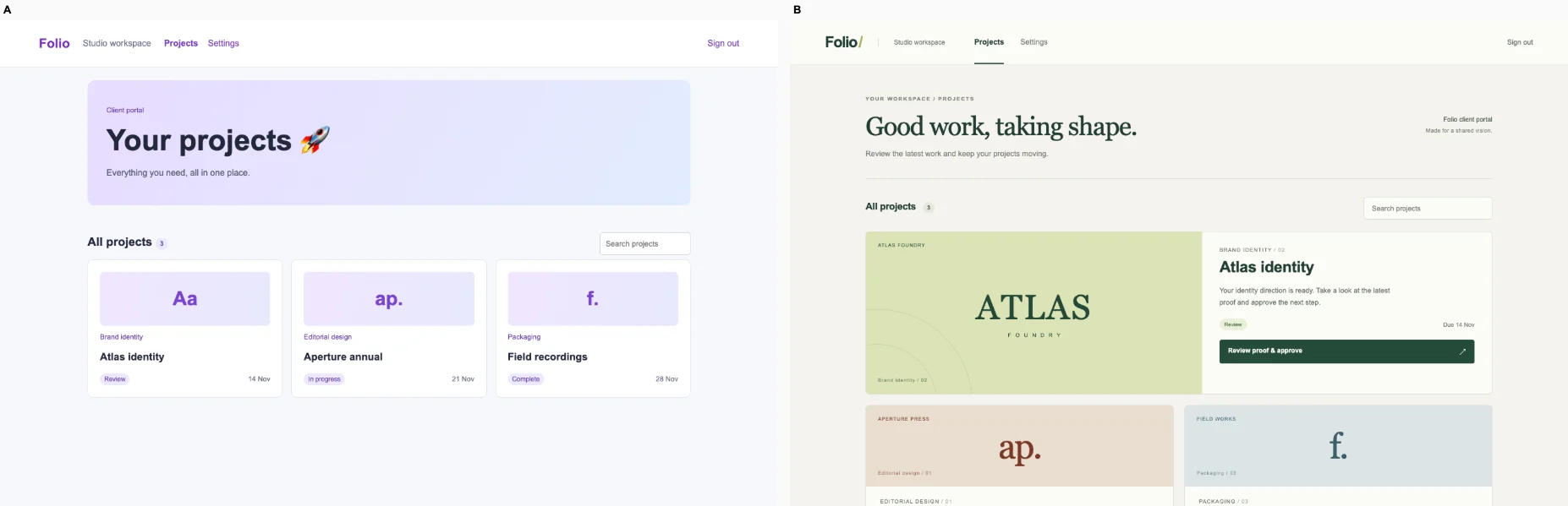
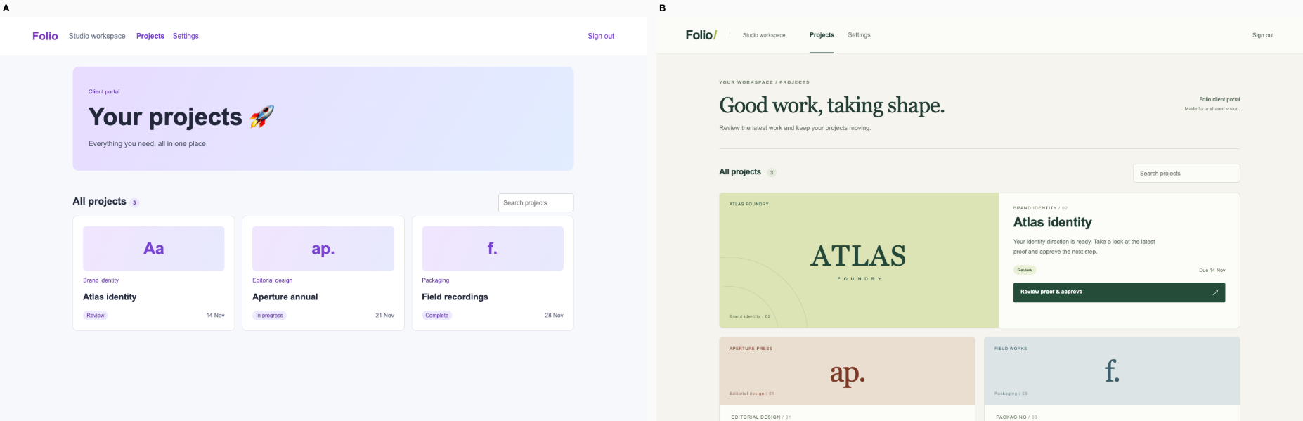
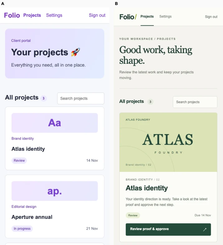
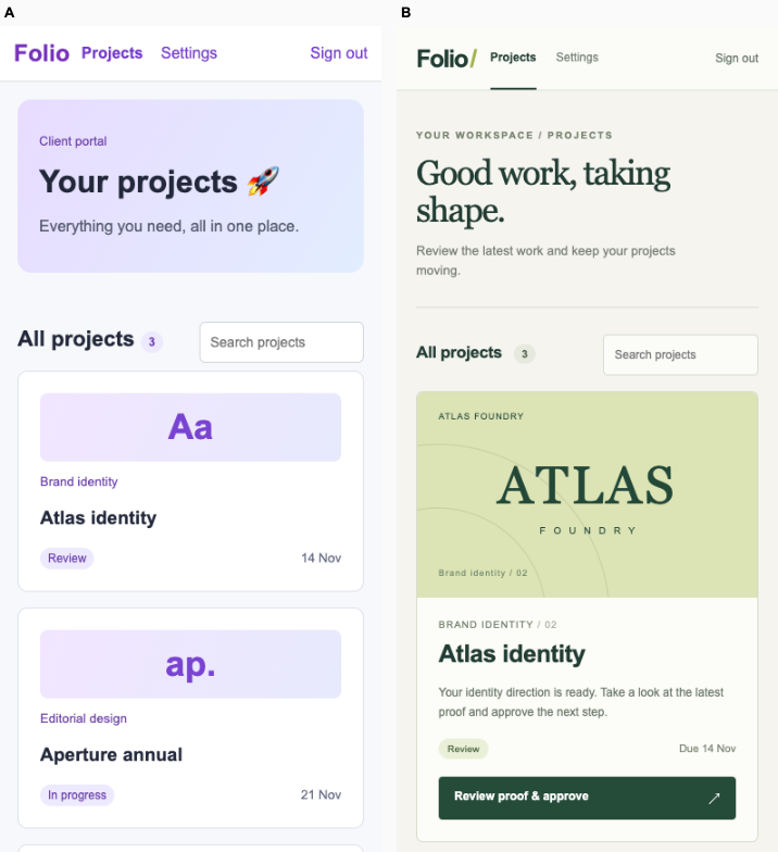
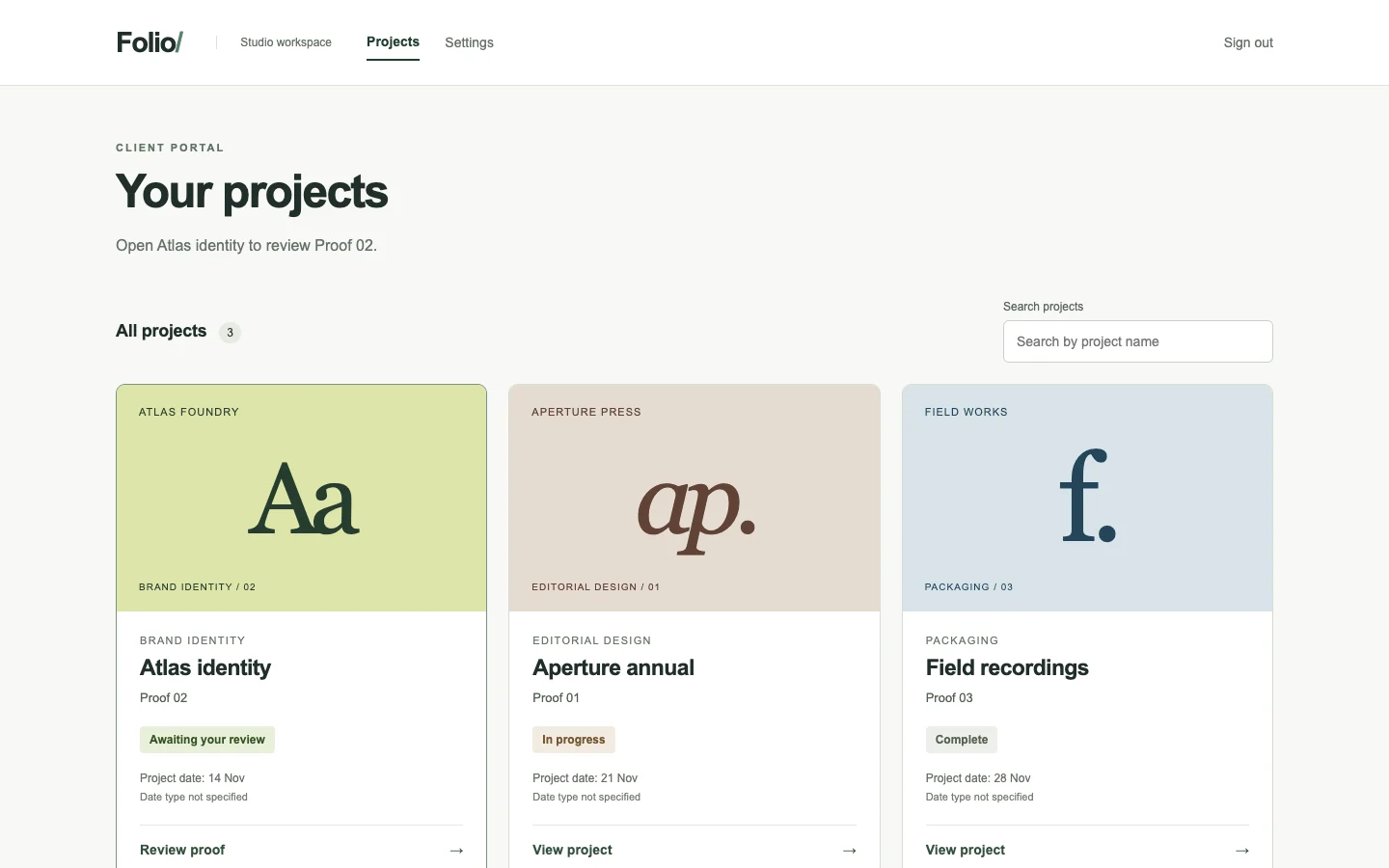
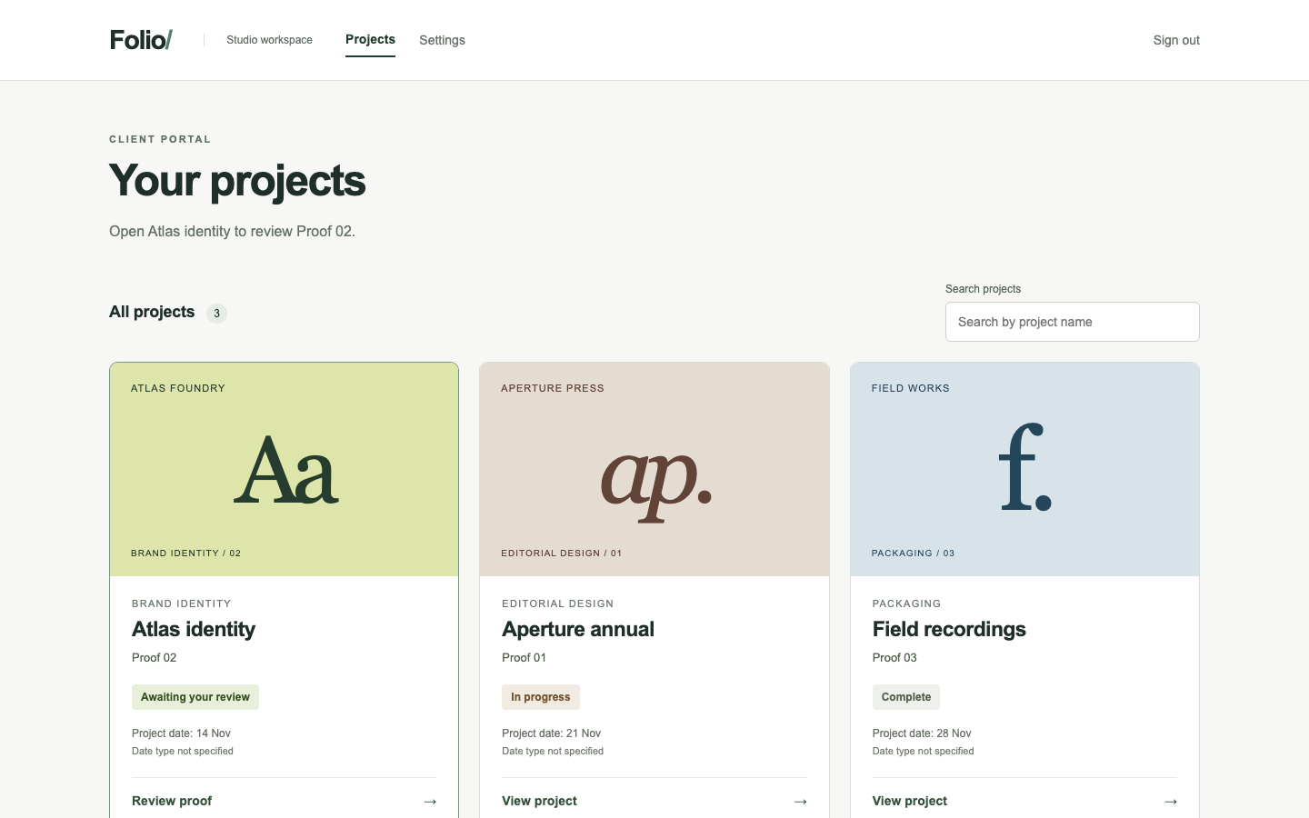
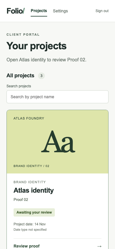
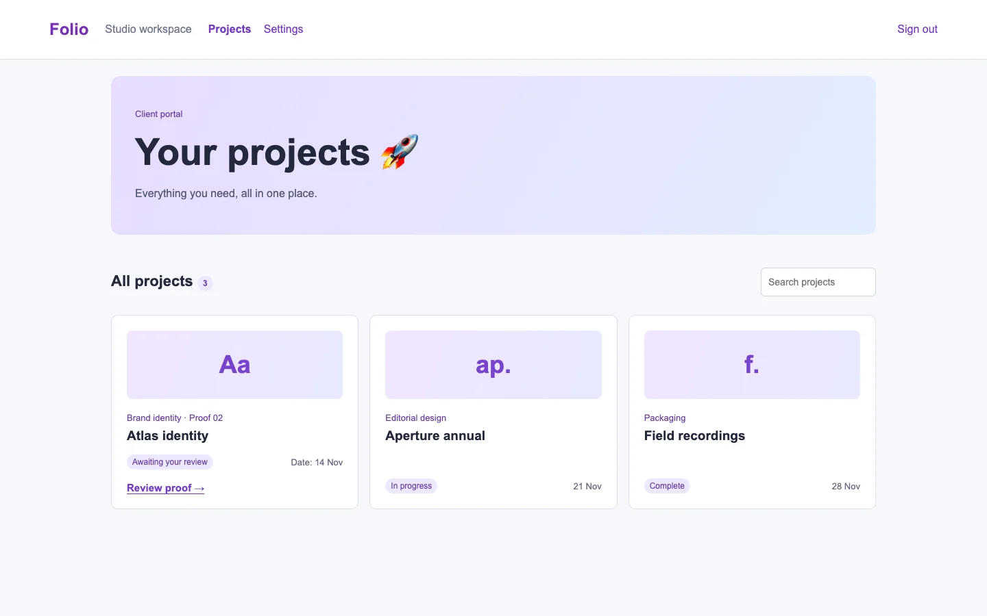
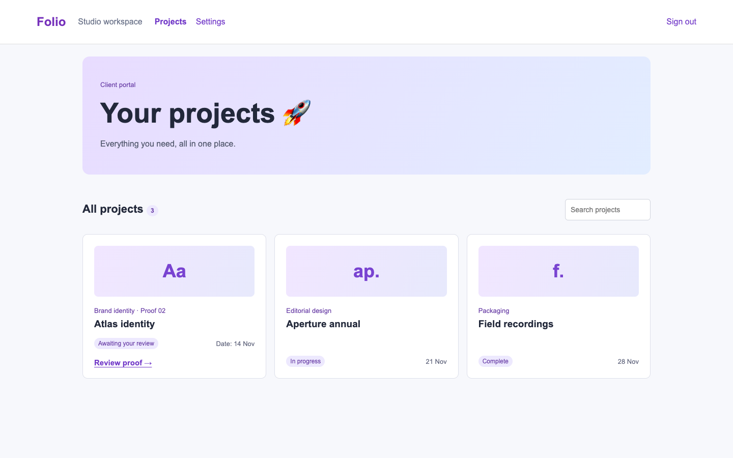
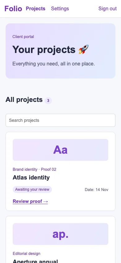
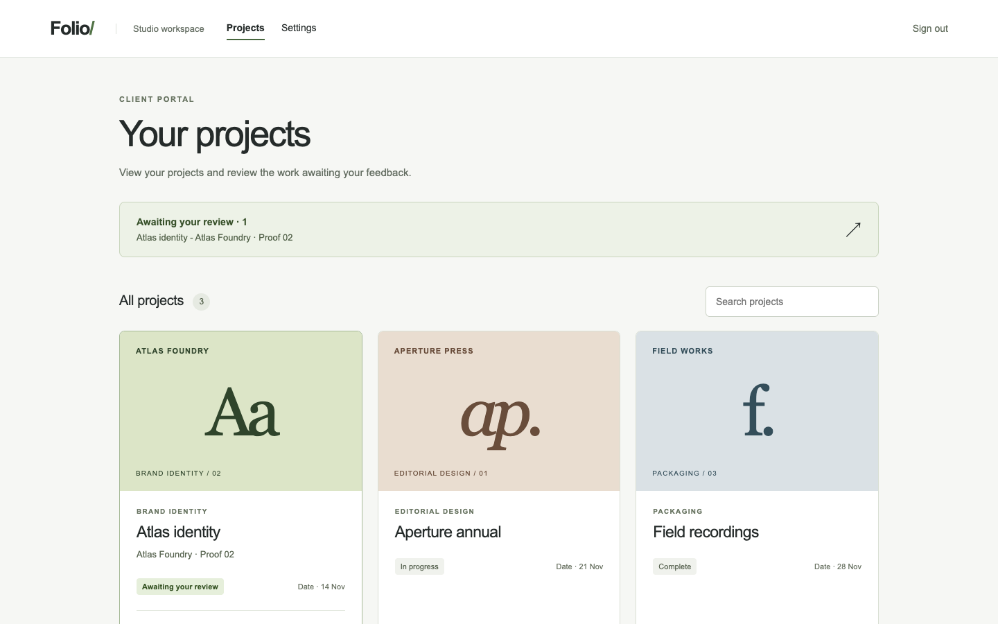
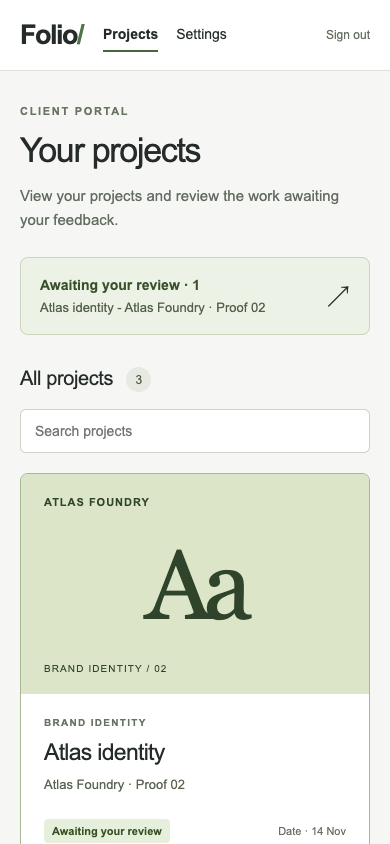
Design client portal · Fix loop

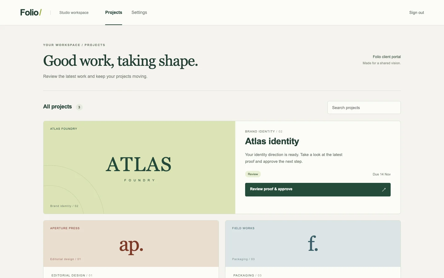
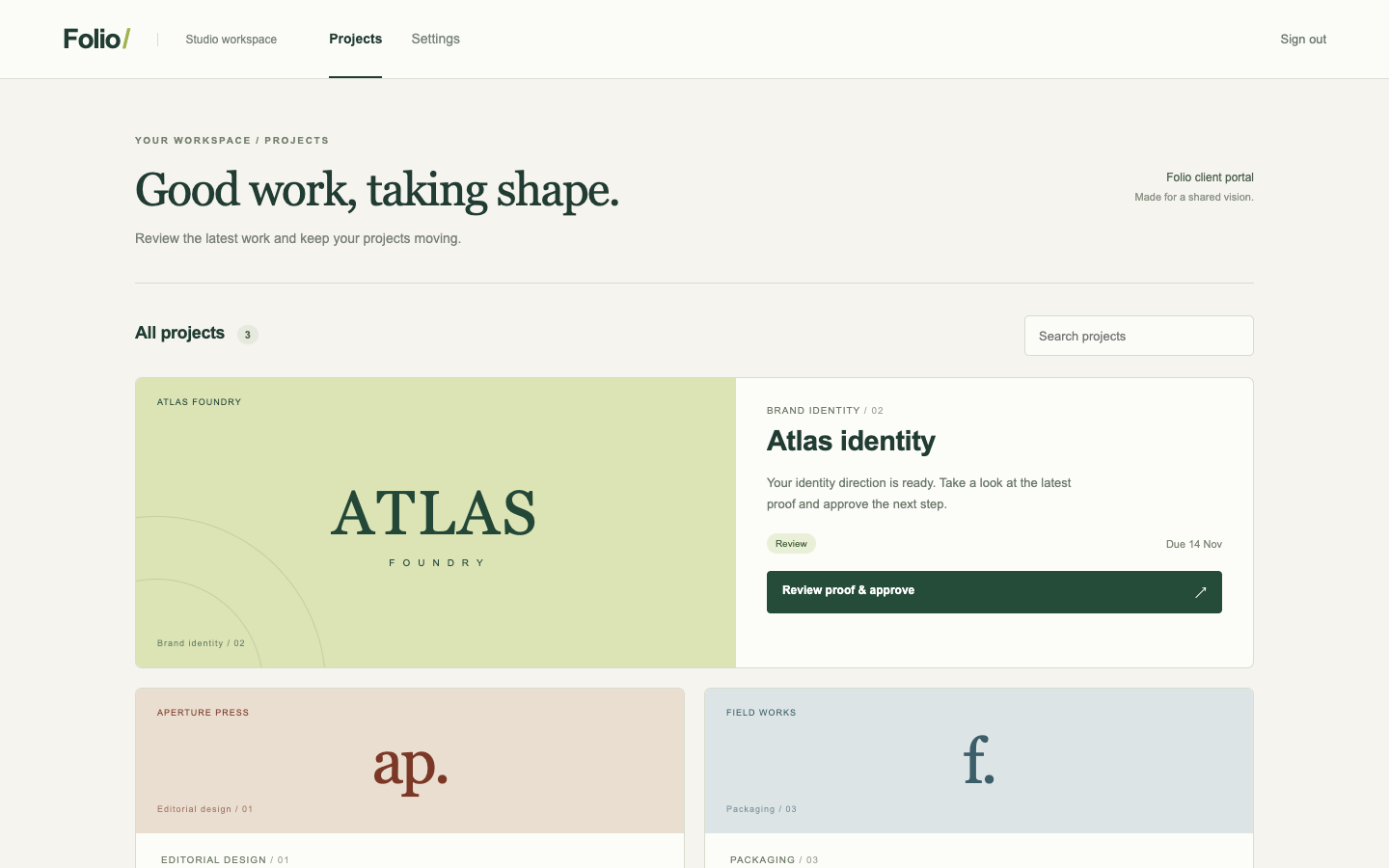
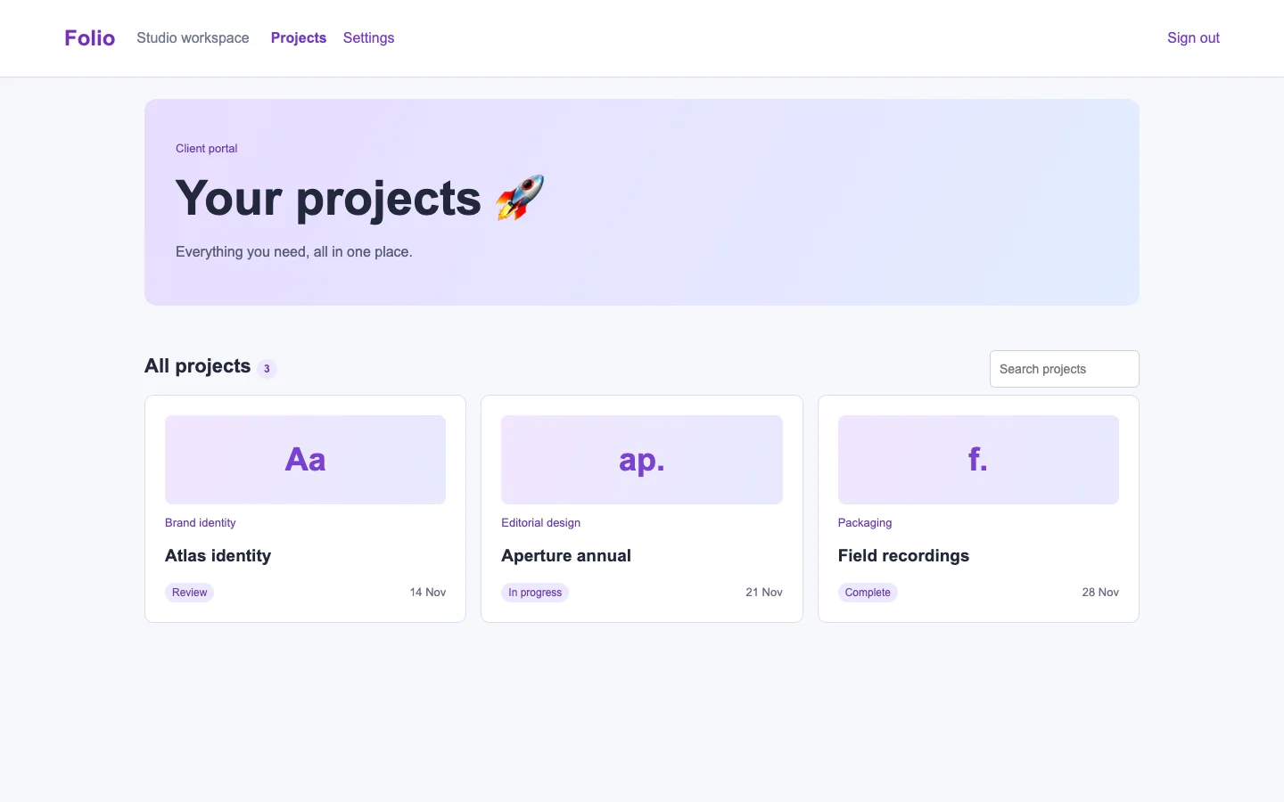
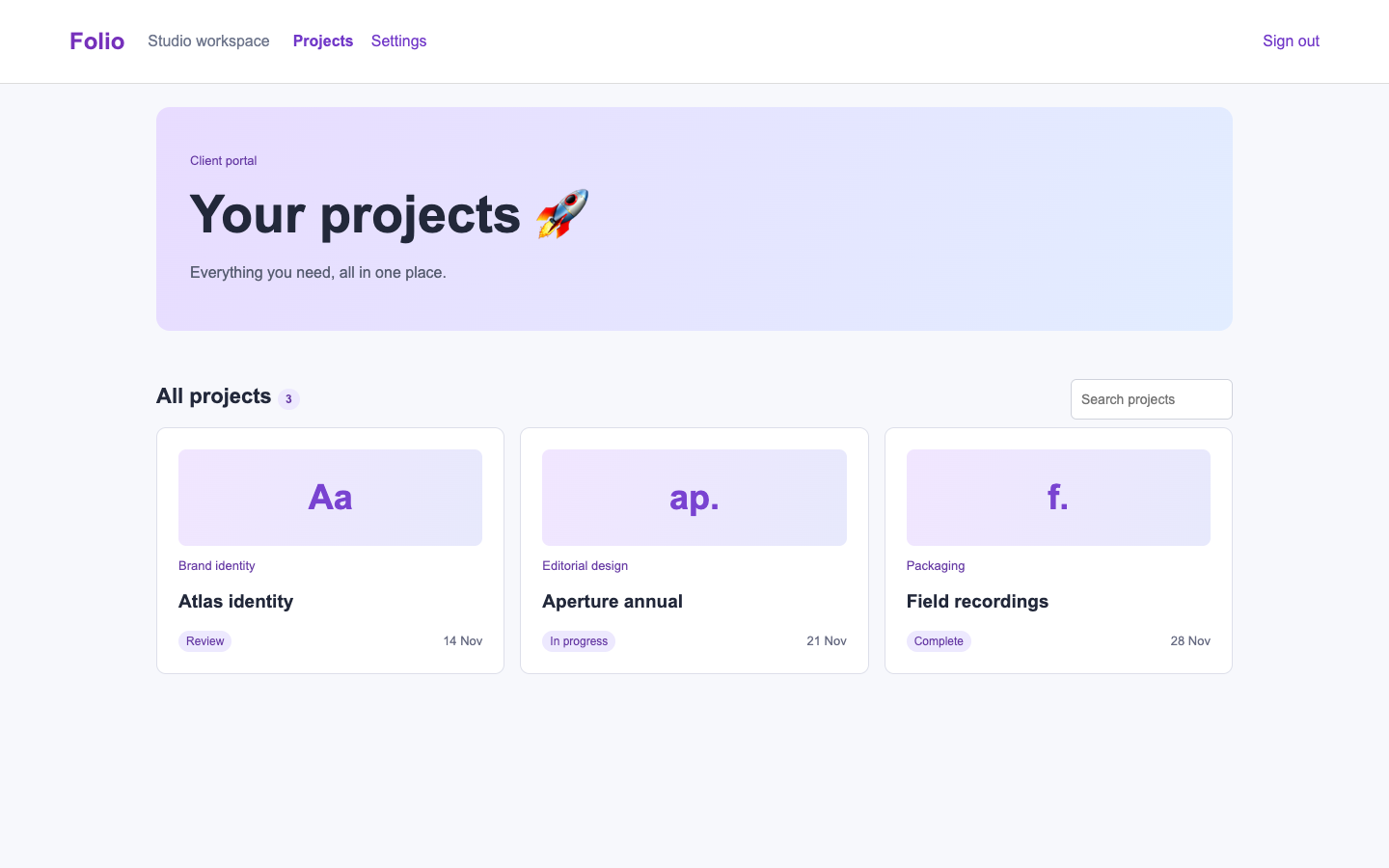
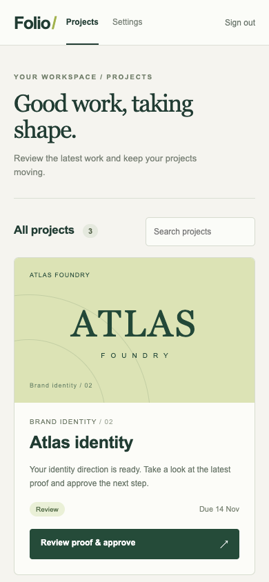
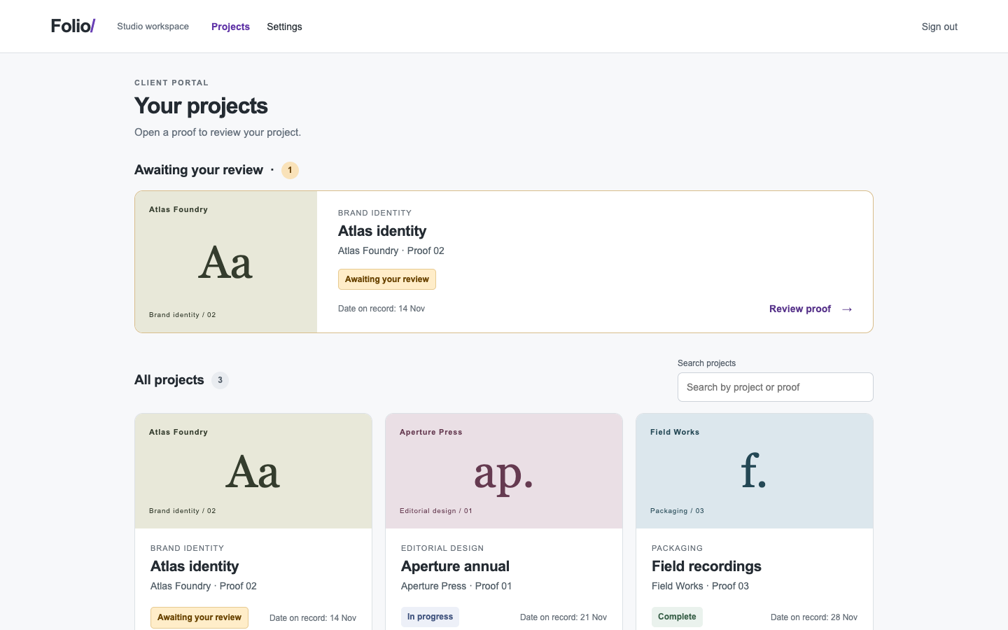
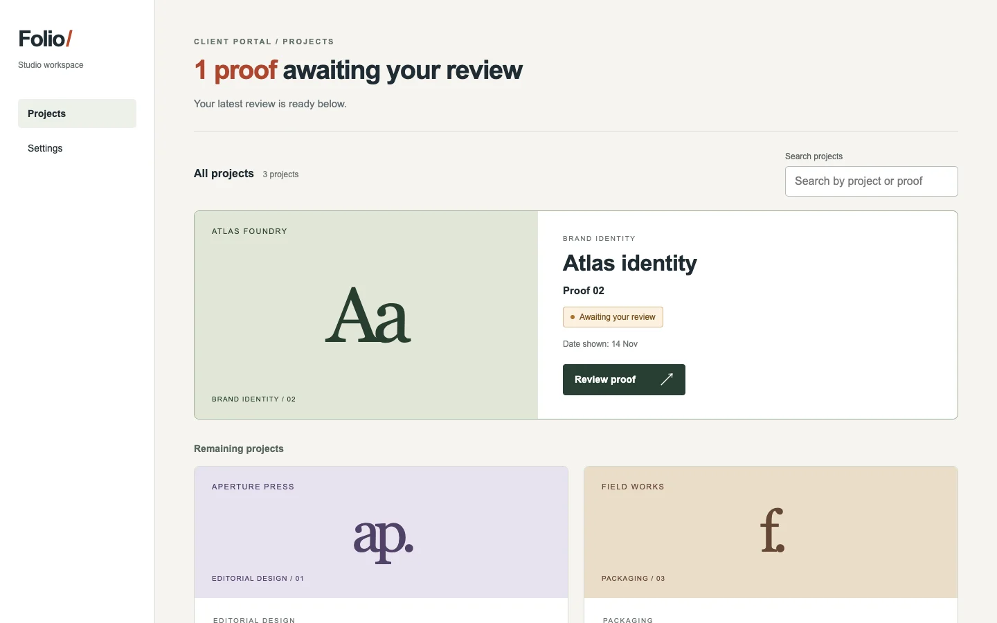
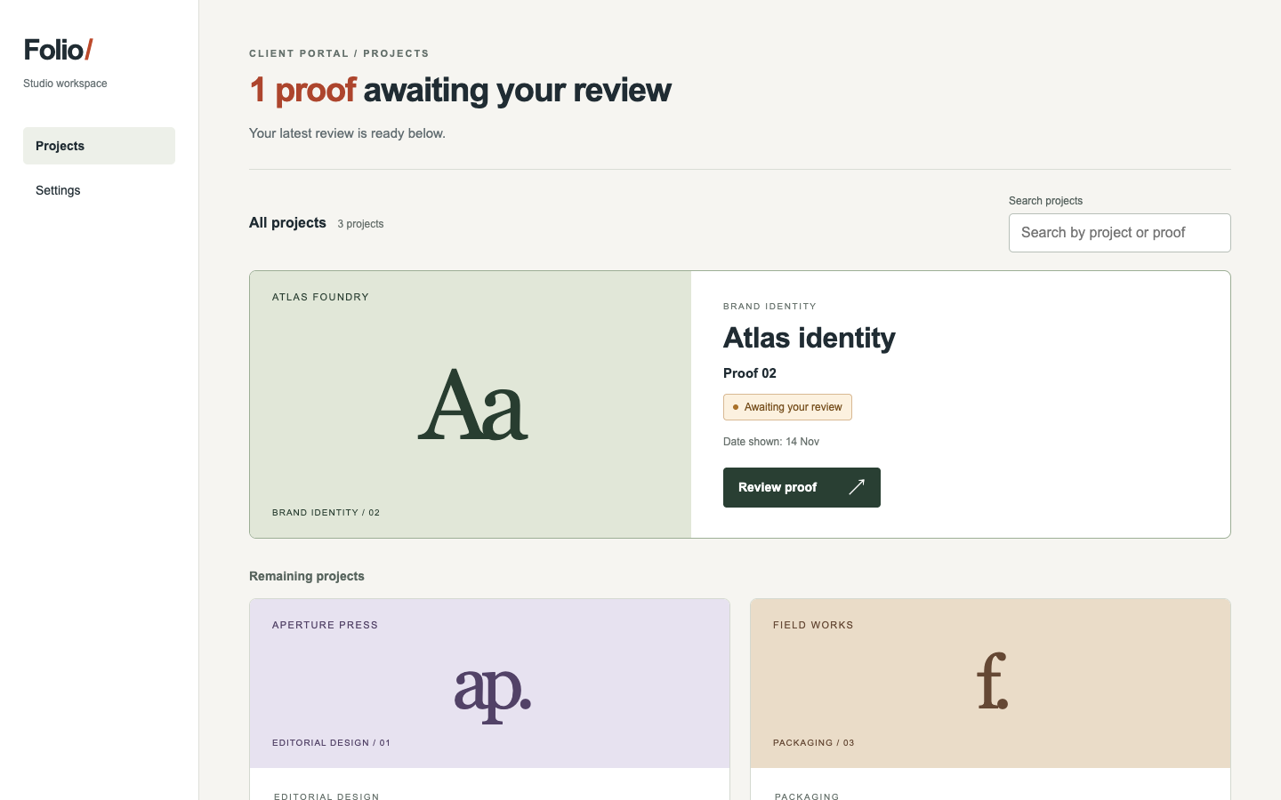
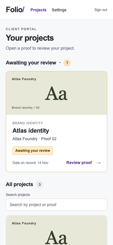
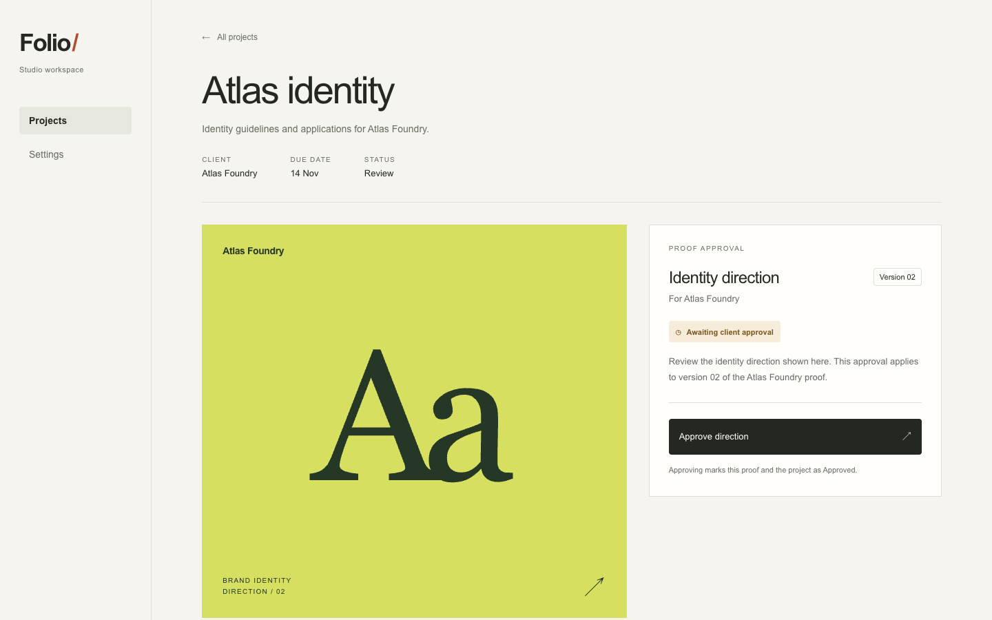
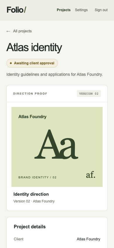
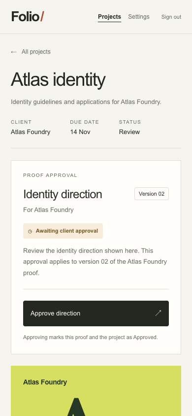
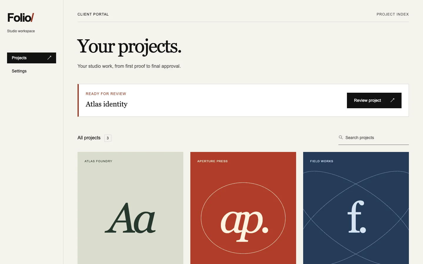
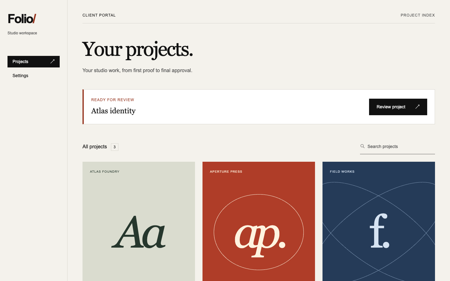
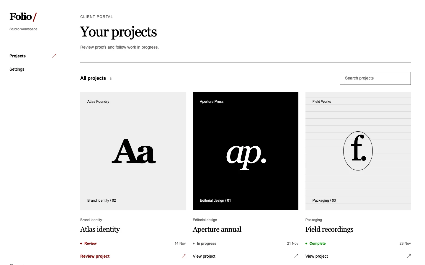
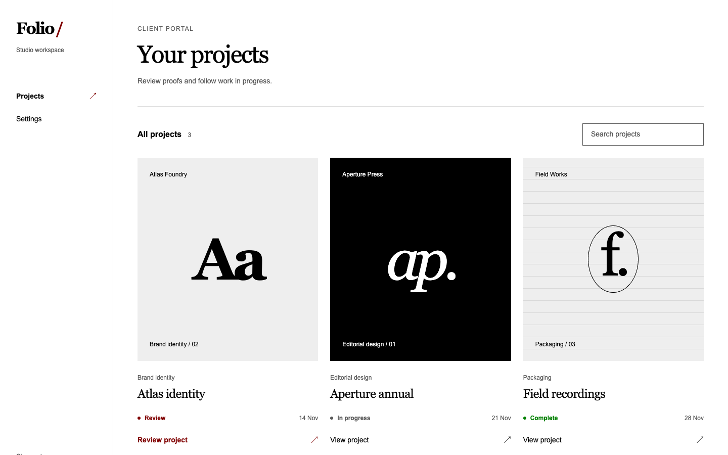
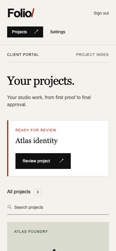
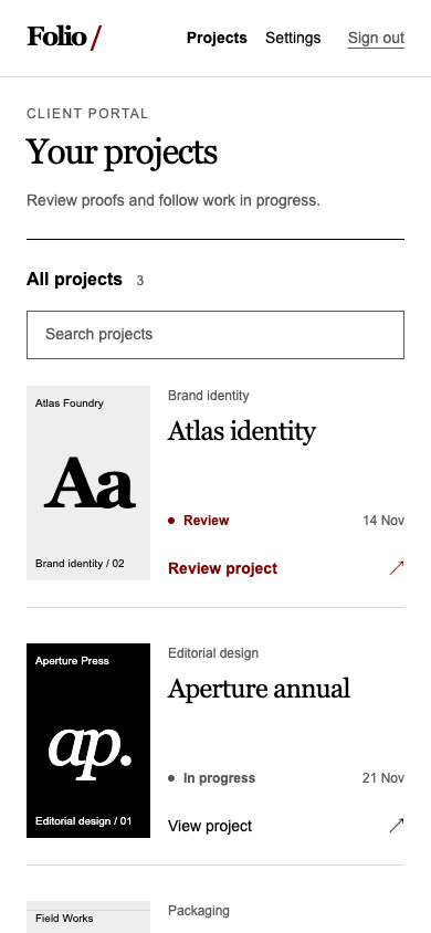
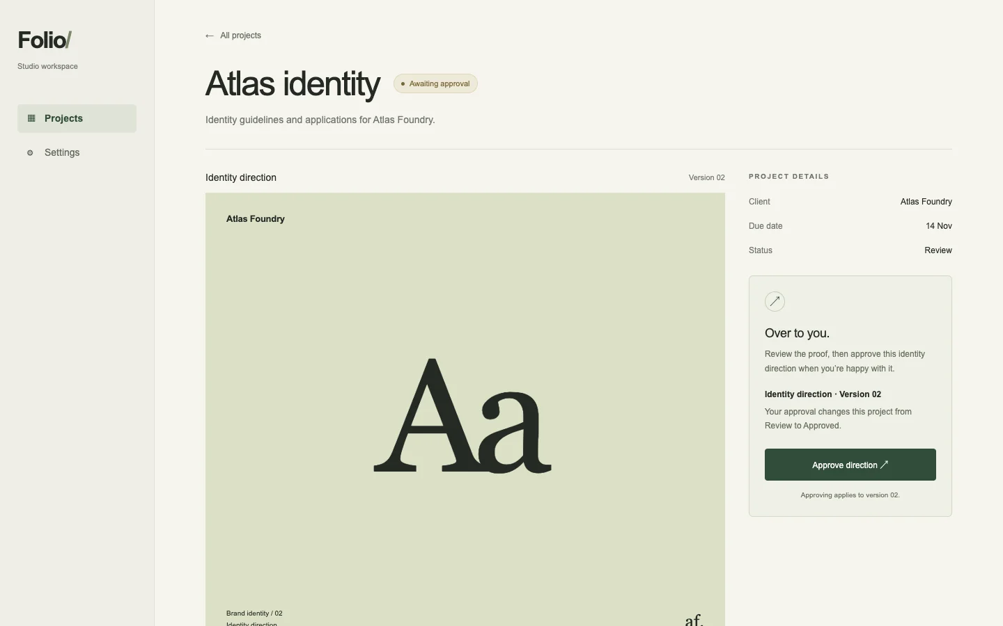
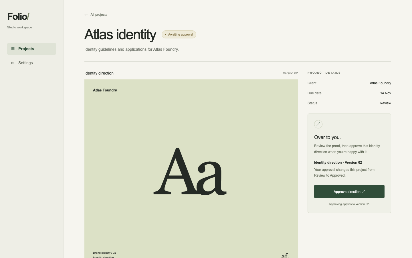
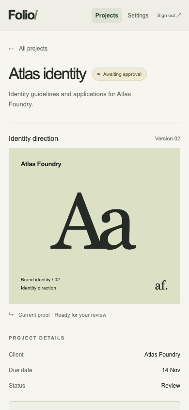
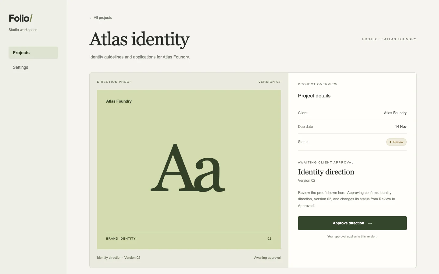
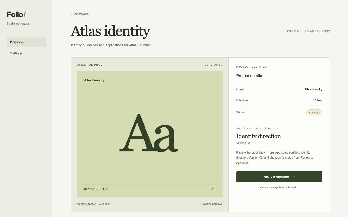
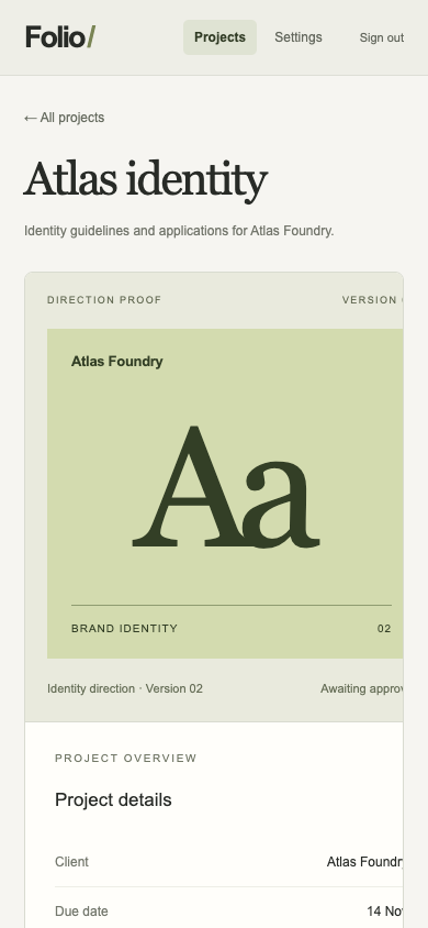
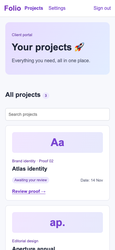
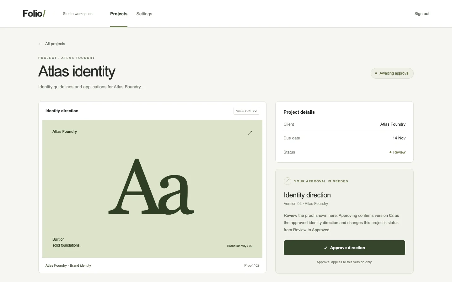
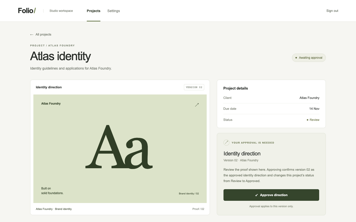
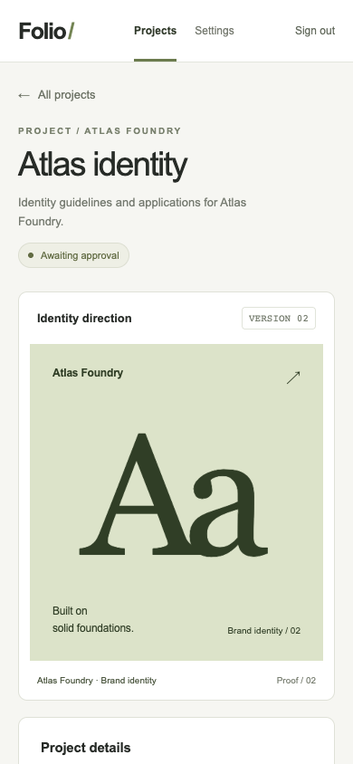
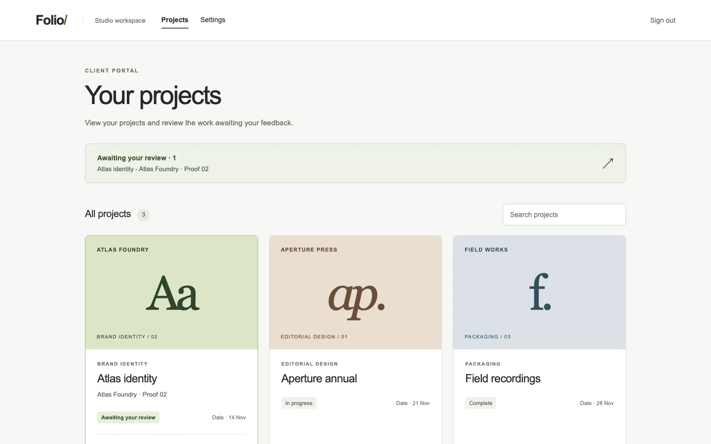
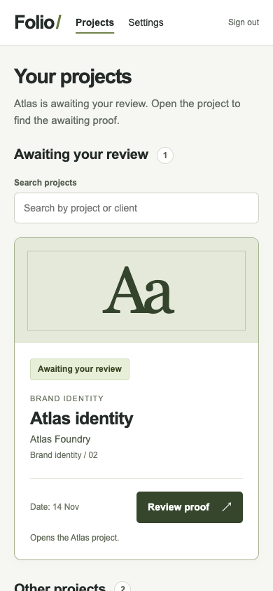
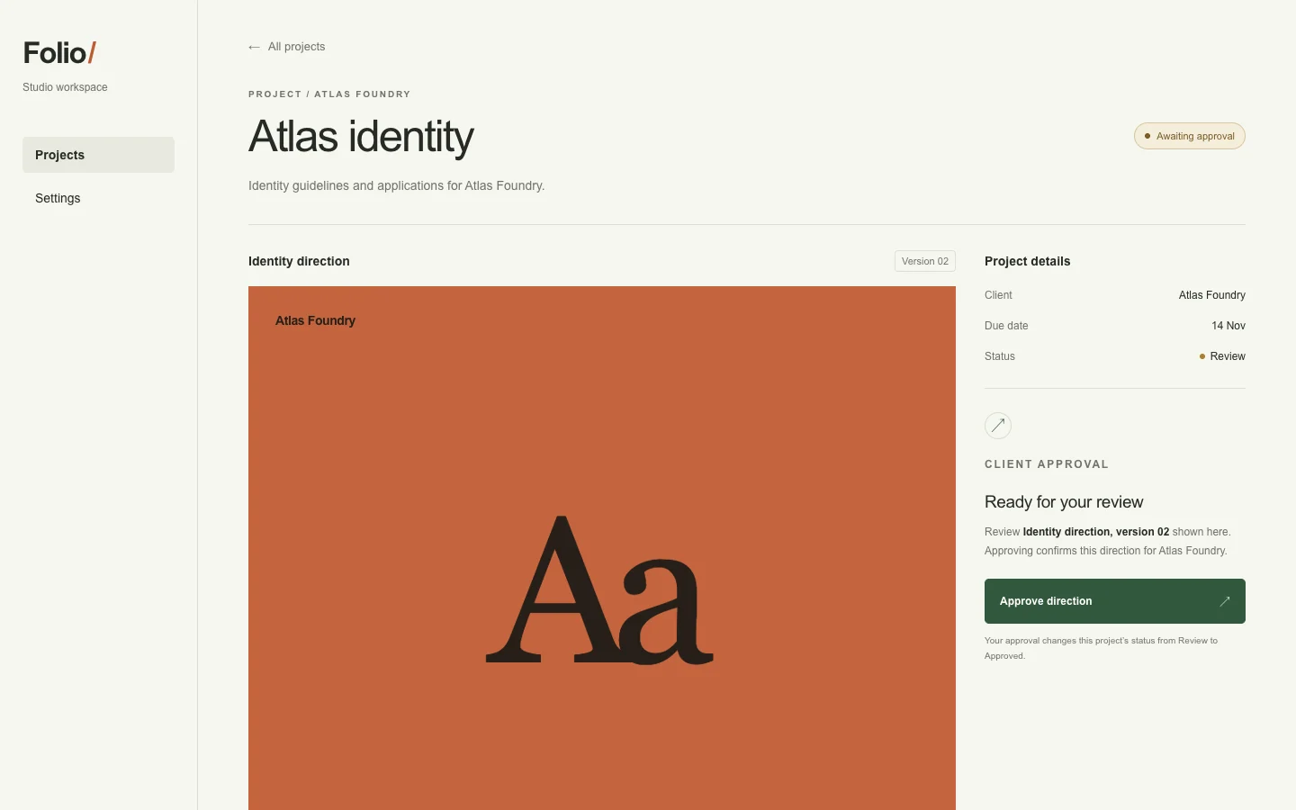
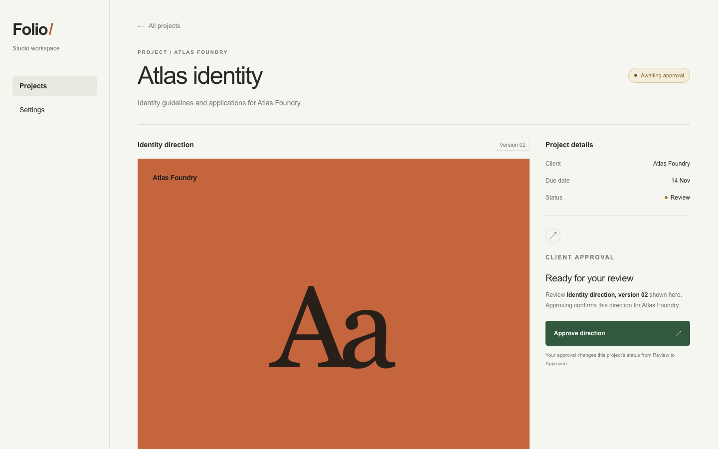
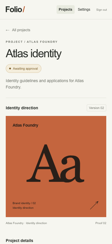
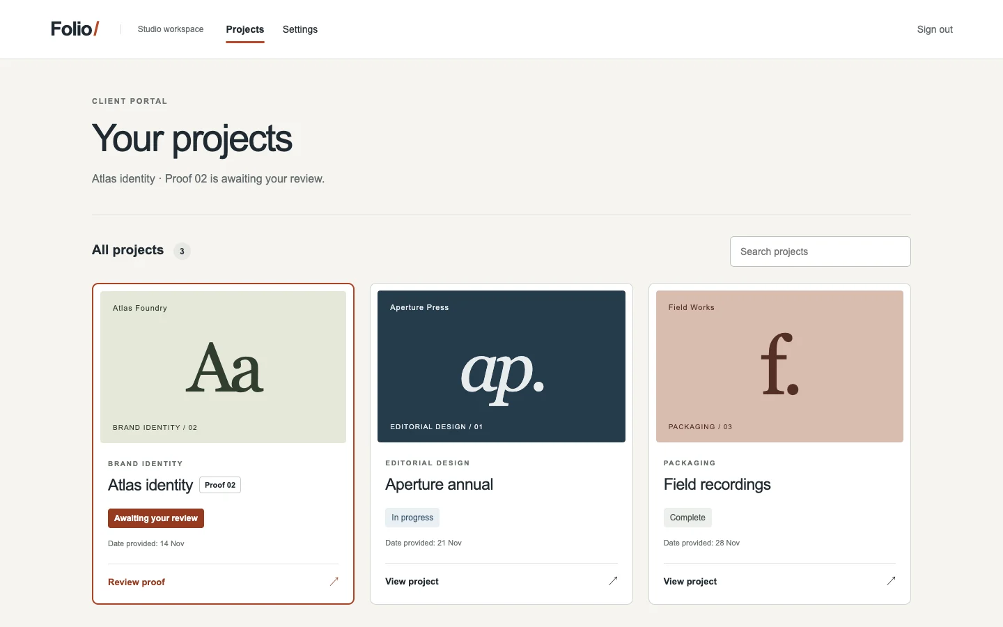
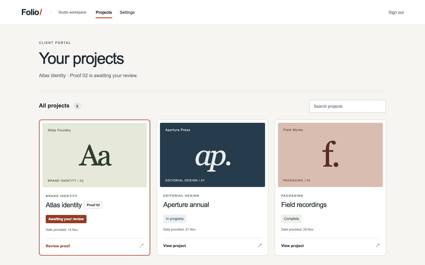
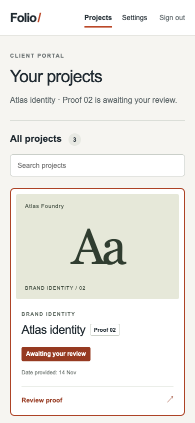
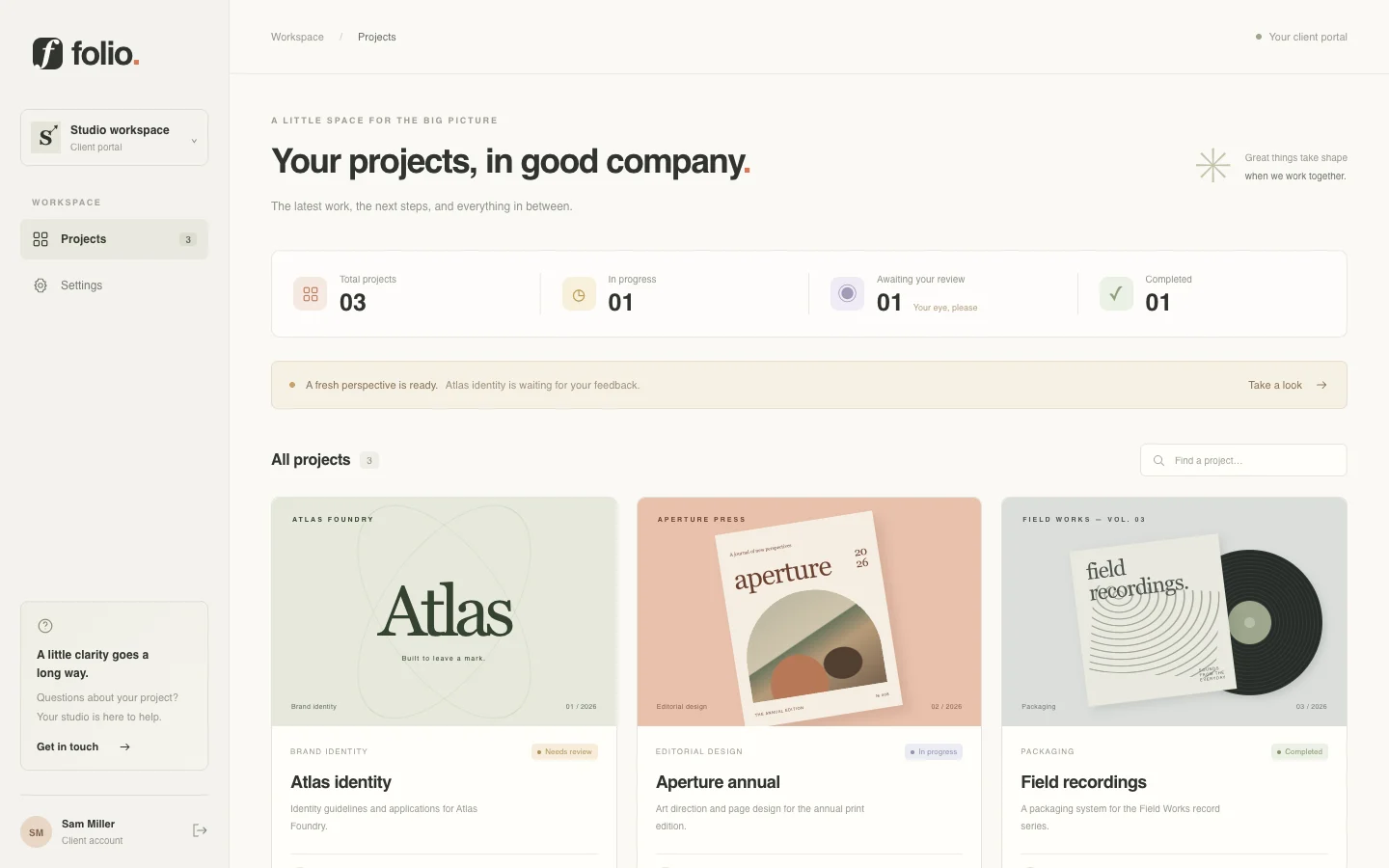
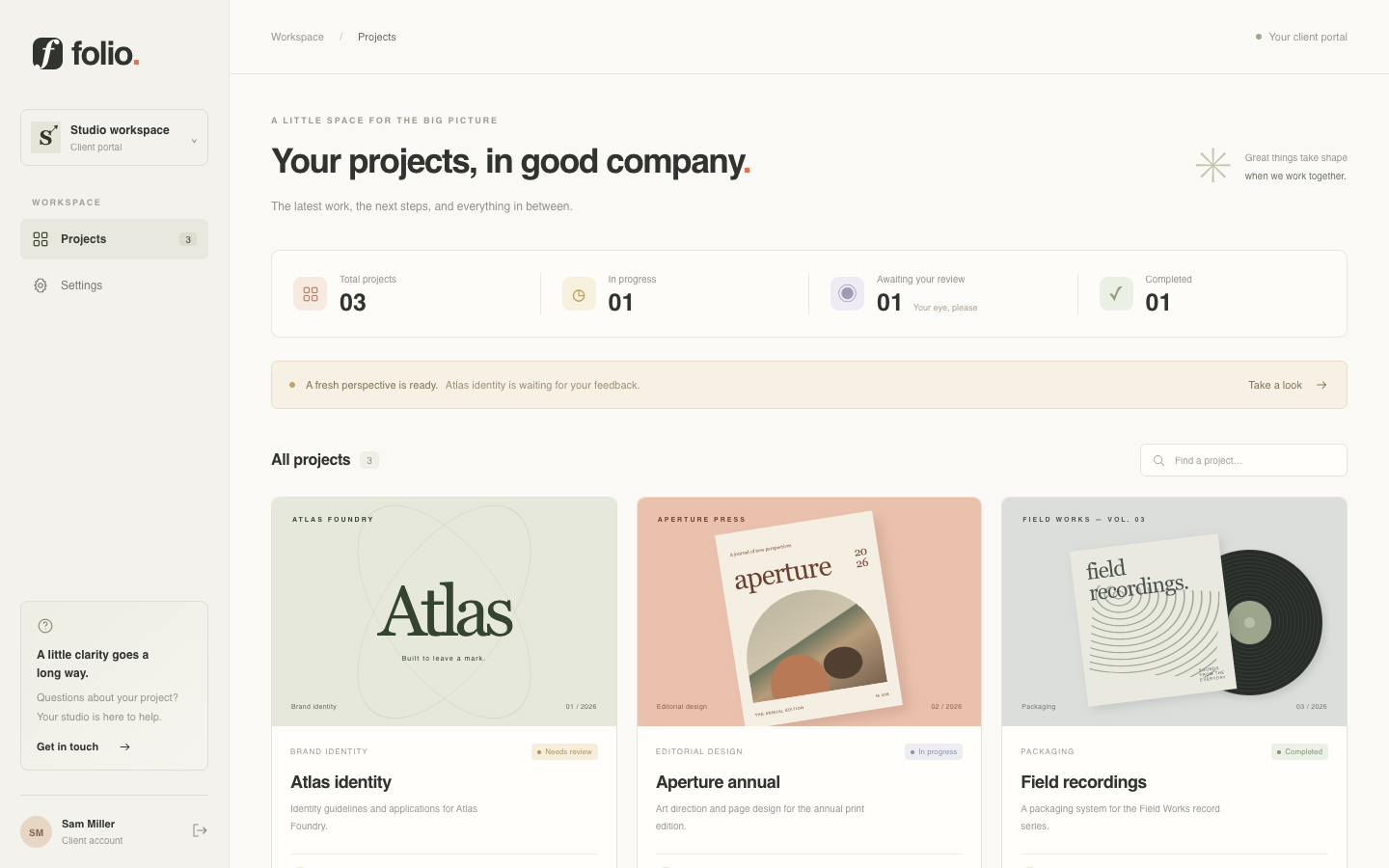
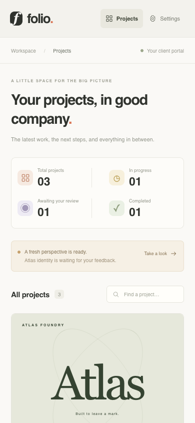
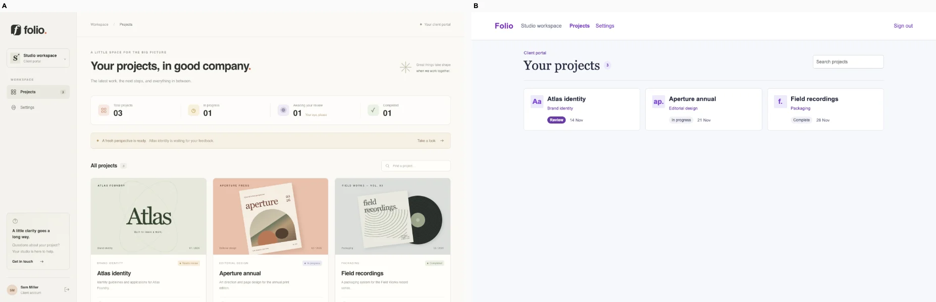
/projects · A client reviews the Atlas proof and finds the approval action. Preserve search, project detail and approval.

Bare agent. One request completed. Source changed. Desktop (original PNG) · Phone
desktop: fail. Expected values to be strictly equal: 1 !== 0 mobile: fail. Expected values to be strictly equal: 1 !== 0

Fix loop. blocked: No verified edit task; see the unverified checks in the audit.. Source changed. Desktop · Phone

desktop: pass. Search narrowed to Atlas. Approval survived reload. mobile: pass. Search narrowed to Atlas. Approval survived reload.

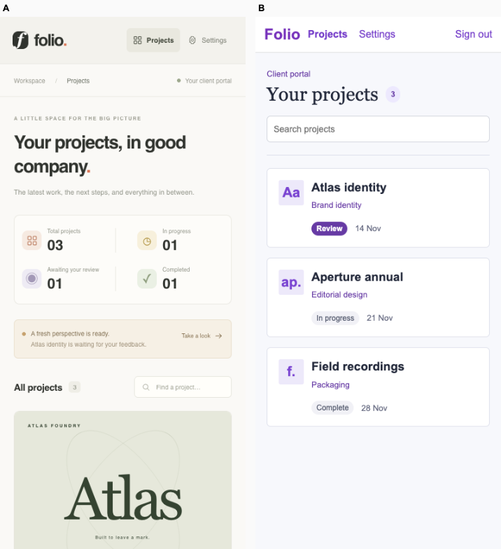
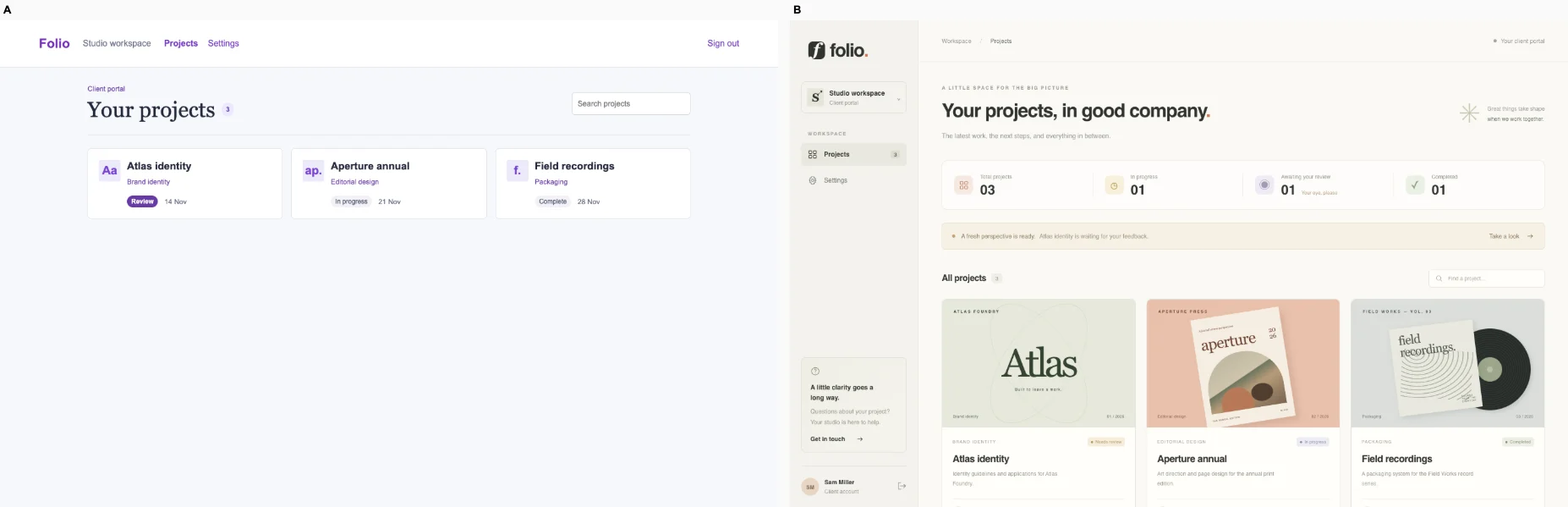
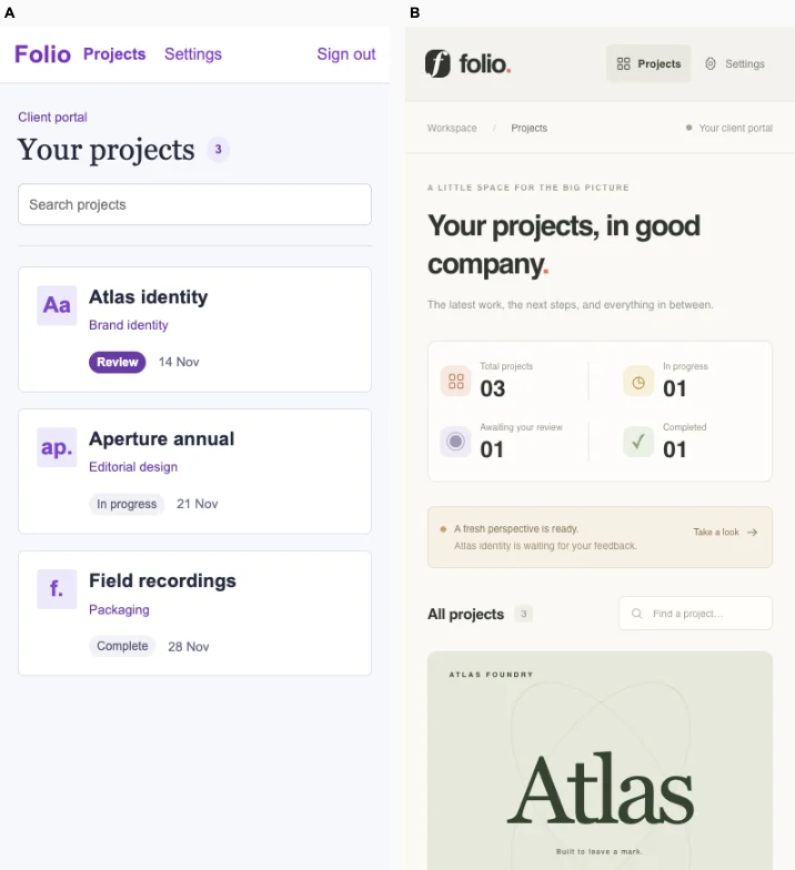
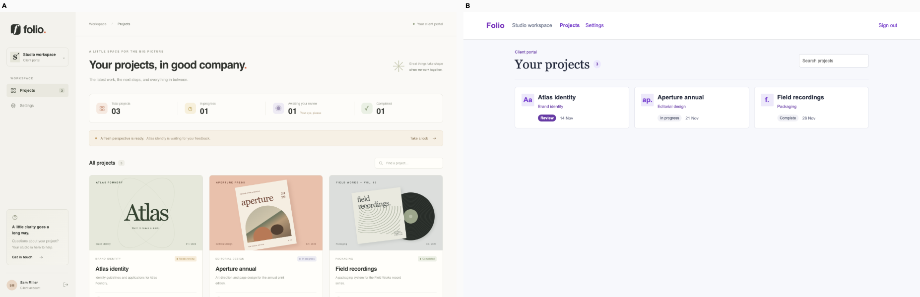
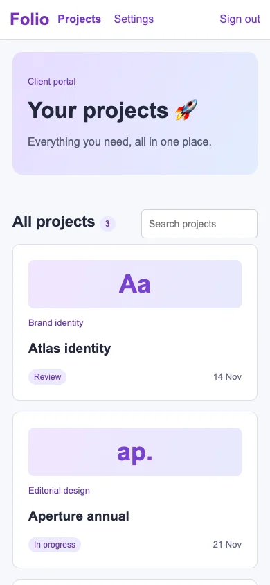
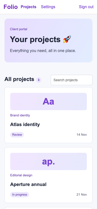
Ballot 1. 6/7 toward fix. Left: bare, right: fix. B wins overall because verified desktop and mobile actions confirm Atlas search and approval persistence after reload; A fails both checks. A provides stronger visual context through actual project artwork, review counts, an Atlas feedback notice and a visible review prompt. B's compact mobile cards keep all three projects and their statuses accessible, while A pushes project details below the fold. Neither render directly exposes an approval button, so successful behavior is decisive.

A shares its cohort's muted cream surfaces, restrained rules, editorial typography and small status accents, but the identity proofs, record artwork and studio sidebar give this product a recognizable purpose. B repeats its cohort's purple branding, pale lavender backgrounds, rounded white boxes and sparse layouts across unrelated domains. Its project names and statuses add specificity, but the composition remains broadly interchangeable.

Desktop pair (original PNG) · Phone pair (original PNG) · Other left products (original PNG) · Other right products (original PNG)

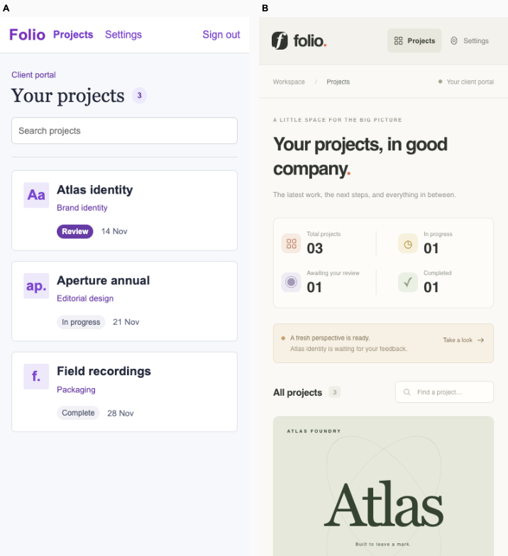
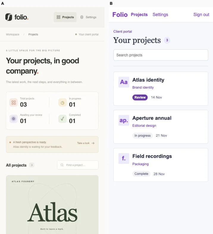
Ballot 2. 6/7 toward fix. Left: fix, right: bare. A wins overall because search and persistent approval passed on desktop and mobile; B failed the protected checks on both, although the reported assertion does not identify the broken step. B better contextualizes Atlas with an actual proof preview, a feedback notice and a review count. Its desktop hierarchy feels considered, but the phone spends substantial space on introductory copy and summaries before reaching the proof. A exposes all three projects and their statuses immediately on mobile, though its small identity tiles provide little evidence for reviewing design work. Neither visible render establishes a prominent approval control.

A closely repeats its cohort’s purple accents, pale backgrounds, simple bordered cards and sparse layouts across unrelated domains. B supplies more relevant project artwork and editorial presentation, giving this portal greater specificity. However, its muted cream surfaces, restrained green accents, sidebar navigation, small labels and generous spacing recur across B’s billing, research, finance and fitness products, so its identity still partly reflects a shared house style.

Desktop pair (original PNG) · Phone pair (original PNG) · Other left products (original PNG) · Other right products (original PNG)

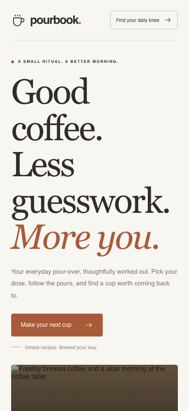
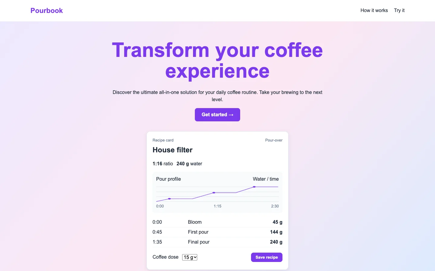
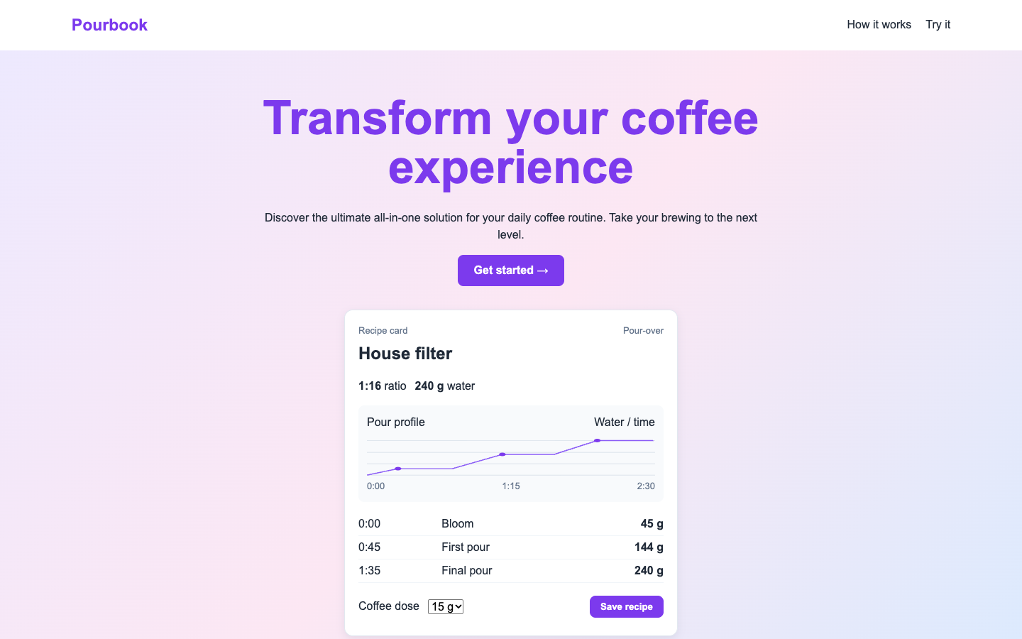
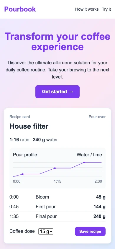
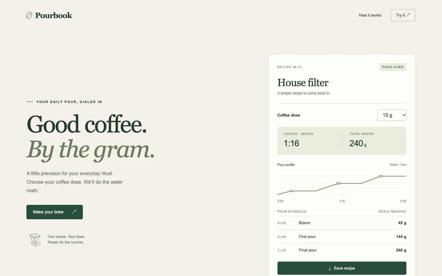
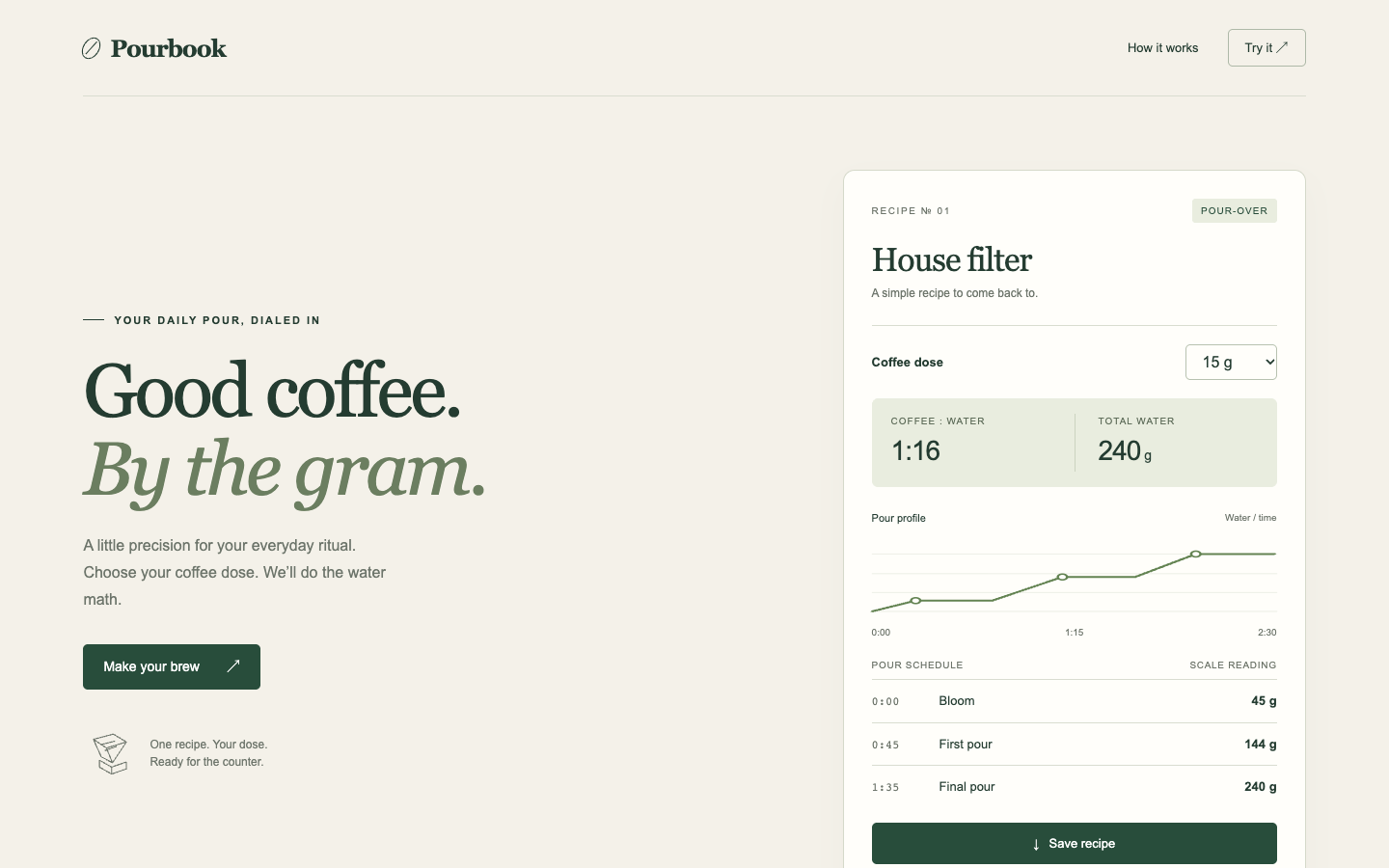
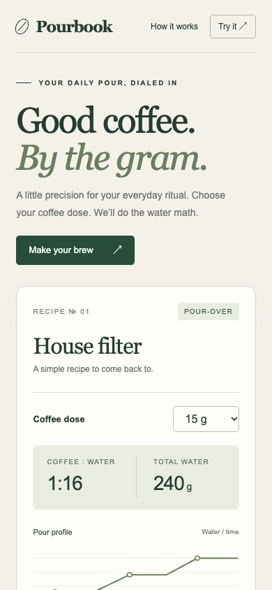
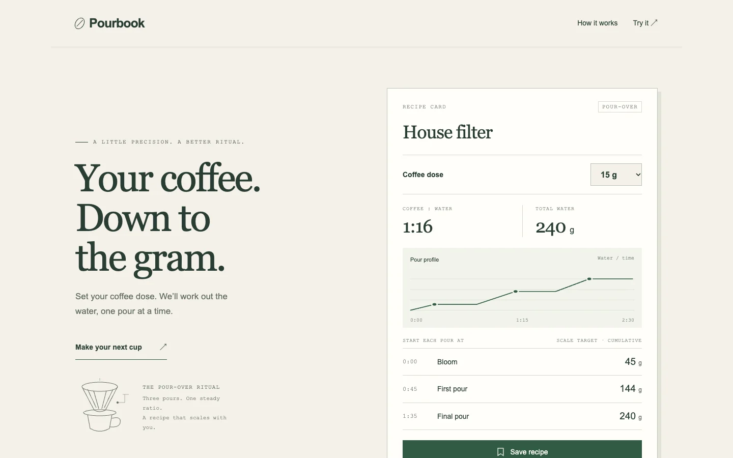
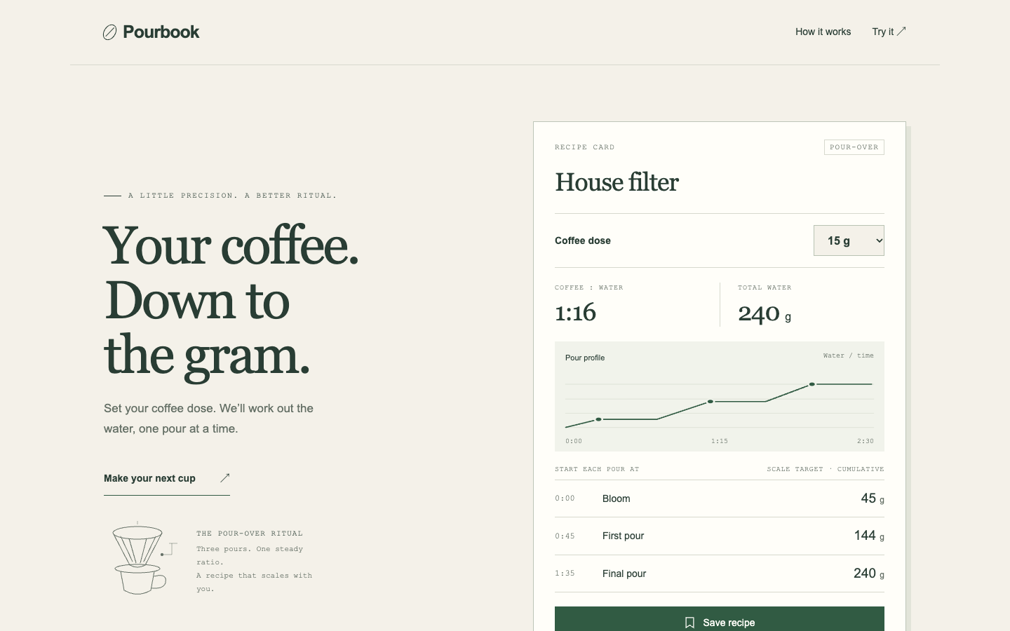
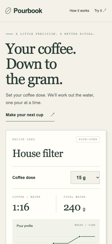
Coffee recipe calculator · Tied or split

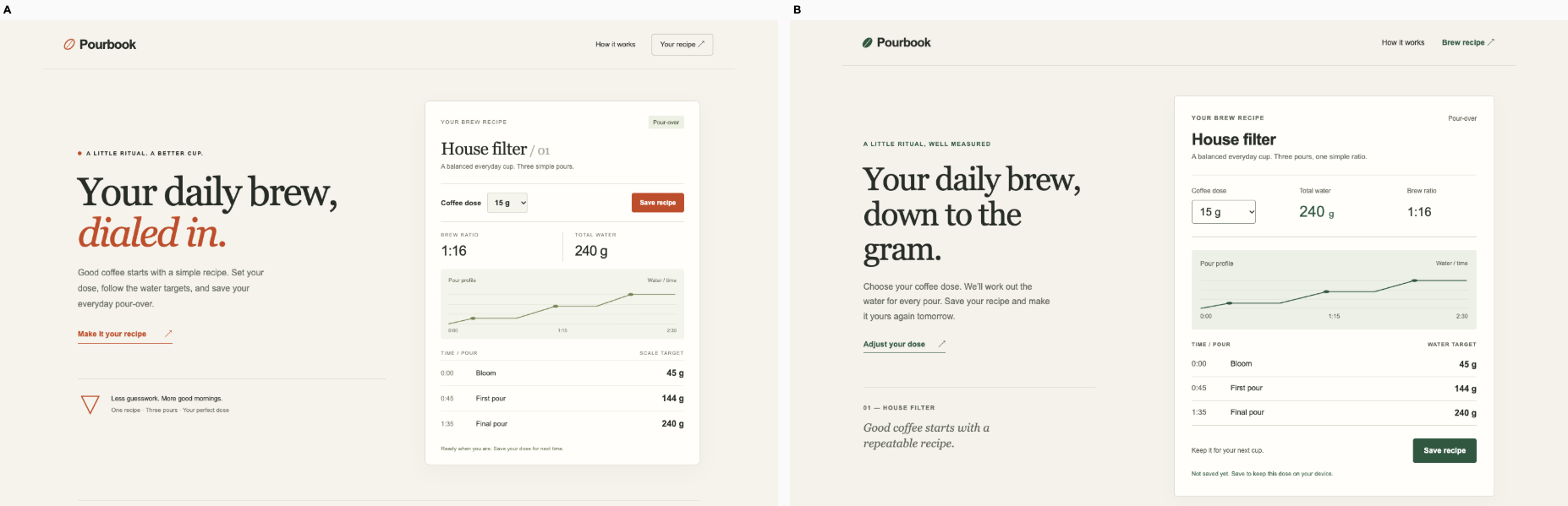
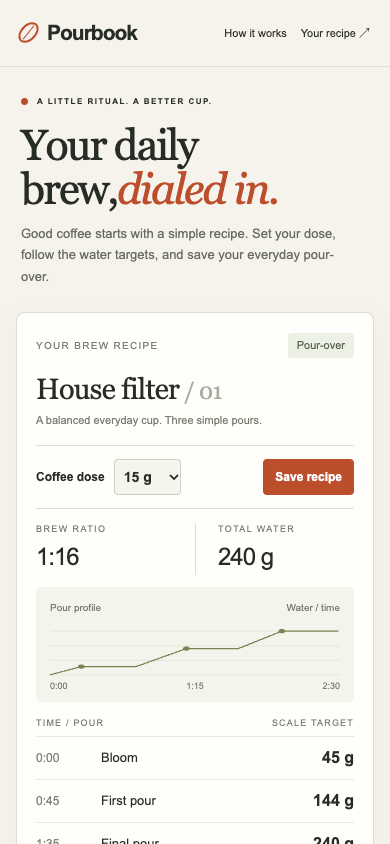
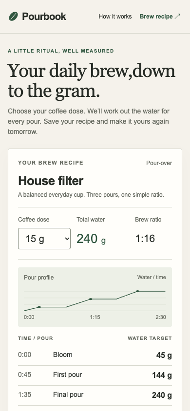
/ · A brewer adjusts the dose, reads the water targets and saves the recipe. Preserve the working calculator.

Bare agent. One request completed. Source changed. Desktop (original PNG) · Phone
desktop: pass. 18 g dose produced 288 g water and survived reload. mobile: pass. 18 g dose produced 288 g water and survived reload.

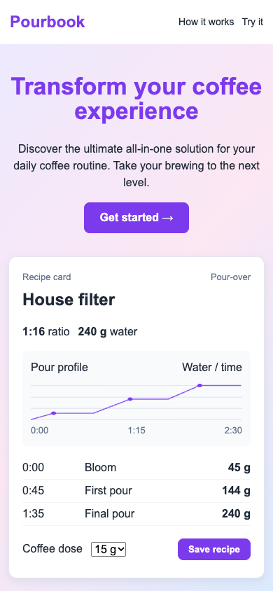
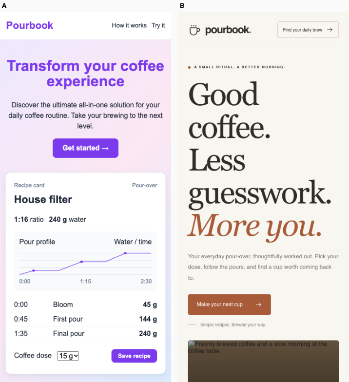
Fix loop. regression: / · Landing message: C to Unverified. Source unchanged. Desktop (original PNG) · Phone (original PNG)
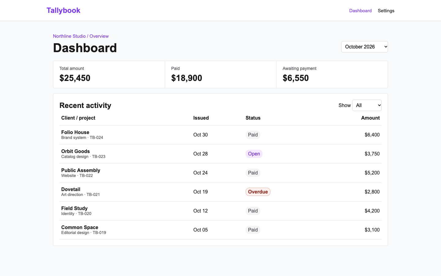
desktop: pass. 18 g dose produced 288 g water and survived reload. mobile: pass. 18 g dose produced 288 g water and survived reload.

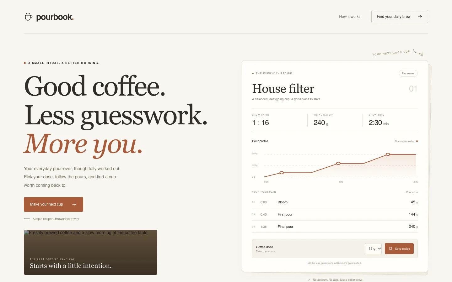
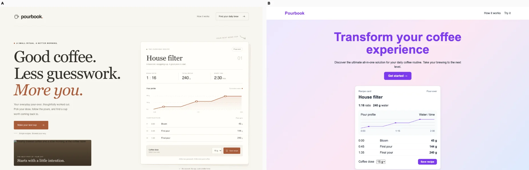
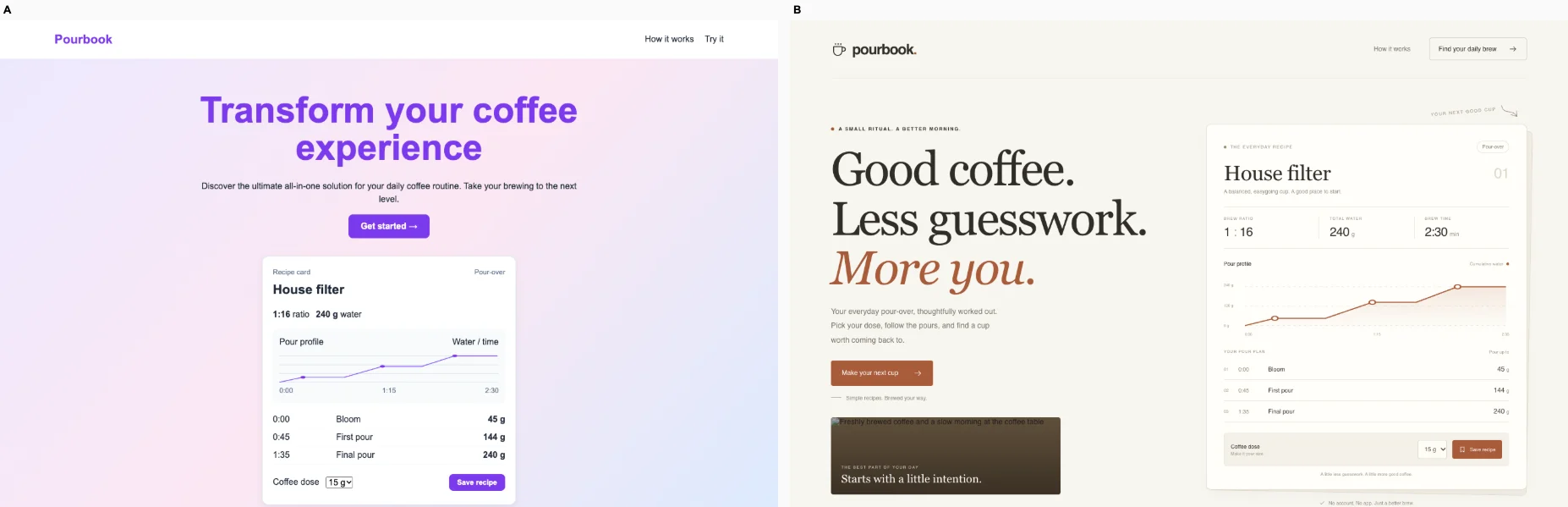
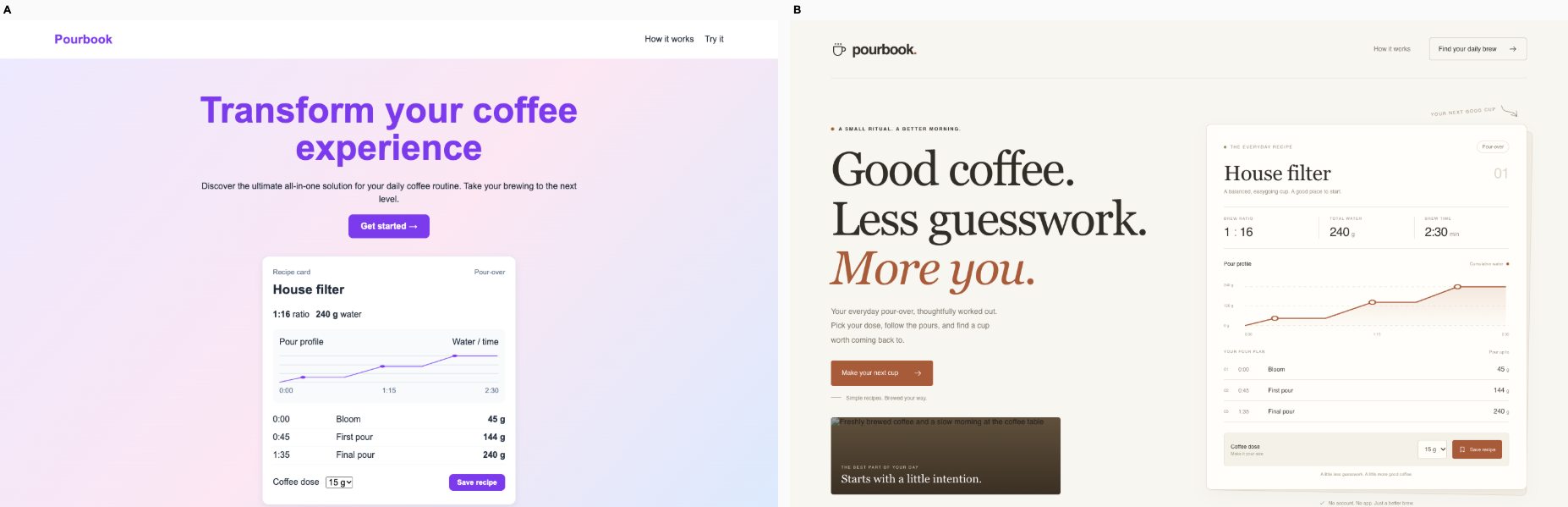
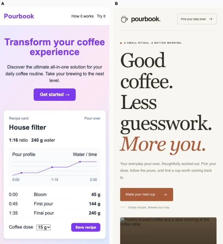
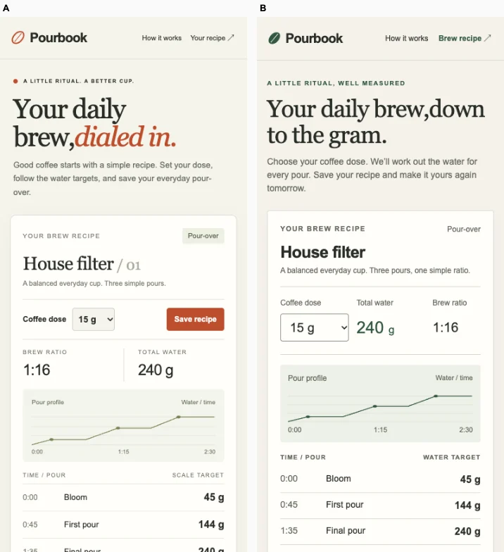
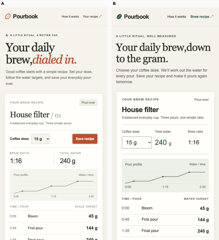
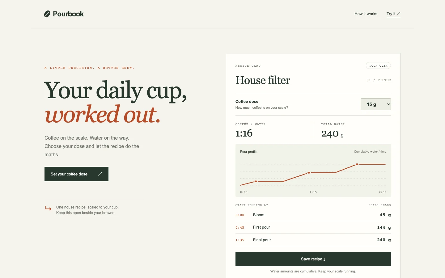
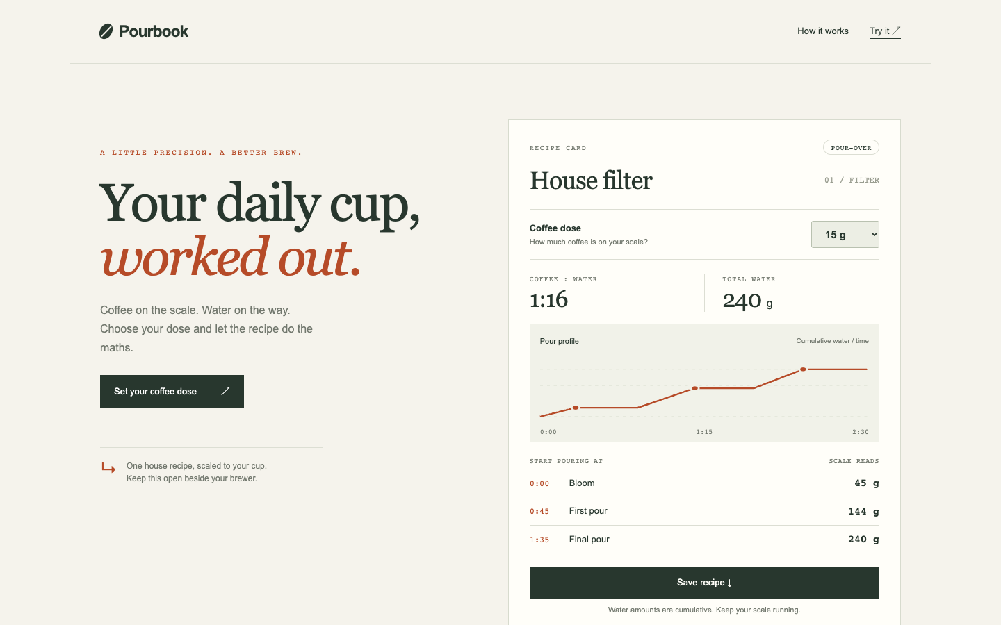
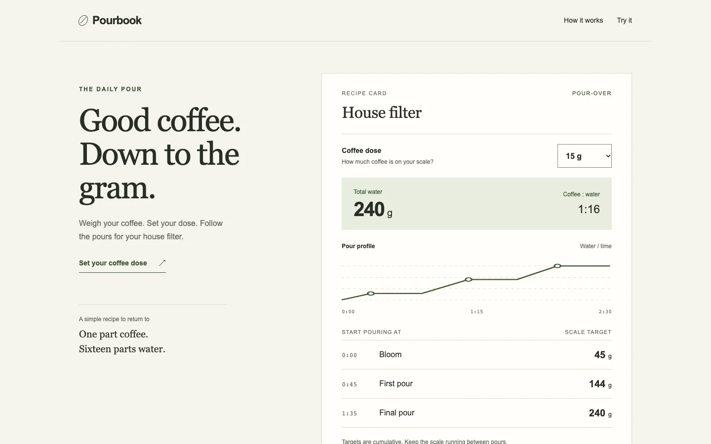
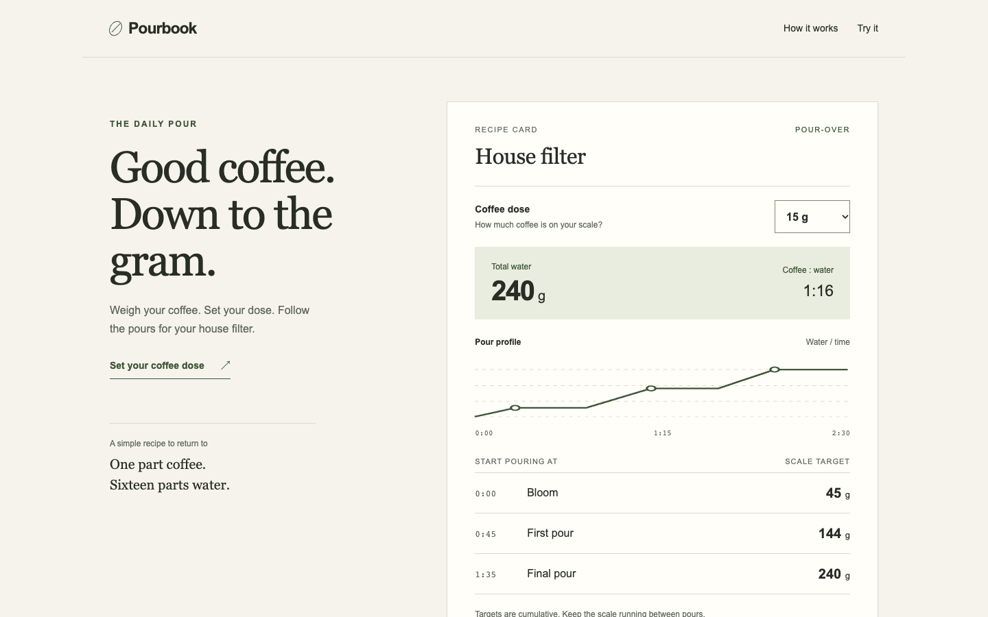
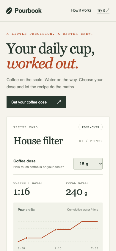
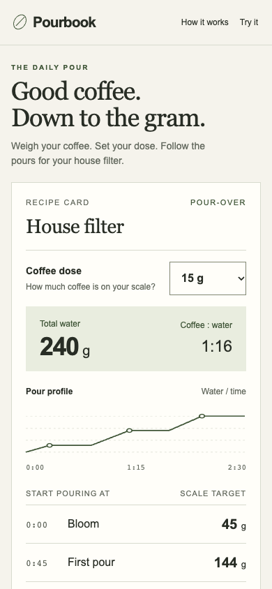
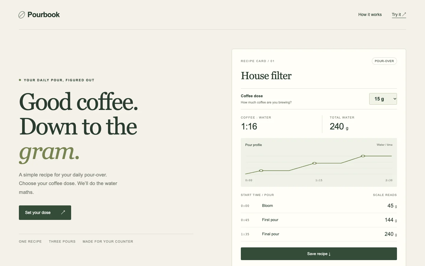
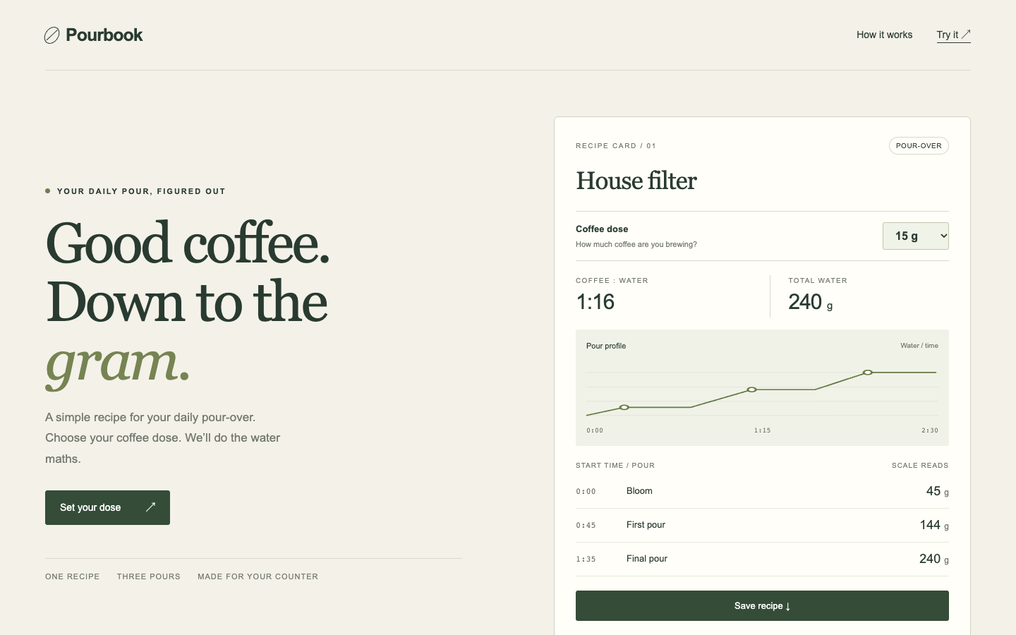
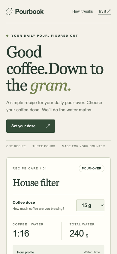
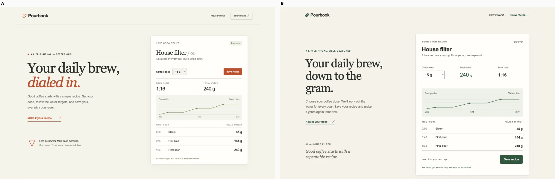
Ballot 1. 2/7 toward fix. Left: bare, right: fix. A gives brewing a coherent identity through editorial typography, restrained rust accents, concrete brewing copy and a detailed recipe with ratio, total water, brew time and pour targets. B's vague transformation headline and large gradient hero weaken its product focus. Both calculators successfully turn 18 g into 288 g and preserve the saved result after reload on desktop and mobile. B has the stronger phone task layout: dose, targets and Save are visible together, while A's oversized headline pushes the calculator below the opening viewport. A wins overall for its more intentional, product-grounded desktop presentation, with a significant mobile hierarchy tradeoff.

A shares muted cream backgrounds, fine rules, small labels and editorial serif headings with its print marketplace, used-tools marketplace and rehearsal-booking peers, so its identity is not wholly unique. Its prominent brewing chart, numbered recipe and timed pours nevertheless give the composition a specific purpose. B repeats the lavender-pink gradient banners, purple buttons, centered promotional headings and generic white cards seen across its print, finance, marketplace and booking peers; its coffee page feels substantially more interchangeable.

Desktop pair (original PNG) · Phone pair (original PNG) · Other left products (original PNG) · Other right products (original PNG)

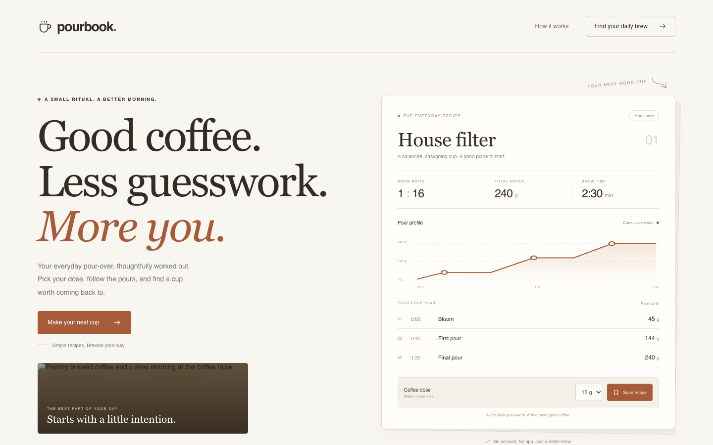
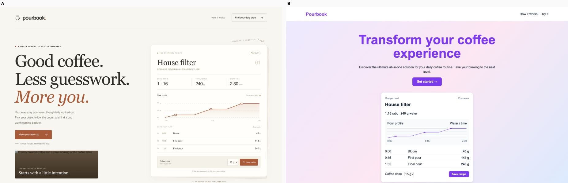
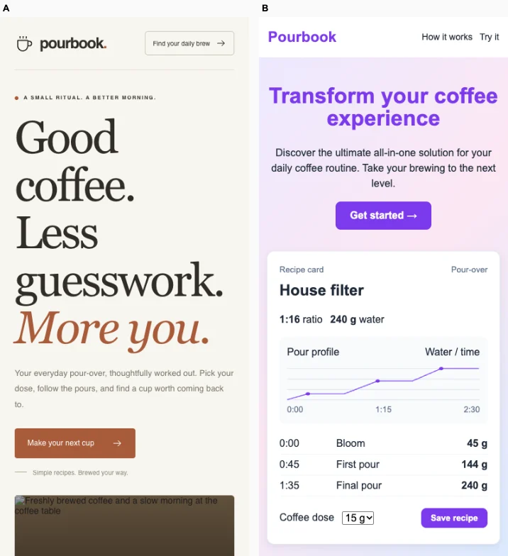
Ballot 2. 5/7 toward fix. Left: fix, right: bare. A keeps the working recipe, water targets, dose selector and Save visible together on desktop and phone. B gives the desktop recipe more room and uses more intentional typography and brewing copy, but its oversized phone headline pushes the calculator below the visible screen, while a broken image occupies space. Both verified calculators update 18 g to 288 g and preserve the saved dose after reload, so behavior is tied. A narrowly wins for making the brewer’s next action accessible.

A repeats its cohort’s purple accents, pale gradients, centered promotional headings and white cards. B replaces those conventions but shares its own cohort’s cream backgrounds, muted olive and rust accents, fine rules, editorial typography and spacious promotional layouts, particularly the print exchange and used tools marketplace. B’s pour chart and recipe table provide useful product evidence, but neither arm establishes a clearly independent visual identity.

Desktop pair (original PNG) · Phone pair (original PNG) · Other left products (original PNG) · Other right products (original PNG)

Research conversation desk · Bare agent

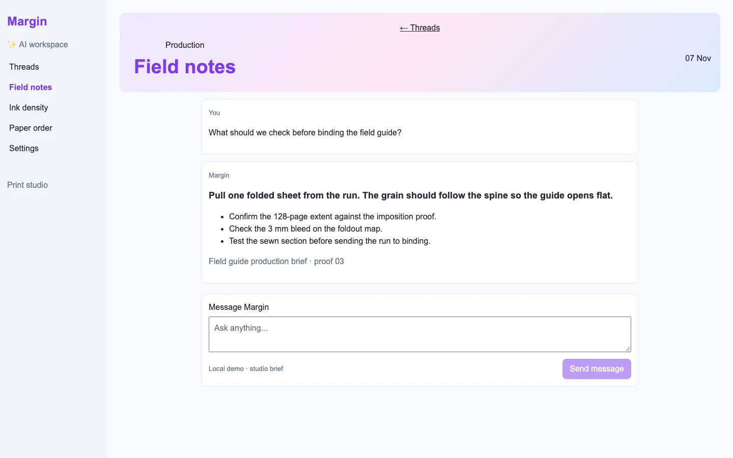
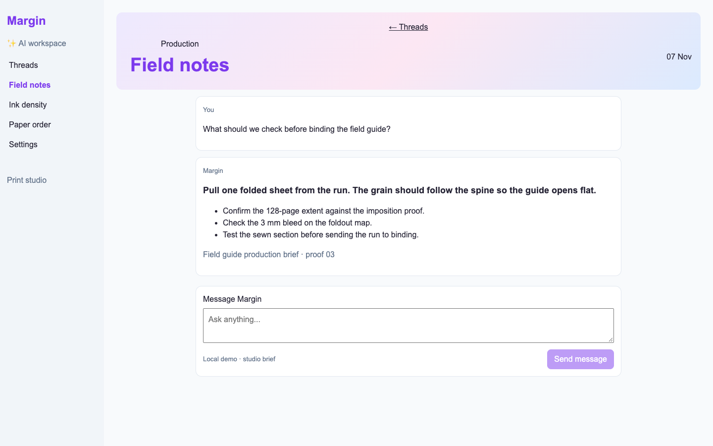
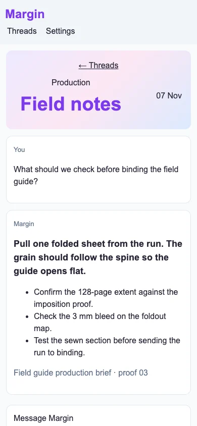
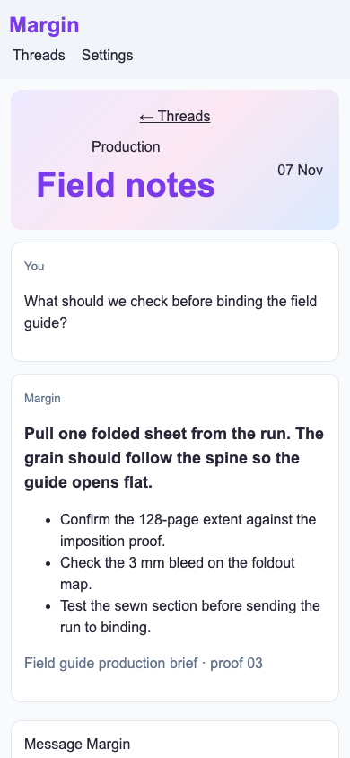
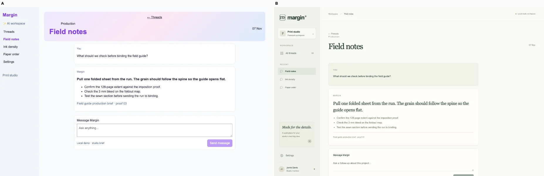
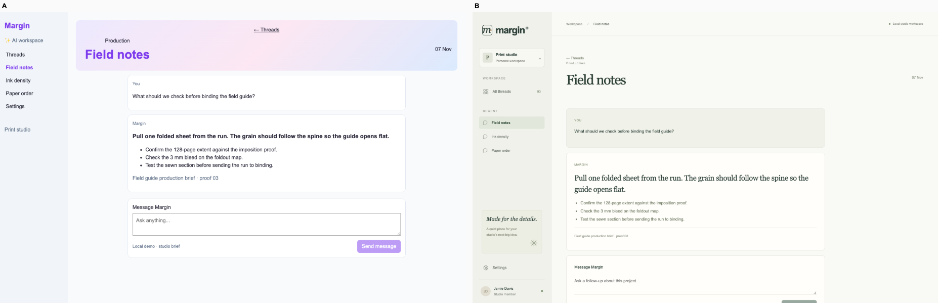
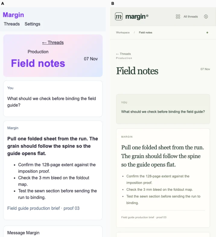
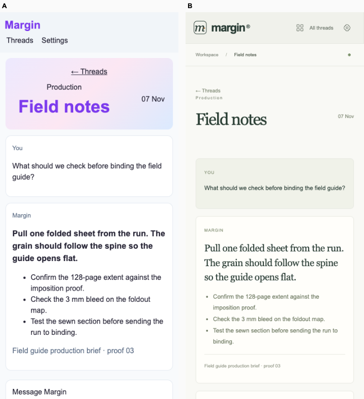
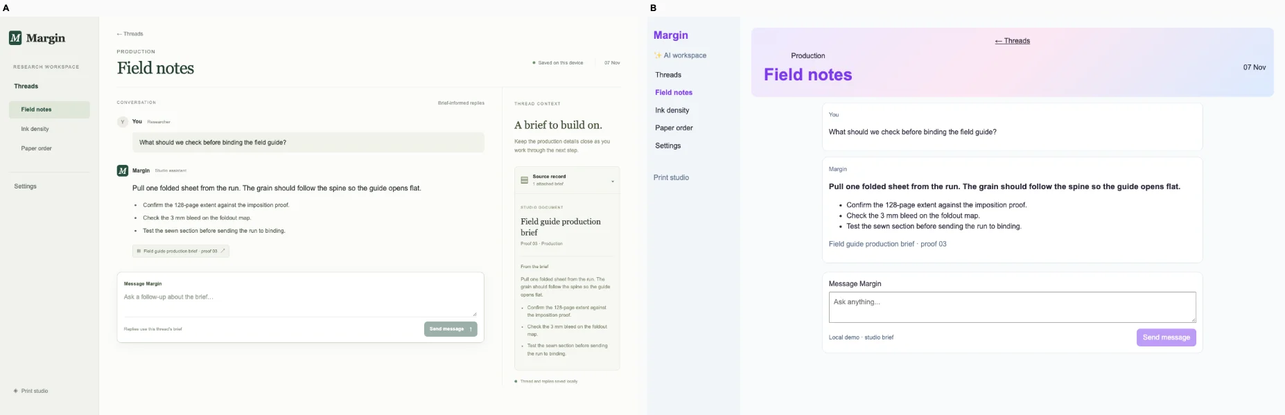
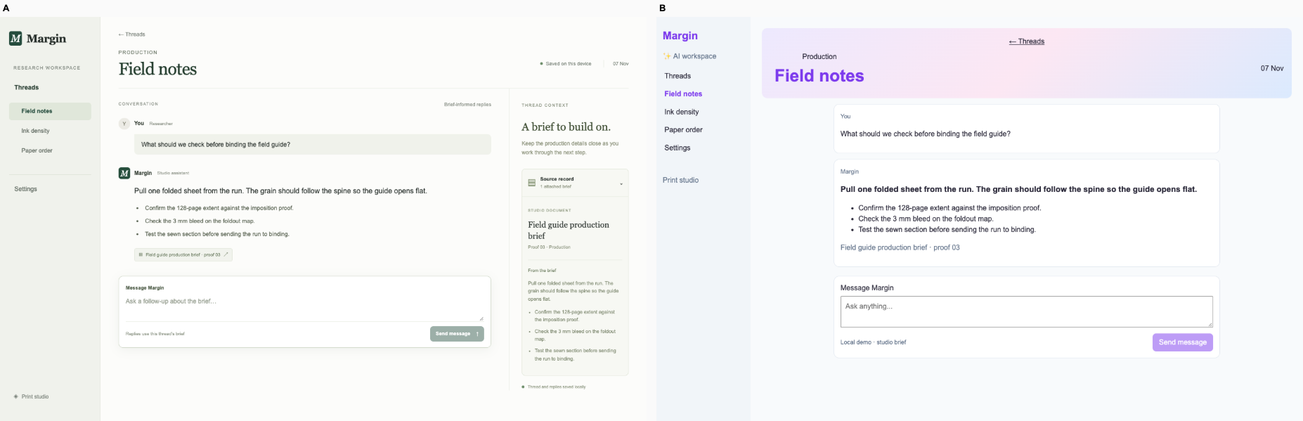
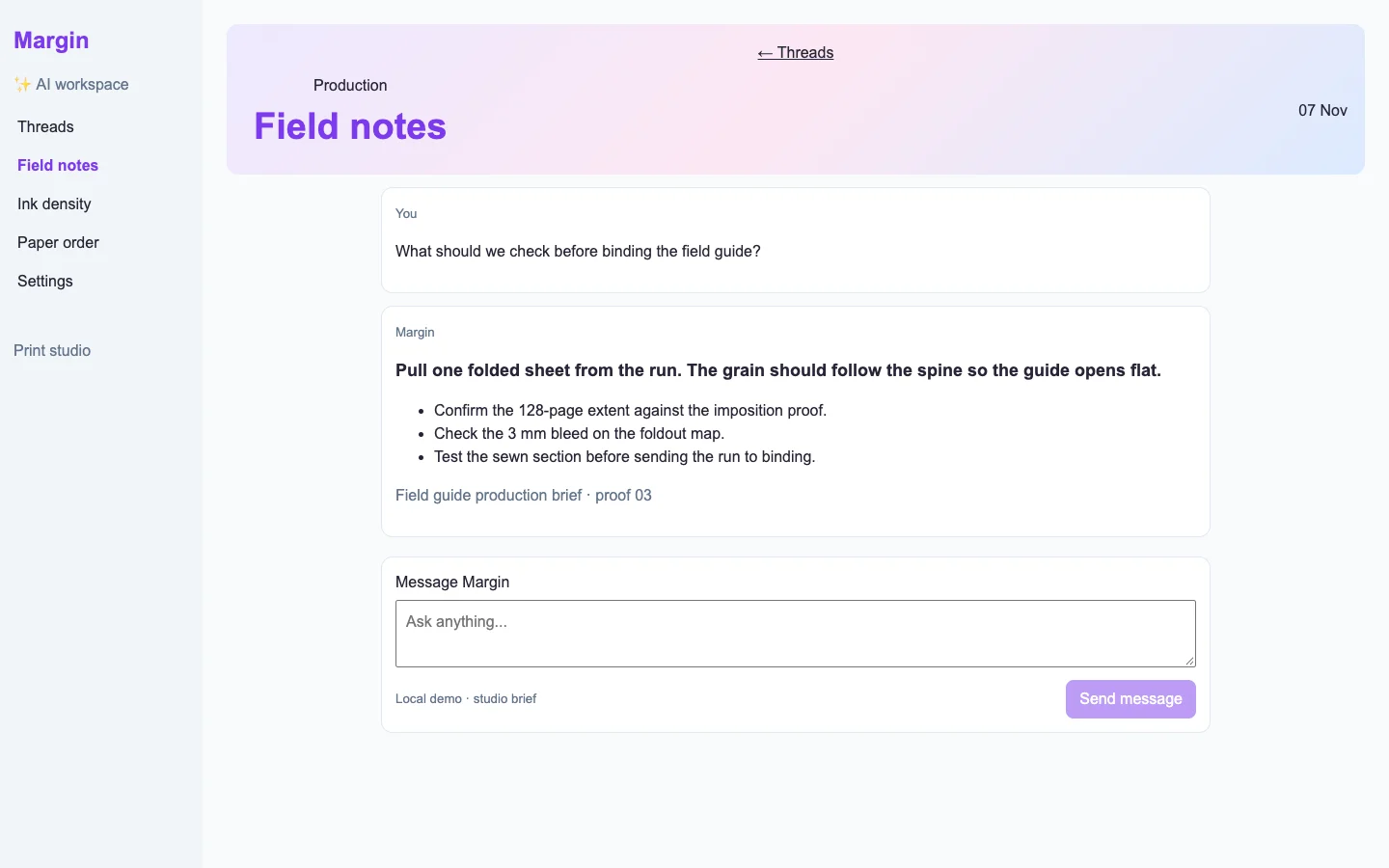
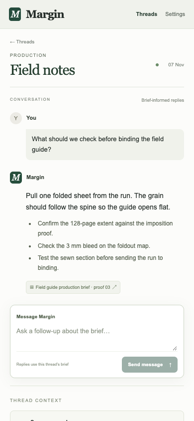
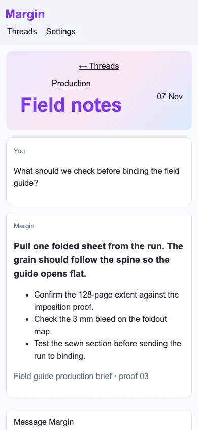
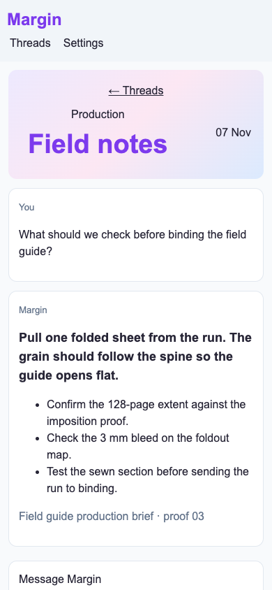
/chat/field-notes · A researcher sends a follow-up about the source brief and reads the answer in context. Preserve the thread and its source records.

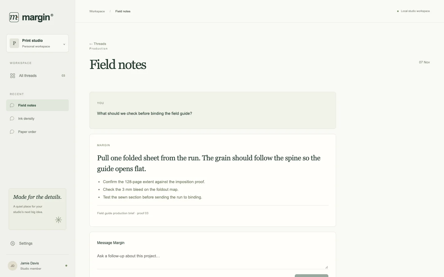
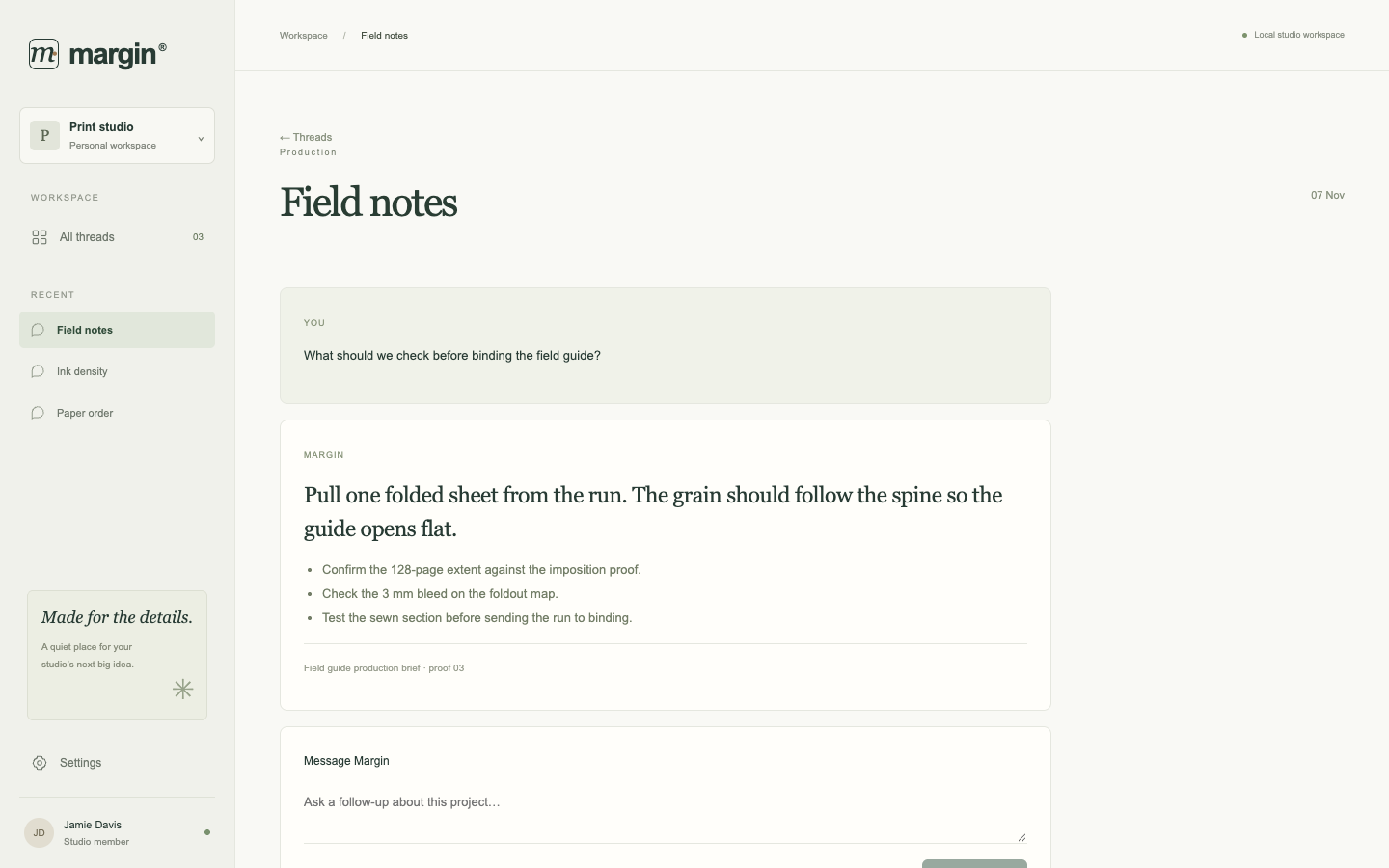
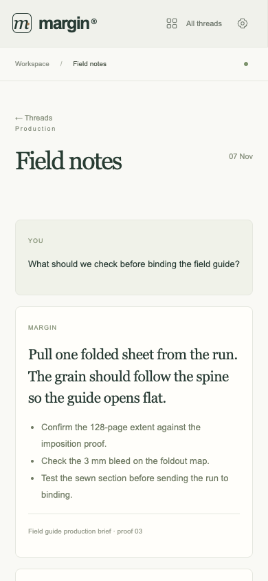
Bare agent. One request completed. Source changed. Desktop (original PNG) · Phone
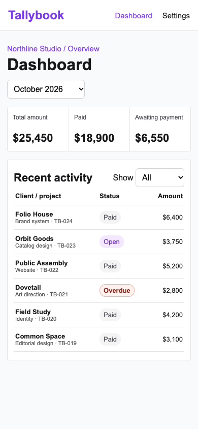
desktop: pass. Sent a source question. The seeded answer survived reload. mobile: pass. Sent a source question. The seeded answer survived reload.

Fix loop. regression: desktop lost an enabled a /threads control or link.. Source unchanged. Desktop (original PNG) · Phone (original PNG)

desktop: pass. Sent a source question. The seeded answer survived reload. mobile: pass. Sent a source question. The seeded answer survived reload.

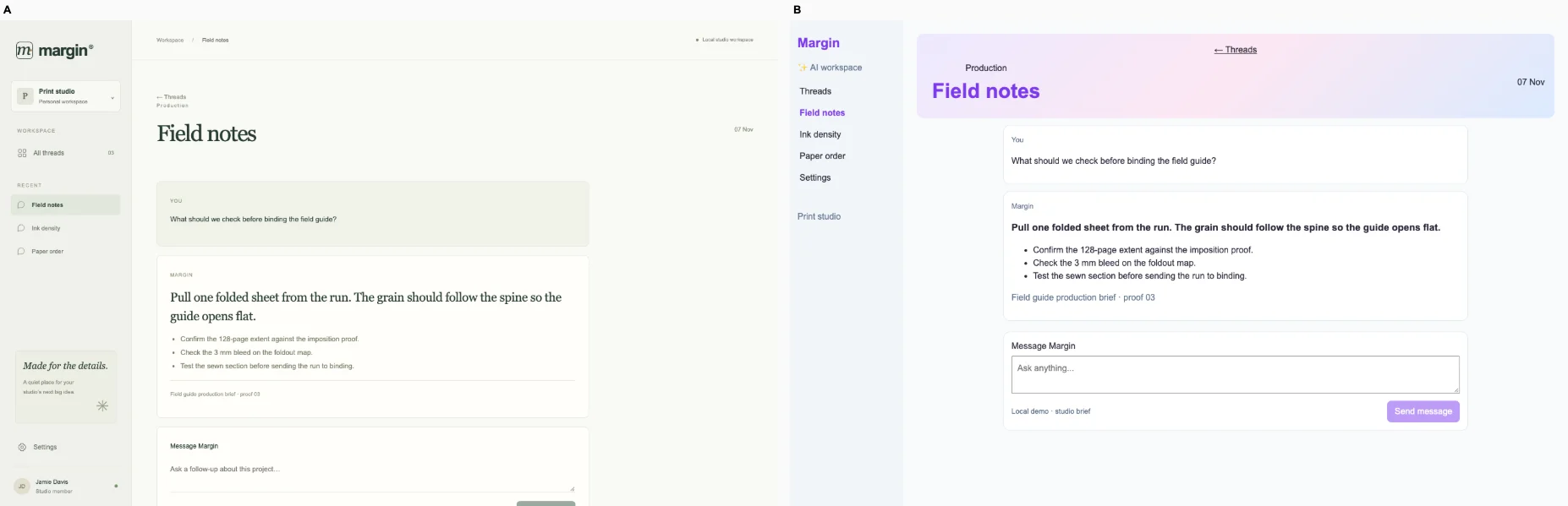
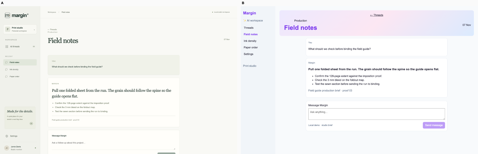
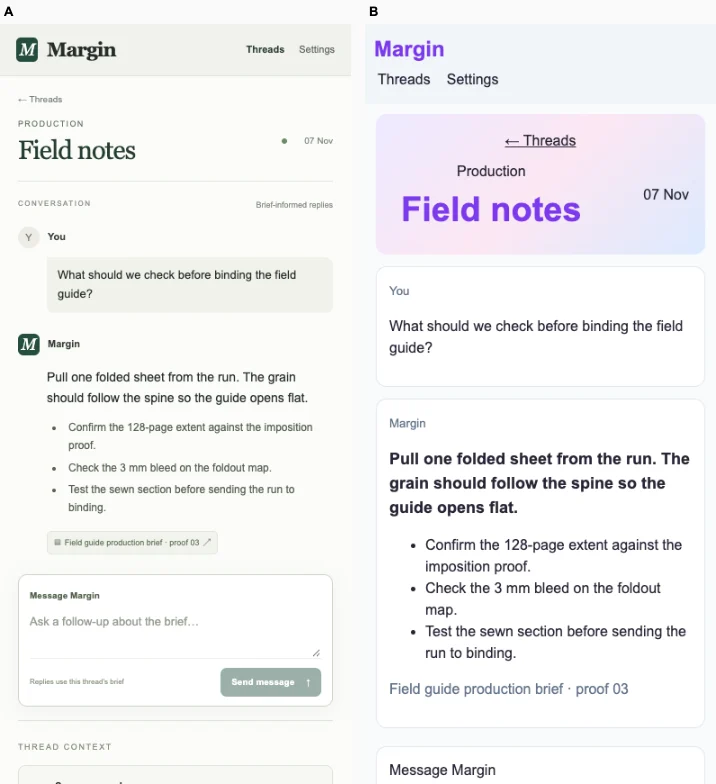
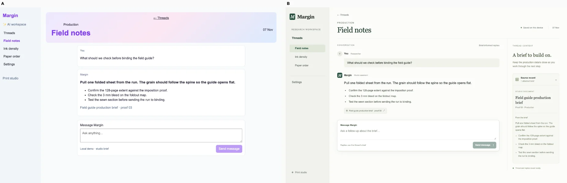
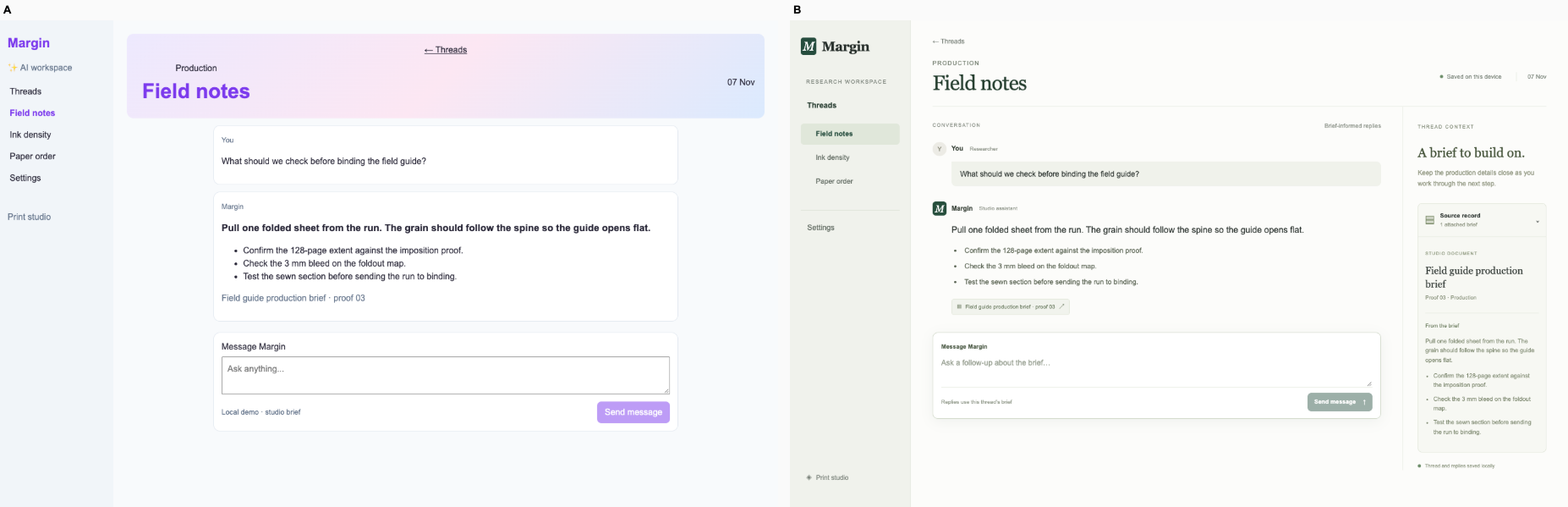
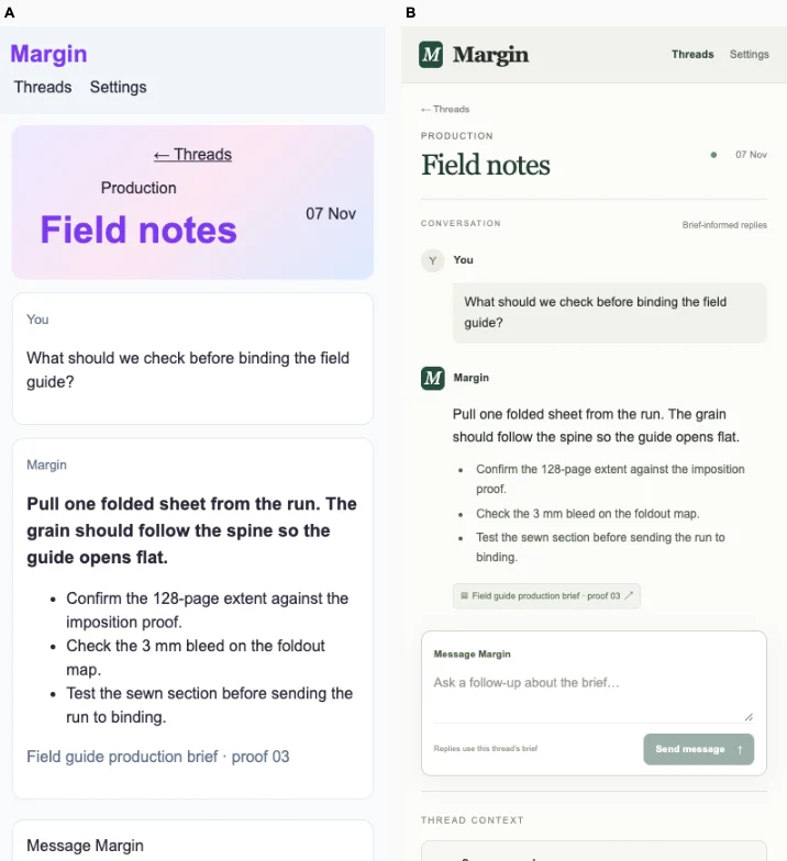
Ballot 1. 2/7 toward fix. Left: bare, right: fix. A gives the production thread a clearer hierarchy with restrained labels, editorial answer typography and a separated source reference. Its paper tones and compact navigation suit the print workspace. B preserves the same specific production facts and offers a more visibly bounded composer on desktop, but its large gradient title competes with the conversation. A's phone layout maintains readable spacing and context; B spends more space on the title and bold answer. Both verified sending and answer persistence on desktop and mobile, so behavior is tied.

B repeats its cohort's purple branding, pastel gradient banners, pale backgrounds and default white cards across finance, coffee, marketplace and booking products. A also shares its cohort's muted greens, serif headlines, fine borders and studio-style navigation, limiting its distinctiveness. However, its paper-like thread, typographic answer and source divider adapt that vocabulary more convincingly to this print-production conversation.

Desktop pair (original PNG) · Phone pair (original PNG) · Other left products (original PNG) · Other right products (original PNG)
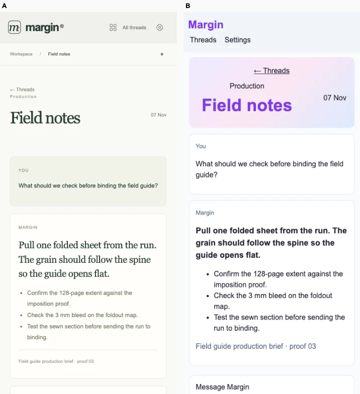
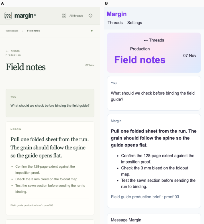
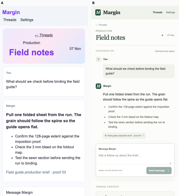
Ballot 2. 2/7 toward fix. Left: fix, right: bare. B gives the production thread a clearer editorial hierarchy, with readable serif answers, restrained metadata and a separated source citation. Its phone layout preserves comfortable text wrapping and navigation; A's bold answer and gradient title compete for attention. Both retain the same concrete binding checks and source record, and verified sending and reload persistence succeed on desktop and mobile. B's generous spacing pushes the composer farther below the conversation, limiting its advantage for follow-up work.

A repeats its cohort's purple accents, pastel gradient banners, pale backgrounds and rounded white cards across unrelated products. B also shares a cohort style, muted cream and sage, fine borders, small metadata and editorial typography, but its narrow thread column, conversation roles and production-source treatment adapt that vocabulary to this workspace. Its identity is more intentional, though not wholly independent of the cohort.

Desktop pair (original PNG) · Phone pair (original PNG) · Other left products (original PNG) · Other right products (original PNG)
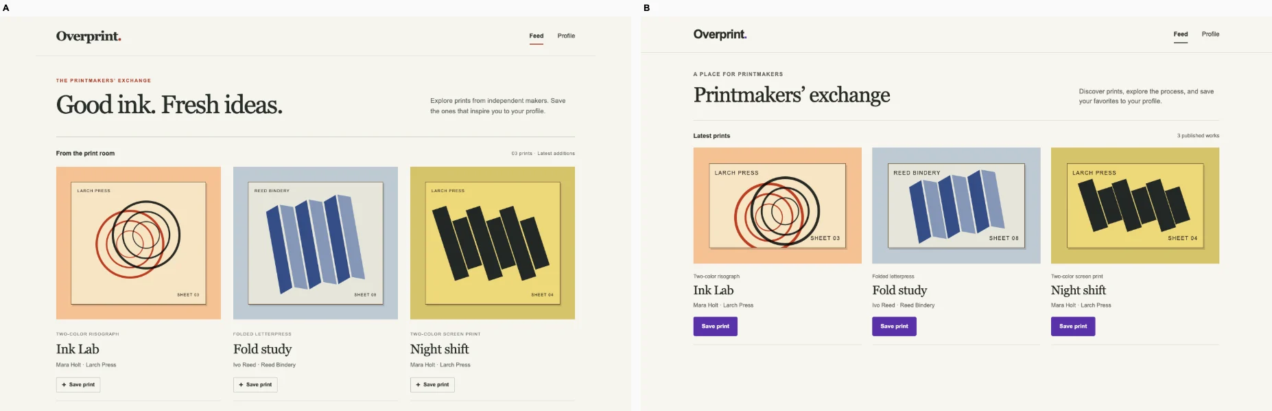
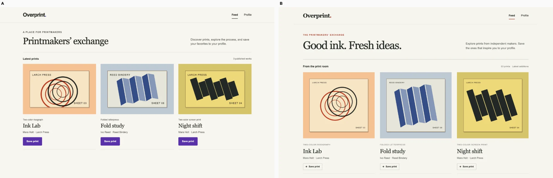
Print exchange feed · Bare agent

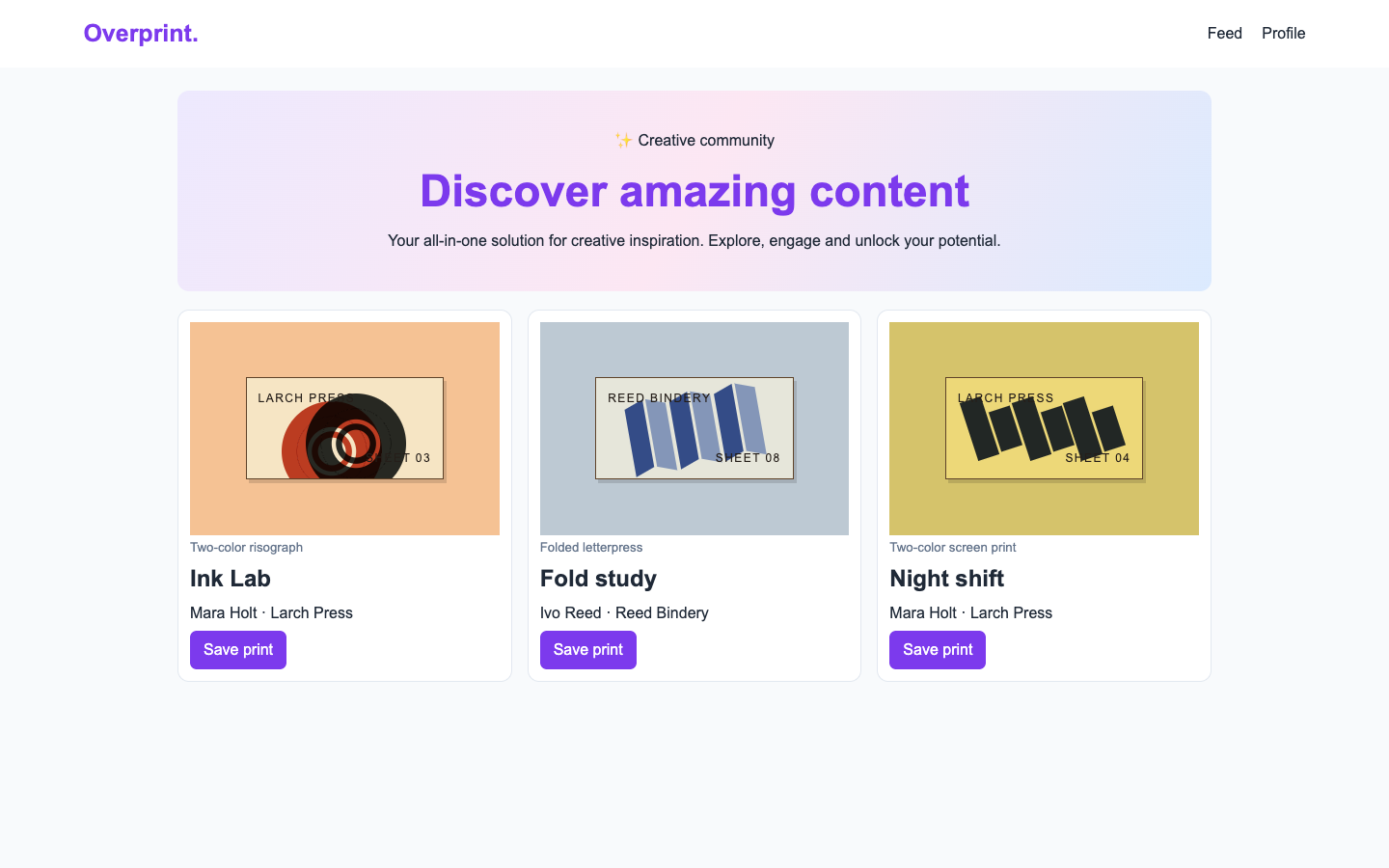
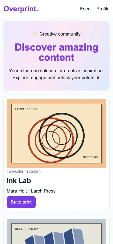
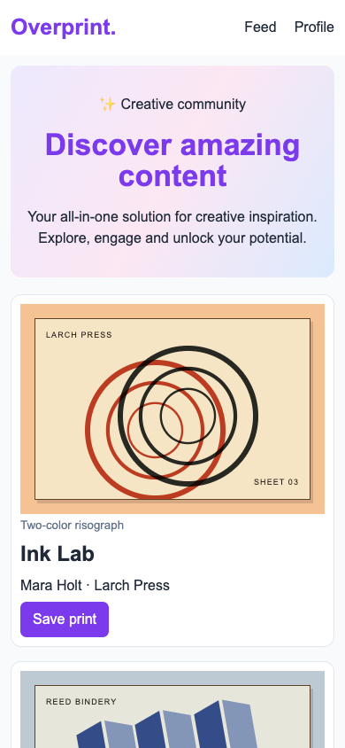
/ · A printmaker finds the Ink Lab entry, saves the post and sees it on their profile. Keep the real listings and routes.

Bare agent. One request completed. Source changed. Desktop (original PNG) · Phone

desktop: pass. Opened Ink Lab, saved it and located it on the profile. mobile: pass. Opened Ink Lab, saved it and located it on the profile.

Fix loop. regression: / · Landing message: C to N/A. Source unchanged. Desktop (original PNG) · Phone (original PNG)

desktop: pass. Opened Ink Lab, saved it and located it on the profile. mobile: pass. Opened Ink Lab, saved it and located it on the profile.

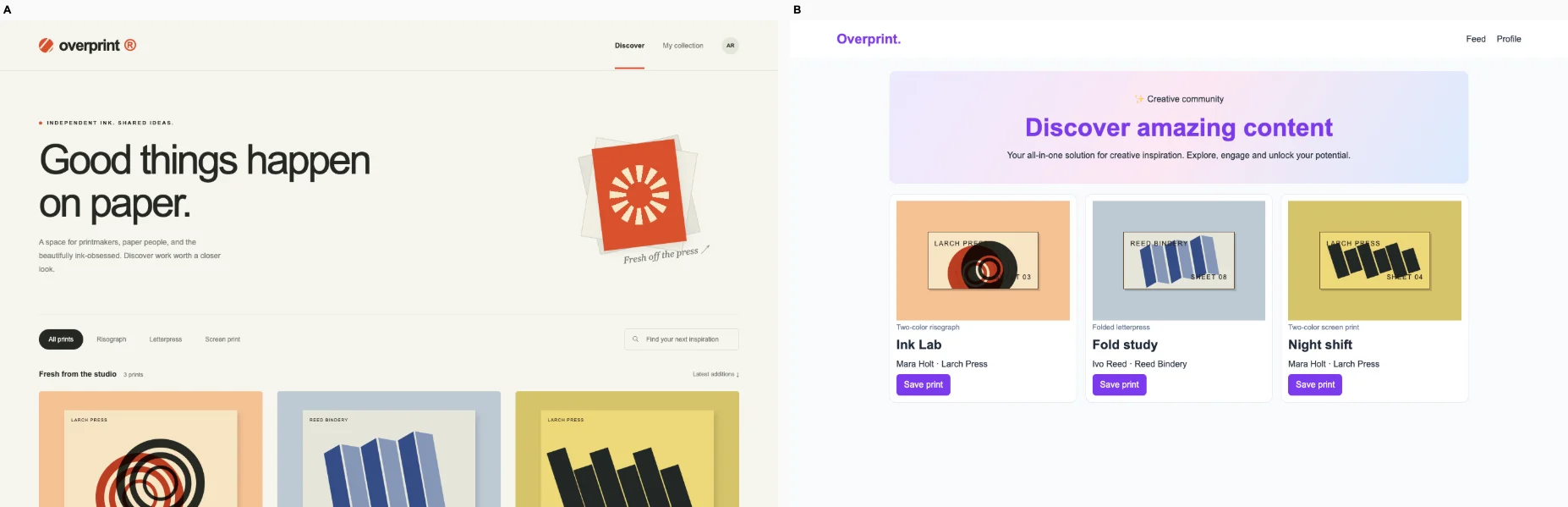
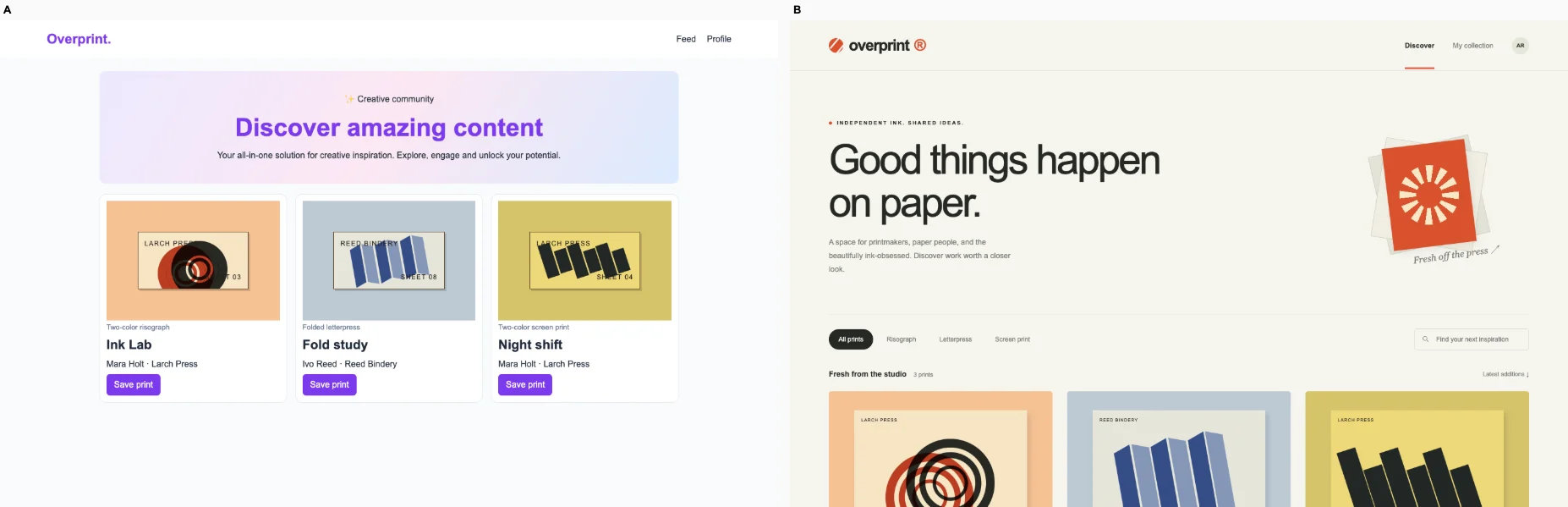
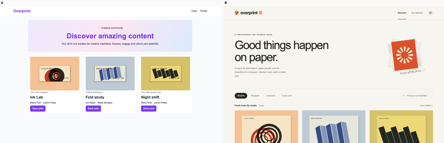
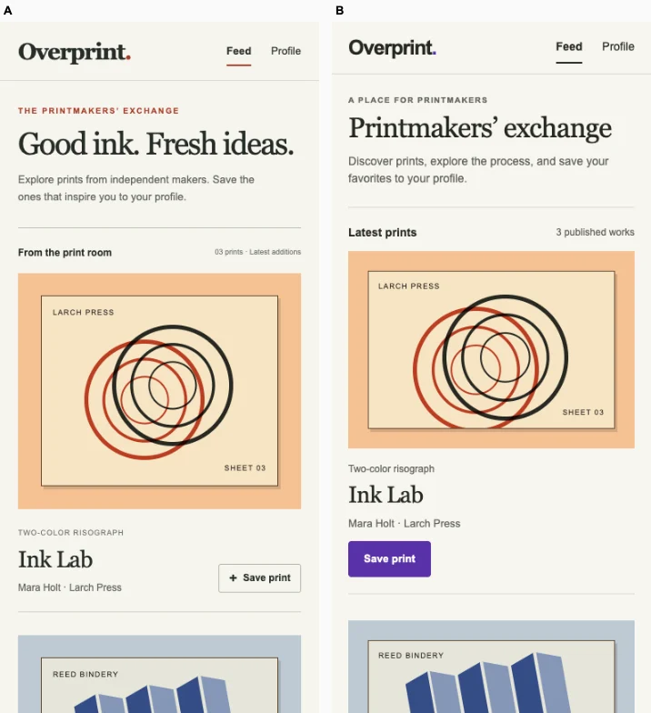
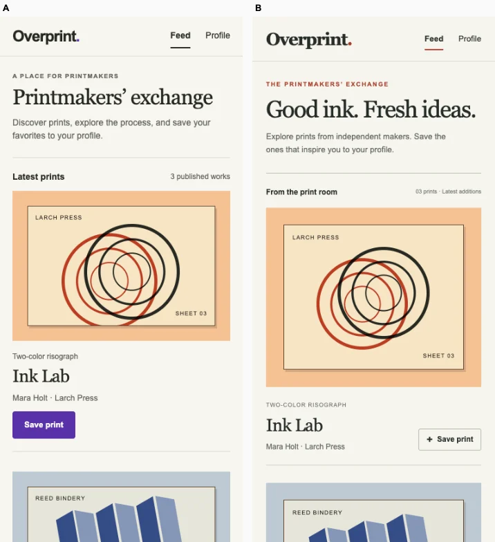
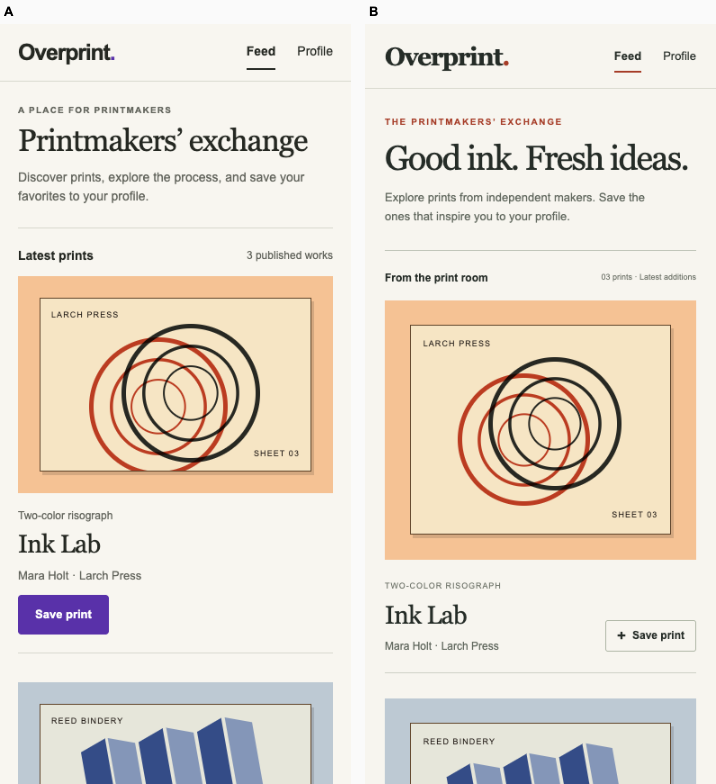
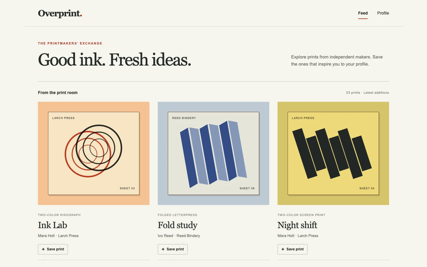
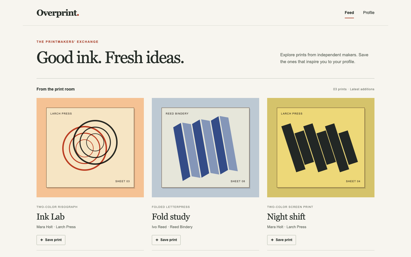
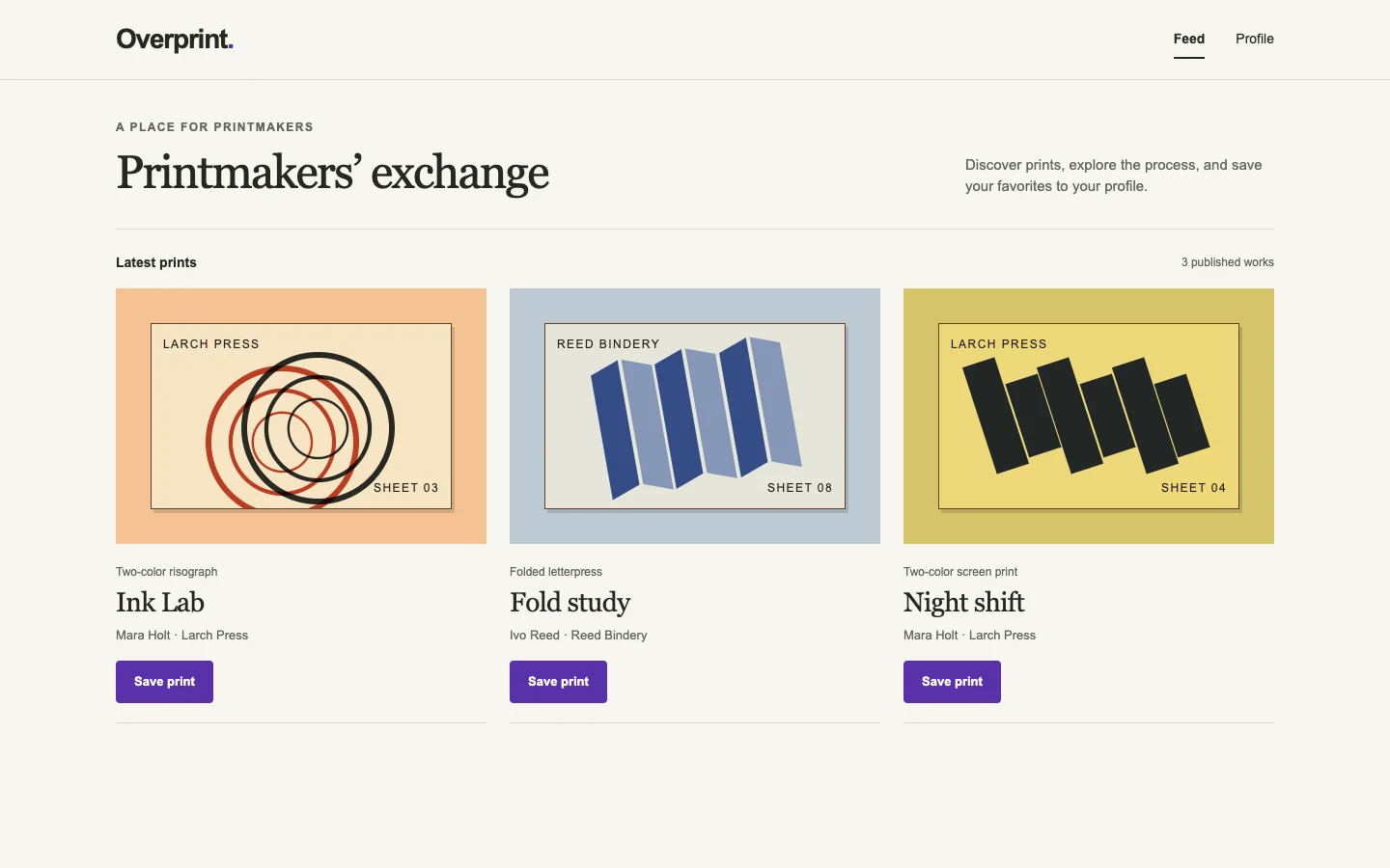
Ballot 1. 2/7 toward fix. Left: bare, right: fix. Both interfaces successfully open Ink Lab, save it and show it on the profile on desktop and mobile. B makes Ink Lab and its Save print action immediately visible, while A's tall introduction delays listing details, especially on phone. A nevertheless provides a more coherent printmaking experience through process filters, studio language, paper tones, editorial typography and artwork presentation. B spends prominent space on generic creative-inspiration copy and a gradient banner. Both phone layouts remain readable; A adds useful search and filtering. Verified behavior is equal, and saved-state styling is not shown.

B closely repeats its cohort's purple branding, pastel gradient banners, centered promotional headings and default white cards across coffee, finance and marketplace products. A shares muted backgrounds, restrained navigation and editorial type with its cohort, especially the coffee calculator and used-tools marketplace, but its ink-red identity, paper artwork, print-process filters and press illustration adapt that vocabulary more specifically to printmaking.

Desktop pair (original PNG) · Phone pair (original PNG) · Other left products (original PNG) · Other right products (original PNG)
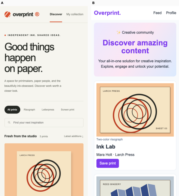
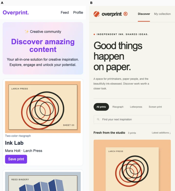
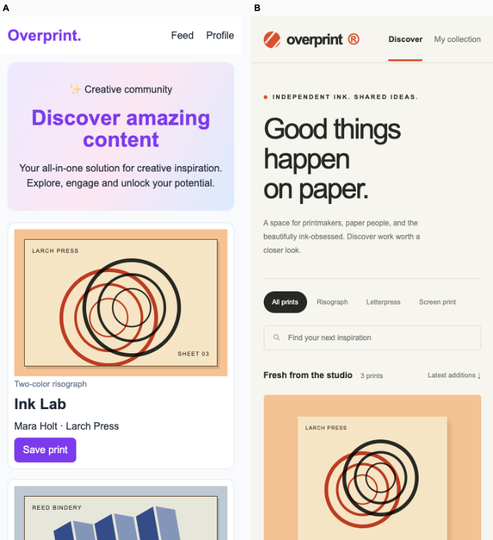
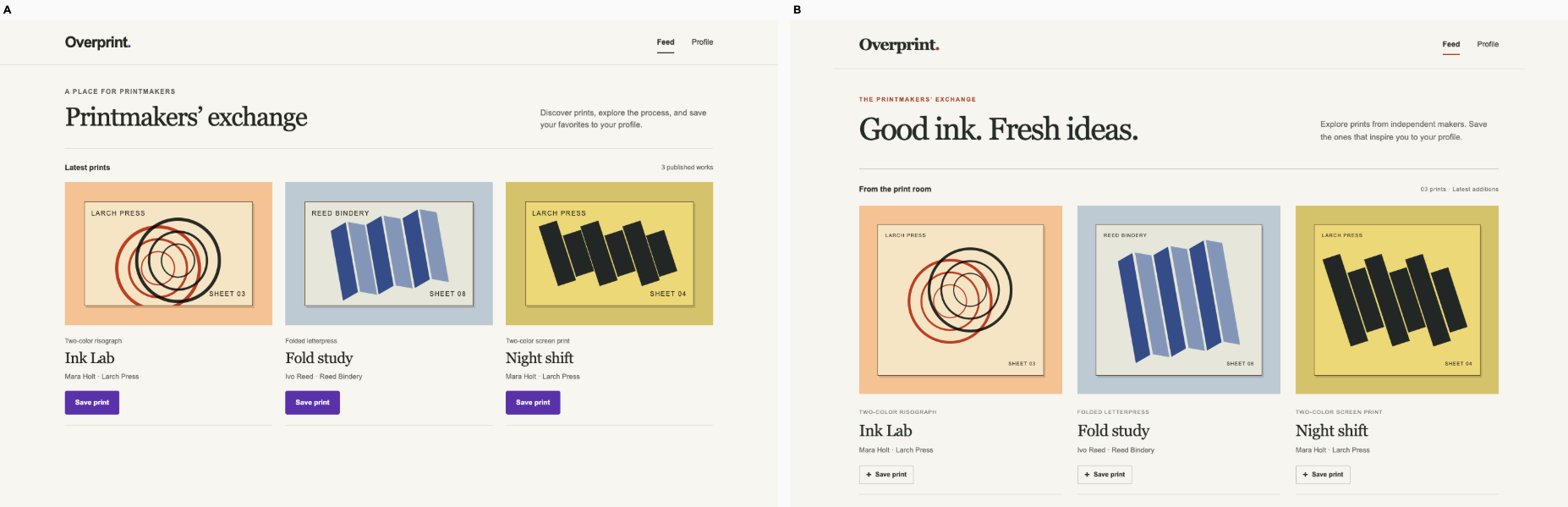
Ballot 2. 2/7 toward fix. Left: fix, right: bare. Both interfaces successfully support opening Ink Lab, saving it and finding it on the profile on desktop and mobile. B gives the print collection a clearer identity through paper textures, larger artwork, printing-process filters and specific editorial copy. A relies on a generic inspiration banner but exposes Ink Lab’s title and Save print action much earlier on mobile; B’s tall introduction pushes those details below the visible area. State styling beyond the verified successful behavior is not shown.

A closely repeats its cohort’s purple accents, pastel gradient banners, centered promotional copy and default cards, especially the coffee calculator and marketplace. B also shares its cohort’s warm neutral backgrounds, restrained navigation and spacious editorial structure. Its ink-orange identity, print-process navigation and paper-led artwork presentation provide some additional specificity, although the overall visual language remains recognizably shared.

Desktop pair (original PNG) · Phone pair (original PNG) · Other left products (original PNG) · Other right products (original PNG)
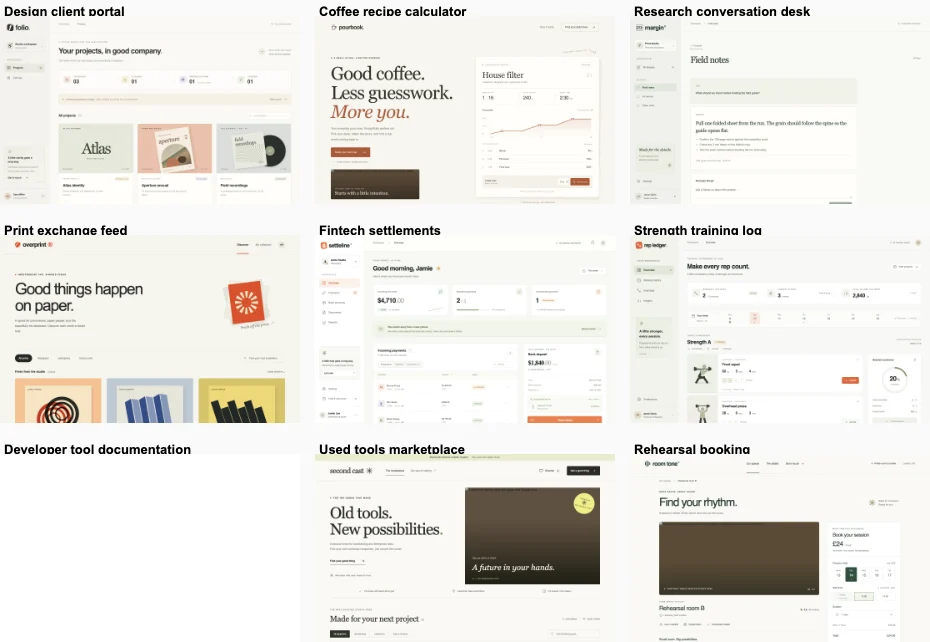
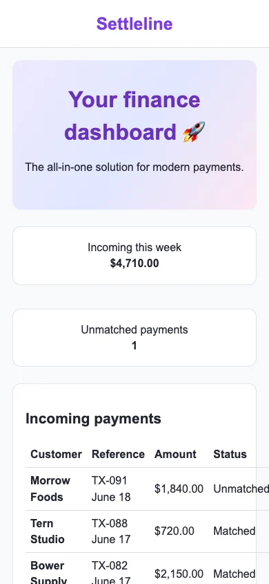
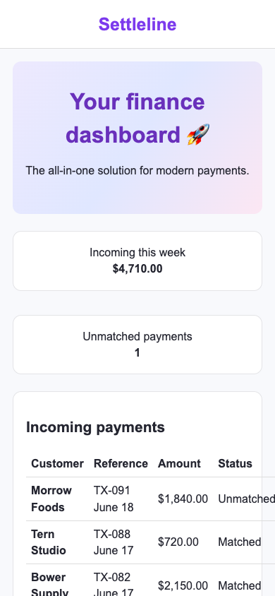
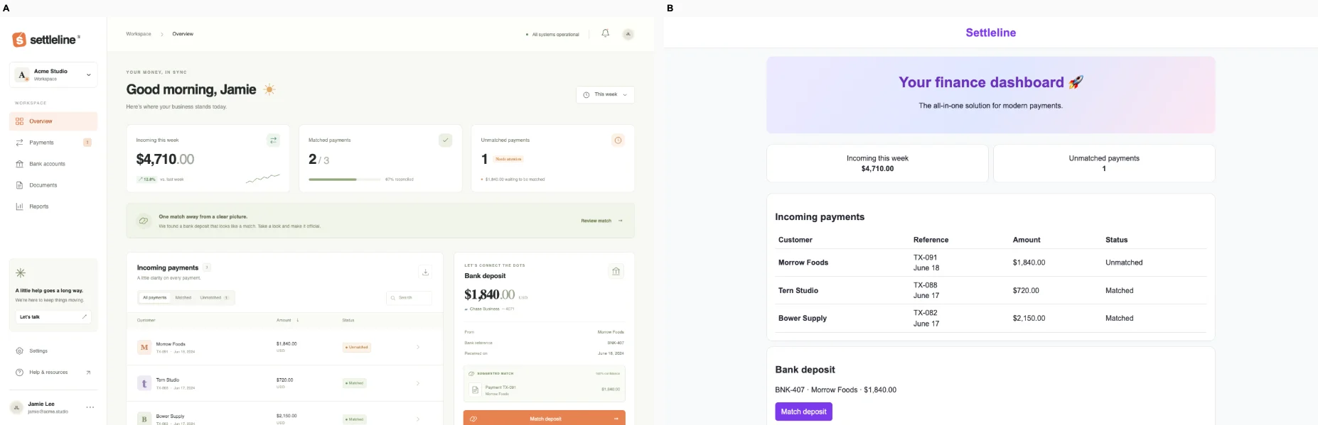
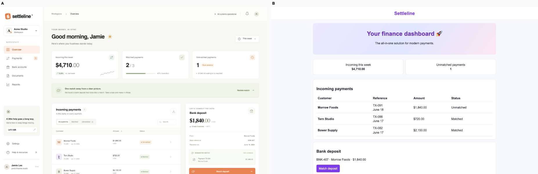
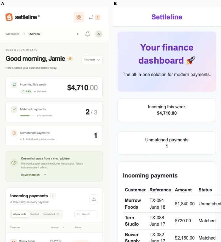
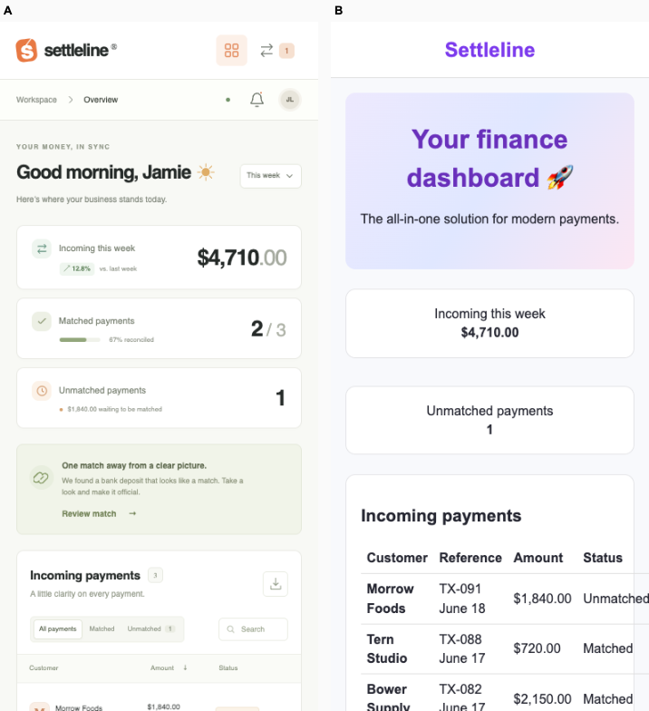
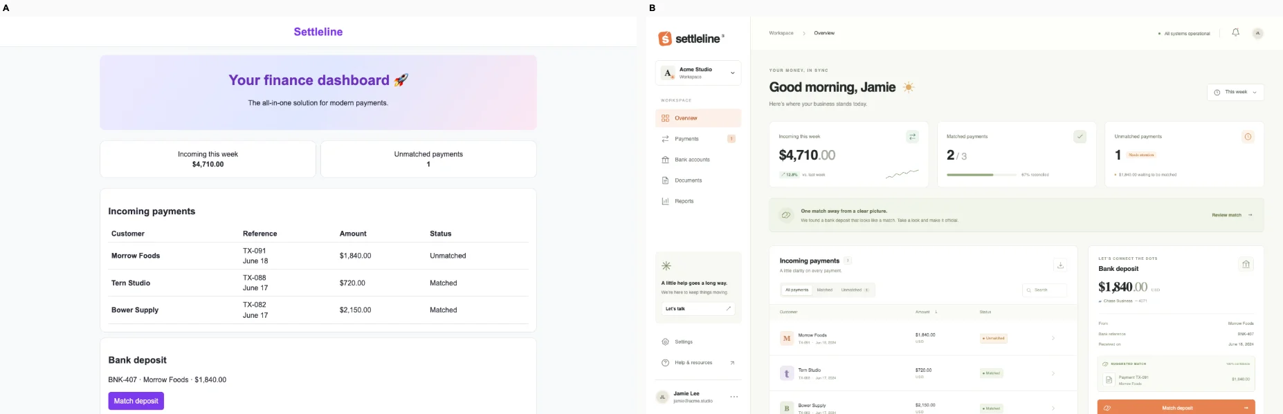
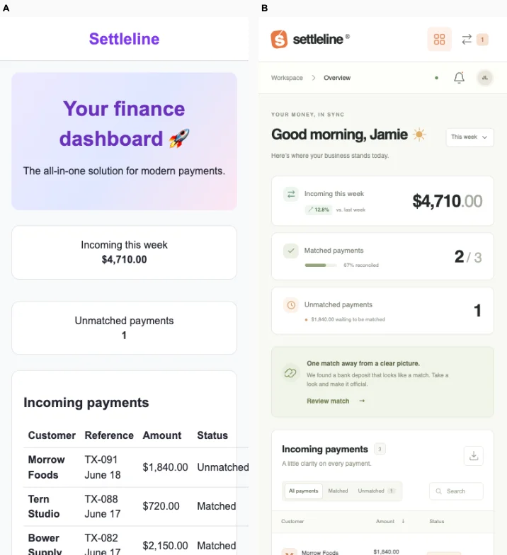
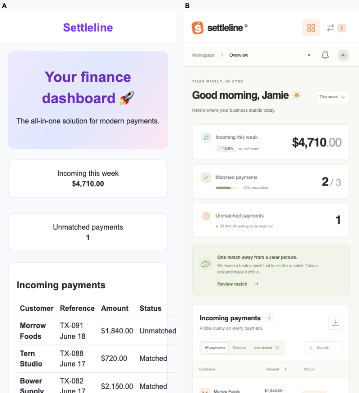
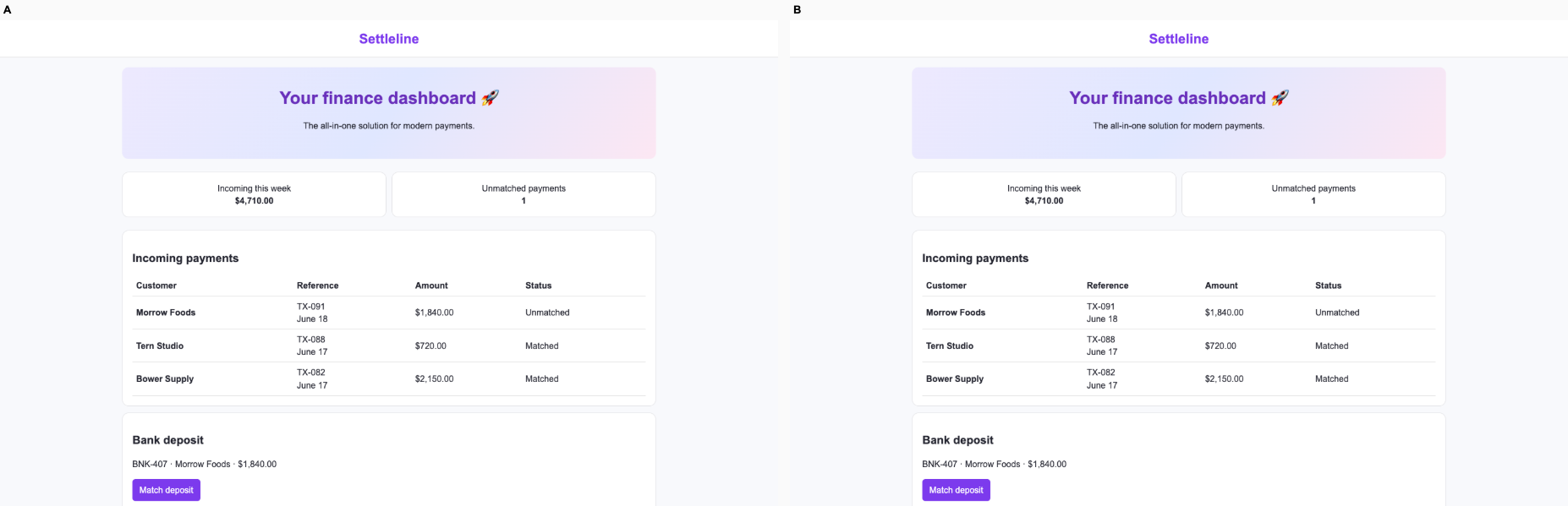
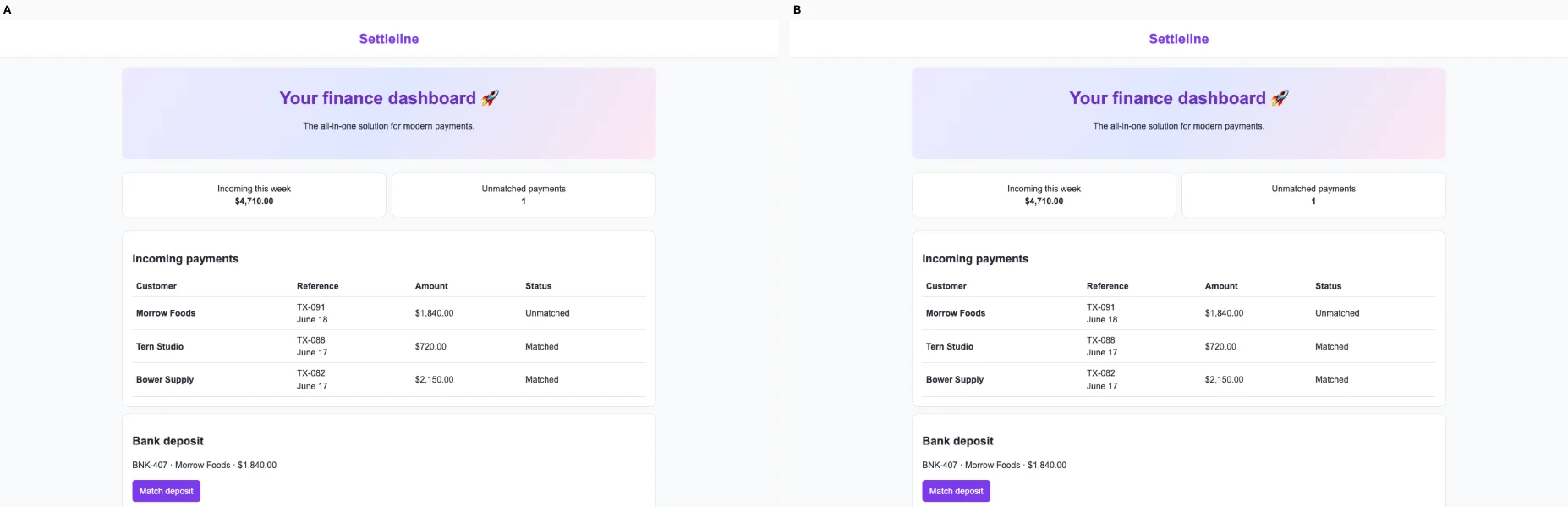
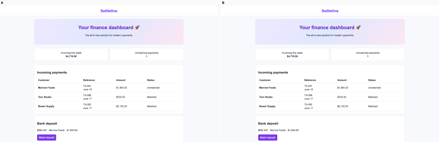
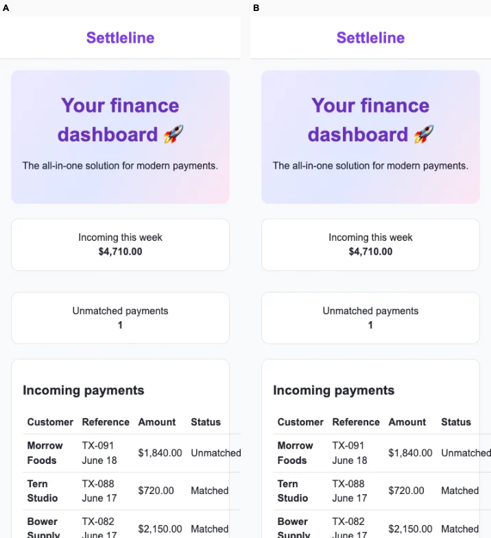
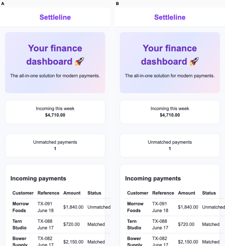
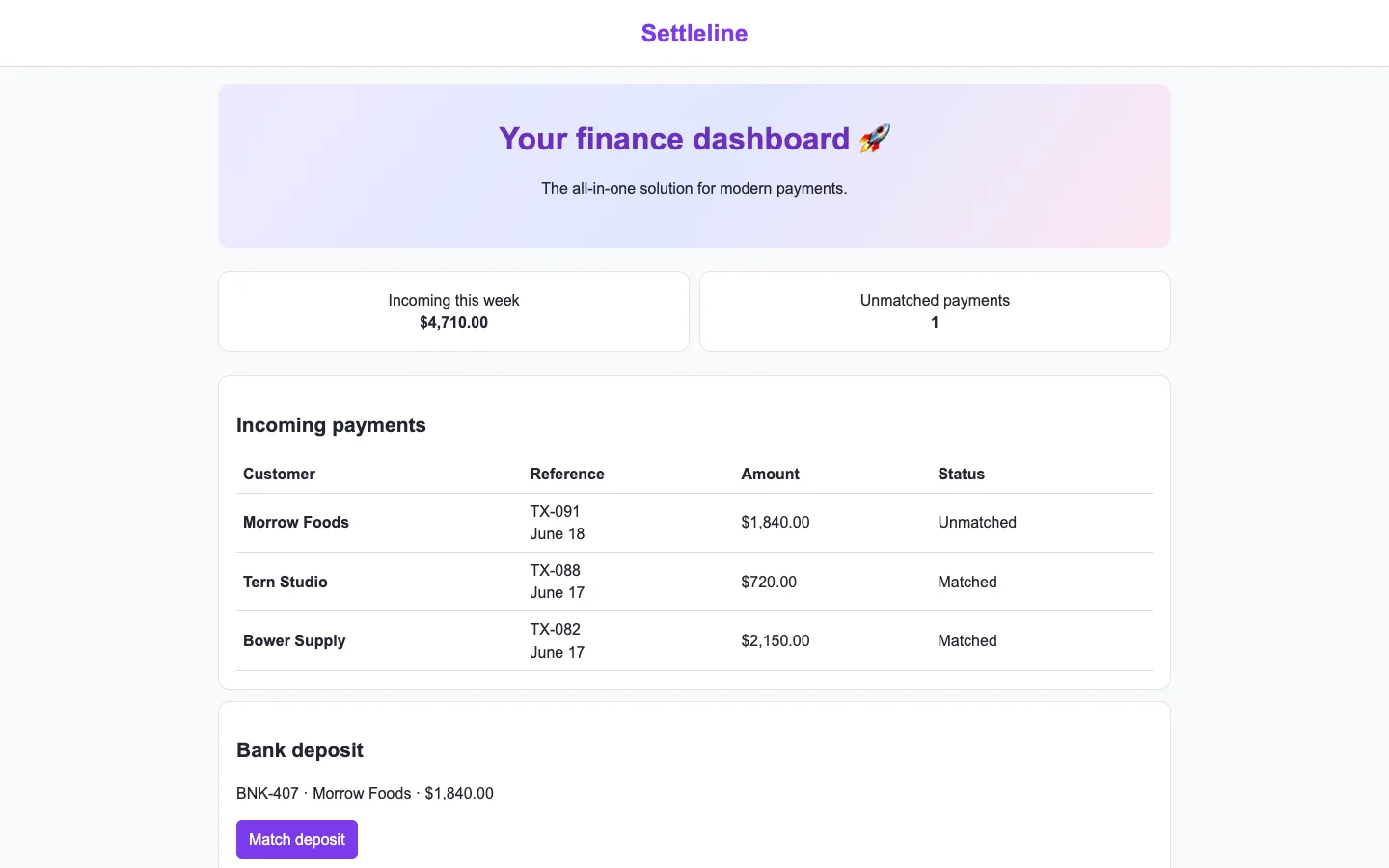
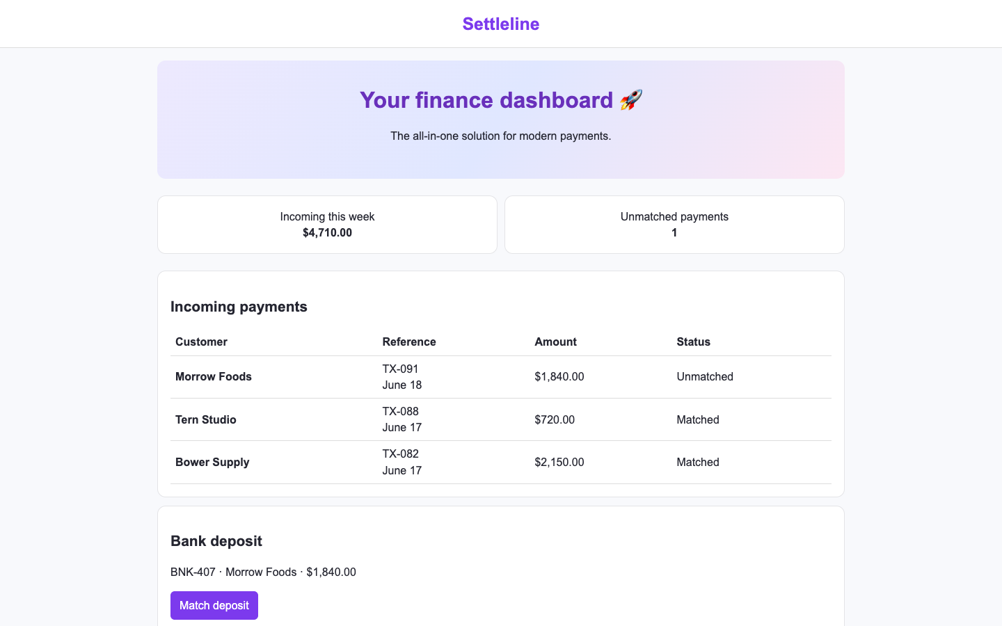
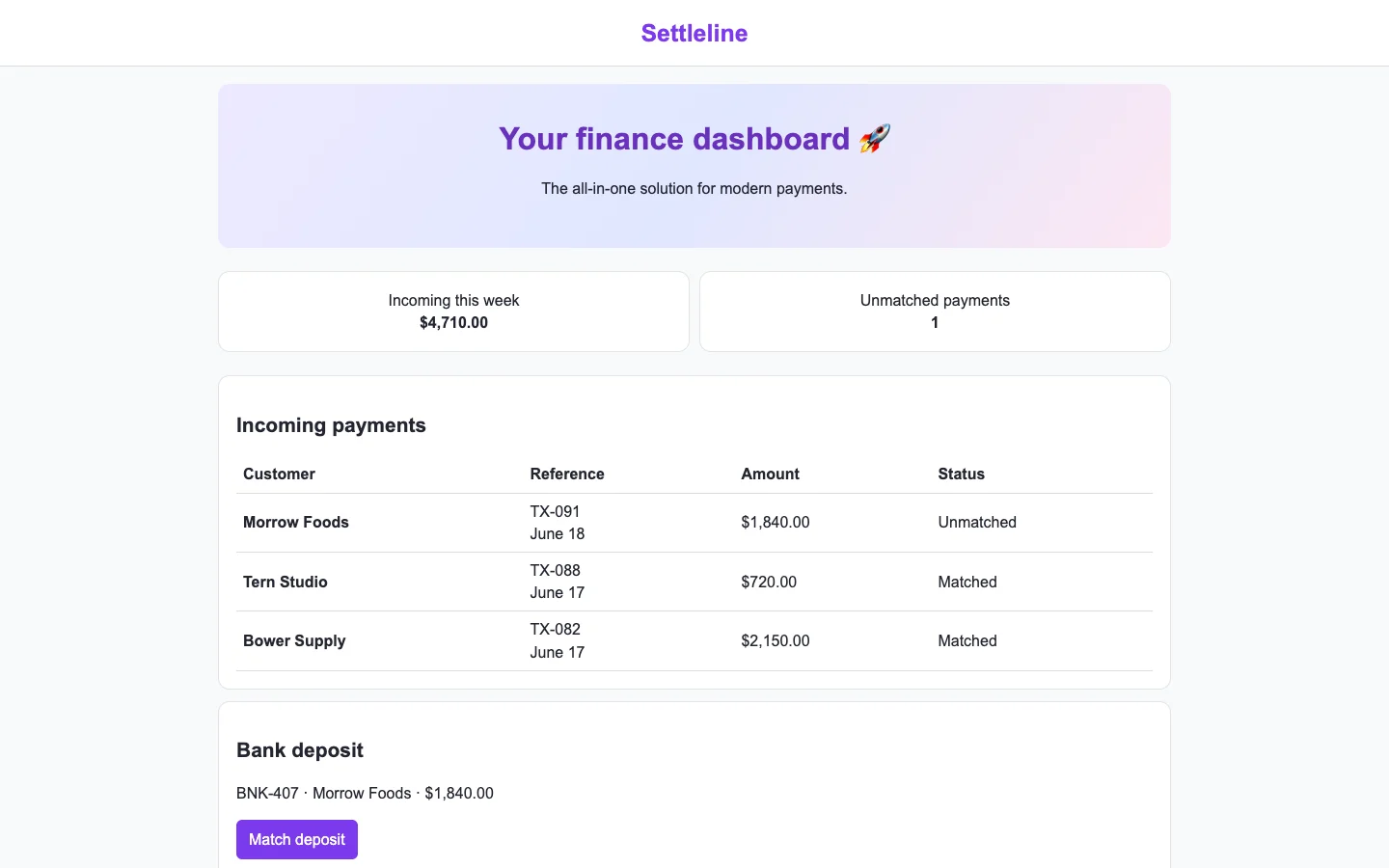
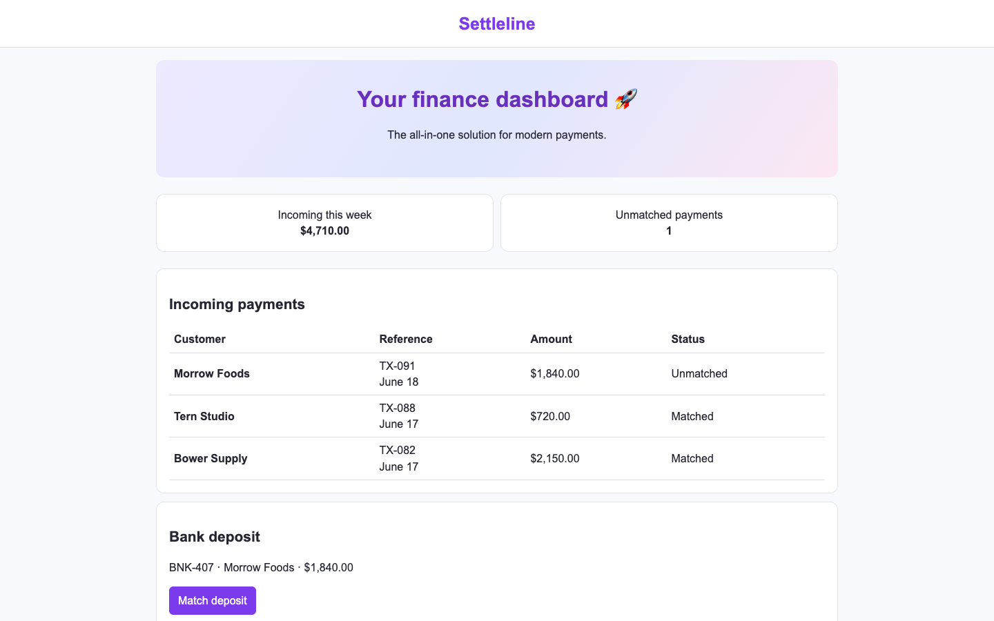
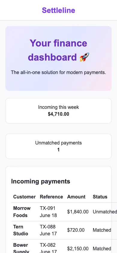
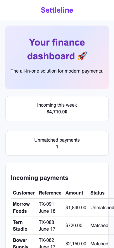
Fintech settlements · Bare agent

/ · A finance operator matches an unmatched payment to its bank deposit and confirms the remaining exception count.

Bare agent. One request completed. Source changed. Desktop (original PNG) · Phone

desktop: pass. TX-091 matched bank deposit BNK-407. mobile: pass. TX-091 matched bank deposit BNK-407.

Fix loop. regression: / · Access and recovery: C to Unverified. Source unchanged. Desktop (original PNG) · Phone (original PNG)

desktop: pass. TX-091 matched bank deposit BNK-407. mobile: pass. TX-091 matched bank deposit BNK-407.

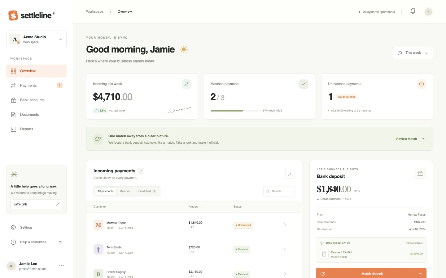
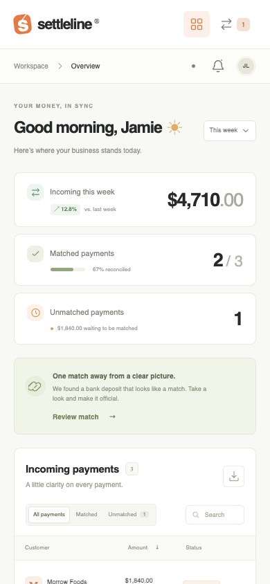
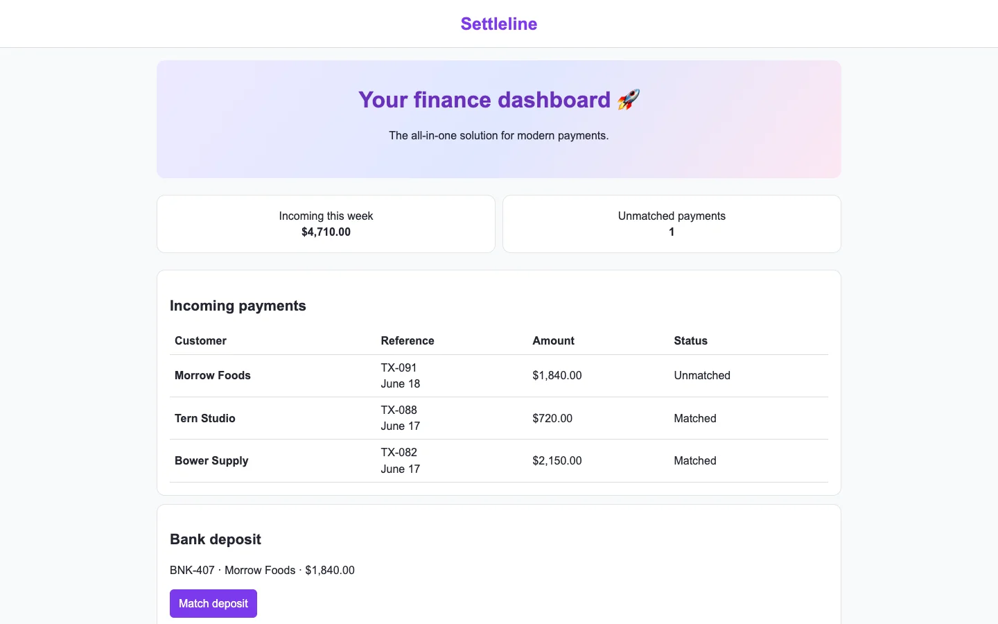
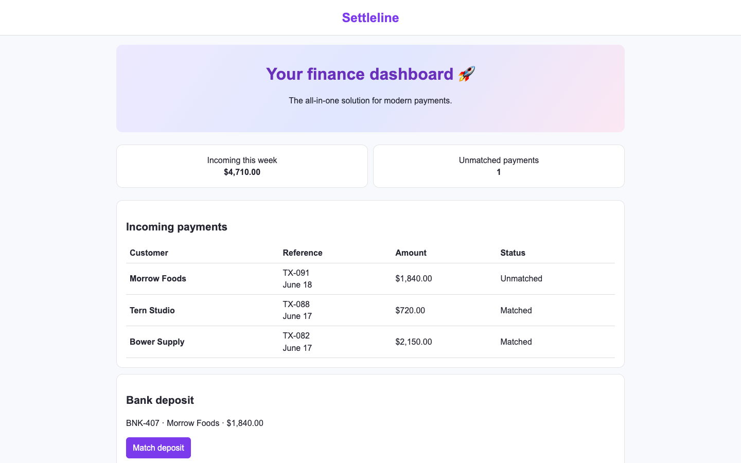
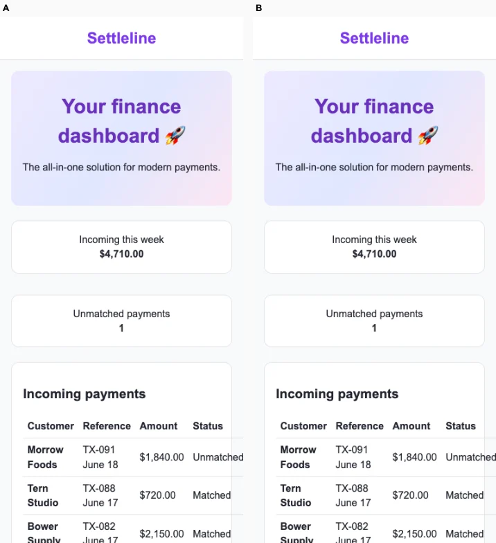
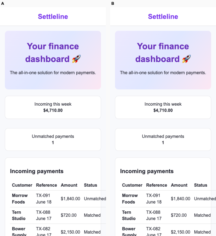
Ballot 1. 1/7 toward fix. Left: bare, right: fix. Both arms verifiably match TX-091 to BNK-407 on desktop and mobile. A better supports the operator’s decision with matched progress, the remaining exception count, $1,840 awaiting reconciliation, and a deposit panel identifying the suggested payment and confidence. B presents the essential records and action, but spends prominent space on a generic finance slogan and gradient hero. A’s phone layout adapts the metrics into compact rows; B’s payment table visibly overflows the viewport. A’s desktop secondary text is quite small, and neither supplied render establishes the exception count after matching.

A shares muted surfaces, restrained green accents, compact navigation and editorial spacing with its billing, research and training peers, but its reconciliation progress, exception prompt and adjacent deposit-matching panel give the target a specific working composition. B repeats the purple branding, pastel gradient banner, centered promotional copy and sparse white cards seen across its coffee, print and marketplace peers; those patterns contribute little to this finance task.

Desktop pair (original PNG) · Phone pair (original PNG) · Other left products (original PNG) · Other right products (original PNG)
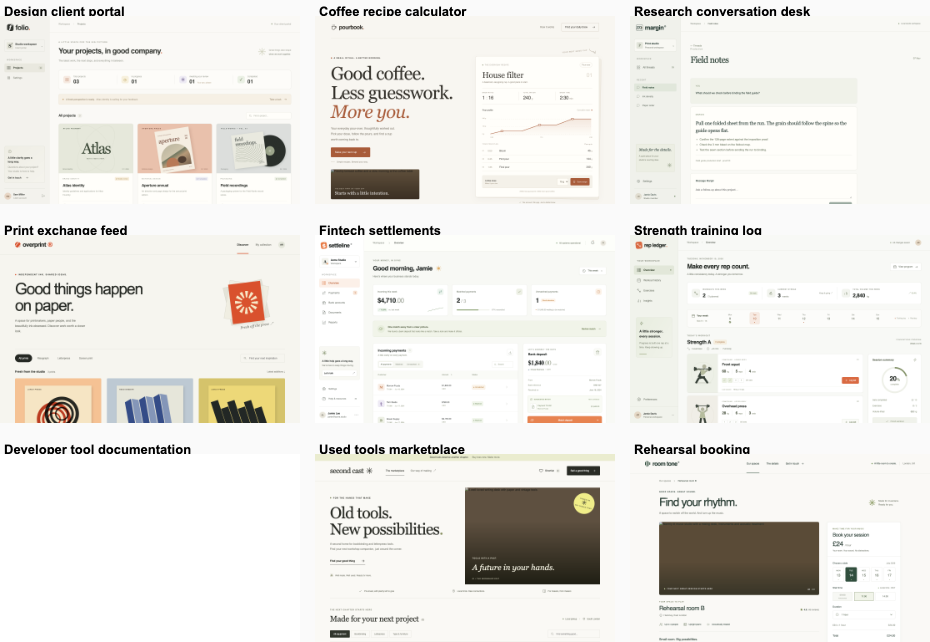
Ballot 2. 2/7 toward fix. Left: fix, right: bare. Both arms successfully matched TX-091 to BNK-407 on desktop and mobile. B makes reconciliation clearer through a deposit detail panel, the suggested payment match, a prominent matching action, and matched/unmatched counts. A spends substantial space on a generic gradient welcome banner. B uses restrained status colors and stronger information hierarchy; its phone summary cards fit cleanly, while A's payment table clips horizontally. B's mobile working action remains below the visible area, and neither render verifies the remaining exception count after matching.

A repeats its cohort's purple branding, pale gradient hero, centered promotional copy and basic white cards. B also shares a recognizable cohort style: warm neutral backgrounds, muted green accents, small uppercase labels, editorial headings and sidebar layouts resembling the billing, research and training products. B's reconciliation workspace is more tailored to finance, but its overall visual identity remains strongly shared with its cohort, so distinctiveness is tied.

Desktop pair (original PNG) · Phone pair (original PNG) · Other left products (original PNG) · Other right products (original PNG)
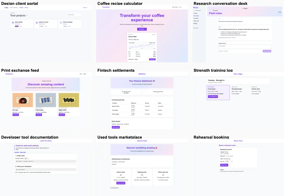
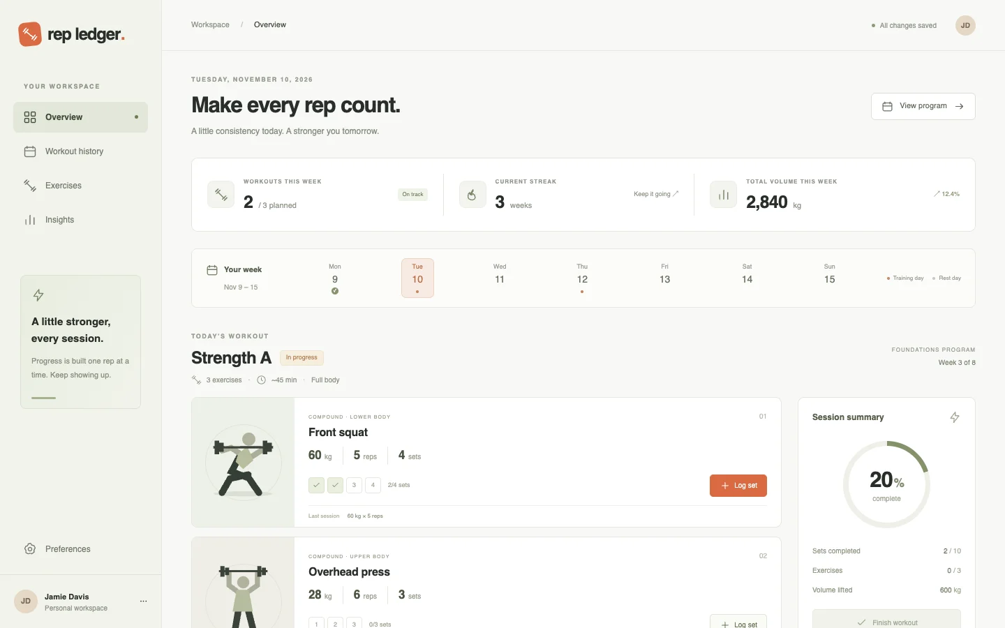
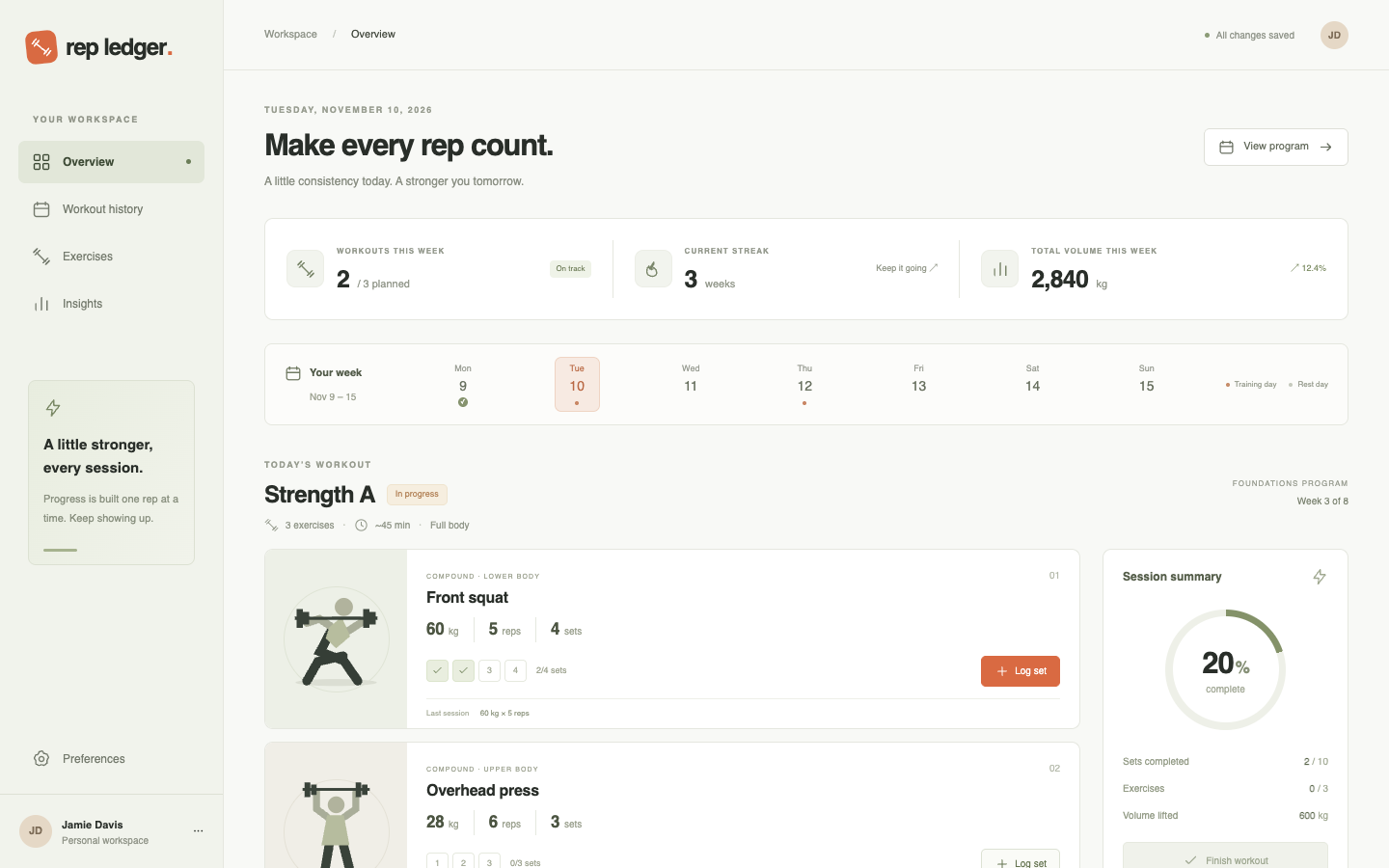
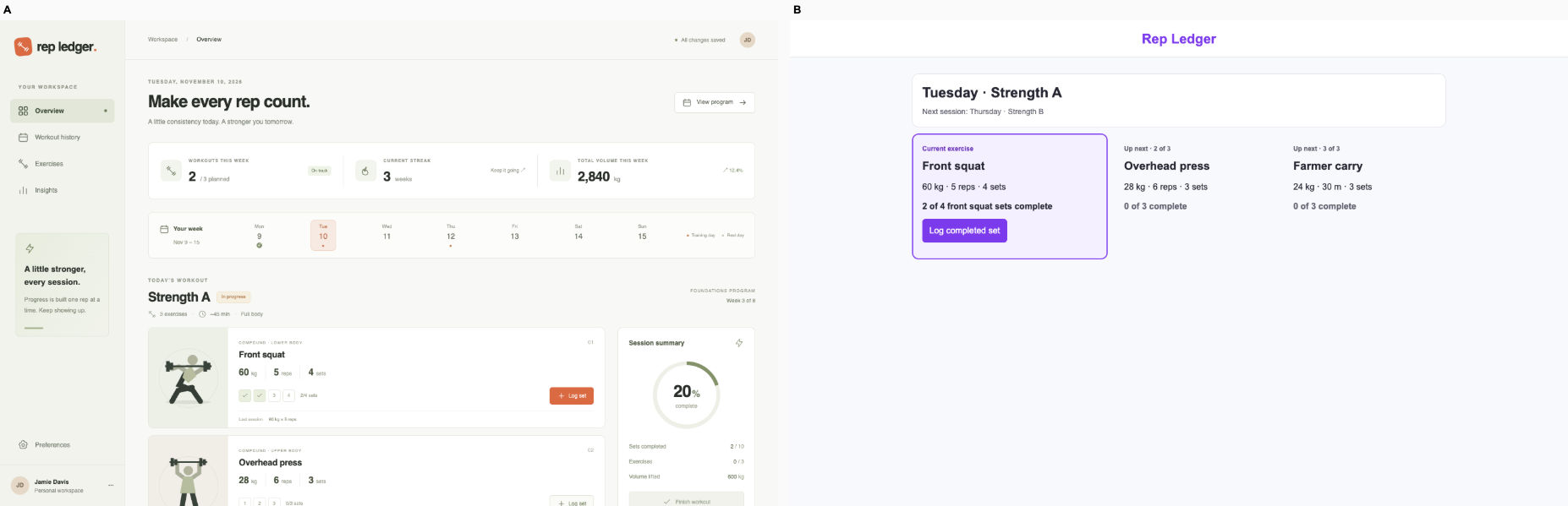
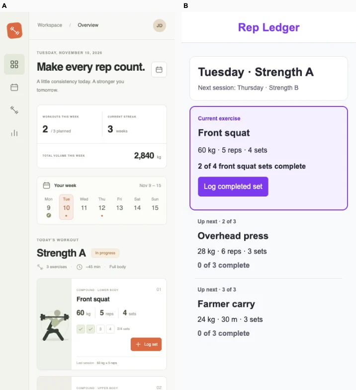
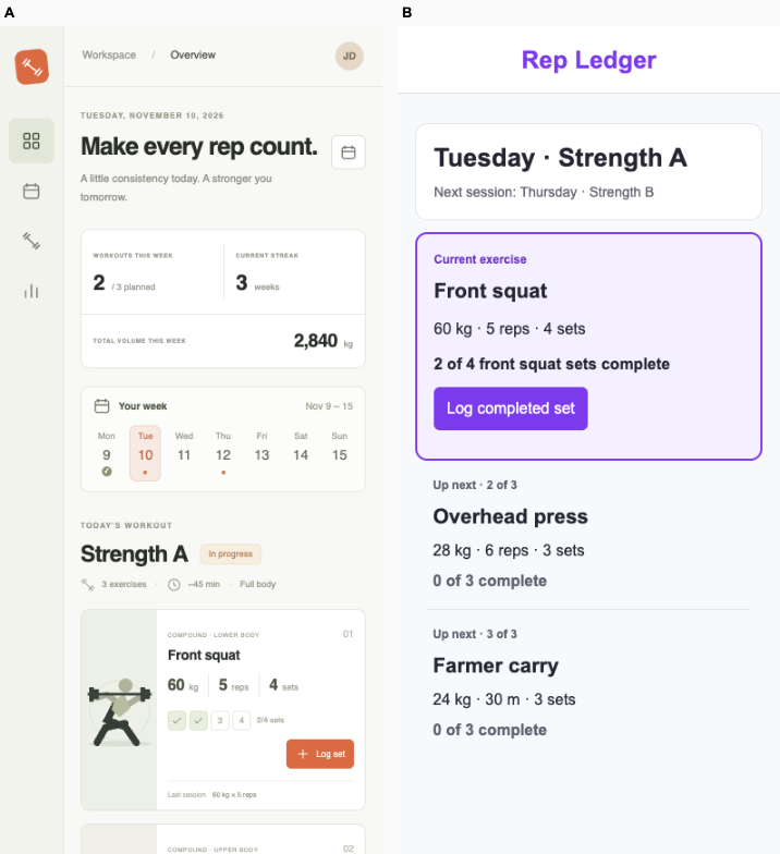
Strength training log · Fix loop

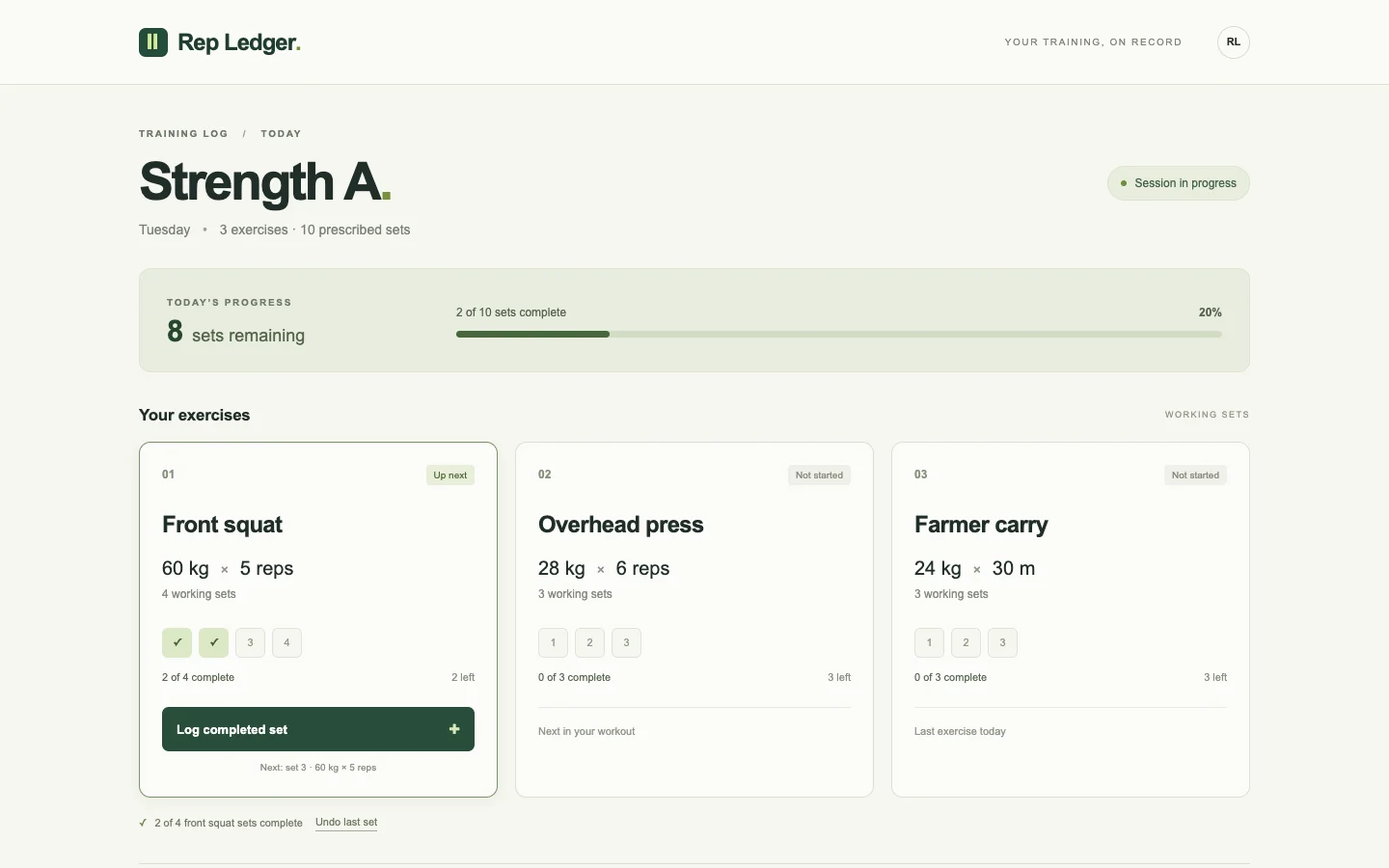
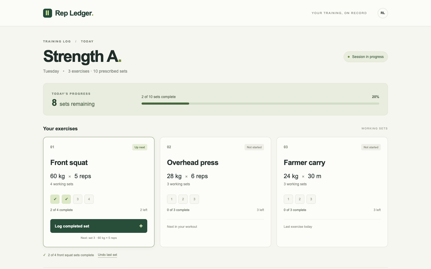
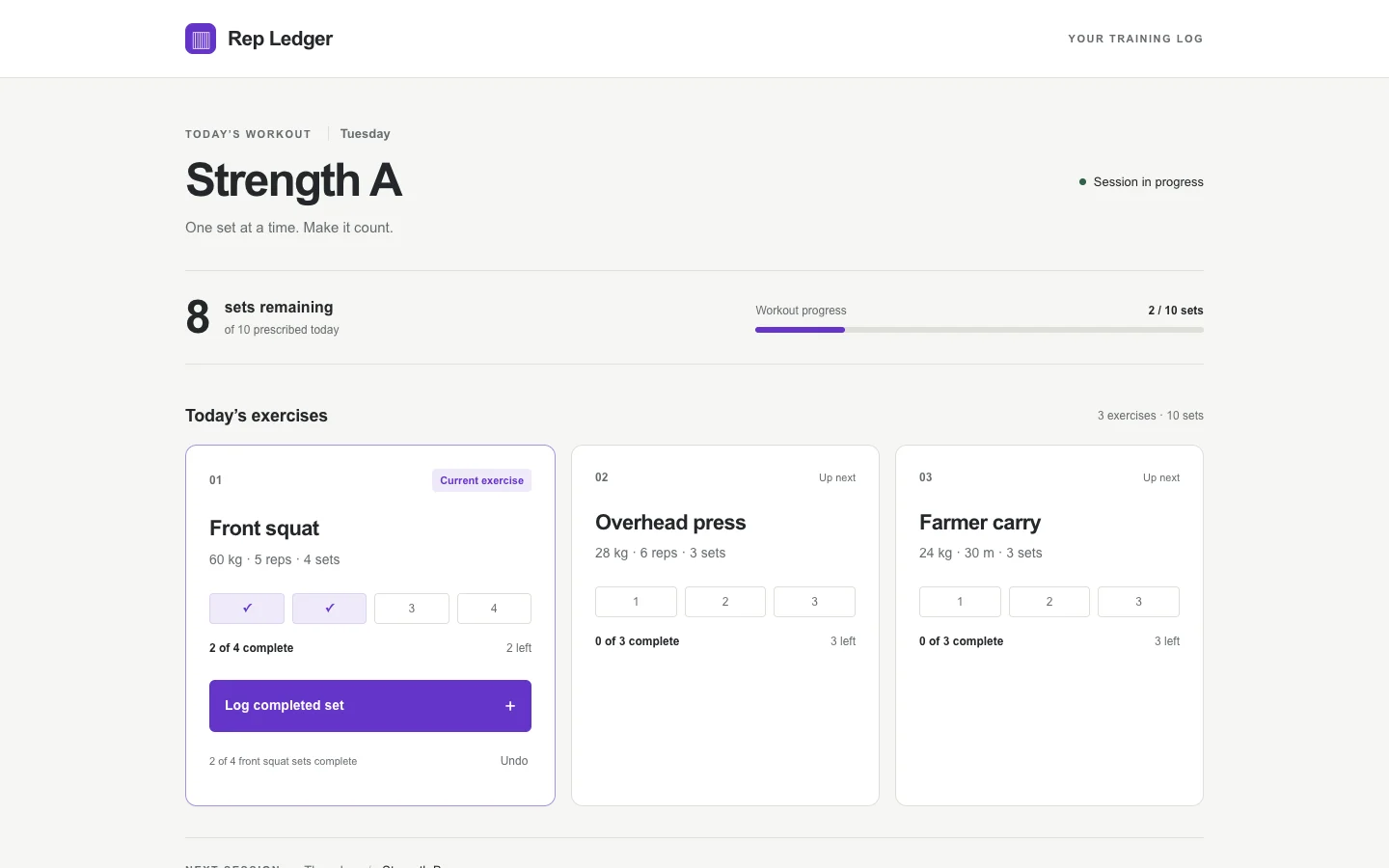
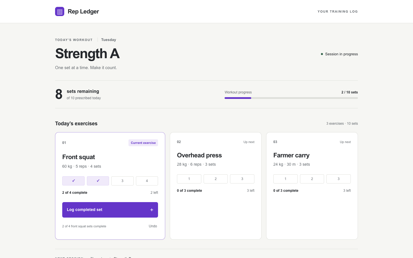
/ · A lifter records the next completed set and sees how many of today’s prescribed sets remain.

Bare agent. One request completed. Source changed. Desktop (original PNG) · Phone

desktop: pass. Logging a set advanced the front squat from two to three of four. mobile: pass. Logging a set advanced the front squat from two to three of four.

Fix loop. blocked: No verified edit task; see the unverified checks in the audit.. Source changed. Desktop · Phone

desktop: pass. Logging a set advanced the front squat from two to three of four. mobile: pass. Logging a set advanced the front squat from two to three of four.

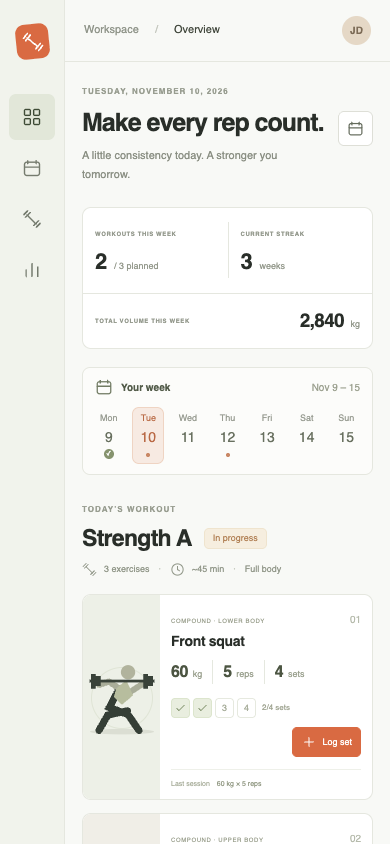
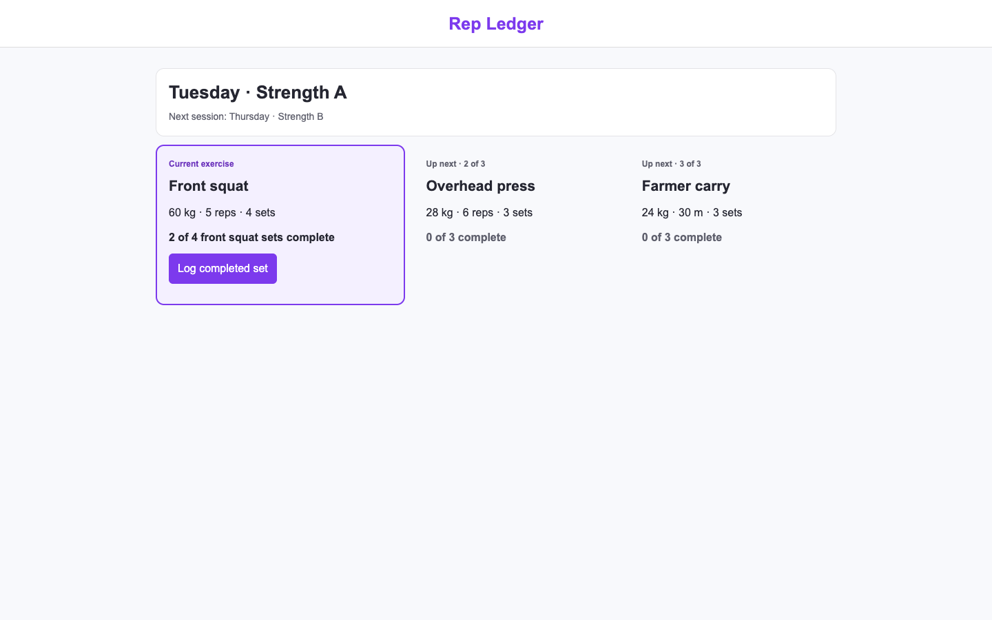
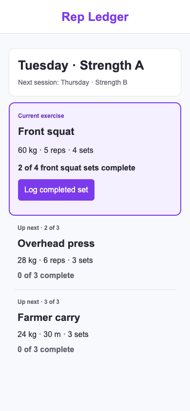
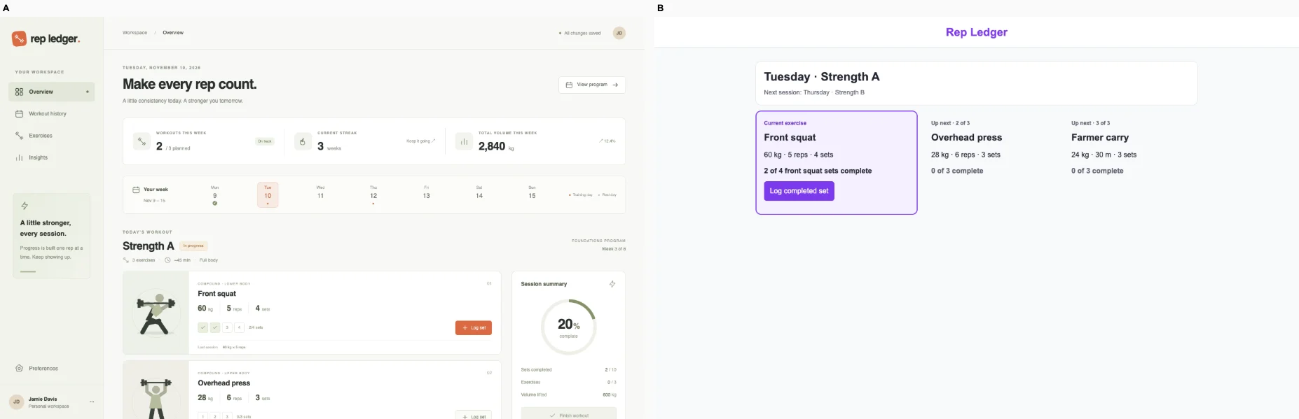
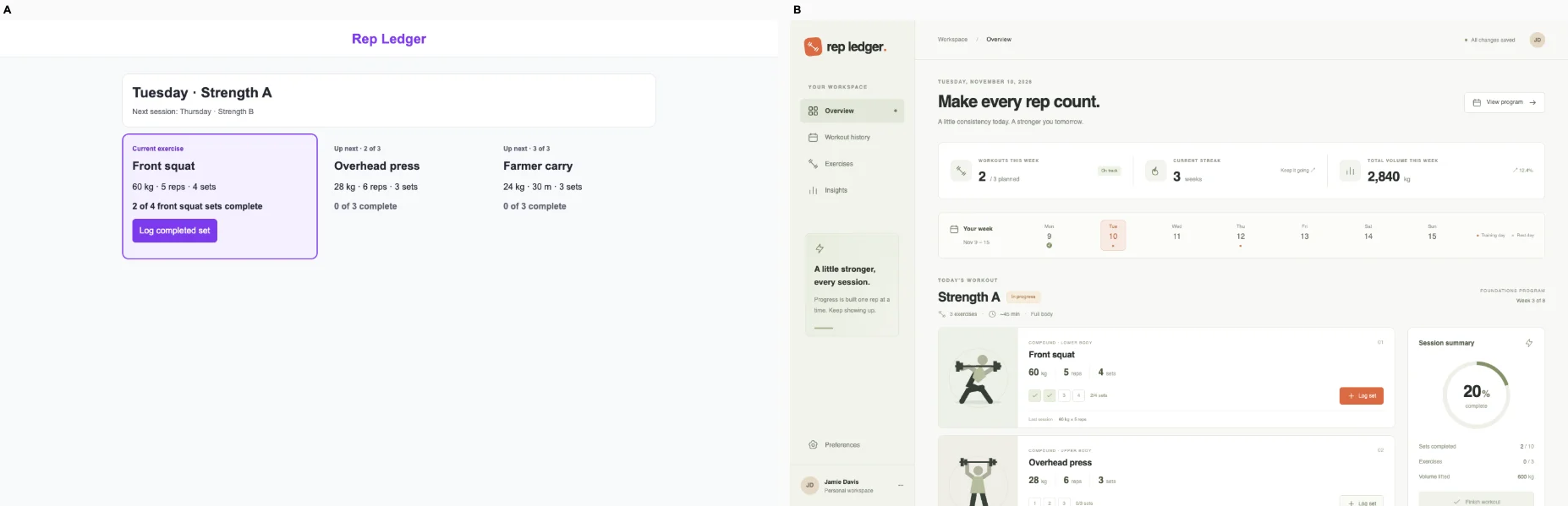
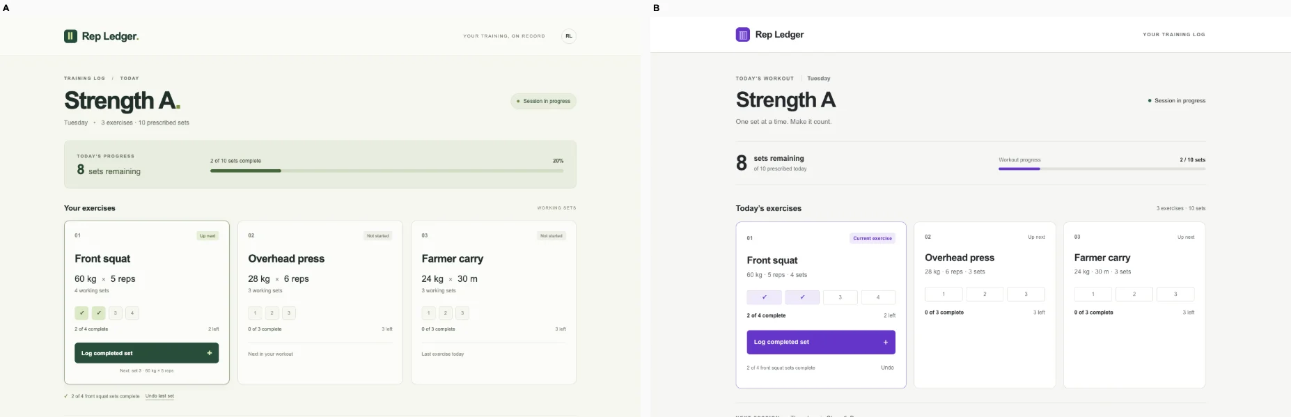
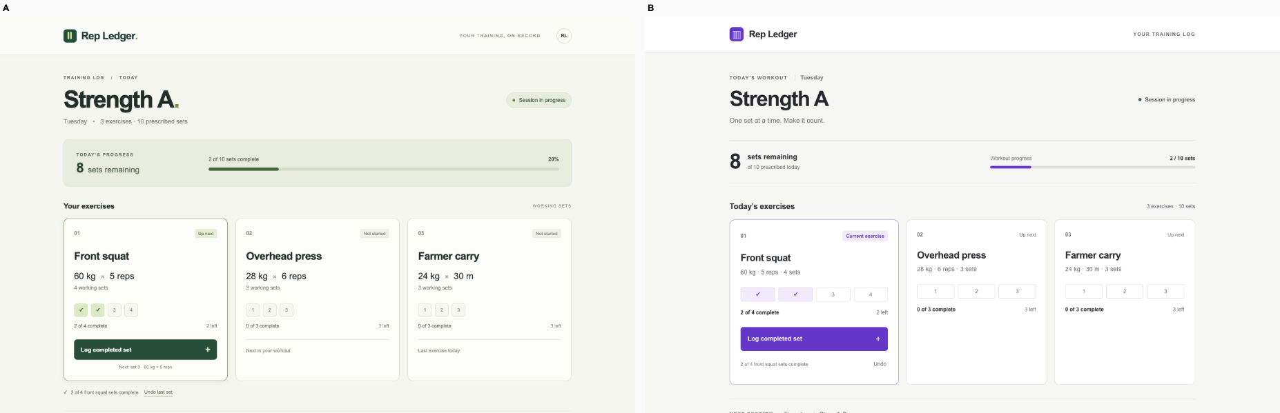
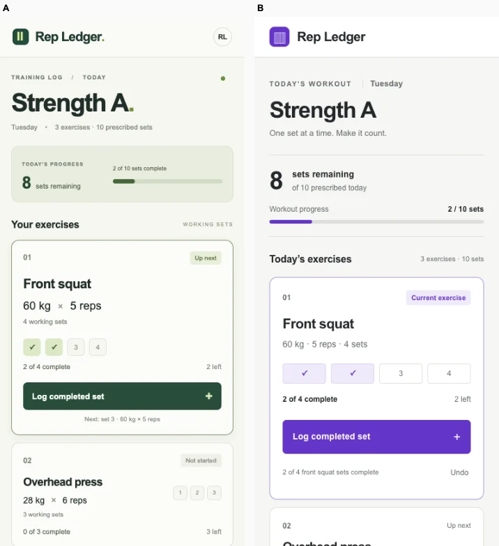
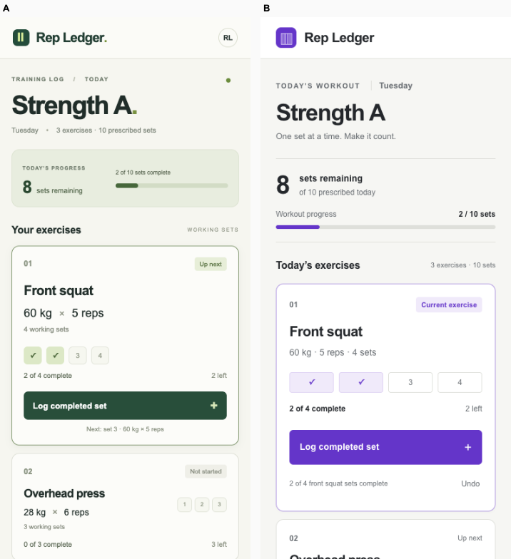
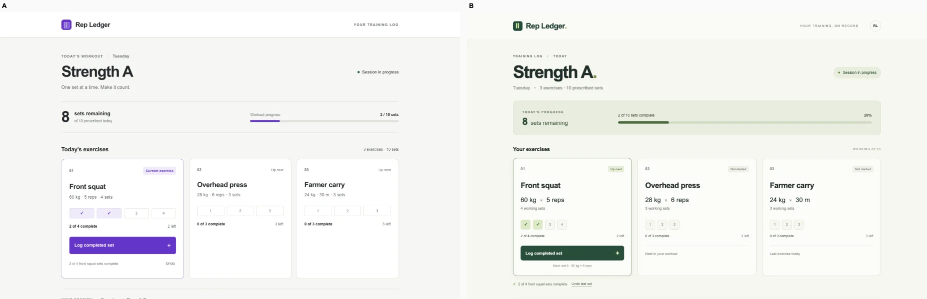
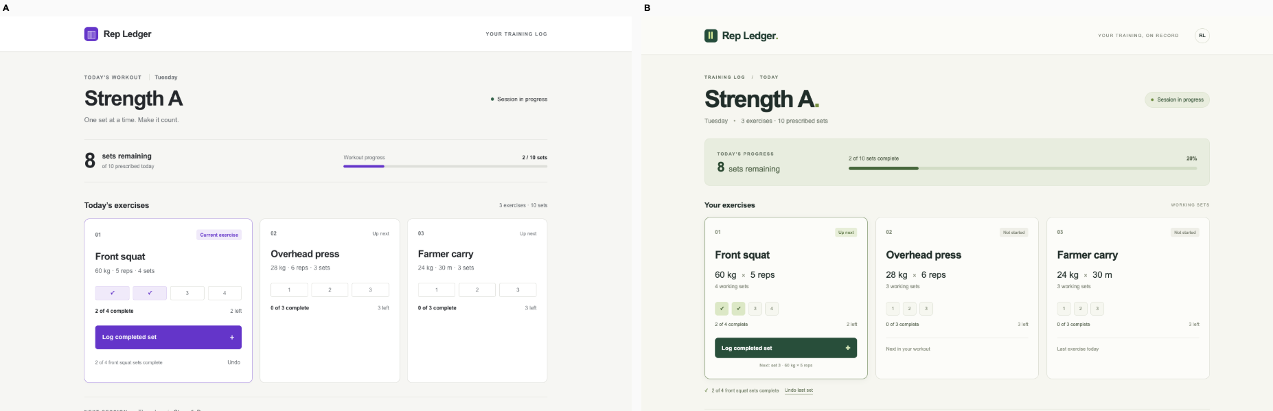
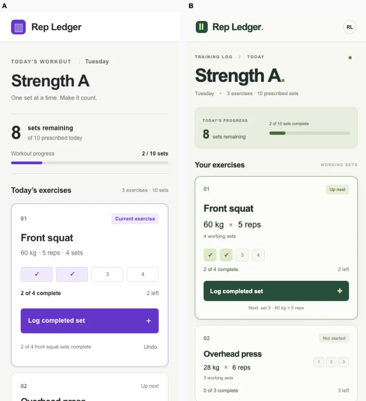
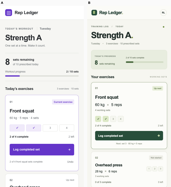
Ballot 1. 5/7 toward fix. Left: bare, right: fix. B makes the next action immediately clear: front squat, 2 of 4 sets complete, and a prominent logging button remain readable on desktop and phone. A provides richer workout evidence through set markers, session totals and exercise illustrations, but its compact text and lower mobile action placement slow the immediate task. Both verified interactions advance completion from two to three sets. Neither phone view clearly states the total prescribed sets remaining today.

B repeats its cohort’s purple branding, pale backgrounds, rounded white cards and sparse layouts, though its current-exercise emphasis is useful and product-specific. A shares its cohort’s muted greens, fine borders, sidebar navigation and editorial dashboard styling, but exercise illustrations, set-level controls and workout progress give it a more distinct identity within that shared system.

Desktop pair (original PNG) · Phone pair (original PNG) · Other left products (original PNG) · Other right products (original PNG)
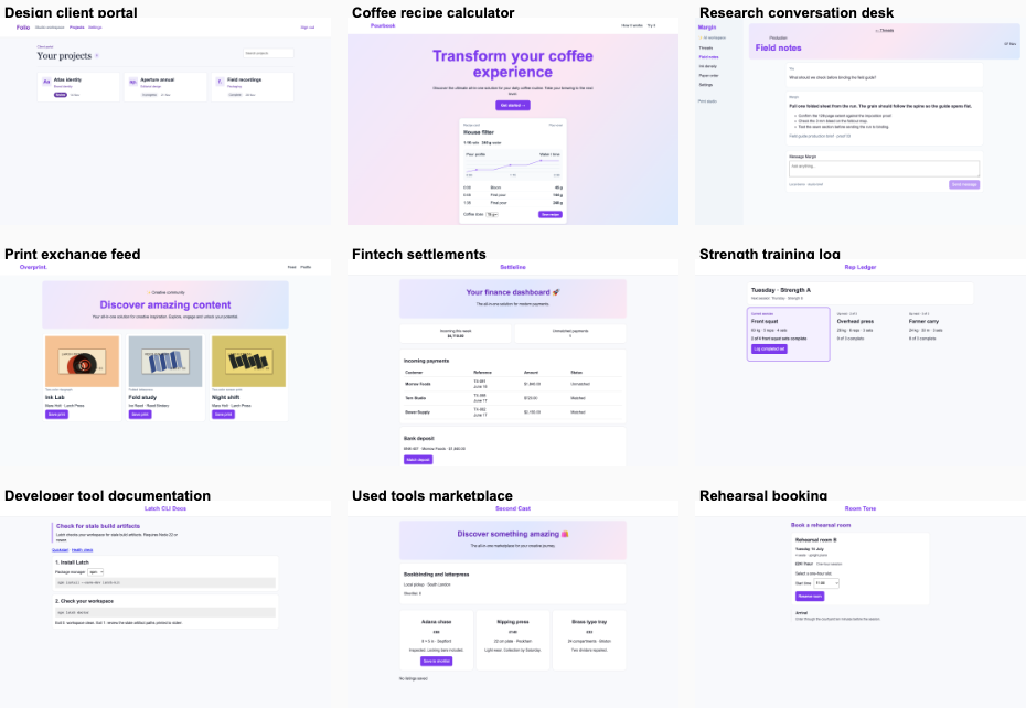
Ballot 2. 5/7 toward fix. Left: fix, right: bare. A puts the current exercise, prescription, completed count and explicit “Log completed set” action first on both screens. B adds useful workout totals, set markers and a session summary, but its motivational heading, metrics and calendar push the working action far down the phone screen; its desktop summary is also small. Both verified interactions advance front squat from two to three of four. B has more refined typography and richer progress evidence, while A better supports the immediate logging task.

A repeats its cohort’s purple accents, pale backgrounds, simple white panels and sparse layouts. B repeats its cohort’s warm neutral surfaces, olive accents, compact navigation, editorial headings and bordered modules. B’s exercise illustrations, prescription groups and set markers give those shared conventions useful lifting-specific meaning; A’s focused current-exercise treatment also fits the task. Neither establishes a clearly stronger identity independent of its cohort.

Desktop pair (original PNG) · Phone pair (original PNG) · Other left products (original PNG) · Other right products (original PNG)
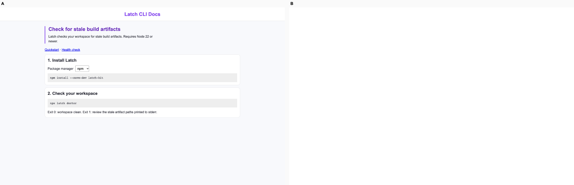
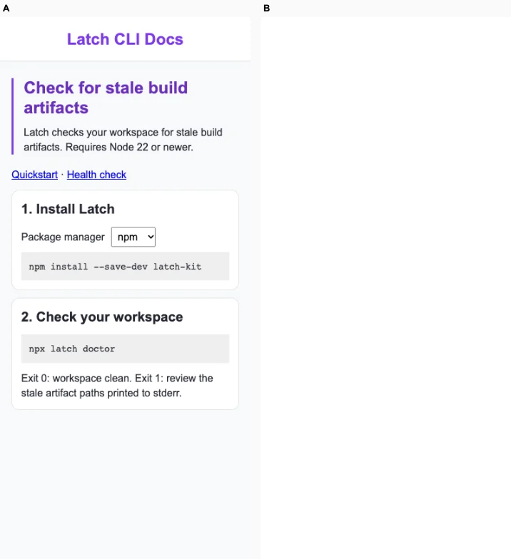
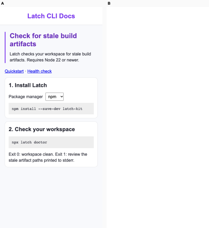
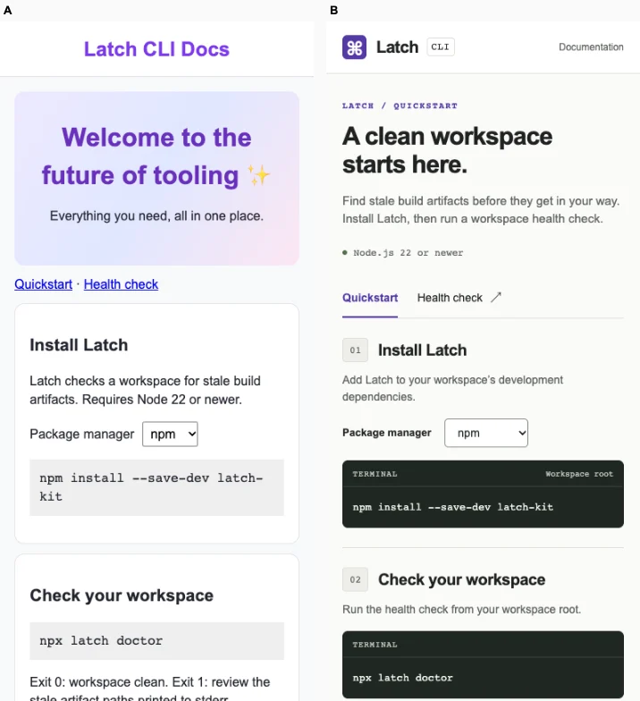
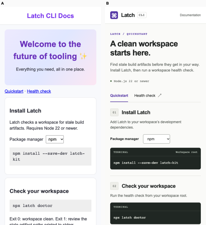
Developer tool documentation · Fix loop

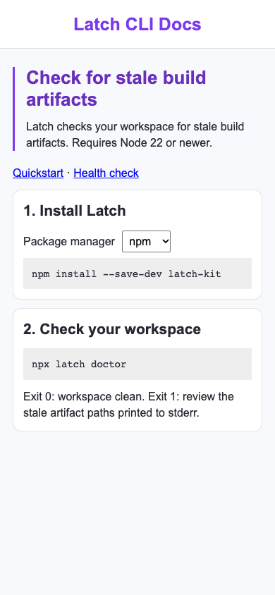
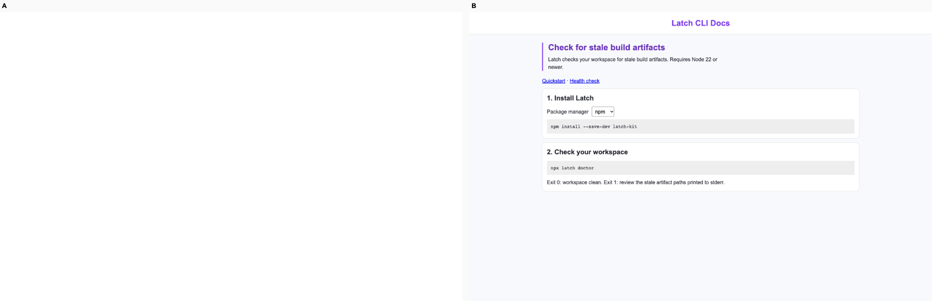
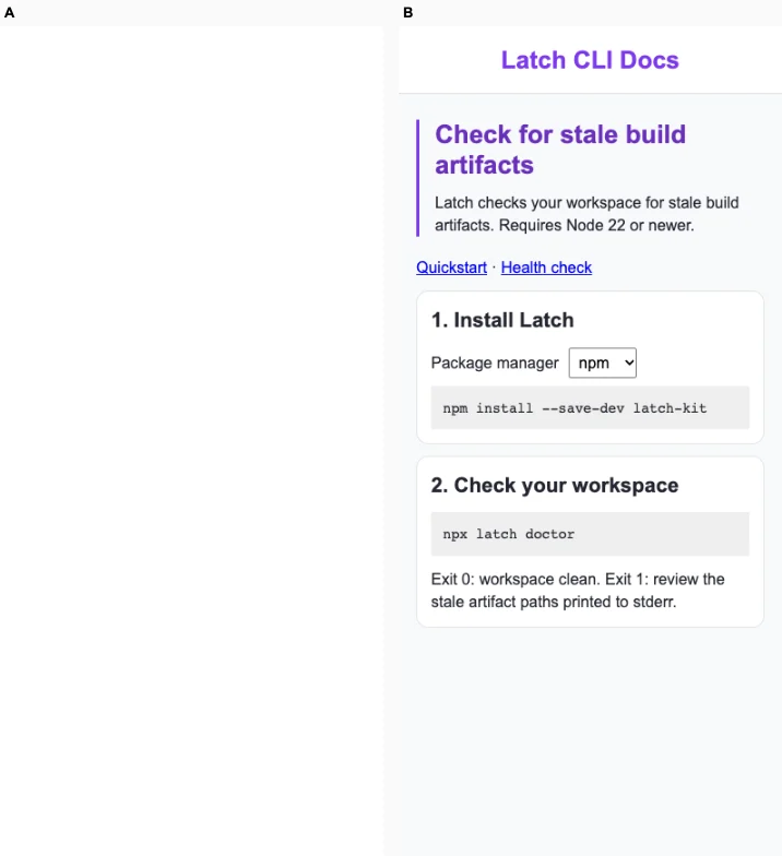
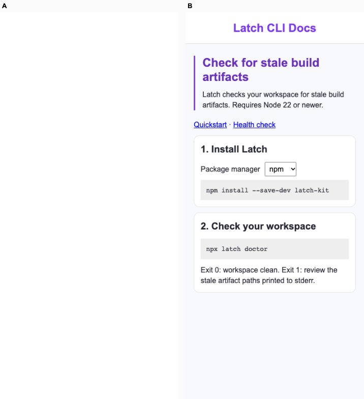
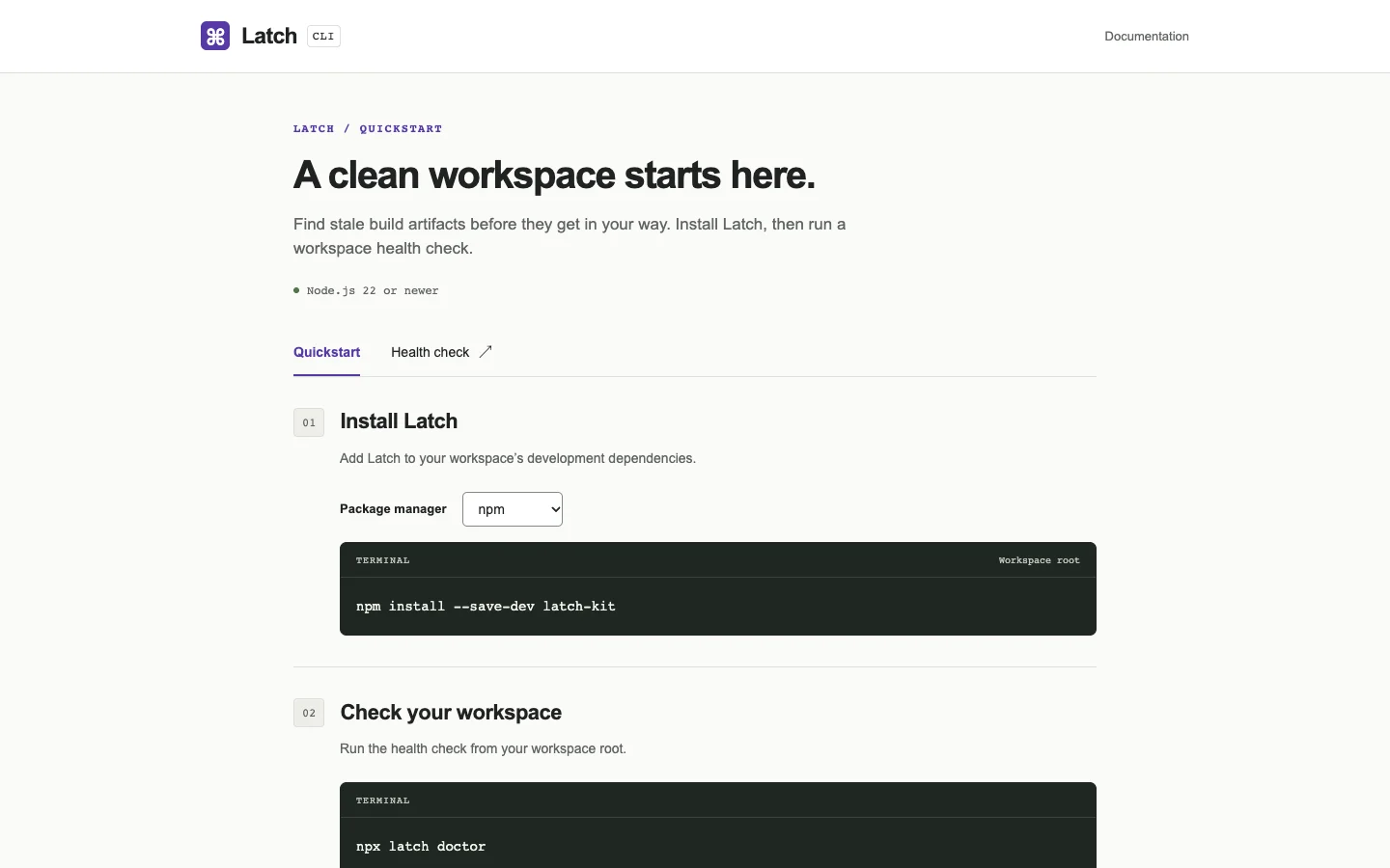
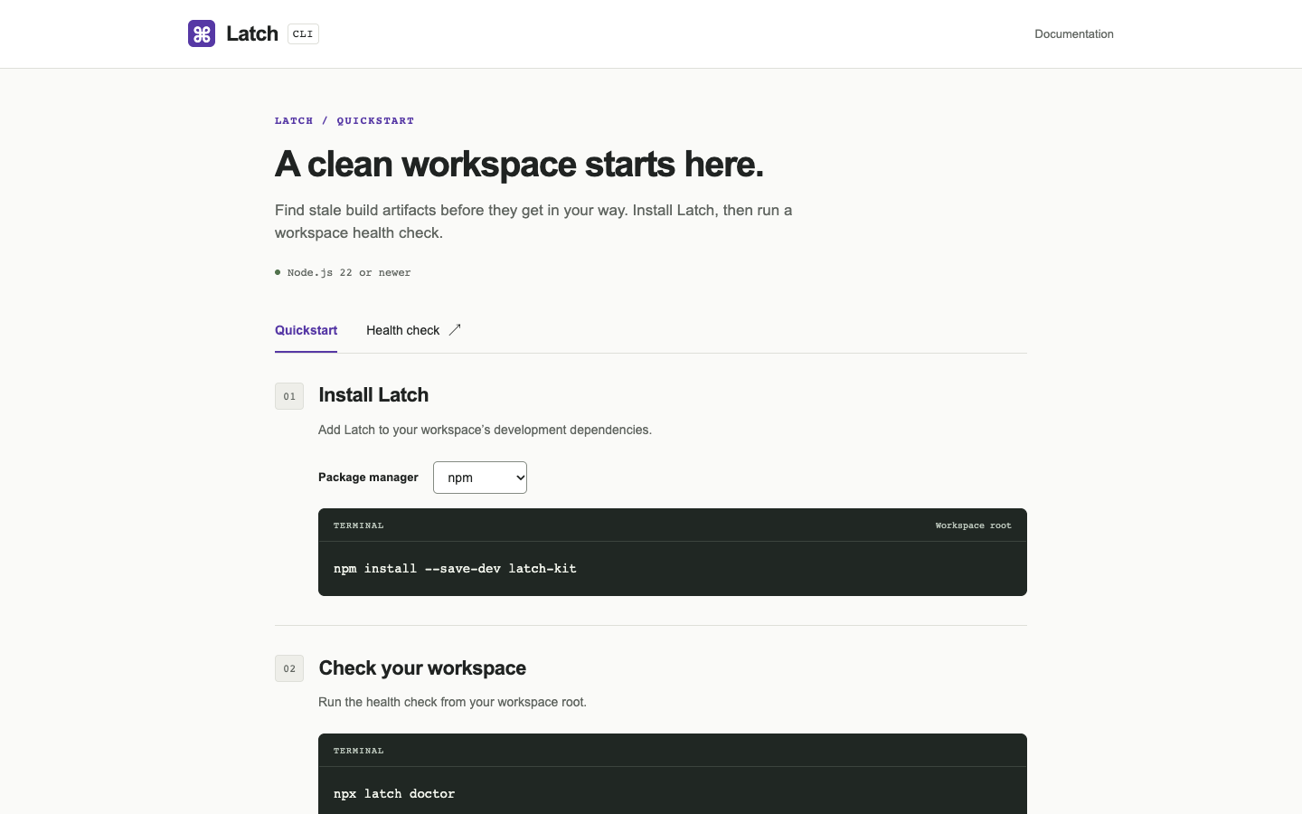
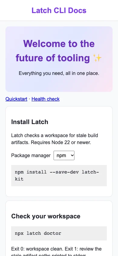
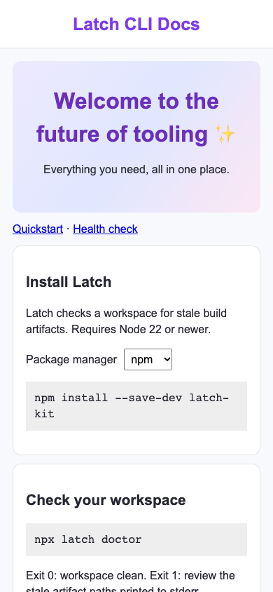
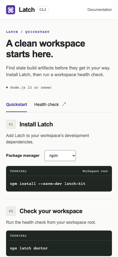
/ · A maintainer finds the correct install and health-check commands for their package manager.

Bare agent. One request completed; final route returned HTTP 500. Source changed. Desktop · Phone

desktop: fail. Target route returned HTTP 500 mobile: fail. Target route returned HTTP 500

Fix loop. blocked: No verified edit task; see the unverified checks in the audit.. Source changed. Desktop · Phone

desktop: pass. Selecting pnpm displayed the correct install command. mobile: pass. Selecting pnpm displayed the correct install command.

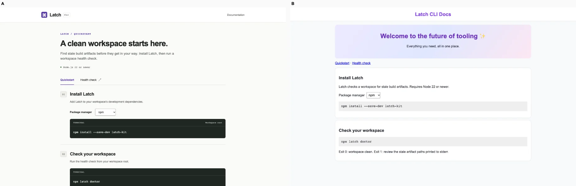
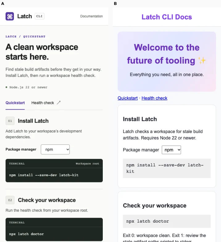
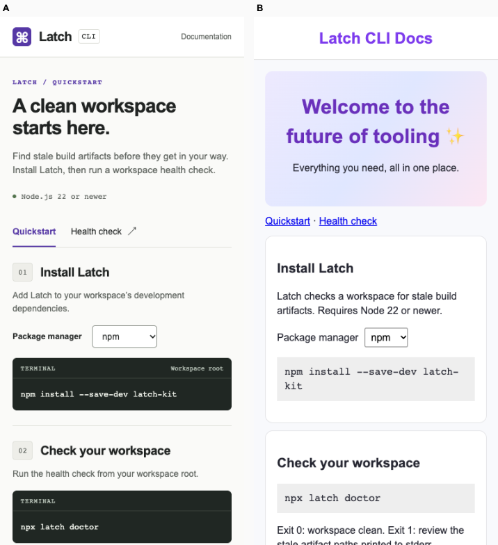
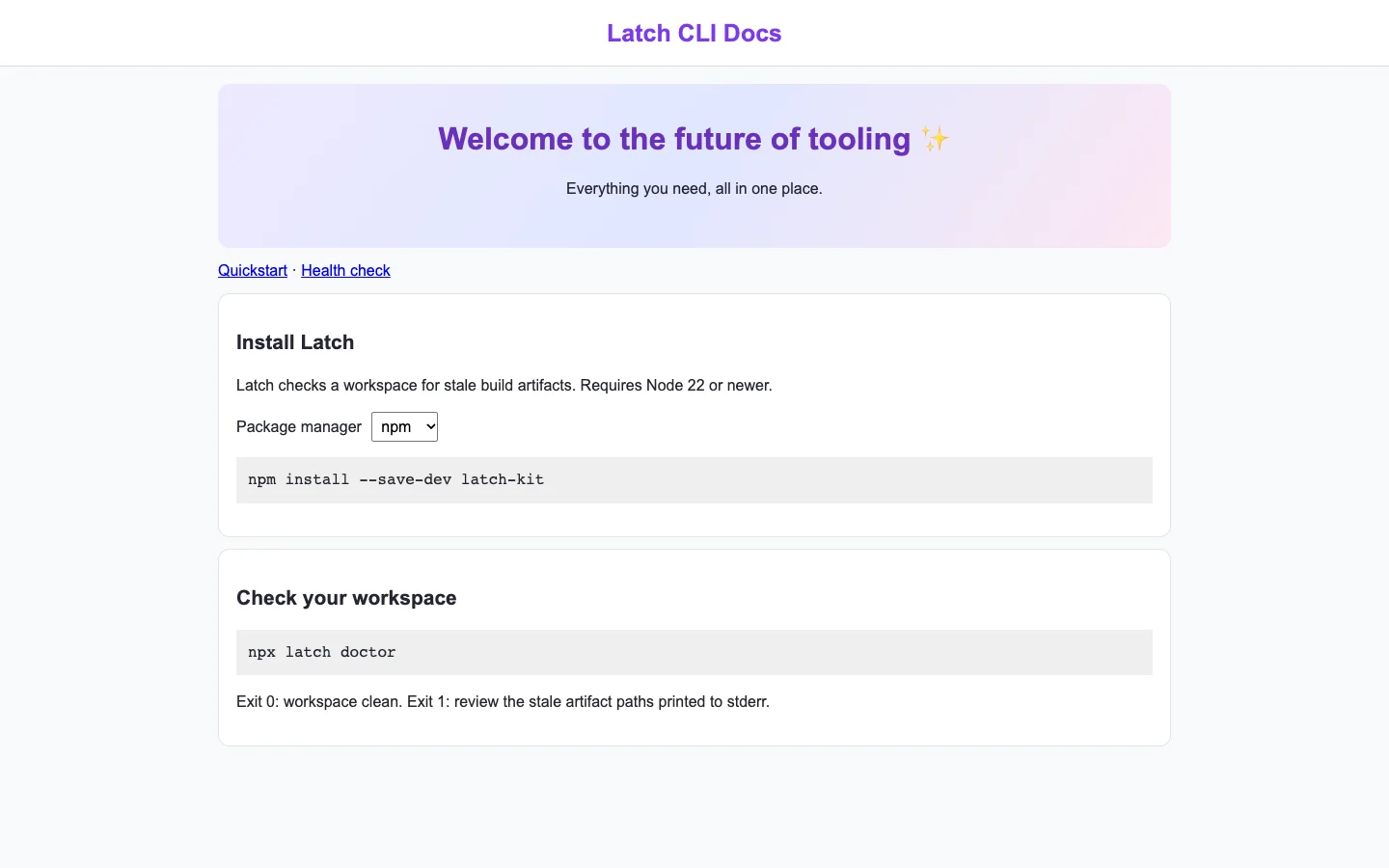
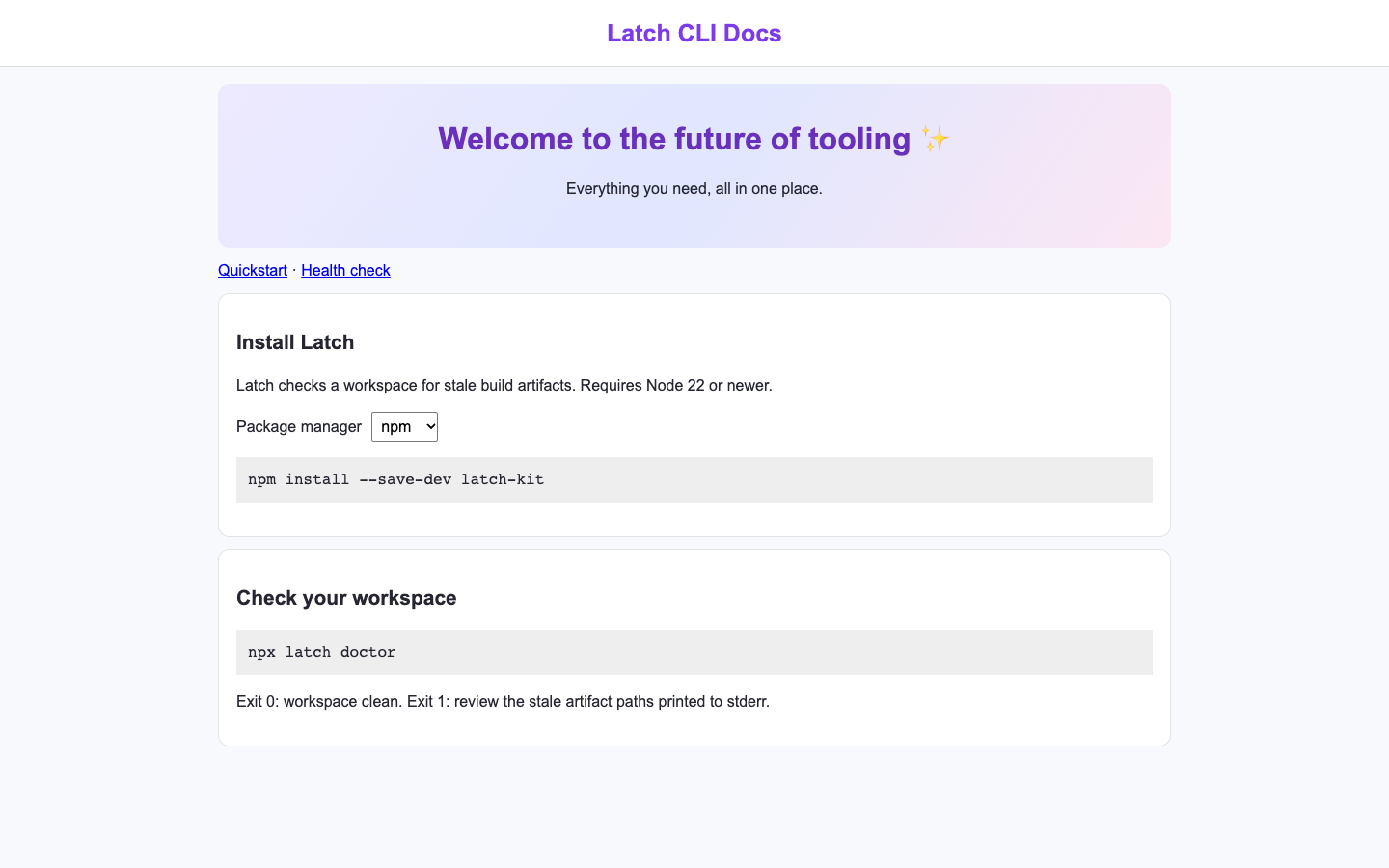
Ballot 1. 7/7 toward fix. Left: bare, right: fix. A is blank on desktop and phone, with verified HTTP 500 failures. B presents a clear install-then-check sequence, package-manager selector, Node 22 requirement, doctor command and exit-code guidance. Selecting pnpm produced the correct install command on both sizes. Its phone layout remains readable and usable, though the desktop composition is sparse and visually basic.

B repeats its cohort’s purple branding, pale background, centered header and rounded white panels. Its compact documentation flow, command blocks and concrete diagnostic guidance provide some product-specific differentiation from the cohort’s promotional banners and card grids. A’s blank render provides no assessable identity to compare with its cohort’s denser, editorial interfaces.

Desktop pair · Phone pair (original PNG) · Other left products (original PNG) · Other right products (original PNG)
Ballot 2. 7/7 toward fix. Left: fix, right: bare. A presents a clear install-then-check sequence, a package-manager selector, concrete commands, Node 22 requirements and exit-code guidance. Its phone layout remains readable and usable, and selecting pnpm produced the correct command on both viewports. B renders blank and its route returned HTTP 500, preventing the task entirely. A’s styling is basic, but its working actions and relevant instructions are prominent.

A repeats its cohort’s purple headings, pale background, rounded white cards and simple command panels; its identity is therefore only modestly distinctive, though the compact documentation sequence fits this product. B’s cohort shows more varied editorial typography, muted palettes and domain-specific layouts, but none of that is visible in B’s blank target. Blankness provides no evidence of a distinctive product design.

Desktop pair · Phone pair (original PNG) · Other left products (original PNG) · Other right products (original PNG)
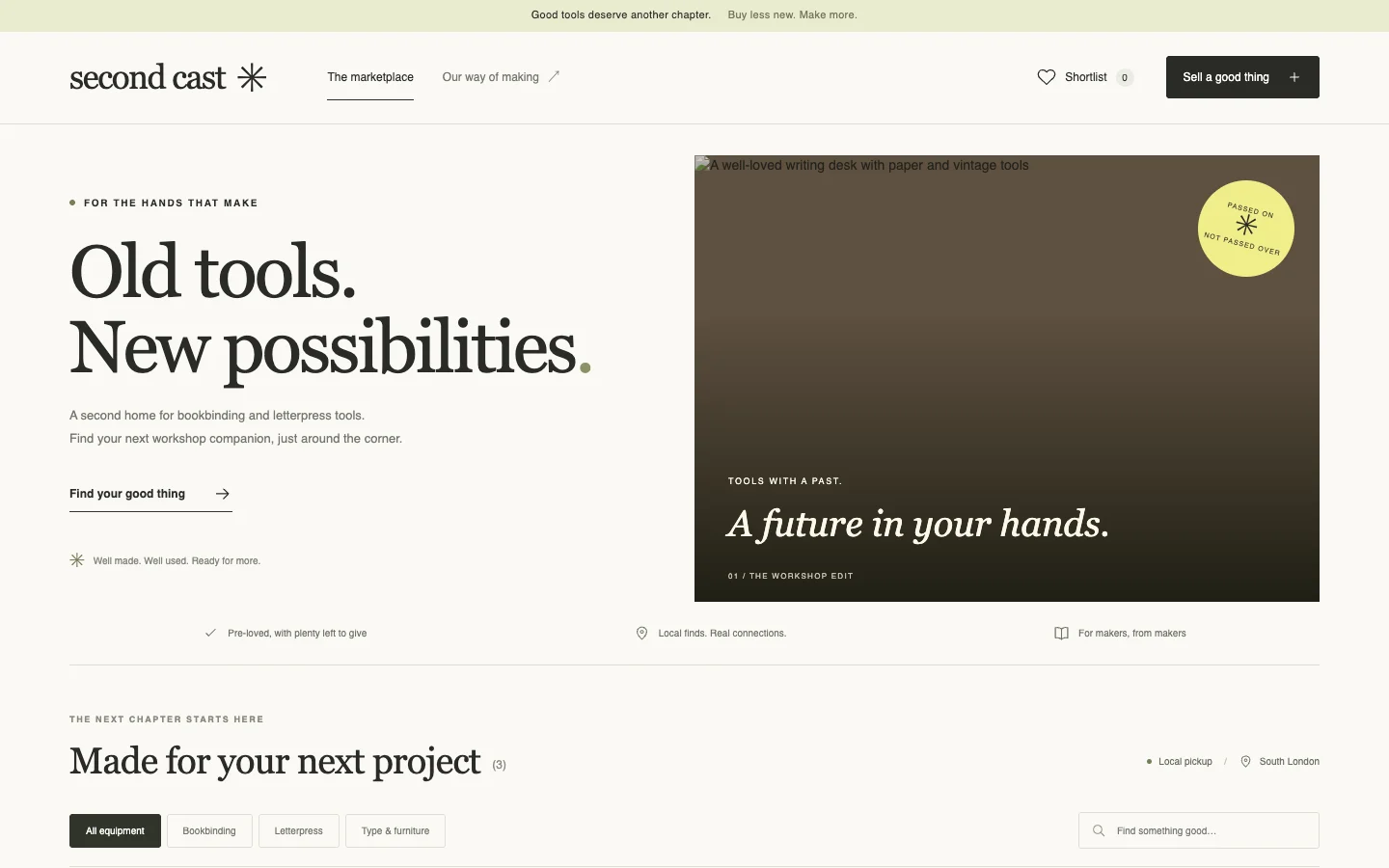
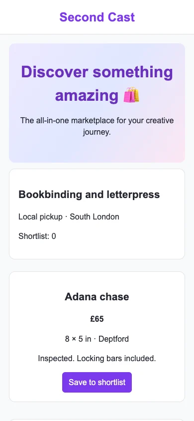
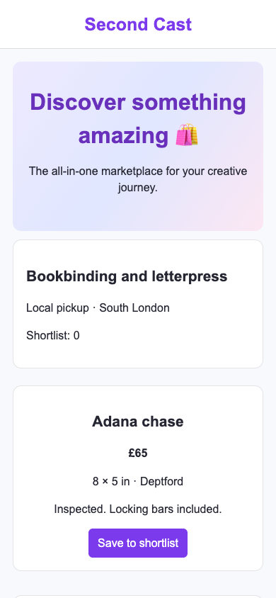
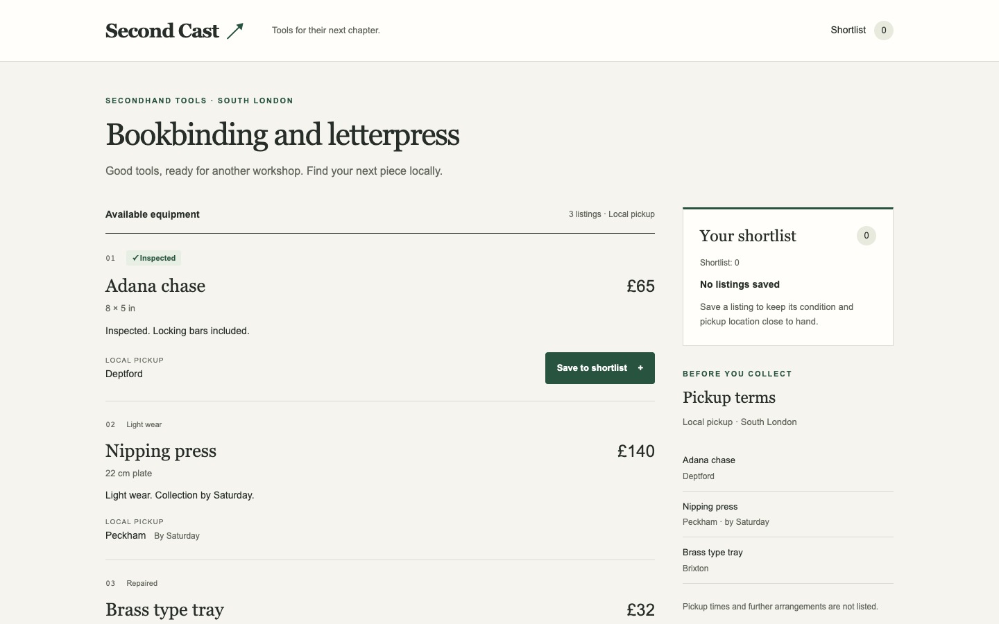
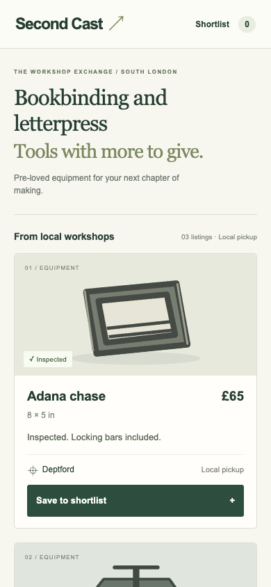
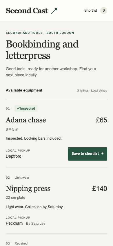
Used tools marketplace · Bare agent

/ · A bookbinder saves an inspected listing to their shortlist and checks the pickup terms.

Bare agent. One request completed. Source changed. Desktop (original PNG) · Phone
desktop: pass. The Adana chase entered the shortlist and the control marked it saved. mobile: pass. The Adana chase entered the shortlist and the control marked it saved.

Fix loop. regression: / · Landing message: C to N/A. Source unchanged. Desktop (original PNG) · Phone (original PNG)
desktop: pass. The Adana chase entered the shortlist and the control marked it saved. mobile: pass. The Adana chase entered the shortlist and the control marked it saved.

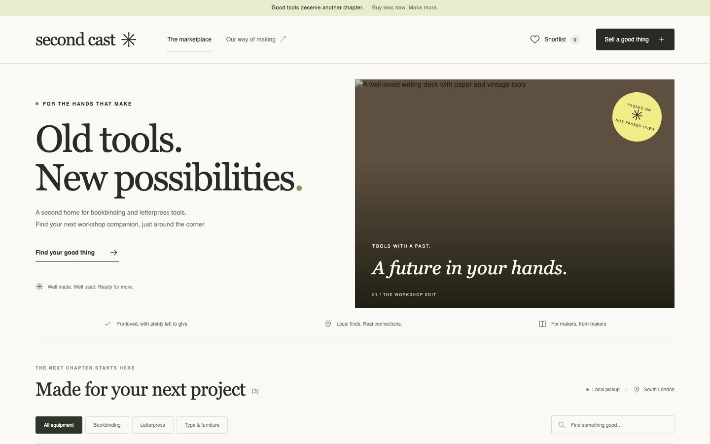
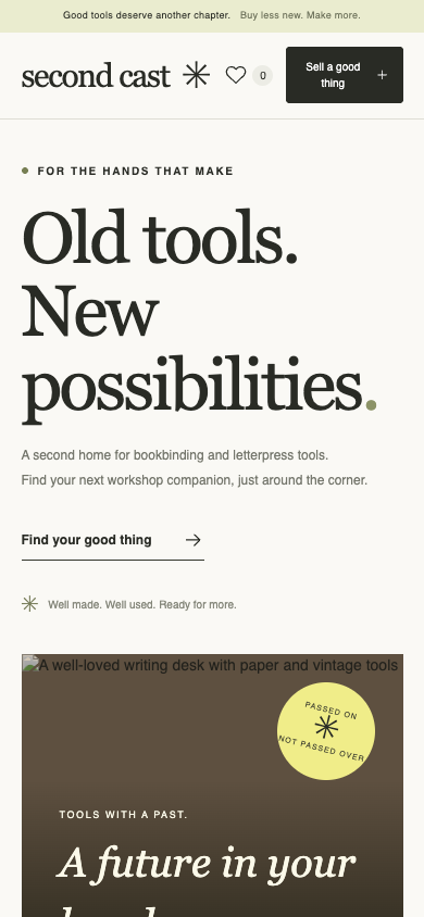
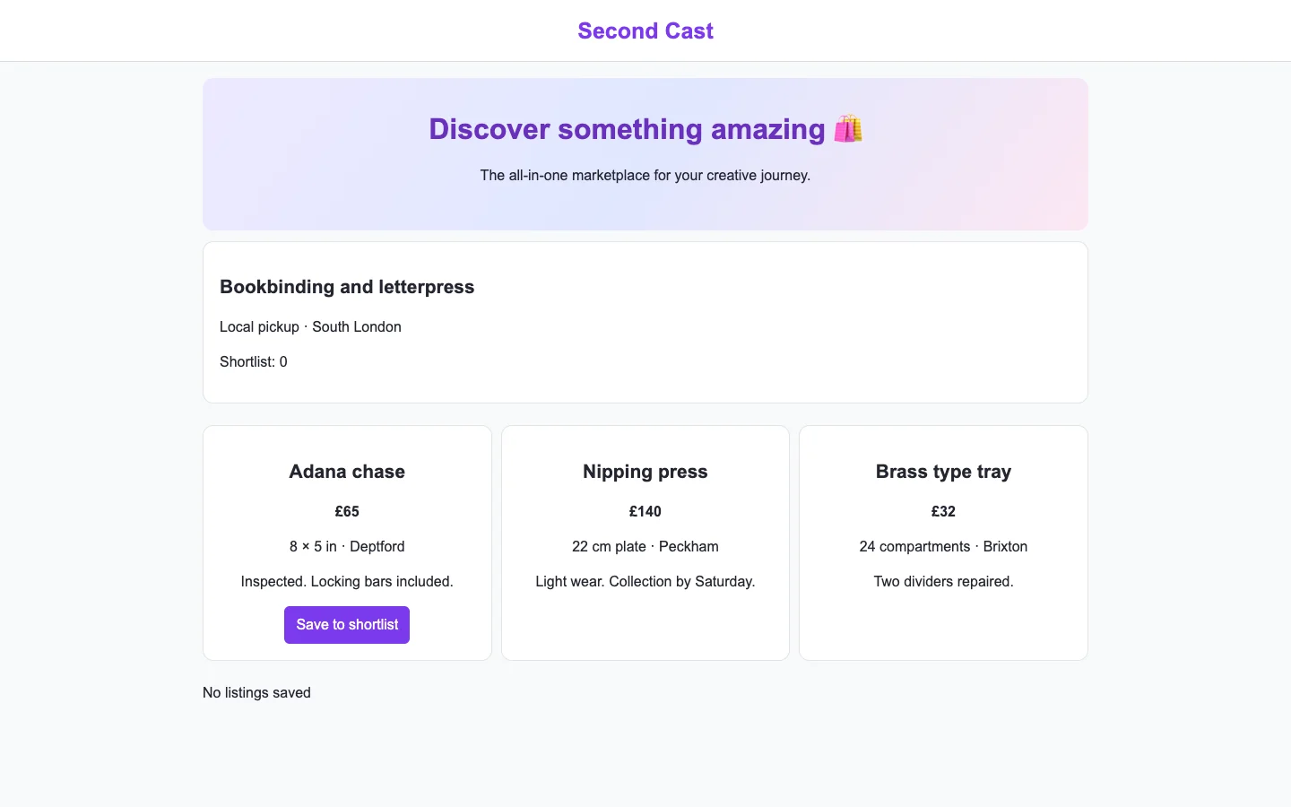
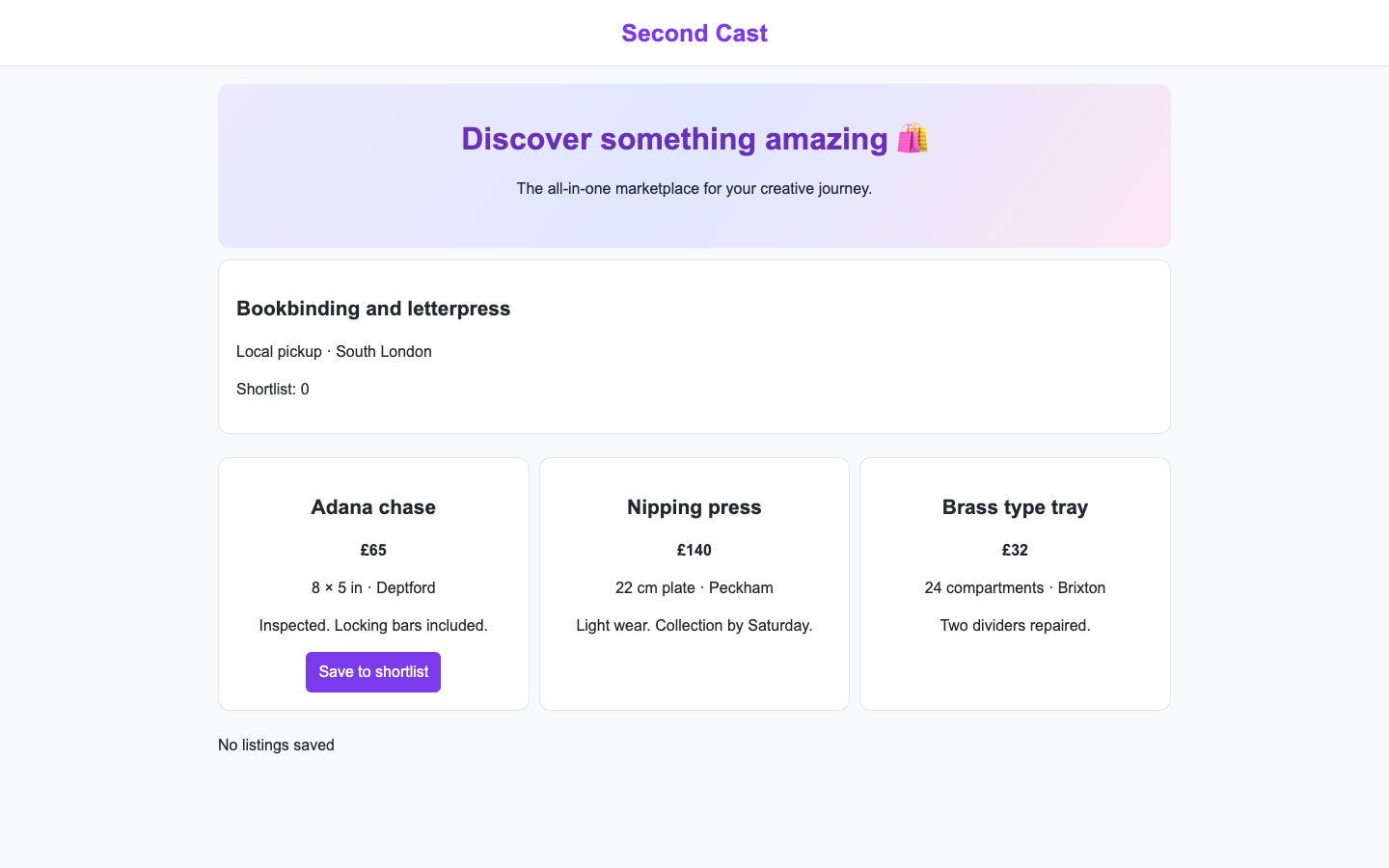
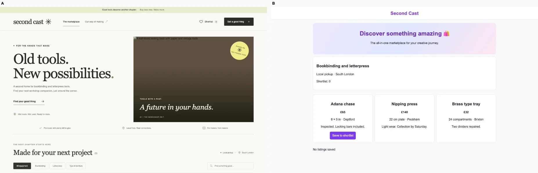
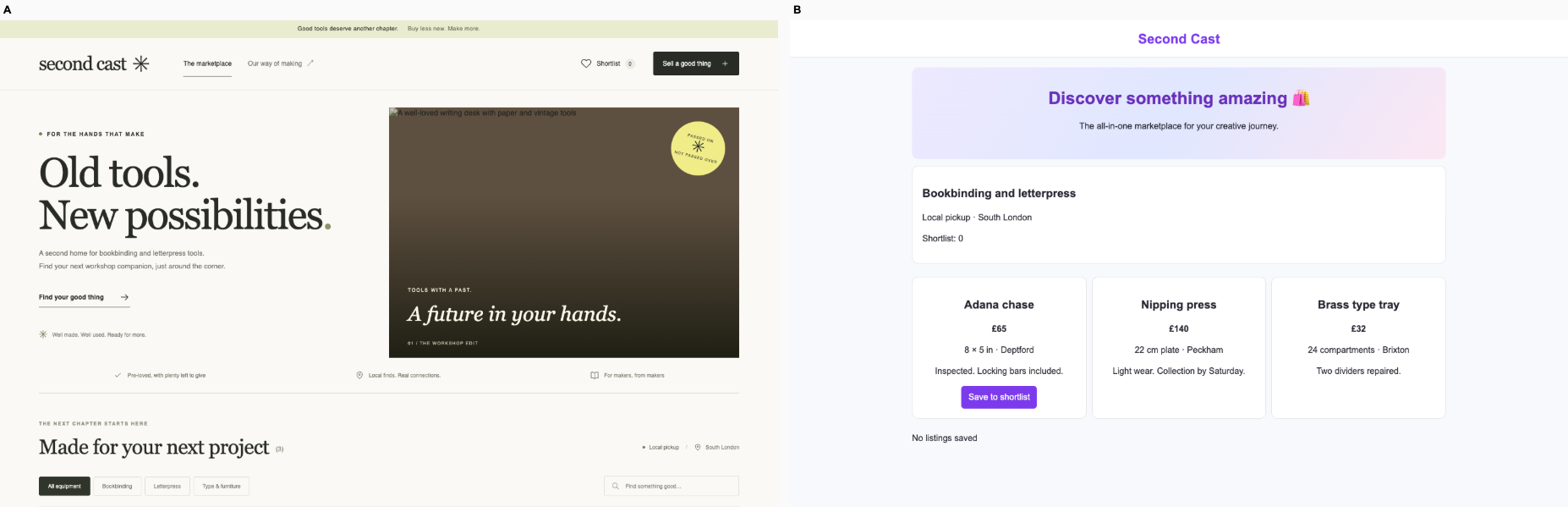
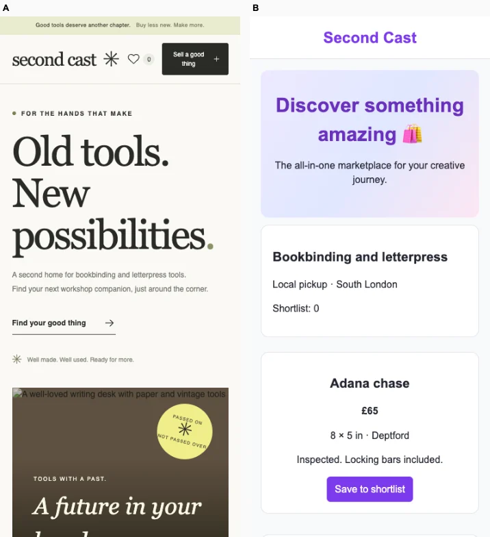
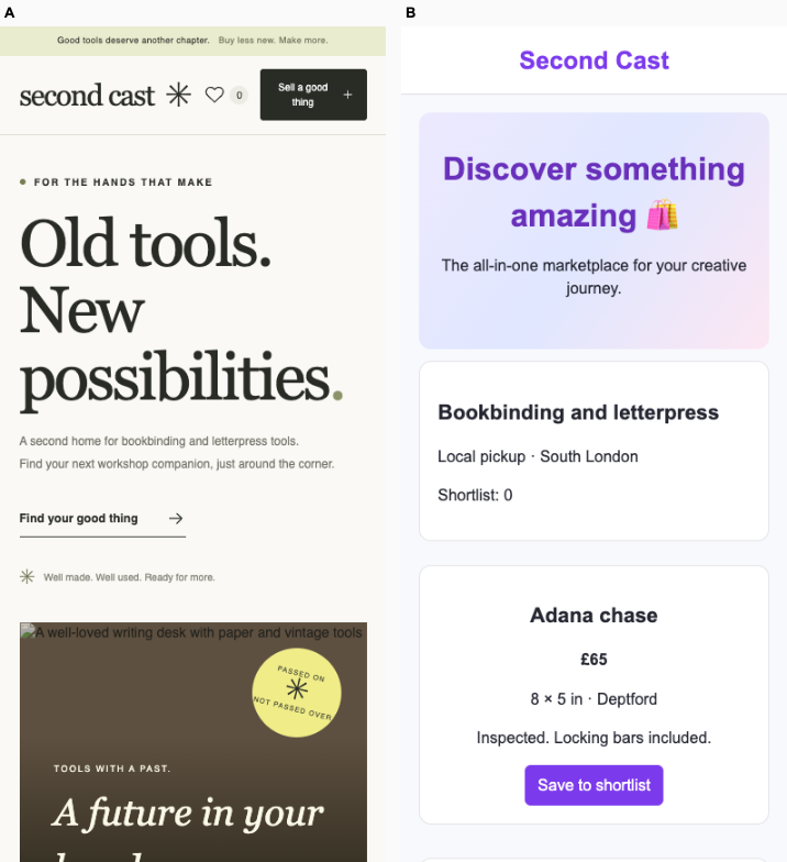
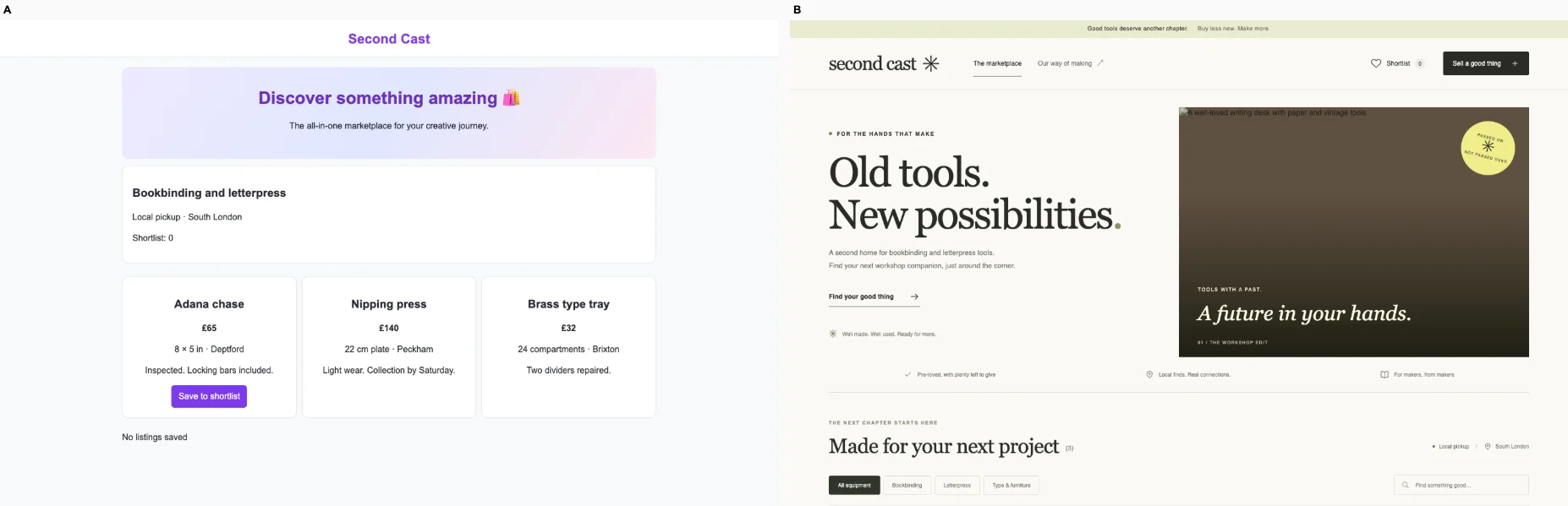
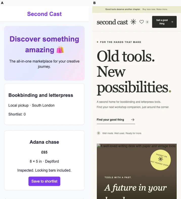
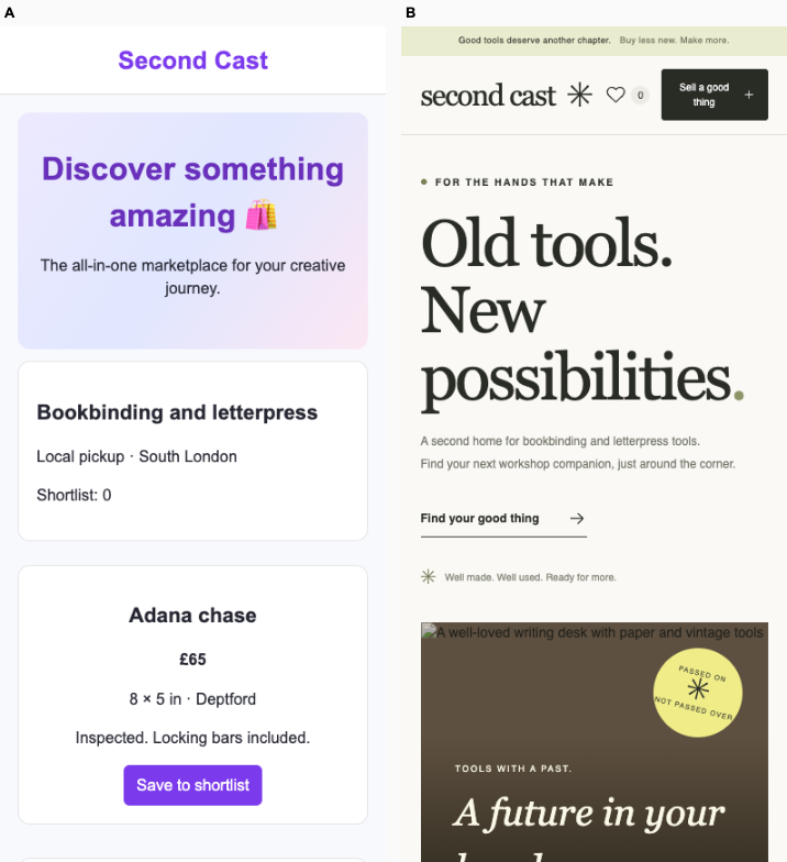
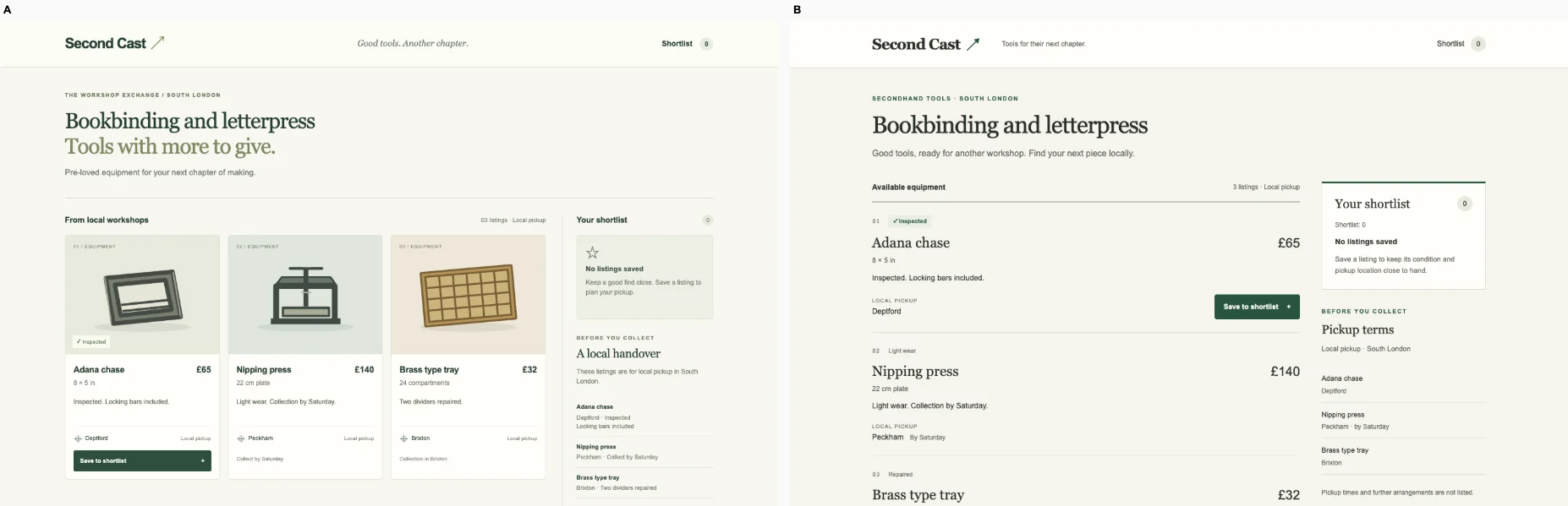
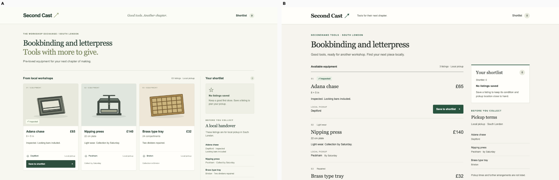
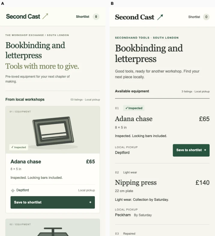
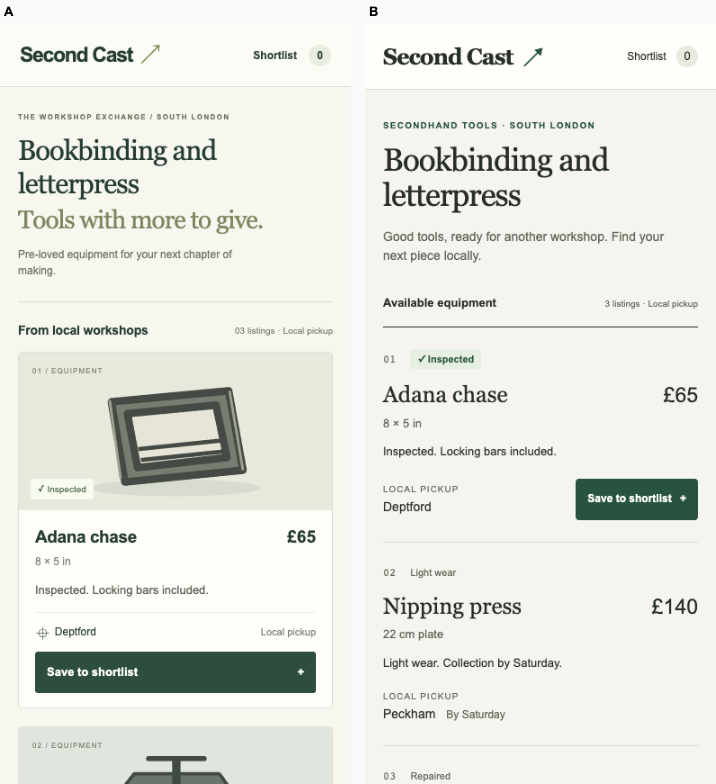
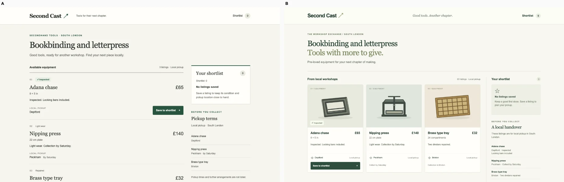
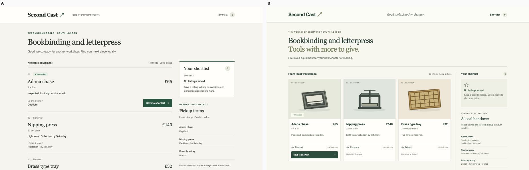
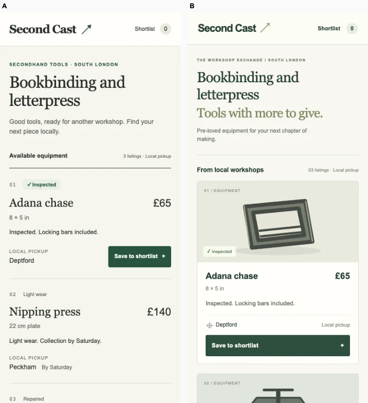
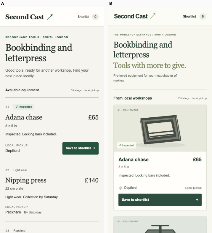
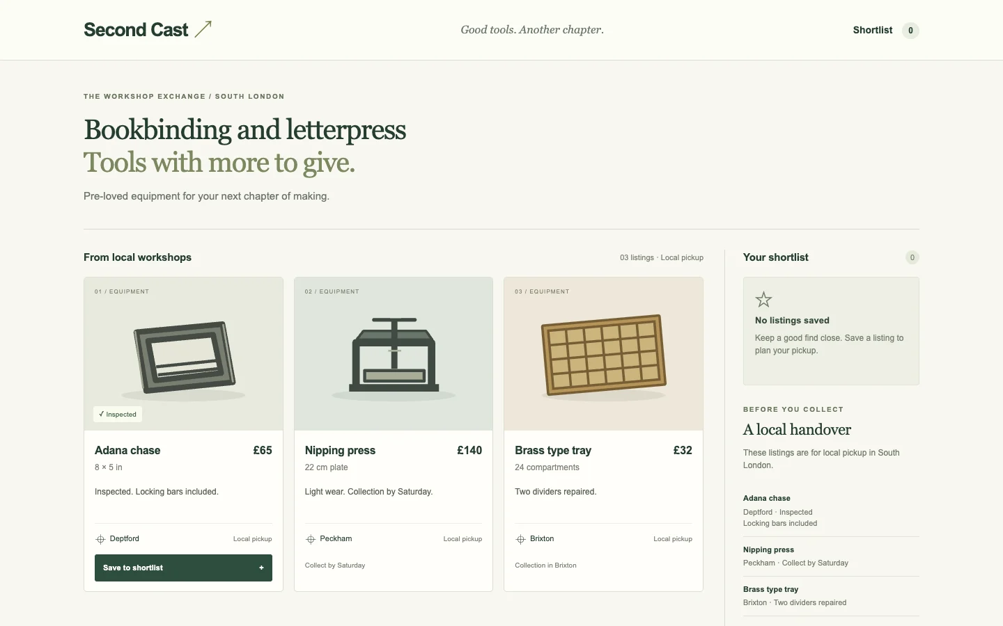
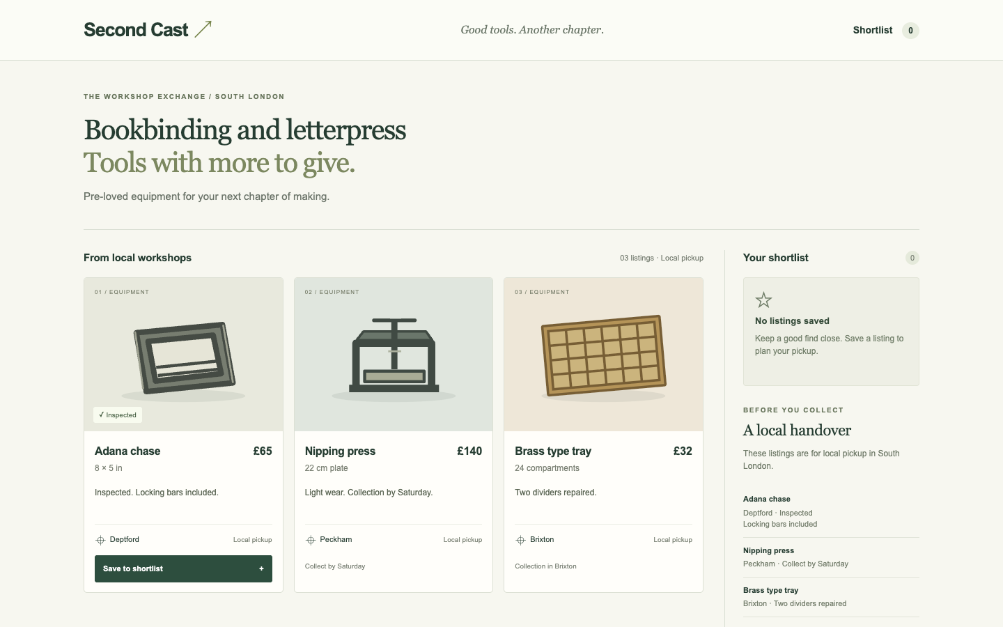
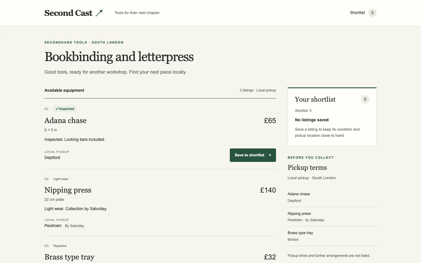
Ballot 1. 3/7 toward fix. Left: bare, right: fix. A has more intentional typography, restrained color and craft-specific language, but its oversized hero delays the listing decision, especially on mobile, and its hero image is broken. B exposes the Adana chase price, dimensions, location, inspection note and save action much sooner; the neighboring press also shows a collection deadline. Its generic promotional banner adds little. Verified saving and saved feedback succeed equally on both devices.

B closely repeats its cohort’s purple branding, pastel gradient banners, centered promotional headings and white rounded cards across unrelated domains. A also shares its cohort’s cream surfaces, muted green accents, editorial headings, fine rules and spacious layouts; its craft identity is therefore only moderately distinctive, though the secondhand-tool language and workshop framing give it more product character.

Desktop pair (original PNG) · Phone pair (original PNG) · Other left products (original PNG) · Other right products (original PNG)

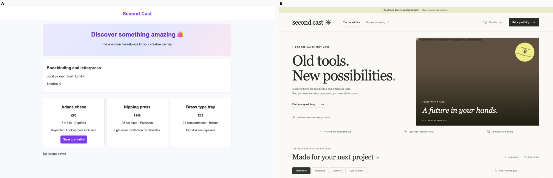
Ballot 2. 3/7 toward fix. Left: fix, right: bare. B gives the marketplace a coherent bookbinding identity through editorial typography, workshop language and equipment filters. A makes the actual task easier to discover: the inspected Adana chase, price, location and save action appear immediately, including on phone. B's oversized mobile introduction pushes listings below the fold, and its broken hero image weakens product evidence. Both verified save interactions succeed; neither render clearly establishes pickup terms for the Adana chase beyond local pickup and location.

A closely repeats its cohort's purple accents, pale gradient banners, centered promotional copy and default cards. B improves specificity, but shares cream backgrounds, muted olive accents, fine rules and editorial layouts with its own cohort, particularly the coffee calculator and print exchange. Its identity is more considered, though still recognizably part of a house style.

Desktop pair (original PNG) · Phone pair (original PNG) · Other left products (original PNG) · Other right products (original PNG)

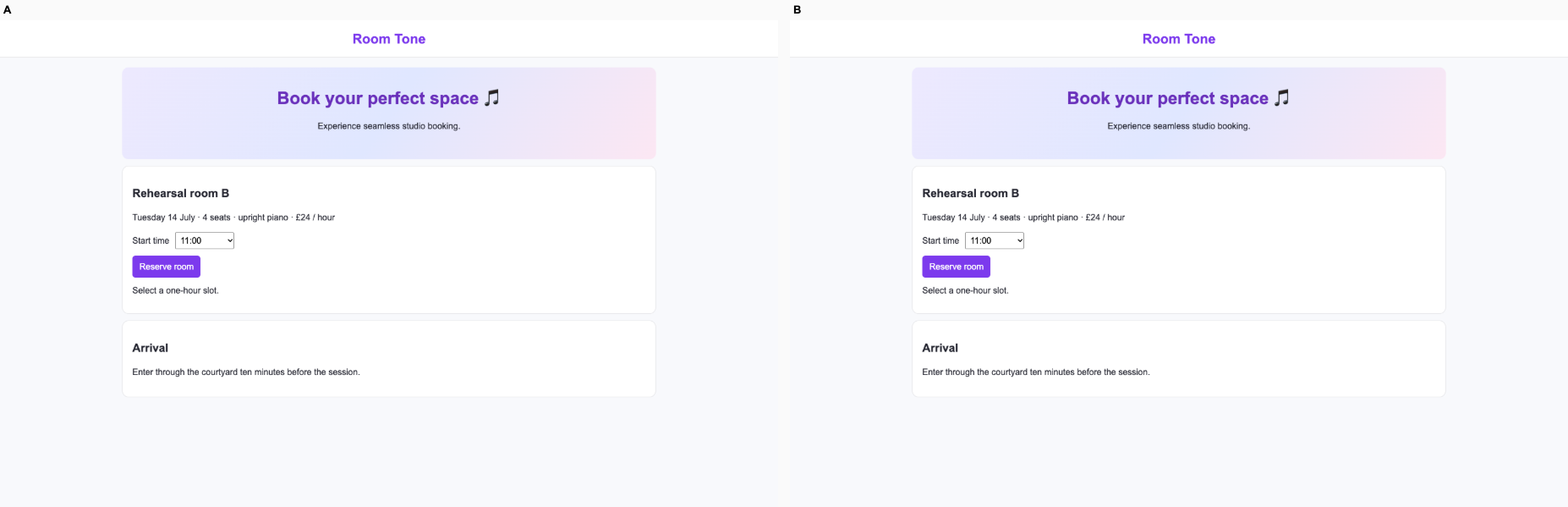
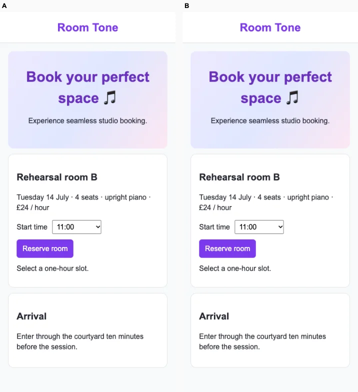
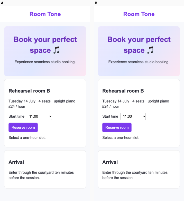
Rehearsal booking · Fix loop

/ · A quartet selects an available rehearsal time and confirms its booked slot. A full slot cannot be booked.

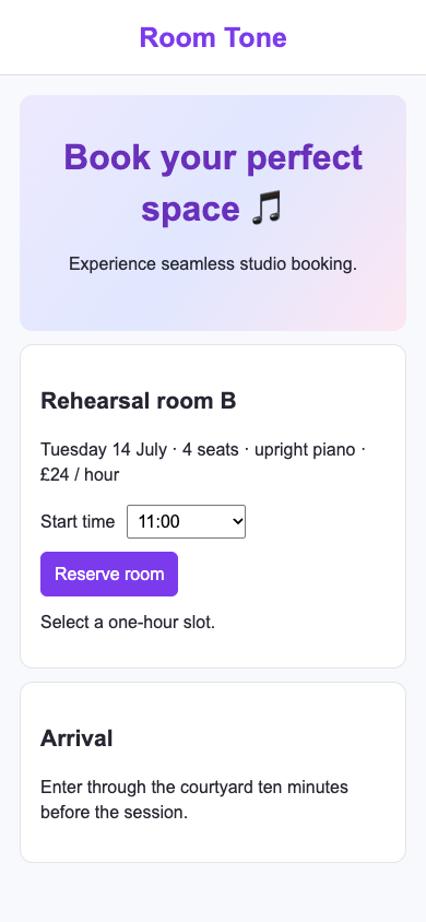
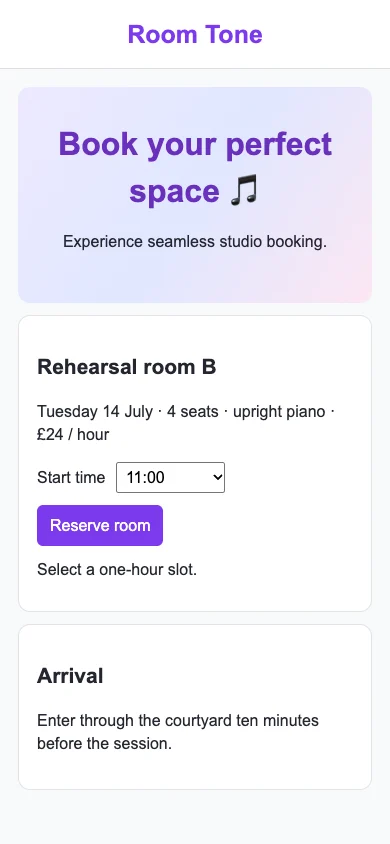
Bare agent. One request completed. Source changed. Desktop (original PNG) · Phone
desktop: fail. locator.isDisabled: Timeout 3500ms exceeded. Call log: - waiting for locator('#slot option[value="09:00"]') mobile: fail. locator.isDisabled: Timeout 3500ms exceeded. Call log: - waiting for locator('#slot option[value="09:00"]')

Fix loop. cap: Three rounds completed; inspect unresolved grades.. Source changed. Desktop · Phone

desktop: pass. Full slot disabled. Room B booked at 14:00. mobile: pass. Full slot disabled. Room B booked at 14:00.

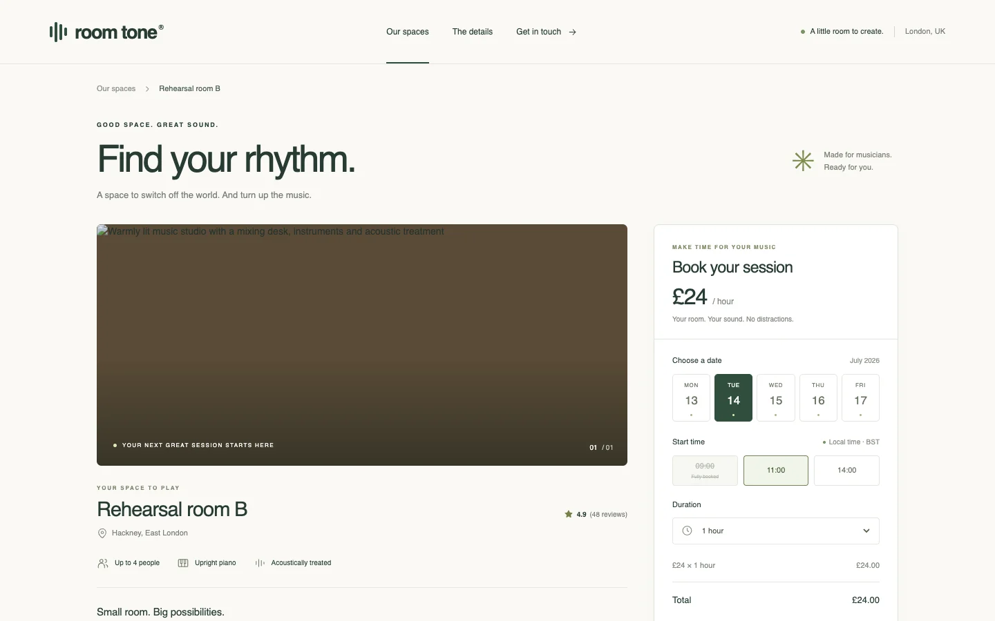
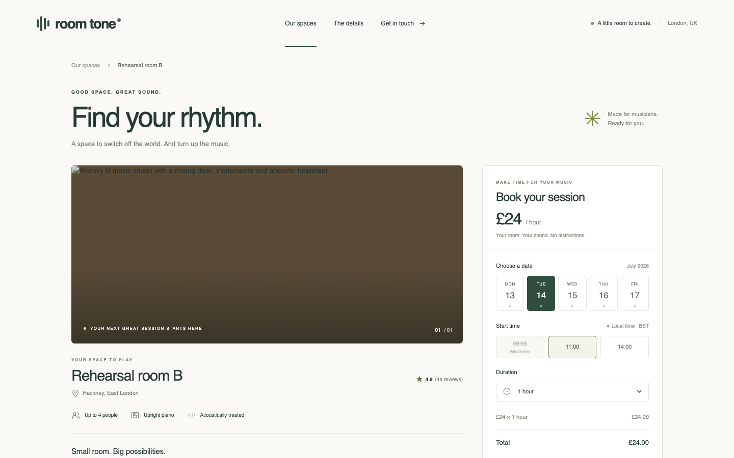
Ballot 1. 6/7 toward fix. Left: bare, right: fix. B makes selecting a time and reserving the room immediately accessible on desktop and phone; verified actions confirm that full slots are disabled and booking at 14:00 succeeds. A has more intentional typography, room details, capacity, pricing and visible time states, but its booking controls fall below the captured phone viewport and successful booking was not verified. A's failed locator alone does not prove its full slot is bookable.

A shares its cohort's muted cream and green palette, editorial headings, small uppercase labels and fine dividers, but adapts them with room imagery and a detailed scheduling panel. B closely repeats its cohort's purple branding, pale backgrounds, white cards and simple headings; its practical booking form supplies product relevance but little distinct identity.

Desktop pair (original PNG) · Phone pair (original PNG) · Other left products (original PNG) · Other right products (original PNG)
Ballot 2. 6/7 toward fix. Left: fix, right: bare. A puts the date, capacity, piano, price, time selector and Reserve room action together on both screens; verified actions confirm that full slots are disabled and 14:00 can be booked. B offers clearer visible availability states and richer room context, with more deliberate typography, but its large broken hero image displaces the booking flow, which is absent from the supplied phone viewport. B's verification timed out on a selector, leaving booking behavior unconfirmed rather than proving it broken. A better supports the immediate task.

A repeats its cohort's purple headings, pale backgrounds, bordered white panels and compact default controls. B follows its cohort's muted cream-and-green palette, small uppercase labels, editorial headings and spacious layouts. Its room amenities and date/time controls provide useful product specificity, although the large promotional hero and aspirational copy resemble the coffee, print and marketplace compositions.

Desktop pair (original PNG) · Phone pair (original PNG) · Other left products (original PNG) · Other right products (original PNG)
Additional action checks

After the original run, we tried equivalent controls in the portal and booking flow. These observations were not shown to the judge and do not change the scored checks.

Secondary study: equal render budgets

In the earlier study both agents received the same render and regrade loop. Only the instruction kit differed.
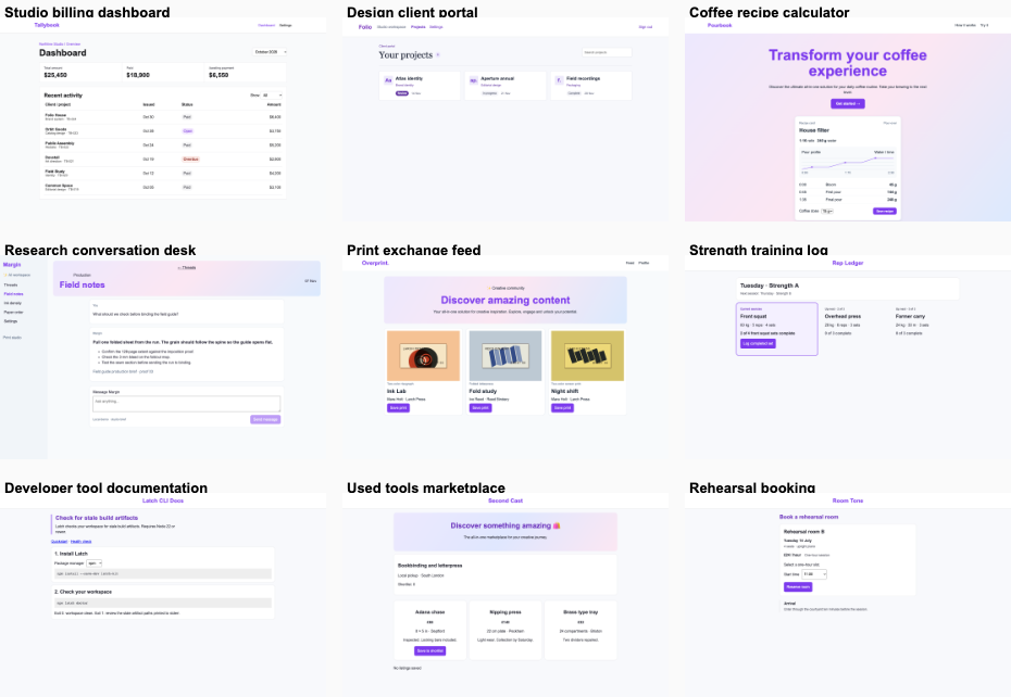
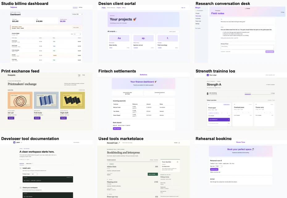
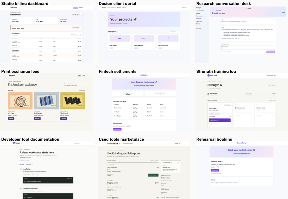
1 kit win · 3 tied or split · 6 plain wins. Both agents worked in fresh copies of the same ten Next.js apps. Each got up to three repair rounds with desktop and phone renders. Only a win in both display orders counts. Across domains, the distinctiveness score averaged 3.65/7 (4 is neutral; above 4 favors the kit).

Repo trials: preference and repair rounds by domain
ProductPreferenceKit roundsPlain roundsKit-oriented votes¹
Studio billing dashboardPlain113 / 3
Design client portalPlain111 / 2
Coffee recipe calculatorTied or split115 / 3
Research conversation deskPlain112 / 2
Print exchange feedPlain112 / 3
Fintech settlementsTied or split114 / 4
Strength training logPlain213 / 3
Developer tool documentationKit116 / 7
Used tools marketplacePlain113 / 3
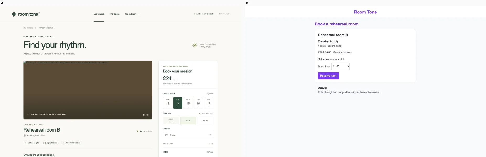
Rehearsal bookingTied or split004 / 4

¹ Both votes are oriented toward the kit: 1 favors plain, 4 is neutral, 7 favors the kit.

Earlier ballots

Each editor could change the actual repo and inspect its own result at 1440 × 900 and 390 × 844. Each got the same protected task and repair budget. The judge saw anonymous final screens twice, with the sides swapped. A separate view of the other domains from each arm lets it consider whether unrelated products share a house style. A still image cannot establish that an interaction works; the runner checks the protected task separately.
There is one pair per domain and one judge family. A tied or split vote is unresolved. A failed run is incomplete. Neither is counted as a win. Read the earlier method and limitations or download the public repo results.
Studio billing dashboard · Plain

/dashboard · Identify the outstanding invoice and filter the ledger by period and status. Keep its exact invoice records and totals.

Ballot 1. A was plain, B was kit. Kit-oriented vote: 3/7. A’s “Invoice overview,” payment-focused subtitle and prominent Dovetail alert establish the task more clearly than B’s generic “Dashboard.” Both retain the displayed $25,450 total, $18,900 paid and $6,550 awaiting payment, with matching visible invoice records and accessible period/status controls. Both verified September/Overdue filters correctly show zero rows on desktop and mobile. B’s compact phone alert and ledger expose more records sooner; A spends more vertical space on context and the overdue action. Neither shows the calibrated two-line period pattern.

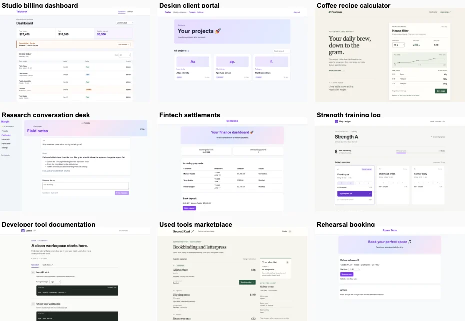
B repeats the purple branding, pale lavender surfaces, rounded cards and compact sans-serif treatment visible across its client portal, research desk, settlements and booking products. A shares muted green and cream with several cohort peers, but its restrained ledger, small section labels, accounting alignment and amber payment notice form a more coherent invoice-specific composition. Its distinction comes from task organization rather than extra decoration.

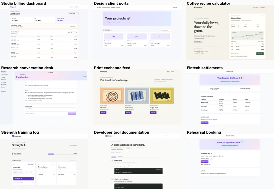
Desktop pair (original PNG) · Phone pair (original PNG) · Other A products (original PNG) · Other B products (original PNG)

Ballot 2. A was kit, B was plain. Kit-oriented vote: 3/7. B makes the invoice task clearer with “Invoice overview,” a prominent Dovetail overdue notice, project context and a readable action. Both show the same totals ($25,450 total, $18,900 paid, $6,550 awaiting payment), matching visible records, period and status controls, and verified empty September / Overdue results on desktop and mobile. A uses space more efficiently: its phone view exposes more ledger rows, while B spends more height on introductory copy and the alert. Neither visible period selector demonstrates the calibrated two-line comparison.

A closely repeats its cohort’s purple branding, pale lavender panels, rounded cards and conventional dashboard typography, especially the fintech and booking examples. B shares muted green accents, small uppercase labels and restrained surfaces with its research, training and marketplace peers, so its identity is not wholly unique. Its compact financial summary, overdue-payment treatment and structured ledger nevertheless make a more coherent product-specific composition.

Desktop pair (original PNG) · Phone pair (original PNG) · Other A products (original PNG) · Other B products (original PNG)

Protected interaction: kit: passed at both widths. plain: passed at both widths.

Round stop: kit, target reached; plain, target reached.
Distinctiveness across domains: 2.50/7.

desktop: Plain render (original PNG) Kit render (original PNG)

mobile: Plain render Kit render (original PNG)

Design client portal · Plain

/projects · A client reviews the Atlas proof and finds the approval action. Preserve search, project detail and approval.

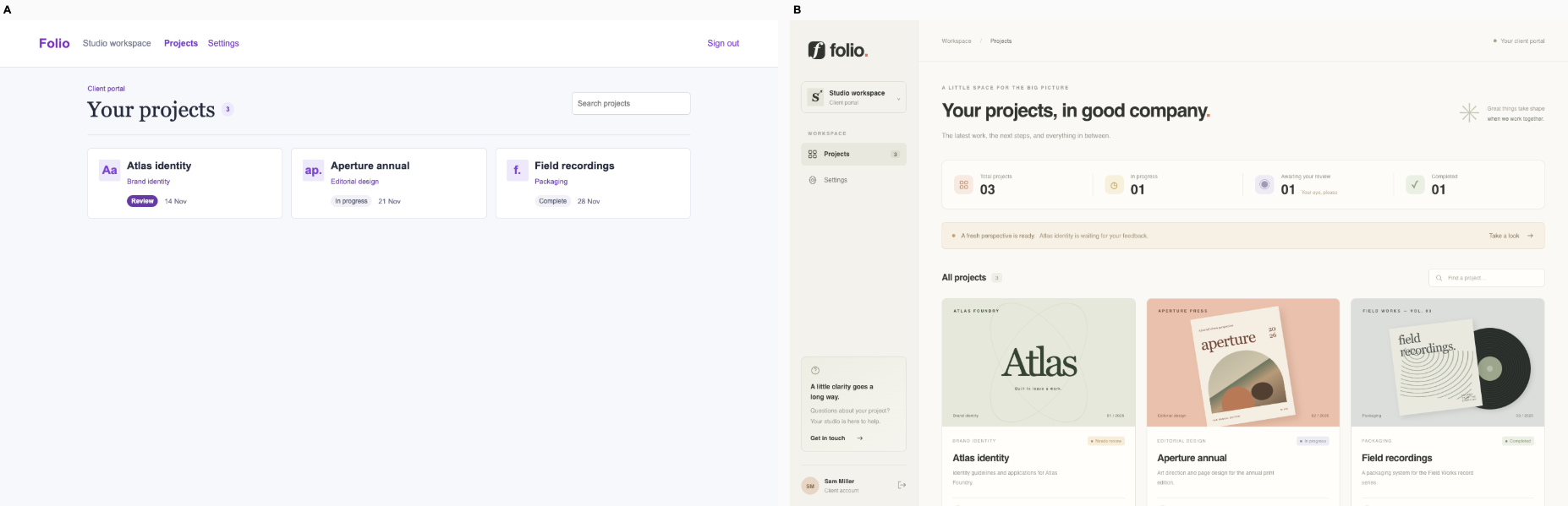
Ballot 1. A was plain, B was kit. Kit-oriented vote: 1/7. Both sides verified search and persistent approval on desktop and mobile. A makes the Atlas proof the primary project, shows its identity artwork, explains that review is needed and exposes “Review proof & approve” directly. B gives three projects equal weight beneath a large generic gradient welcome banner; its initial render provides no visible approval action. A’s serif headline, restrained palette and project-specific artwork support a studio portal. Both show readable status pills and dates. On mobile, A preserves the proof, review context and approval button together, although its taller cards require more scrolling.

B repeats the lavender gradient banner, purple accents and white cards visible in its fintech, documentation and rehearsal cohorts, with similarly broad welcome copy. A shares warm neutrals, serif display type and muted green accents with its coffee, print and tools cohorts, so its styling is not wholly unique. However, its oversized Atlas artwork, featured review composition and explicit approval action give this portal a more specific identity and workflow.

Desktop pair (original PNG) · Phone pair (original PNG) · Other A products (original PNG) · Other B products (original PNG)

Ballot 2. A was kit, B was plain. Kit-oriented vote: 2/7. B makes Atlas the primary project, shows a recognizable proof preview, explains that the identity direction is ready, and exposes “Review proof & approve” on desktop and phone. A gives all projects equal weight with placeholder monograms and requires discovering approval through project detail. B's larger mobile card costs scanning space but keeps the next action visible. Both preserve search and approval after reload on both devices; B's advantage is clarity, not verified behavior. Review status and due dates are legible in both.

A repeats its cohort's purple accents, pale gradient welcome banner, emoji headline and white cards, particularly the finance and rehearsal products. B also shares a cohort style: cream backgrounds, green accents, serif editorial headings and fine rules recur in coffee, print exchange and the marketplace. Its Atlas proof artwork, project-specific palette and prominent review action give that shared vocabulary a stronger product purpose, though its identity is not wholly distinct from the cohort.

Desktop pair (original PNG) · Phone pair (original PNG) · Other A products (original PNG) · Other B products (original PNG)

Protected interaction: kit: passed at both widths. plain: passed at both widths.

Round stop: kit, regression; plain, target reached.
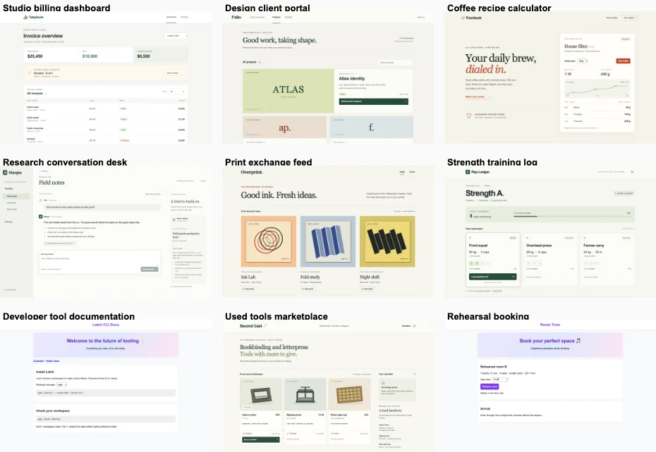
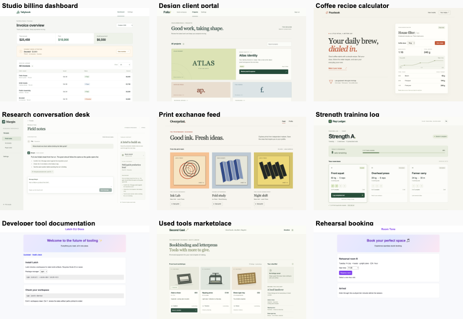
Distinctiveness across domains: 2.50/7.
desktop: Plain render (original PNG) Kit render (original PNG)

mobile: Plain render Kit render (original PNG)

Coffee recipe calculator · Tied or split

/ · A brewer adjusts the dose, reads the water targets and saves the recipe. Preserve the working calculator.

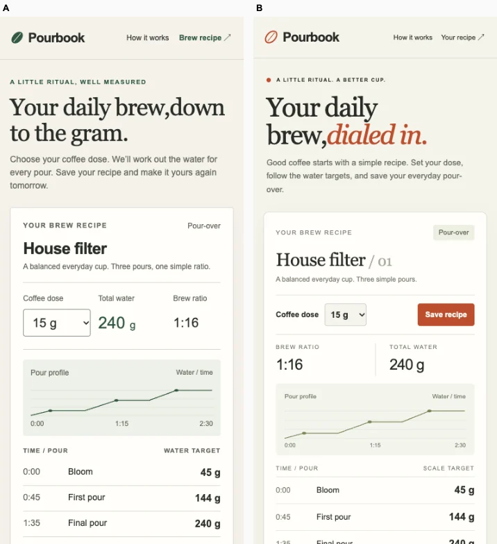
Ballot 1. A was plain, B was kit. Kit-oriented vote: 5/7. B groups dose, total water and ratio together, making the calculator’s immediate result easier to read, and places Save after the pour targets with an explicit unsaved message. A makes Save visible earlier on mobile and has a more distinctive serif-and-orange identity, but separates dose from its outputs. Both verified desktop and mobile actions correctly produced 288 g from 18 g and persisted after reload. B’s clearer calculation hierarchy earns a slight overall preference.

A shares warm paper backgrounds, serif editorial headings, muted green panels and fine rules with its print exchange, marketplace and client portal cohort, though orange italic typography gives Pourbook some identity. B avoids the lavender banners and purple controls repeated across much of its cohort, but its green branding, cream background and restrained cards resemble the strength log and marketplace. Neither is wholly interchangeable; A’s typographic treatment is slightly more distinctive within its cohort.

Desktop pair (original PNG) · Phone pair (original PNG) · Other A products (original PNG) · Other B products (original PNG)

Ballot 2. A was kit, B was plain. Kit-oriented vote: 3/7. B puts Save beside the dose control and separates ratio from total water clearly; on mobile, saving is visible while A places it below the targets and outside the shown viewport. B’s restrained serif hierarchy and orange action color improve scanning. A offers more concrete copy about grams and clearer unsaved-state feedback. Both retain the pour chart, timed water targets and verified calculator behavior: 18 g produces 288 g and persists after reload on desktop and mobile. B narrowly wins for the main working action.

A’s green brewing interface departs substantially from its cohort’s recurring lavender gradient banners, purple actions and dashboard cards. B removes those generic treatments, but its cream background, editorial serif headings, muted green details and fine rules recur across its client portal, research desk, print exchange and marketplace. B is polished and appropriate, while A has greater visual independence within its own cohort.

Desktop pair (original PNG) · Phone pair (original PNG) · Other A products (original PNG) · Other B products (original PNG)

Protected interaction: kit: passed at both widths. plain: passed at both widths.

Round stop: kit, target reached; plain, target reached.

Distinctiveness across domains: 4.50/7.

desktop: Plain render (original PNG) Kit render (original PNG)

mobile: Plain render Kit render

Research conversation desk · Plain

/chat/field-notes · A researcher sends a follow-up about the source brief and reads the answer in context. Preserve the thread and its source records.

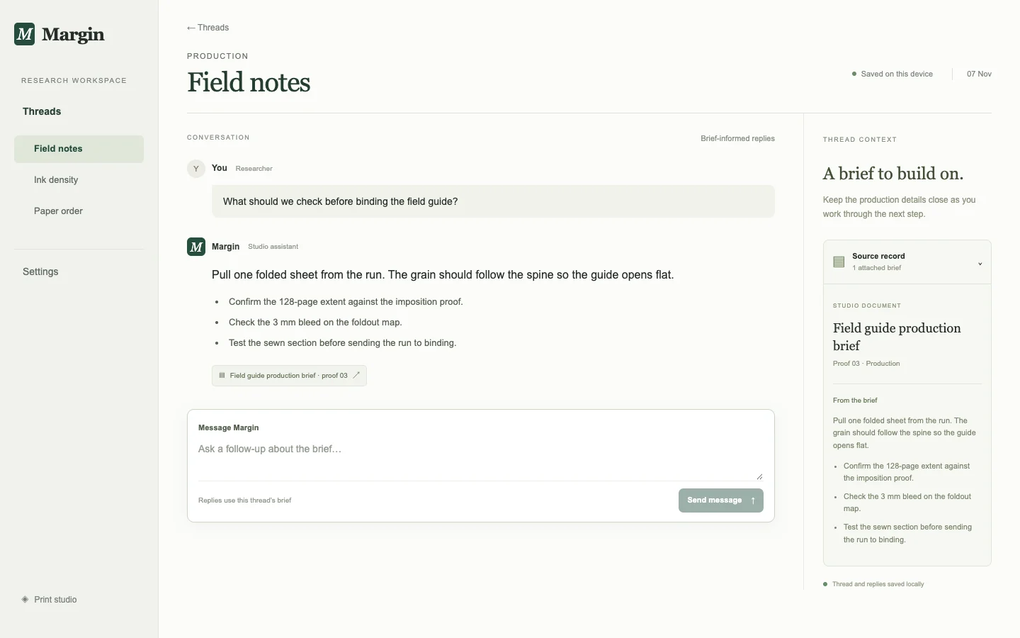
Ballot 1. A was plain, B was kit. Kit-oriented vote: 2/7. A connects the conversation to an attached source record, brief excerpt and local-save status, supporting follow-up research in context. Its restrained hierarchy keeps the answer, citation and composer close together. B preserves the same useful production facts but gives substantial space to a gradient title banner and oversized message cards; its source is a plain reference without the visible record context. On mobile, A fits the answer and complete composer onscreen while B pushes the writing area below the visible fold. Both passed sending and reload persistence on desktop and mobile; A additionally makes saved state visible.

B repeats the lavender gradient banners, purple accents and rounded white cards seen in its client portal, settlements and rehearsal products. A shares serif headings, muted greens and editorial spacing with its portal, coffee and marketplace cohort, so its identity is not wholly unique. However, its conversation rail, document context panel and compact source citation adapt that vocabulary more specifically to research work.

Desktop pair (original PNG) · Phone pair (original PNG) · Other A products (original PNG) · Other B products (original PNG)

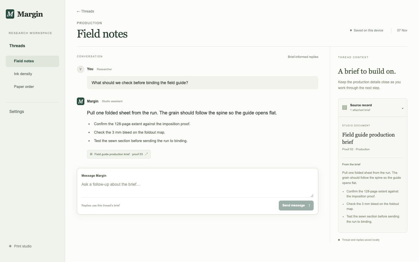
Ballot 2. A was kit, B was plain. Kit-oriented vote: 2/7. B connects the conversation to a visible source record, proof number and brief excerpt, supporting a researcher’s follow-up in context. Its restrained message hierarchy and compact source link keep the answer readable, while the phone render brings the composer into view sooner than A’s tall cards. A has larger, accessible text but gives disproportionate space to the gradient title and separates the brief from the working context. Both passed sending and reload persistence on desktop and mobile; B additionally makes local saving and brief-informed replies visible, though some supporting text is small.

A repeats the lavender gradient banners, purple accents, pale backgrounds and rounded white cards visible in its client portal, settlements and rehearsal cohorts. B replaces that composition with a research sidebar, conversation column and source-record rail. Its serif headings, muted green palette and fine rules still resemble B’s coffee, marketplace and strength interfaces, so its identity is more product-specific without being wholly distinct from its cohort.

Desktop pair (original PNG) · Phone pair (original PNG) · Other A products (original PNG) · Other B products (original PNG)

Protected interaction: kit: passed at both widths. plain: passed at both widths.

Round stop: kit, regression; plain, target reached.

Distinctiveness across domains: 3.00/7.

desktop: Plain render (original PNG) Kit render (original PNG)

mobile: Plain render Kit render (original PNG)

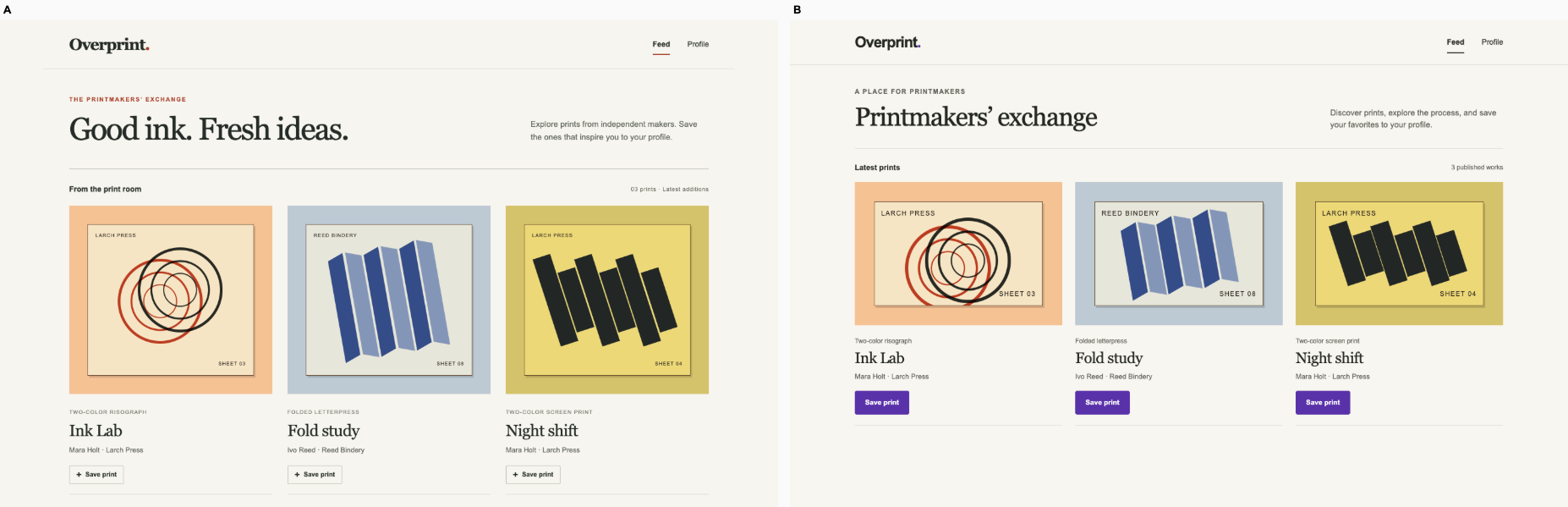
Print exchange feed · Plain

/ · A printmaker finds the Ink Lab entry, saves the post and sees it on their profile. Keep the real listings and routes.

Ballot 1. A was plain, B was kit. Kit-oriented vote: 2/7. Both interfaces successfully support opening Ink Lab, saving it and finding it on the profile on desktop and mobile. A has a more intentional print-publication character through serif typography, restrained red accents, small uppercase process labels and outlined save controls. Both preserve meaningful artwork, processes and maker credits. B makes saving more prominent with solid purple buttons and larger mobile controls; A offers a tighter mobile title/action arrangement and larger desktop artwork. Saved-state styling is not visible, so neither receives an advantage for it.

B repeats the purple action buttons and broadly neutral interface typography seen across its billing, project, research, fitness and booking cohort, although its serif heading adds some identity. A shares editorial serif typography and muted colors with its coffee, client portal and marketplace peers, but combines them with red ink accents, process captions, thin rules and artwork-led spacing that feel more specific to a print exchange.

Desktop pair (original PNG) · Phone pair (original PNG) · Other A products (original PNG) · Other B products (original PNG)

Ballot 2. A was kit, B was plain. Kit-oriented vote: 3/7. Both interfaces verified the complete Ink Lab save-to-profile journey on desktop and mobile. B gives the prints more visual weight, uses more deliberate serif typography and restrained controls, and keeps the mobile save action beside the entry details. A's purple save buttons are easier to spot, and its introductory copy explains the task more directly than B's slogan. B's stronger print presentation earns a slight overall preference; successful behavior is equal.

A repeats the purple actions and conventional heading-plus-grid structure seen across its client portal, settlements and booking cohort, although its artwork adds identity. B shares editorial serif headings, muted backgrounds and fine rules with its coffee and marketplace peers, so it also shows a house style. Its red accents, large print reproductions and compact technique labels nevertheless give this exchange a somewhat more specific visual identity.

Desktop pair (original PNG) · Phone pair (original PNG) · Other A products (original PNG) · Other B products (original PNG)

Protected interaction: kit: passed at both widths. plain: passed at both widths.

Round stop: kit, target reached; plain, target reached.

Distinctiveness across domains: 2.50/7.

desktop: Plain render (original PNG) Kit render (original PNG)

mobile: Plain render Kit render

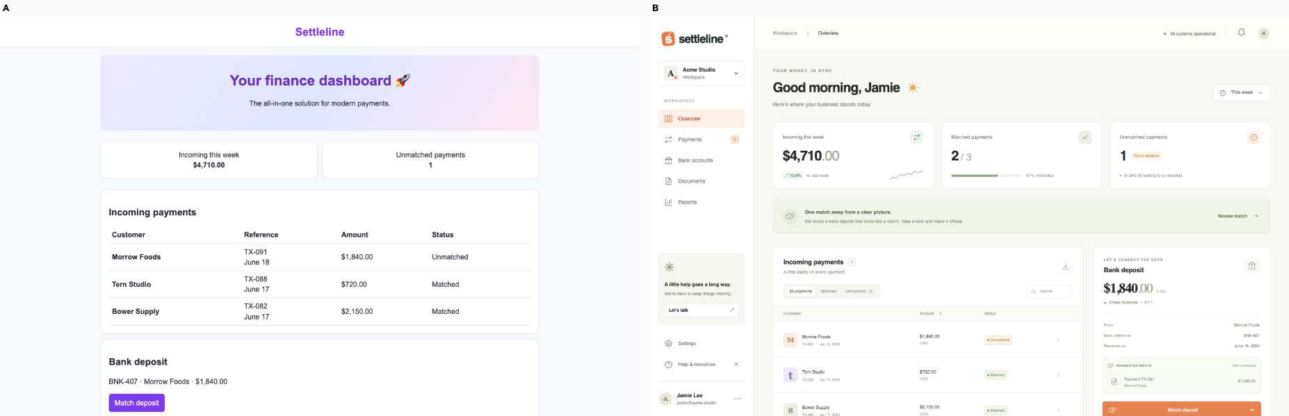
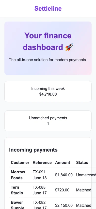
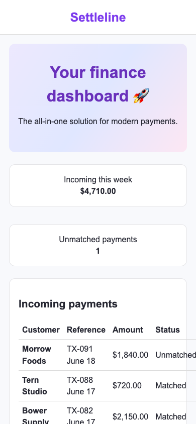
Fintech settlements · Tied or split

/ · A finance operator matches an unmatched payment to its bank deposit and confirms the remaining exception count.

Ballot 1. A was plain, B was kit. Kit-oriented vote: 4/7. A and B appear equivalent: both show the $4,710 incoming total, one unmatched payment, TX-091 for $1,840 and corresponding deposit BNK-407 with a Match deposit action. Both verified matching successfully on desktop and mobile, but the supplied evidence does not confirm the remaining count after matching. Both prioritize a large generic welcome banner over the working action. Mobile stacks summary cards with generous spacing while the payment table overflows horizontally, limiting scanning of statuses.

Both repeat their cohorts’ purple branding, pastel gradient hero, rounded white cards and centered promotional copy, particularly the developer documentation and rehearsal booking examples. The finance table and deposit references provide relevant content, but neither interface establishes a distinctive finance workflow through layout, typography or density.

Desktop pair (original PNG) · Phone pair (original PNG) · Other A products (original PNG) · Other B products (original PNG)

Ballot 2. A was kit, B was plain. Kit-oriented vote: 4/7. A and B are effectively identical. Both show meaningful customer names, payment references, amounts, an unmatched count of 1 and a deposit matching action, but give the generic gradient hero more prominence than the exception workflow. Both successfully match TX-091 to BNK-407 on desktop and mobile; neither provides visible evidence of the remaining count after matching. Both phone tables overflow their cards, compromising readability. Typography, spacing, color and copy offer no material preference.

Both targets repeat the centered purple branding, pastel gradient banner, rounded white cards and promotional headline seen in their respective rehearsal booking interfaces. A also shares these patterns with its client portal and research desk; B with its developer documentation. B’s other cohort products more often use editorial typography, muted colors and denser task layouts, but the finance target retains the same generic composition as A. Neither establishes a distinct finance identity.

Desktop pair (original PNG) · Phone pair (original PNG) · Other A products (original PNG) · Other B products (original PNG)

Protected interaction: kit: passed at both widths. plain: passed at both widths.

Round stop: kit, regression; plain, regression.

Distinctiveness across domains: 4.00/7.

desktop: Plain render (original PNG) Kit render (original PNG)

mobile: Plain render (original PNG) Kit render (original PNG)

Strength training log · Plain

/ · A lifter records the next completed set and sees how many of today’s prescribed sets remain.

Ballot 1. A was plain, B was kit. Kit-oriented vote: 3/7. Both passed set logging on desktop and mobile, advancing front squat from two to three of four. A gives weight, reps and the next-set prescription greater prominence, keeps eight remaining sets in a compact progress panel, and exposes more of the exercise queue on phone. B has larger set targets and clearer current-exercise labeling; A confusingly labels the active squat 'Up next.' B spends more mobile height on introductory copy and separated progress sections. A narrowly wins through prescription clarity and efficient workout scanning.

A shares cream surfaces, muted green accents and restrained borders with its coffee, marketplace and client-portal cohort, but its bold sans-serif exercise names, compact set markers and prescription hierarchy provide a recognizable workout structure. B avoids the gradient banners and emoji headings repeated across its portal, finance and booking examples, yet its purple accents, pale badges and spacious white cards retain more of that cohort's common app styling. Both adapt their shared visual language to the task; A does so somewhat more specifically.

Desktop pair (original PNG) · Phone pair (original PNG) · Other A products (original PNG) · Other B products (original PNG)

Ballot 2. A was kit, B was plain. Kit-oriented vote: 3/7. Both successfully advance front squat from two to three completed sets on desktop and mobile. B groups remaining sets and progress clearly, emphasizes load and reps, and places the next set prescription beneath the logging button. Its compact mobile cards expose more upcoming work. A labels the active exercise more accurately: B says “Up next” on the exercise already in progress. A also gives Undo clearer prominence.

A shares purple accents and conventional white cards with its billing, finance and booking peers, though its left-aligned workout hierarchy avoids their gradient hero banners. B shares cream backgrounds, green accents, small uppercase labels and editorial typography with its coffee, marketplace and client portal peers. Both adapt those recurring styles with set counters and a prominent logging action; neither has a strong distinctiveness advantage.

Desktop pair (original PNG) · Phone pair (original PNG) · Other A products (original PNG) · Other B products (original PNG)

Protected interaction: kit: passed at both widths. plain: passed at both widths.

Round stop: kit, target reached; plain, target reached.

Distinctiveness across domains: 3.50/7.

desktop: Plain render (original PNG) Kit render (original PNG)

mobile: Plain render Kit render

Developer tool documentation · Kit

/ · A maintainer finds the correct install and health-check commands for their package manager.

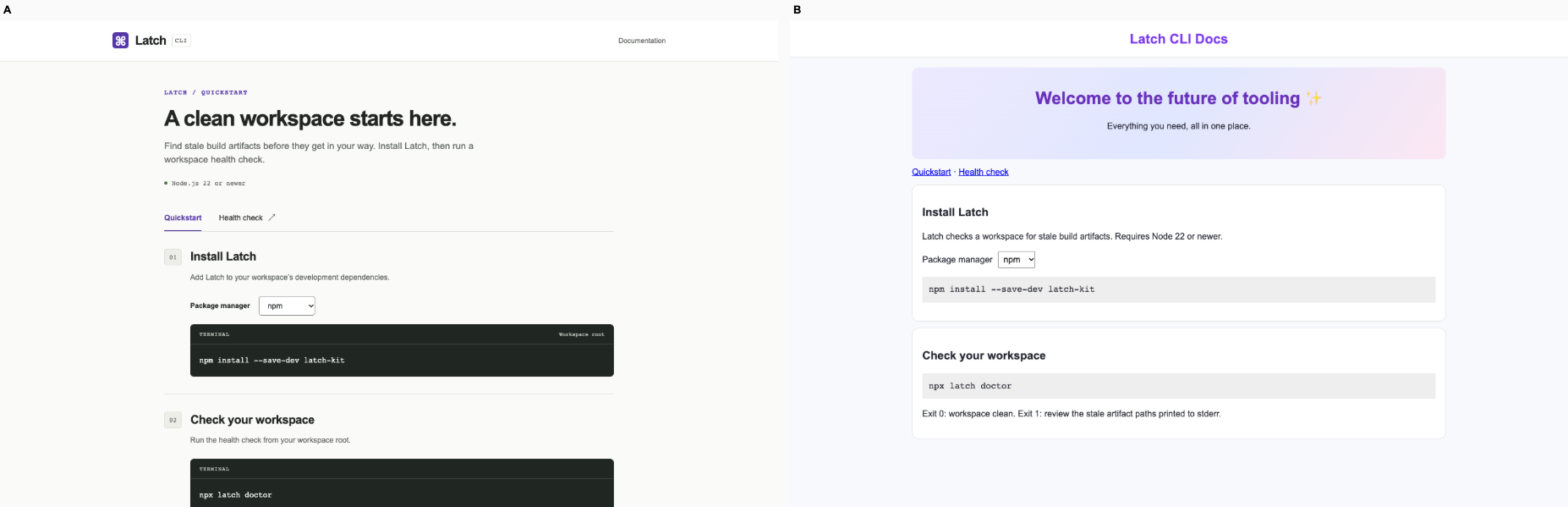
Ballot 1. A was plain, B was kit. Kit-oriented vote: 6/7. B makes installation and workspace checking a clear numbered sequence, with prominent commands, readable terminal panels and useful workspace-root guidance. Its headline describes the actual maintenance task; A spends substantial space on a vague welcome gradient. Both expose the package-manager selector and verified pnpm switching works on desktop and mobile. B keeps the install command on one line on the phone, while A wraps the package name. A does make exit-code meanings visible earlier, a useful operational detail.

A repeats the centered purple branding, pastel gradient welcome banner, emoji and rounded white cards seen in its finance and rehearsal products, with similar framing in the client portal. B shares restrained typography and muted surfaces with its print, coffee and marketplace cohort, but its numbered documentation flow, compact runtime prerequisite and dark command panels give Latch a more specific identity. Its distinction serves command discovery rather than adding decoration.

Desktop pair (original PNG) · Phone pair (original PNG) · Other A products (original PNG) · Other B products (original PNG)

Ballot 2. A was kit, B was plain. Kit-oriented vote: 7/7. A prioritizes the maintainer’s workflow with numbered install and health-check steps, a clear package-manager selector, and readable terminal commands. Its mobile install command stays on one line, while B wraps it and spends substantial space on a vague welcome banner. B does provide useful exit-code guidance. Both correctly update the command after selecting pnpm on desktop and mobile, so interaction evidence is tied.

A shares restrained typography and terminal styling with its cohort but adapts them to CLI documentation through numbered steps, workspace-root labels, and command panels. B repeats the centered purple gradient banner, rounded white cards, and promotional phrasing visible in its finance and rehearsal products. A’s composition is more specific to the task, though its purple accents also recur across its cohort.

Desktop pair (original PNG) · Phone pair (original PNG) · Other A products (original PNG) · Other B products (original PNG)

Protected interaction: kit: passed at both widths. plain: passed at both widths.

Round stop: kit, target reached; plain, regression.

Distinctiveness across domains: 6.00/7.

desktop: Plain render (original PNG) Kit render (original PNG)

mobile: Plain render (original PNG) Kit render

Used tools marketplace · Plain

/ · A bookbinder saves an inspected listing to their shortlist and checks the pickup terms.

Ballot 1. A was plain, B was kit. Kit-oriented vote: 3/7. A slightly wins: equipment illustrations, inspection badges and location details make the inspected Adana chase easy to identify, and its full-width mobile save button is prominent. B offers clearer desktop pickup terms and a more compact text inventory, but loses useful equipment recognition. Both expose dimensions, condition, prices and pickup locations; verified saving and saved feedback work on desktop and mobile for both.

A repeats its cohort’s muted green, cream, editorial serif headings and restrained cards, particularly the print exchange, client portal and training tracker. Its equipment drawings and collection details give that vocabulary a relevant purpose. B avoids the lavender banners and purple controls common across much of its cohort, but closely resembles its coffee calculator and print exchange in cream palette, serif typography and thin rules. Neither establishes a wholly unique visual system.

Desktop pair (original PNG) · Phone pair (original PNG) · Other A products (original PNG) · Other B products (original PNG)

Ballot 2. A was kit, B was plain. Kit-oriented vote: 3/7. B makes the inspected chase easier to identify through equipment illustrations and gives its save action a prominent full-width mobile button. Its desktop pickup panel also repeats condition and collection details. A is more compact, exposes the next listing sooner on mobile, and uses clearer pickup language: B’s “A local handover” is less direct than “Pickup terms.” Both successfully save the listing and visibly mark it saved on desktop and mobile; neither demonstrates fuller pickup arrangements.

A’s restrained list and serif heading differ from its cohort’s frequent lavender banners and white dashboard cards, although its warm editorial styling resembles the coffee and print products. B’s olive palette, serif headlines, small uppercase labels and fine rules recur across its coffee, print and project interfaces. Its equipment drawings add useful product evidence, but the surrounding editorial treatment remains recognizable as a cohort style. Neither has a decisive distinctiveness advantage.

Desktop pair (original PNG) · Phone pair (original PNG) · Other A products (original PNG) · Other B products (original PNG)

Protected interaction: kit: passed at both widths. plain: passed at both widths.

Round stop: kit, target reached; plain, target reached.

Distinctiveness across domains: 4.00/7.

desktop: Plain render (original PNG) Kit render (original PNG)

mobile: Plain render Kit render

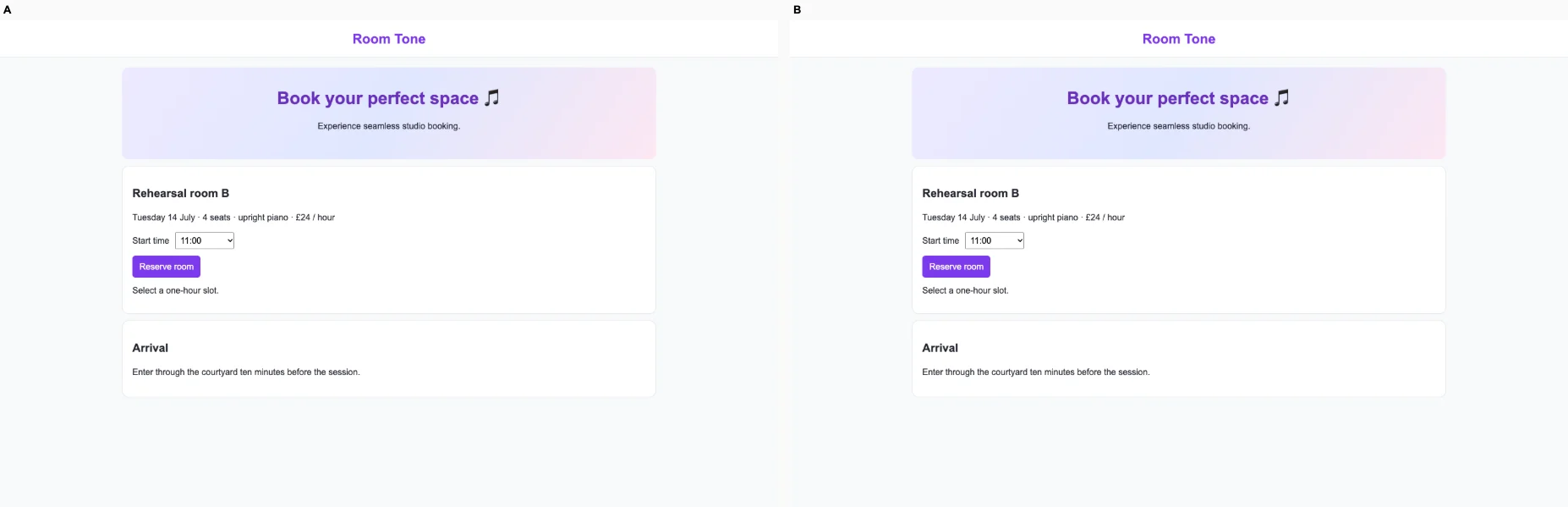
Rehearsal booking · Tied or split

/ · A quartet selects an available rehearsal time and confirms its booked slot. A full slot cannot be booked.

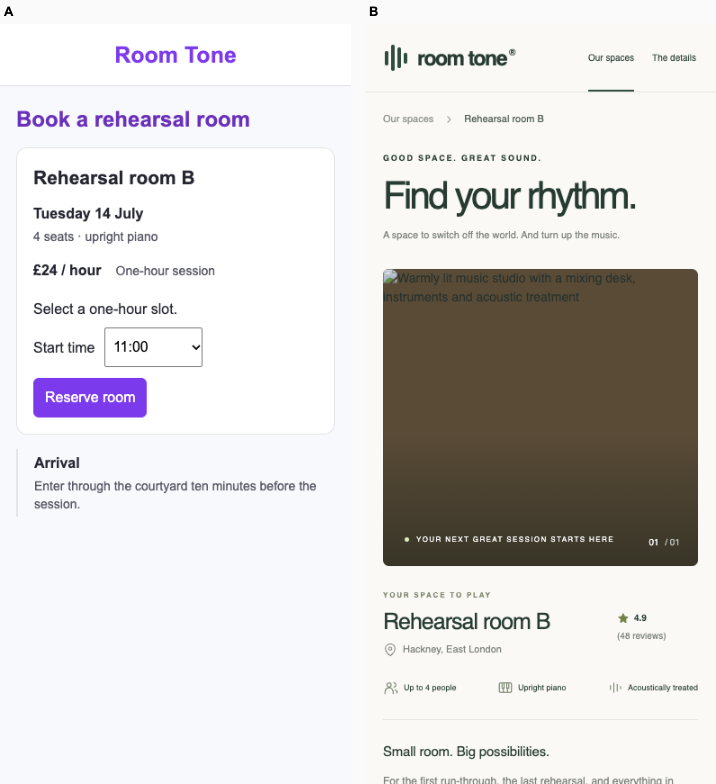
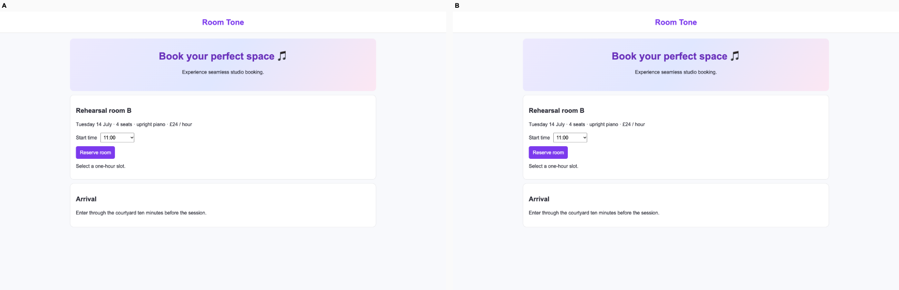
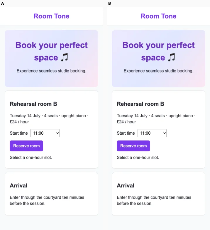
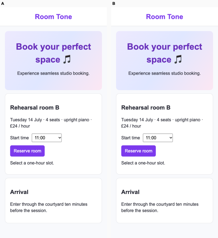
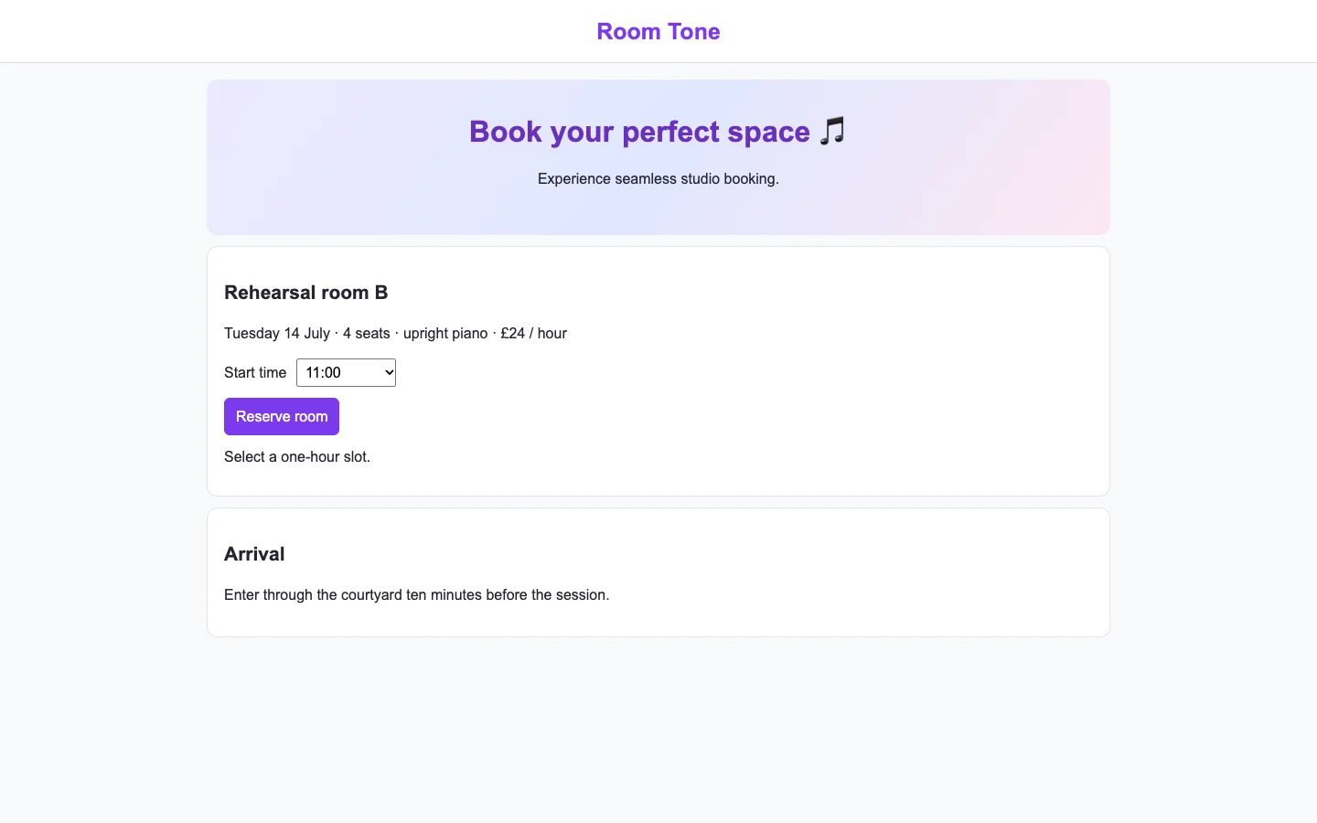
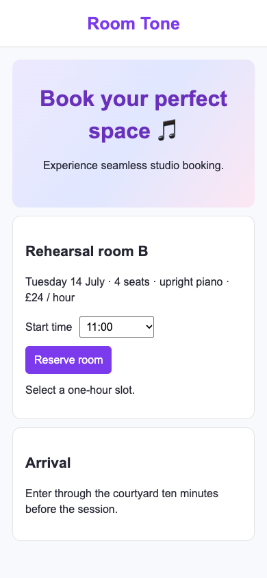
Ballot 1. A was plain, B was kit. Kit-oriented vote: 4/7. A and B appear visually identical at both sizes. Both clearly show Room B, four seats, upright piano, £24/hour, a time selector and Reserve room action. Phone layouts remain readable and usable, though the large promotional banner takes prominence over availability. Verified interactions equally confirm booking at 14:00 and prevent booking full slots.

Both repeat the centered purple branding, pastel gradient hero, broad promotional copy and rounded white cards seen in their respective finance dashboards. A also closely resembles its developer documentation cohort; B shares treatments with its client portal and research desk. Rehearsal details provide useful specificity, but neither target develops a distinct booking-oriented visual identity.

Desktop pair (original PNG) · Phone pair (original PNG) · Other A products (original PNG) · Other B products (original PNG)

Ballot 2. A was kit, B was plain. Kit-oriented vote: 4/7. A and B are visually equivalent on desktop and phone. Both clearly present Room B, four seats, upright piano, £24/hour, a time selector and Reserve room action. Both give substantial prominence to a generic gradient headline, while booking details remain legible and mobile controls usable. Verified interactions equally demonstrate disabled full slots and successful booking at 14:00.

Both repeat the centered purple branding, pastel gradient hero, rounded white cards and neutral sans-serif typography visible in the fintech settlements cohort. A also closely resembles its client portal and research desk; B resembles its developer documentation. B’s other cohort products show more varied editorial layouts, but the target itself has no visible distinguishing advantage. Rehearsal details provide useful specificity without establishing a distinctive booking identity.

Desktop pair (original PNG) · Phone pair (original PNG) · Other A products (original PNG) · Other B products (original PNG)

Protected interaction: kit: passed at both widths. plain: passed at both widths.

Round stop: kit, target reached; plain, target reached.

Distinctiveness across domains: 4.00/7.

desktop: Plain render (original PNG) Kit render (original PNG)

mobile: Plain render (original PNG) Kit render (original PNG)

Secondary study: one-shot screens

On 18 development pairs the earlier one-shot study recorded 13 kit wins, 4 tied or split and 1 plain win. The final fresh cohort was 1 kit win, 1 unresolved and 1 plain win. These are separate experiments. Do not add them to the repo results.

One-shot development results
CommandKit winsTied or splitPlain wins
landing200
polish110
harden200
ship110
audit200
motion200
fix111
design-system210

The development set includes eight original demo routes, seven new synthetic screens and three design-system assignments. We revised procedures on development evidence. Each confirmation cohort uses new domains and records. The first tested the preceding revision; the second tested the final one. Neither cohort is included in the development totals. There is one judge family. Static images cannot verify motion, runtime safety or customer preference.

Read the one-shot method and revision history · Download the numerical results

Command trials

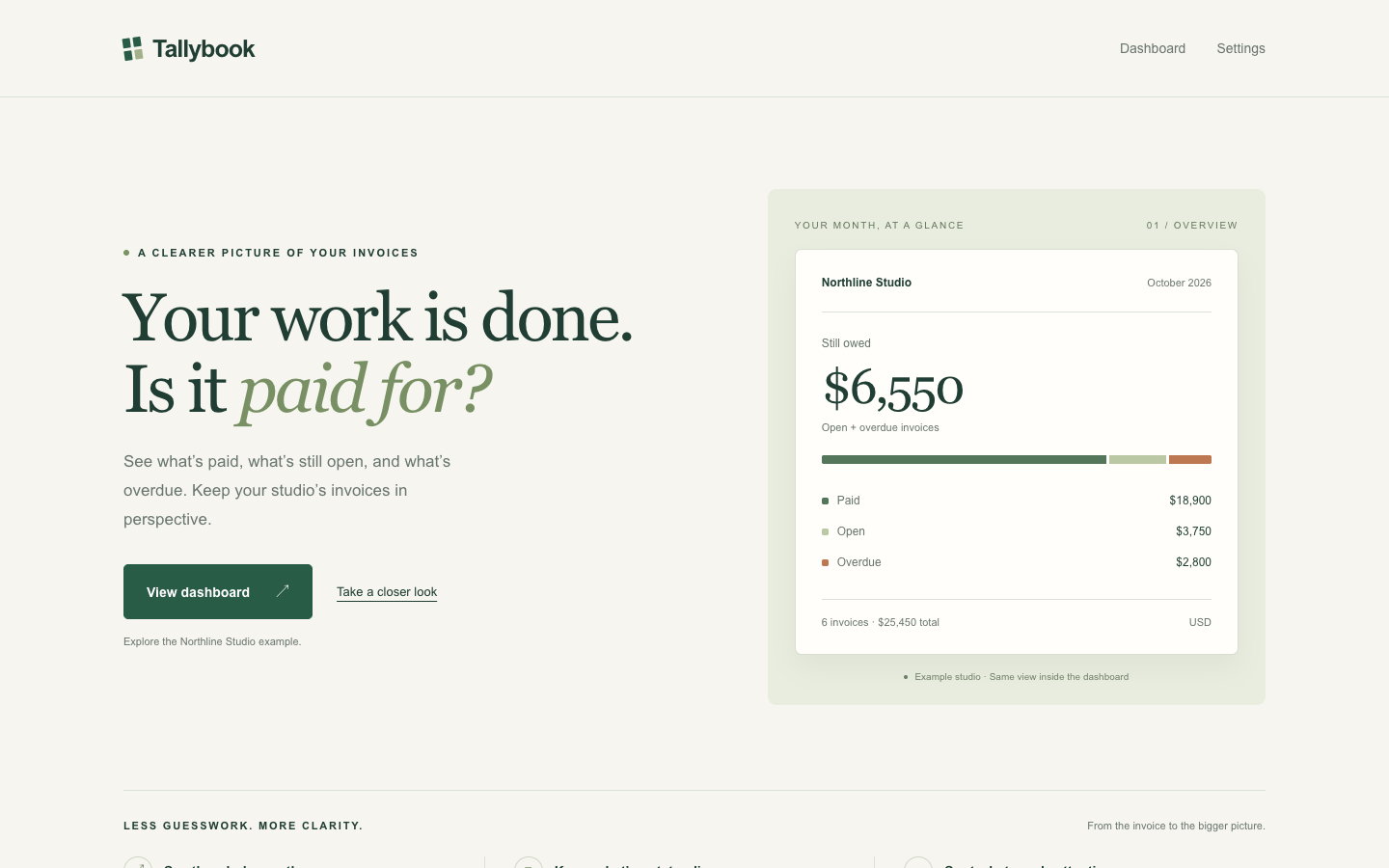
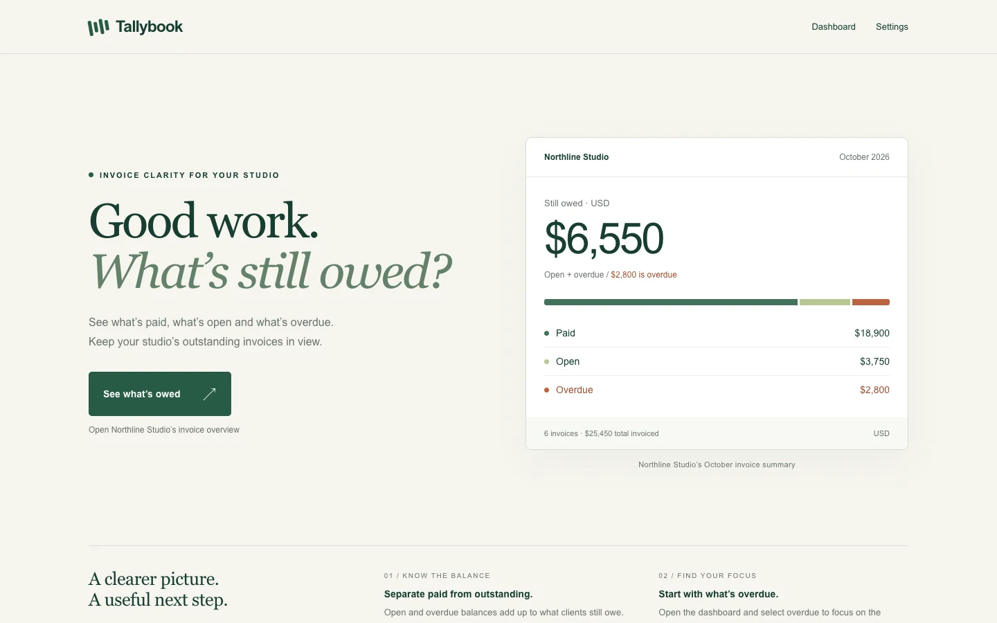
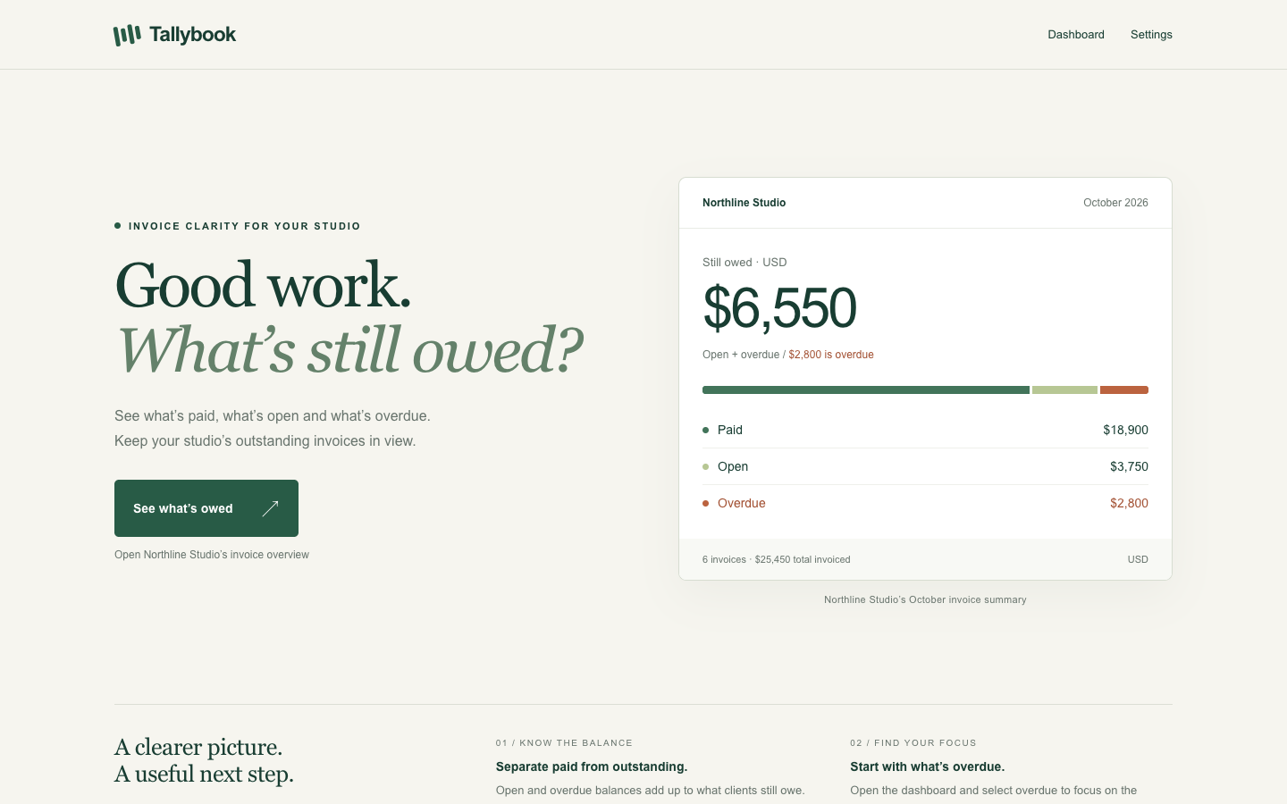
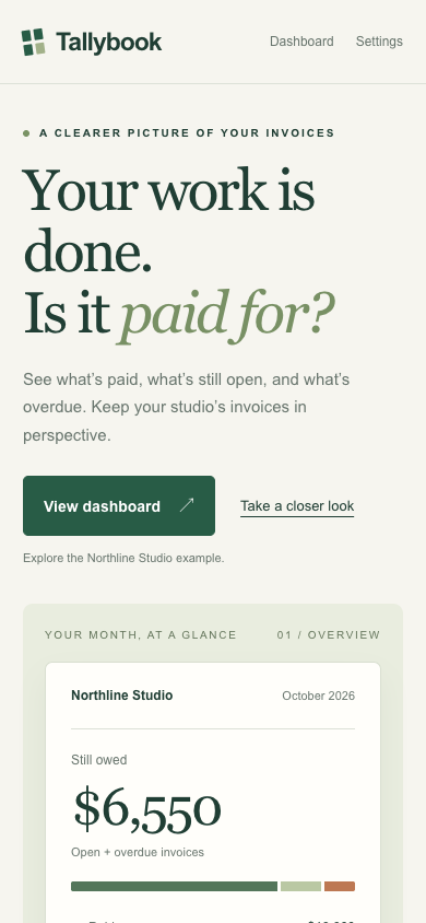
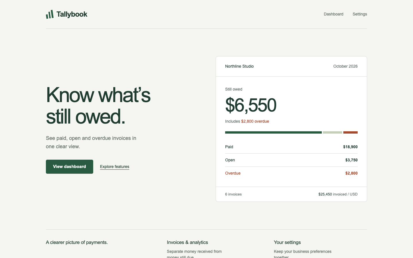
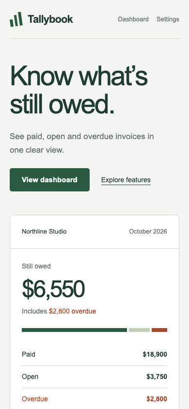
/landing · tally-home · win

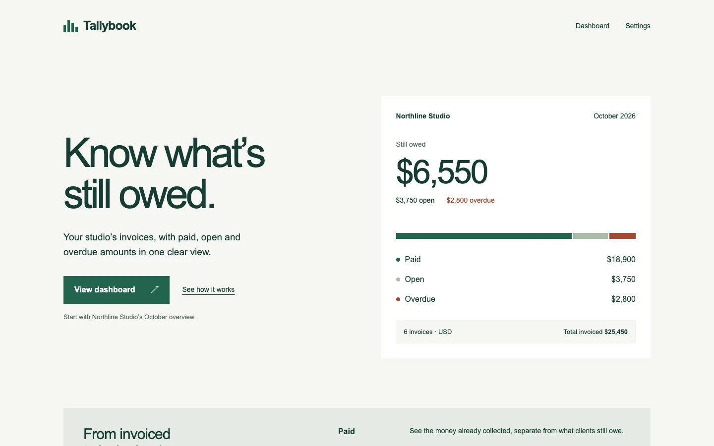
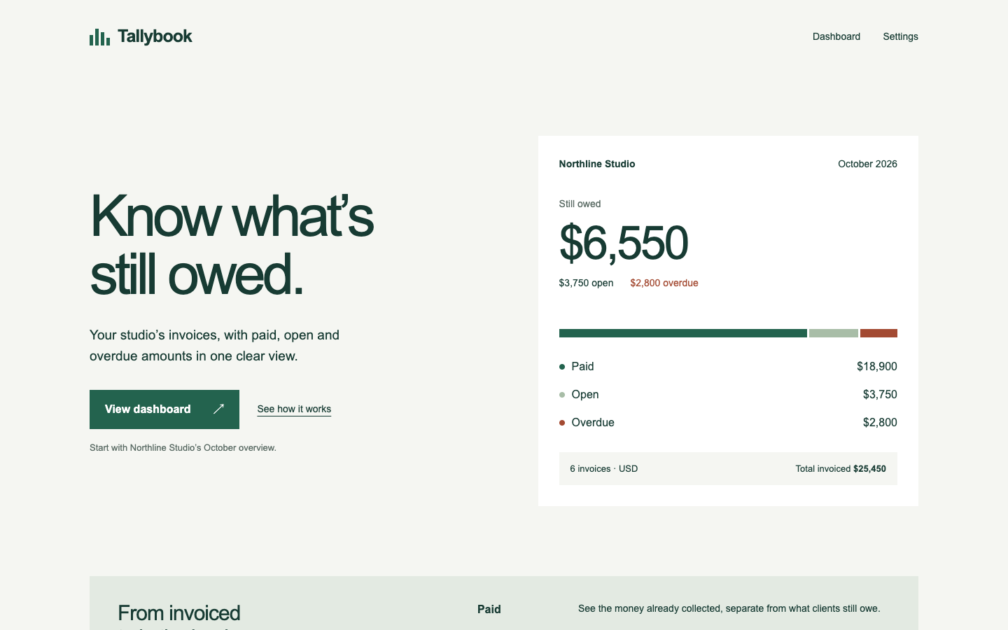
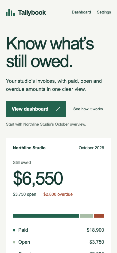
A studio owner wants to see whether this invoice tool can show what clients still owe. Make the opening screen and its next step convincing.

desktop: Plain render (original PNG) · Procedure render (original PNG)

mobile: Plain render · Procedure render (original PNG)

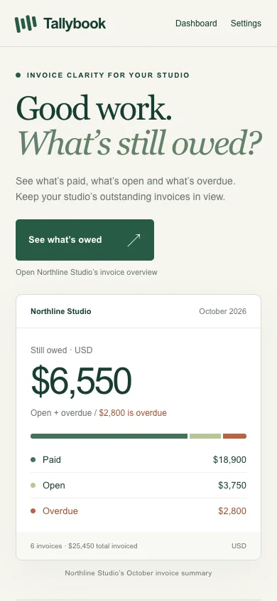
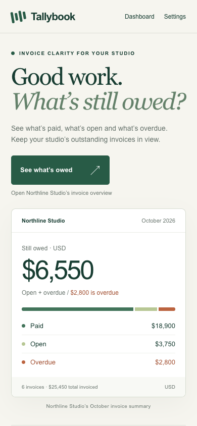
Pass 1. Left: plain; right: kit-landing. Raw preference: 7/7 (4 is neutral, higher favors right). B connects “See what’s owed” directly to the $6,550 outstanding balance and highlights $2,800 overdue, making the next step more specific than A’s “View dashboard.” B also shows the complete summary on mobile; A’s larger headline and framed preview provide more breathing room but push key invoice facts below the visible screen.

Pass 2. Left: kit-landing; right: plain. Raw preference: 2/7 (4 is neutral, higher favors right). A connects “What’s still owed?” to “See what’s owed” and explicitly identifies $2,800 as overdue; B’s “View dashboard” is less specific. B gives the summary a distinct frame, but its taller mobile headline and framing push the invoice breakdown below the visible screen, while A shows all three balances.

/polish · tally-dashboard · tied or split

Make October billing legible at a glance for the studio owner following up unpaid invoices.

desktop: Plain render (original PNG) · Procedure render (original PNG)

mobile: Plain render (original PNG) · Procedure render

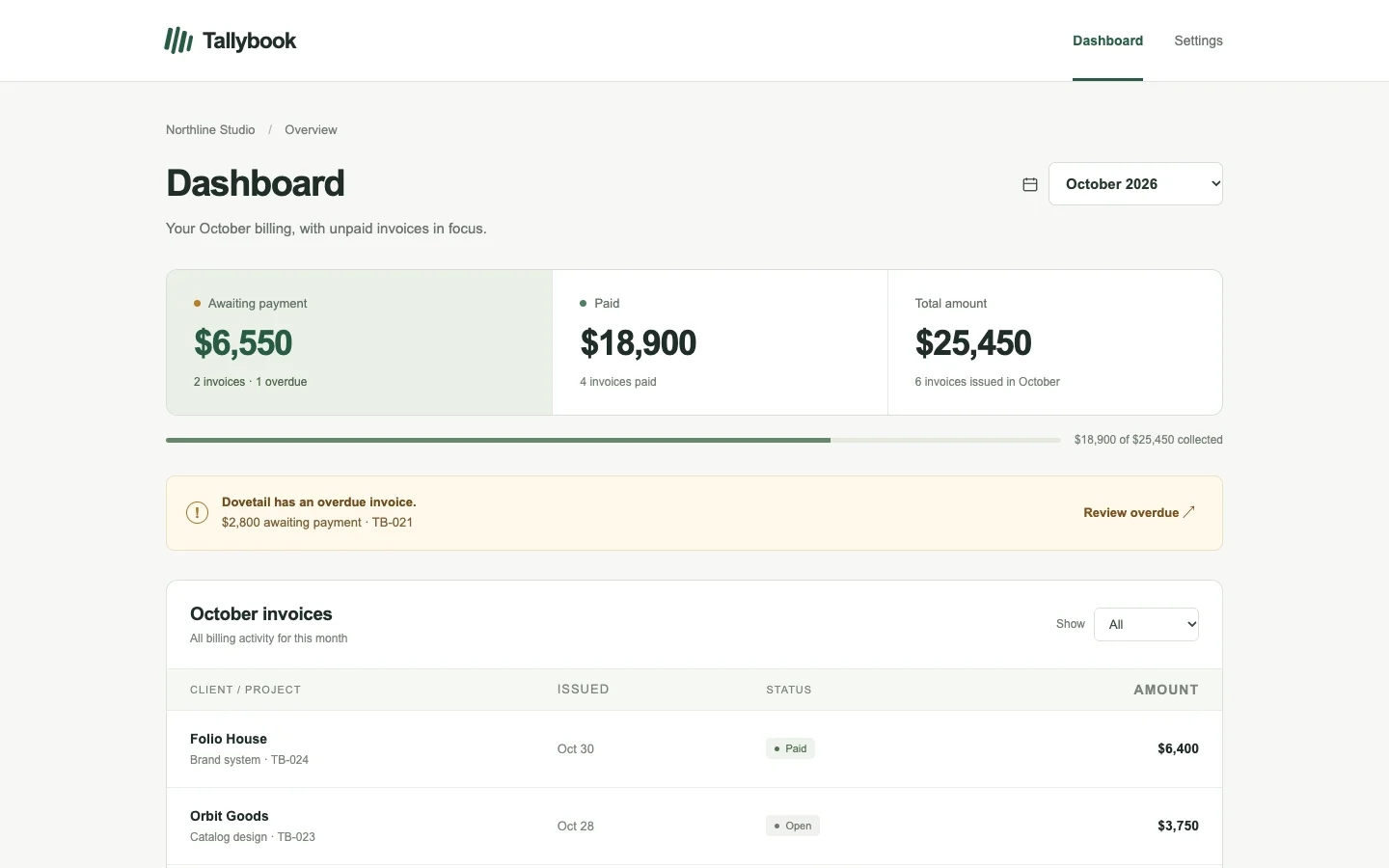
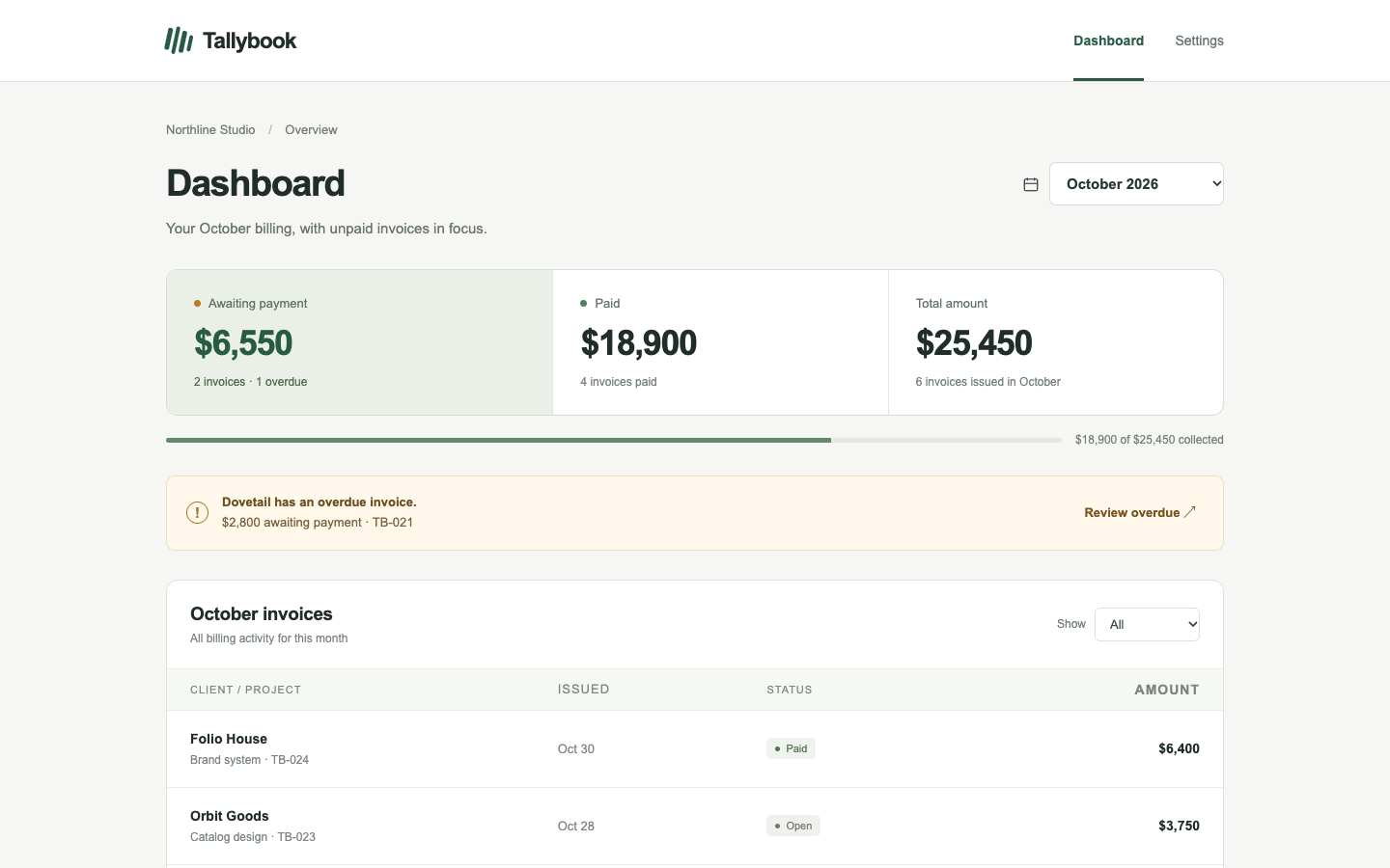
Pass 1. Left: plain; right: kit-polish. Raw preference: 5/7 (4 is neutral, higher favors right). B puts Dovetail’s $2,800 overdue invoice first and keeps unpaid rows visible on mobile, making follow-up easier to prioritize. A provides a clearer “Review overdue” action and collection progress, but its mobile layout pushes the invoice list below the summary and alert.

Pass 2. Left: kit-polish; right: plain. Raw preference: 5/7 (4 is neutral, higher favors right). B groups October totals with collection progress and gives the overdue invoice a specific review action. A keeps overdue and open invoices first in the table, making unpaid follow-up easier to scan, while B uses mobile space on a separate overdue notice above paid-first rows.

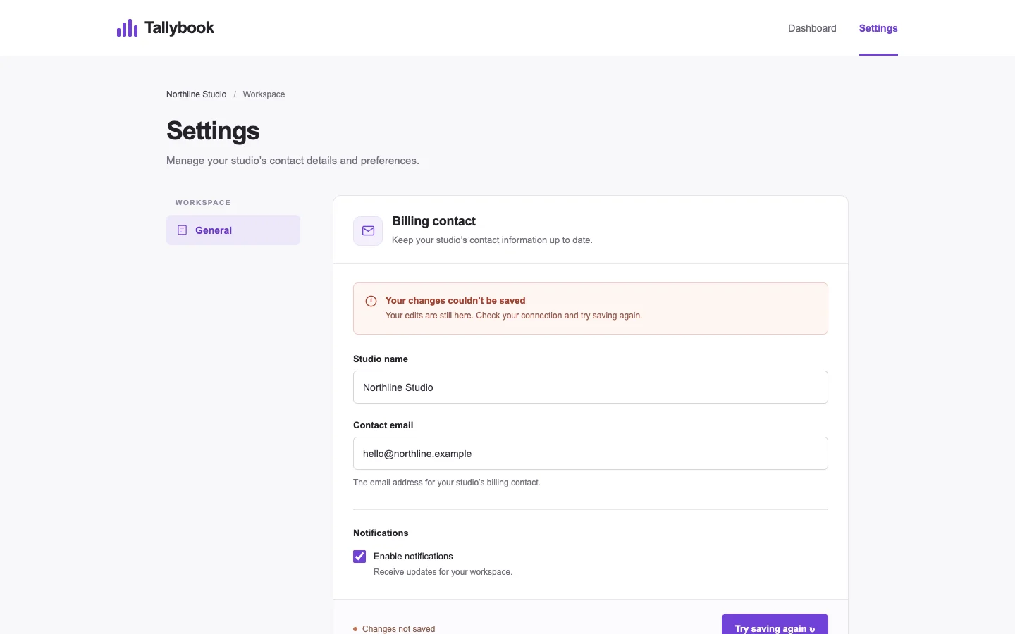
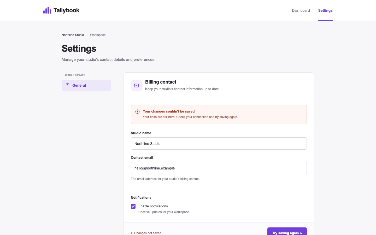
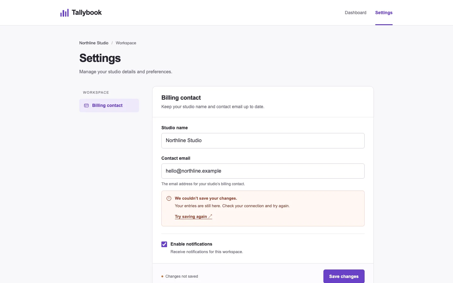
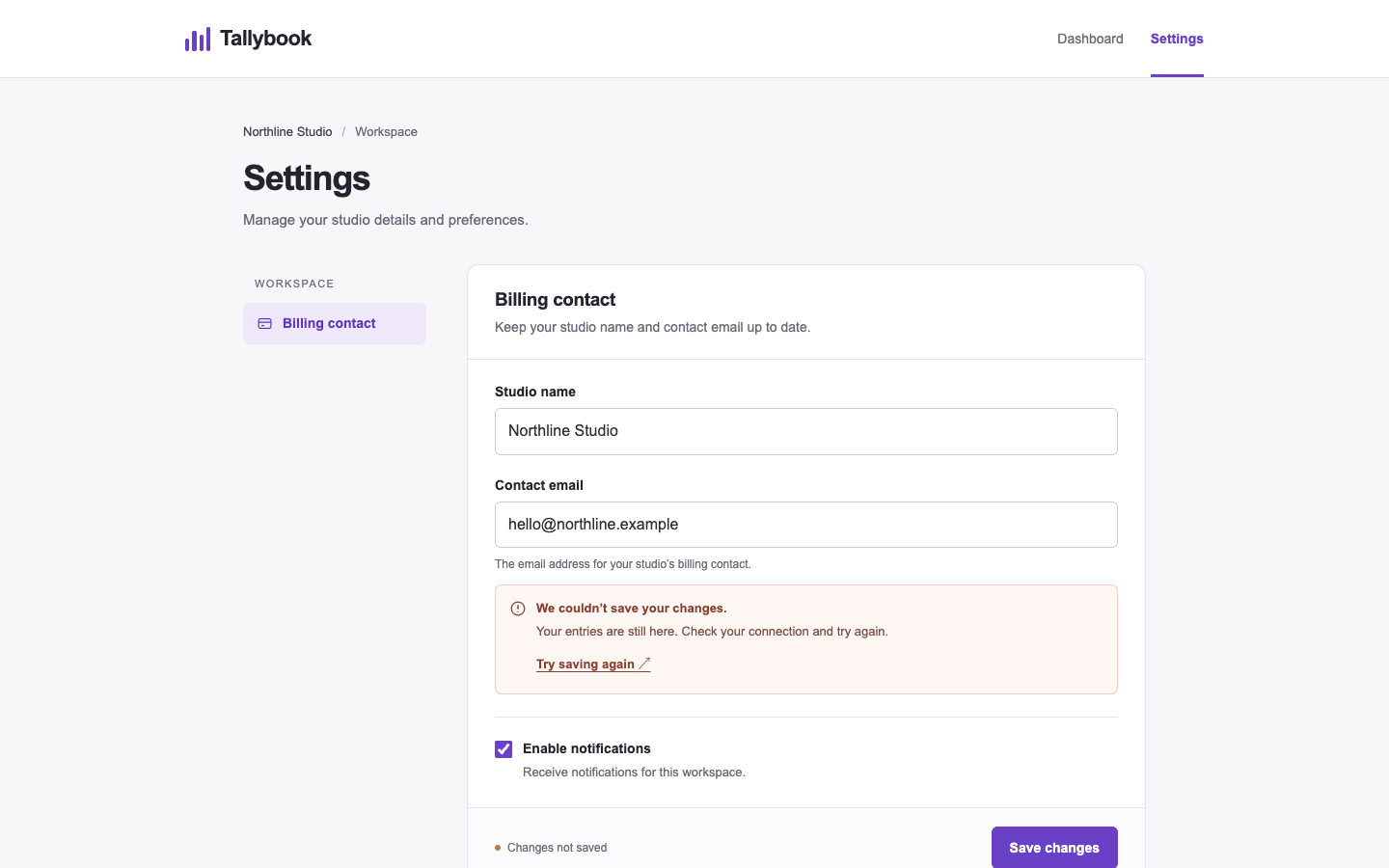
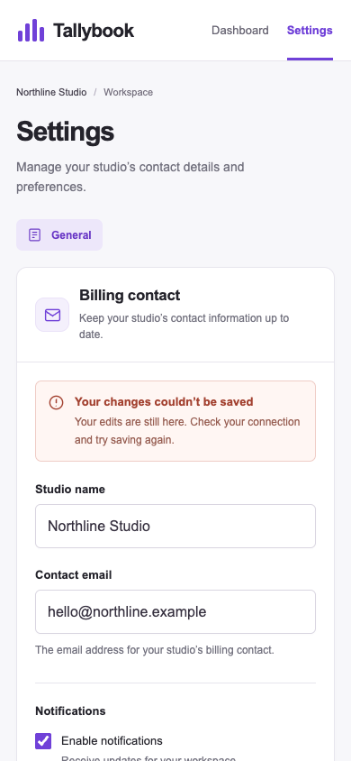
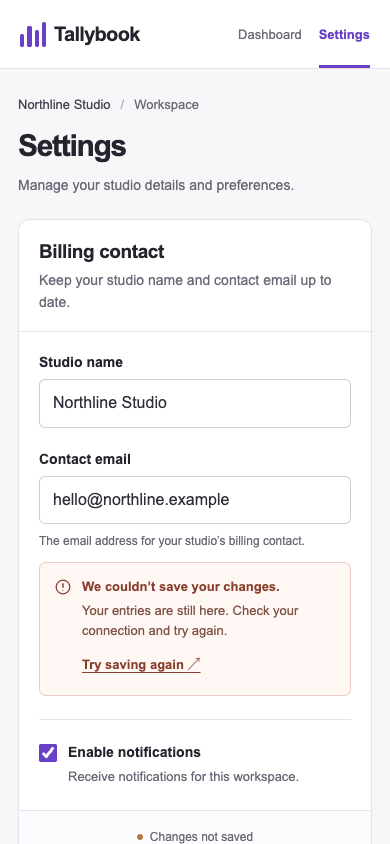
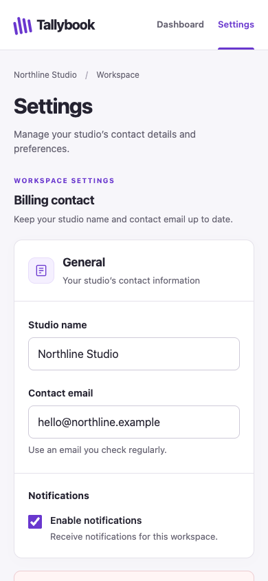
/harden · tally-settings · win

Make the billing contact settings ready for a studio owner to edit and recover from a failed save on a phone.

desktop: Plain render (original PNG) · Procedure render (original PNG)

mobile: Plain render · Procedure render

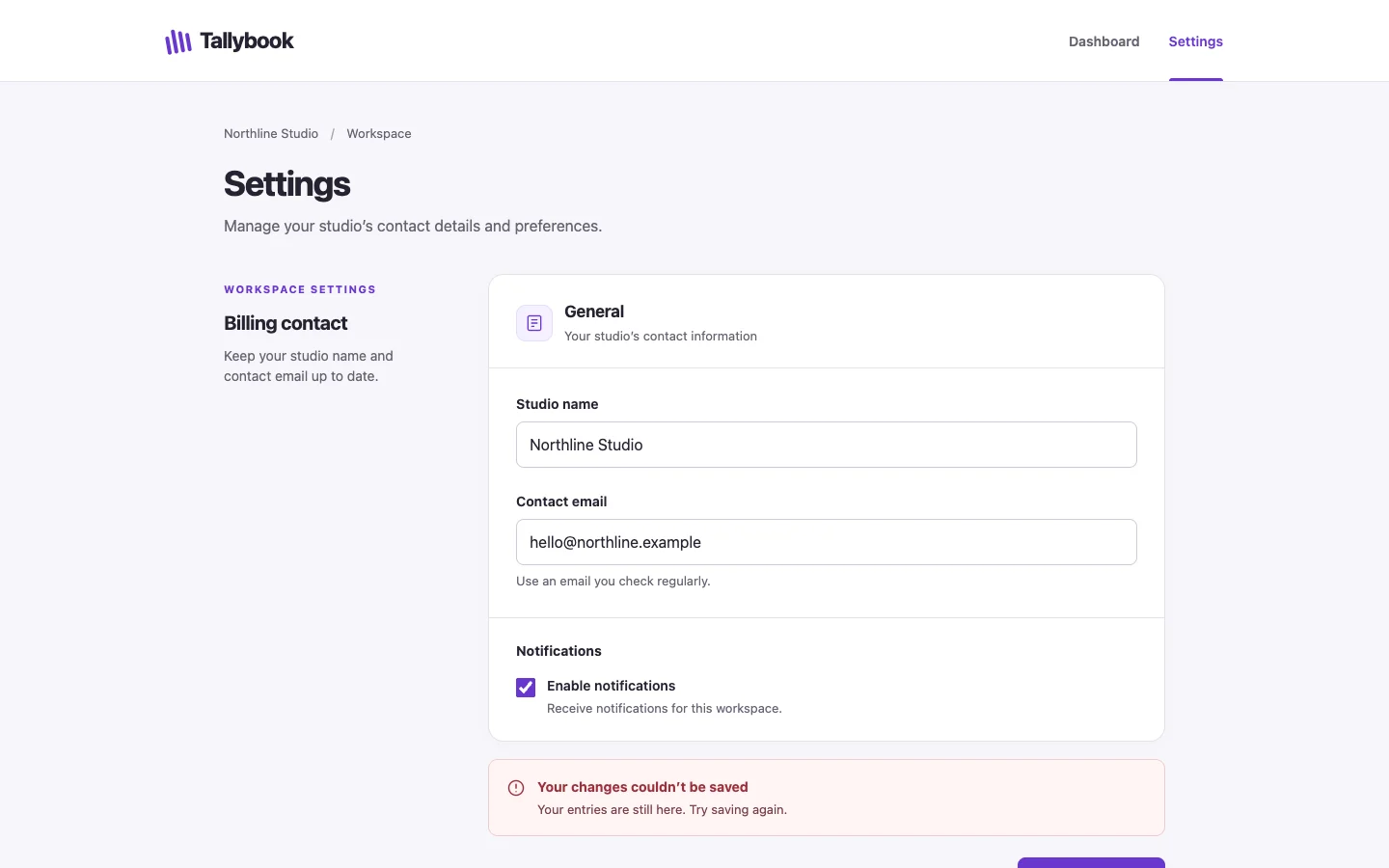
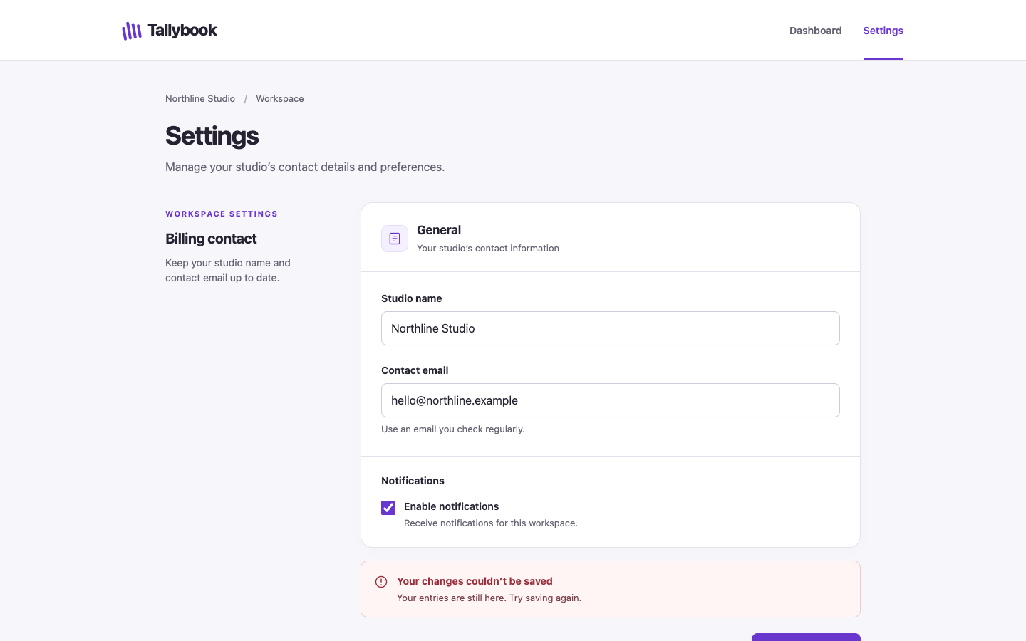
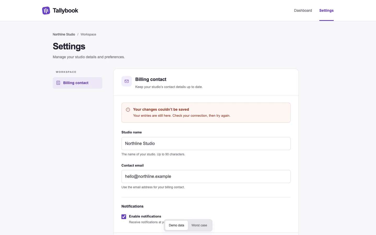
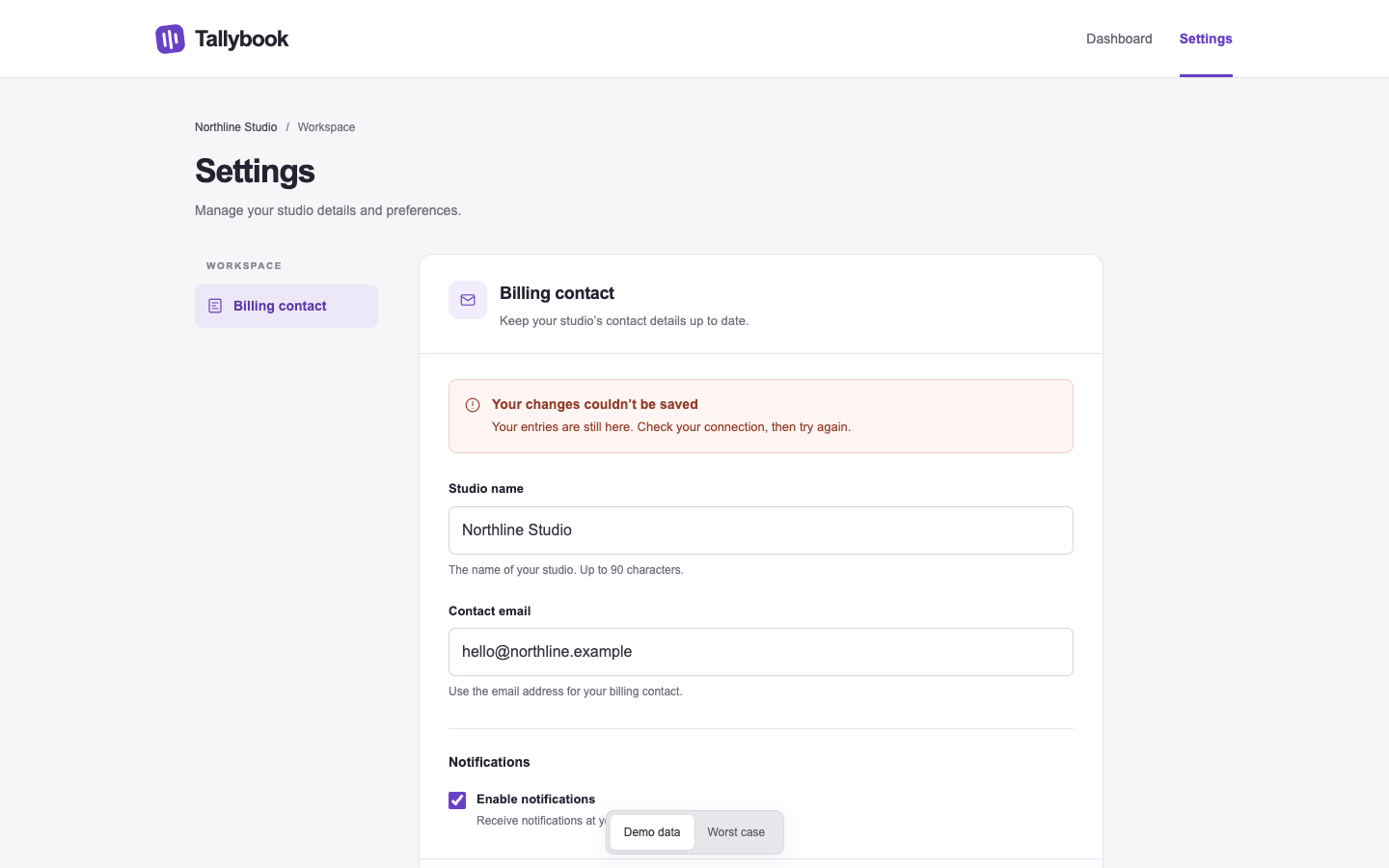
Pass 1. Left: plain; right: kit-harden. Raw preference: 6/7 (4 is neutral, higher favors right). B places an explicit retry action inside the failed-save message, visible on mobile; A puts recovery in the desktop footer, outside the mobile view. B also brings the editable fields higher on mobile by removing the General tab and decorative header icon, though A makes the error more prominent by placing it before the fields.

Pass 2. Left: kit-harden; right: plain. Raw preference: 2/7 (4 is neutral, higher favors right). A places “Try saving again” inside the error beside the preserved billing details, making recovery visible on mobile; B places its retry action in the desktop footer, outside the visible mobile area. B makes the failure prominent above the fields, but its General tab and taller header push editing controls farther down the phone screen.

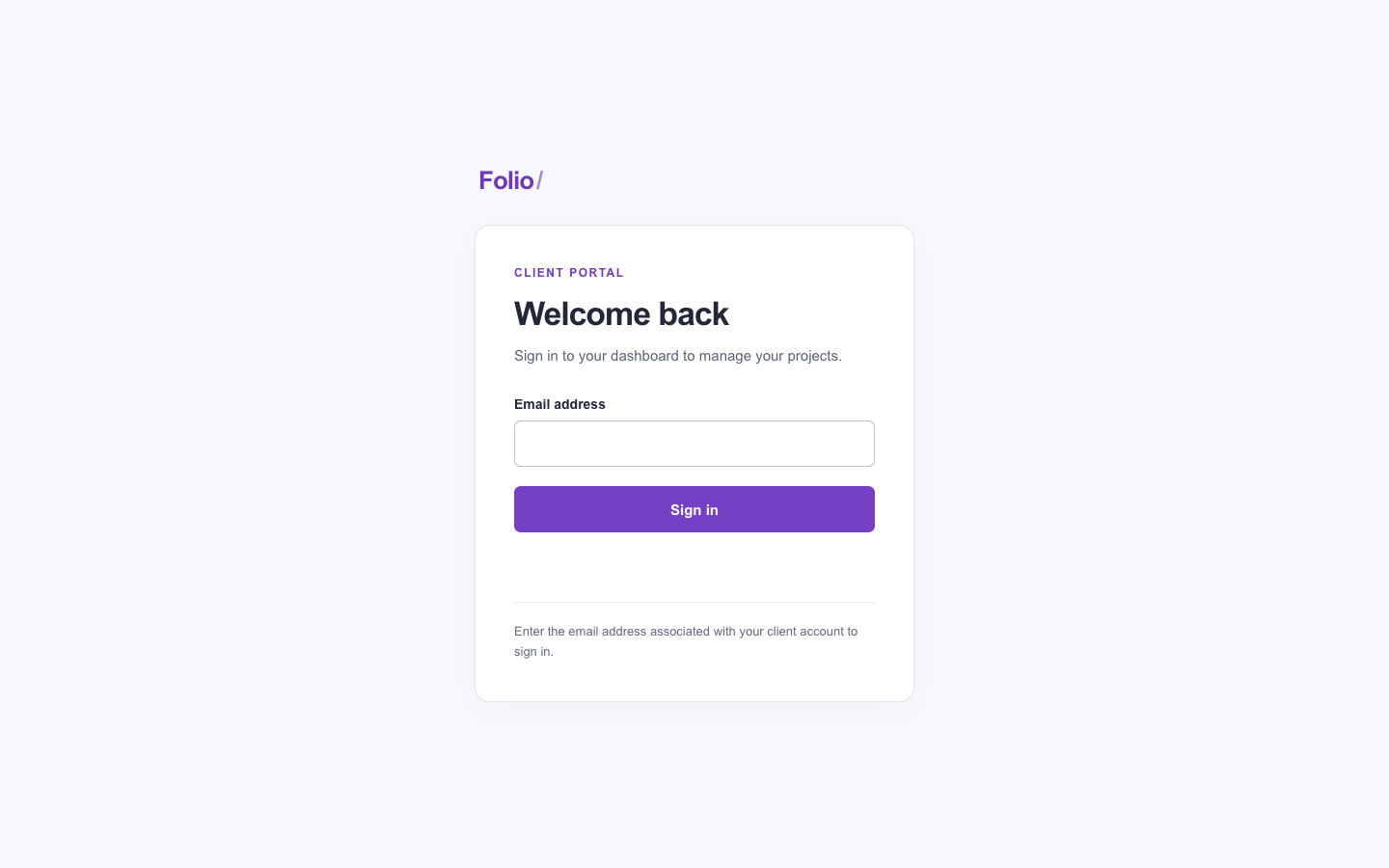
/ship · folio-login · win

Prepare the client sign-in screen for release. Review the customer-visible path and address the most consequential presentation defects.

desktop: Plain render · Procedure render

mobile: Plain render · Procedure render

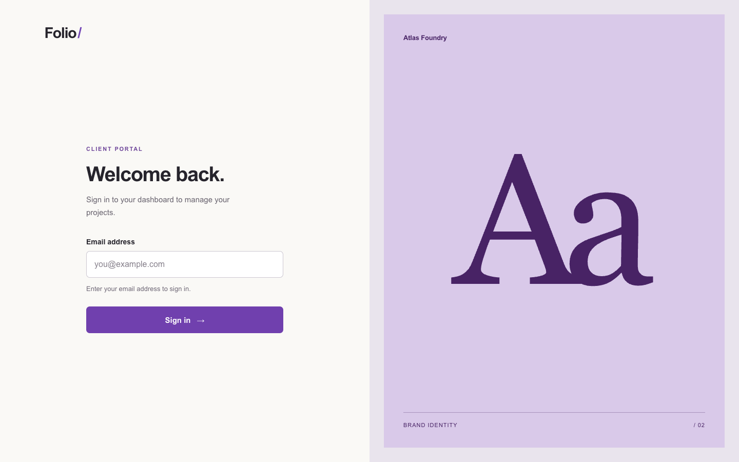
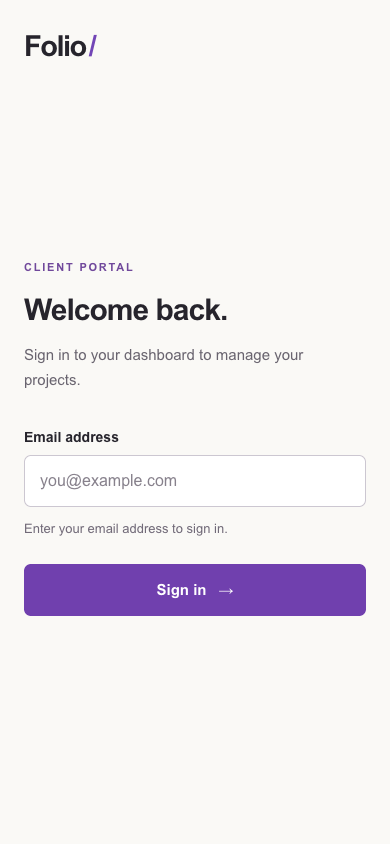
Pass 1. Left: plain; right: kit-ship. Raw preference: 6/7 (4 is neutral, higher favors right). B’s desktop split layout and typographic specimen give the screen a distinct identity, while its mobile form retains clear labels and a prominent sign-in action. A provides more useful account-specific guidance and places the form higher on mobile, but its bordered card feels more generic.

Pass 2. Left: kit-ship; right: plain. Raw preference: 2/7 (4 is neutral, higher favors right). A’s Atlas Foundry panel gives the desktop a specific studio identity, while B’s centered card feels more interchangeable. A also places email guidance directly beneath the field; B groups the mobile form more compactly but separates that guidance from the input with a large gap and divider.

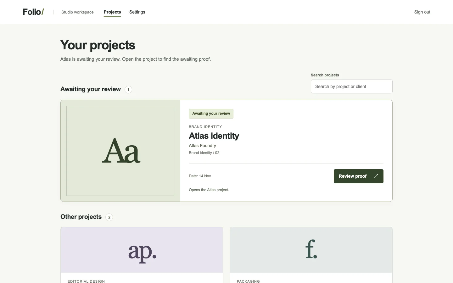
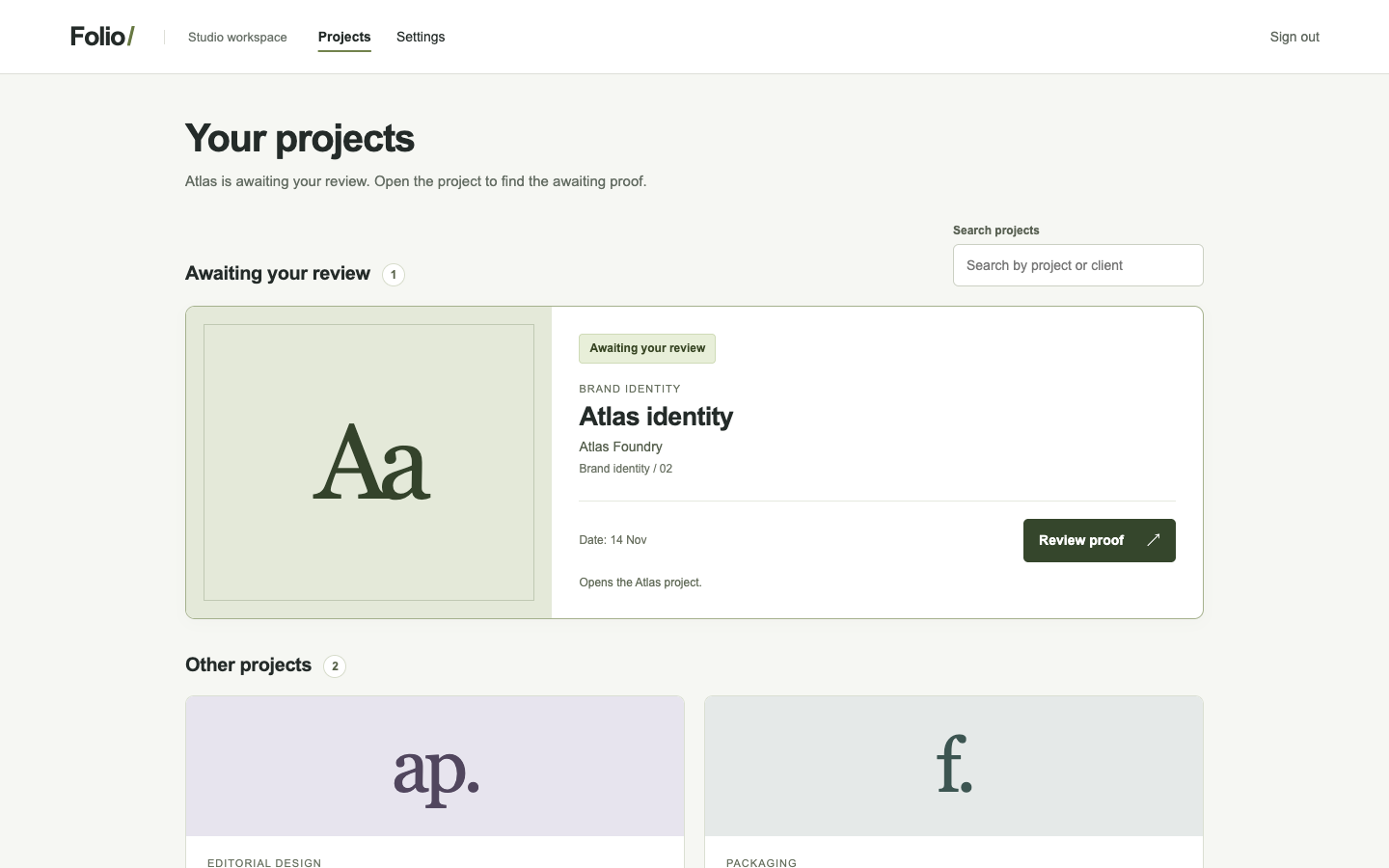
/audit · folio-projects · win

Audit how a client finds the Atlas proof awaiting review. Give the implementer a precise repair brief.

desktop: Plain render (original PNG) · Procedure render (original PNG)

mobile: Plain render · Procedure render

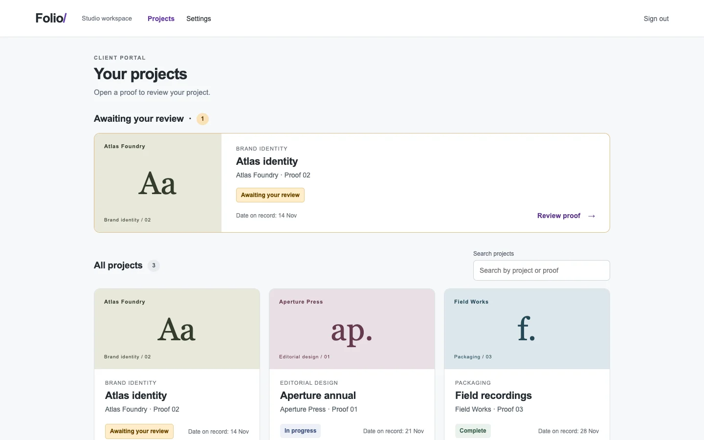
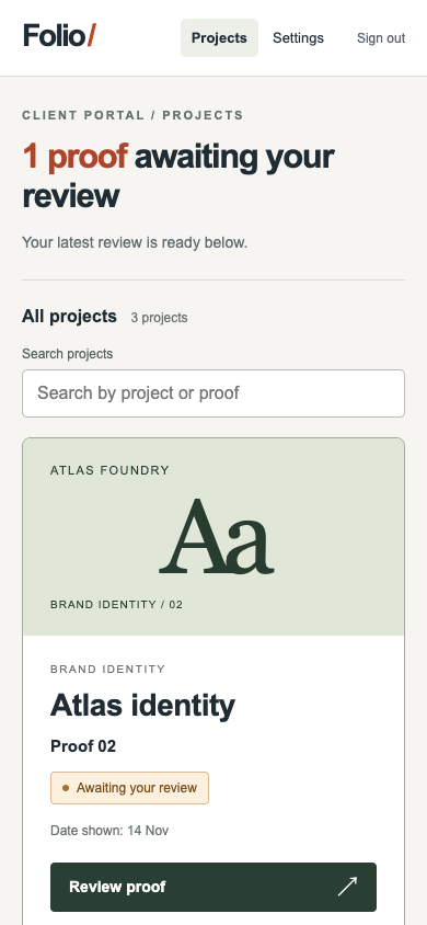
Pass 1. Left: plain; right: kit-audit. Raw preference: 5/7 (4 is neutral, higher favors right). B gives the pending Atlas proof one prominent placement and a clear Review proof button; A duplicates it under All projects, adding scanning work. However, B drops Atlas Foundry from the proof details, weakens Date on record to Date shown, and pushes the mobile action near the viewport bottom. Preserve B’s single placement, restore those facts, and tighten mobile spacing so the action appears sooner.

Pass 2. Left: kit-audit; right: plain. Raw preference: 3/7 (4 is neutral, higher favors right). A makes the pending task explicit with “1 proof awaiting your review” and gives Atlas a prominent Review proof button; preserve that priority, but replace “Date shown” with a precise date label. B groups pending reviews clearly, but repeats Atlas under All projects and gives its mobile action less emphasis; consolidate the duplicate and strengthen Review proof.

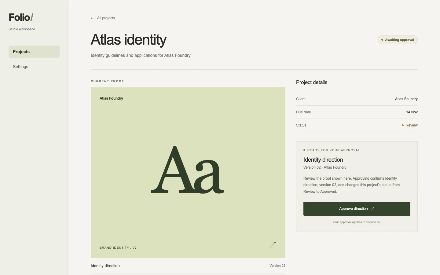
/motion · folio-project · win

Clarify which proof awaits approval and how its state changes when a client approves it, including a quiet path for reduced motion.

desktop: Plain render (original PNG) · Procedure render (original PNG)

mobile: Plain render · Procedure render

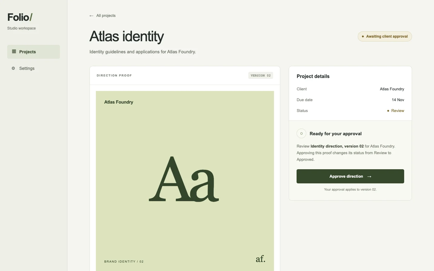
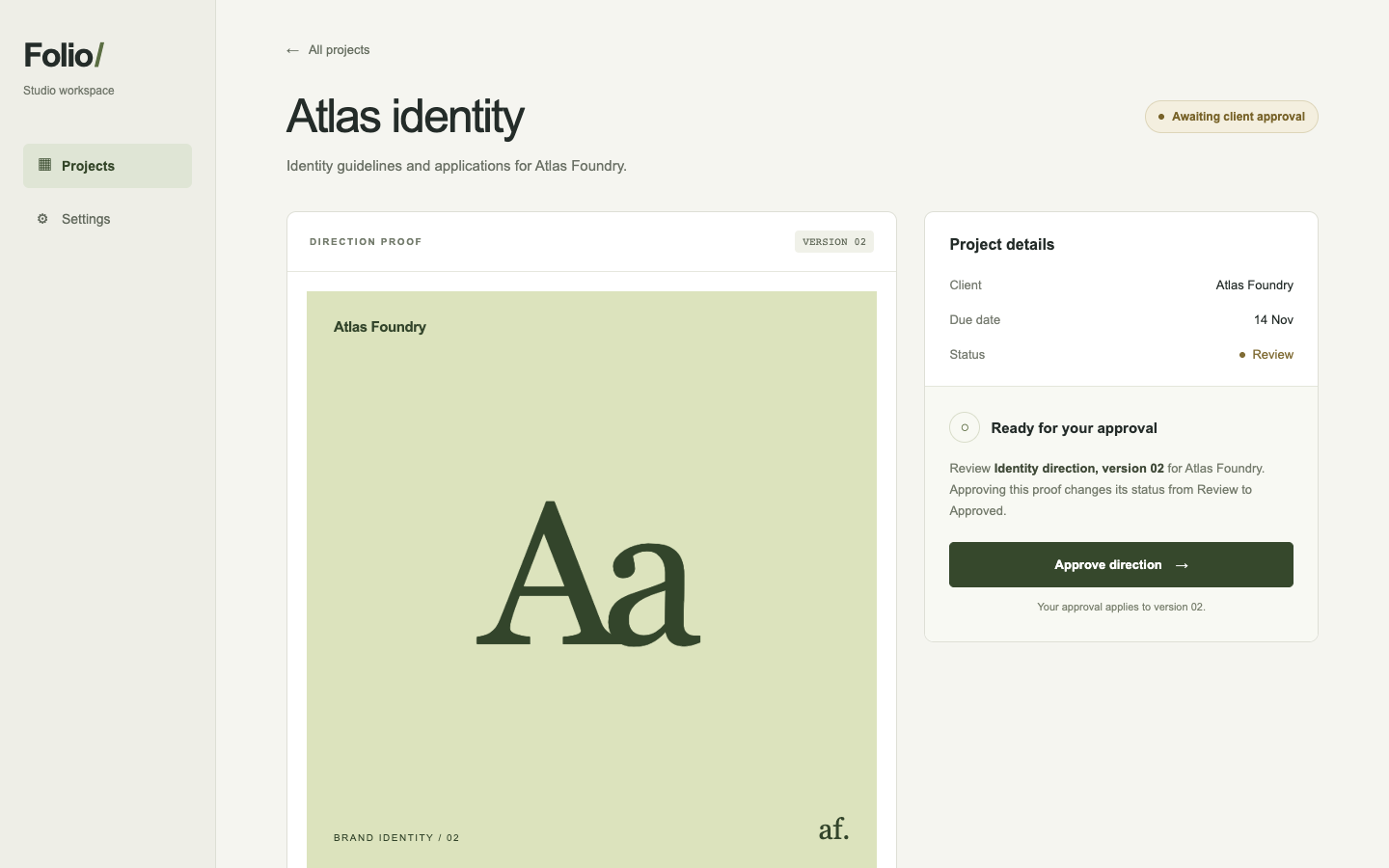
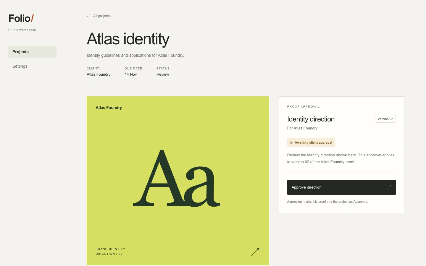
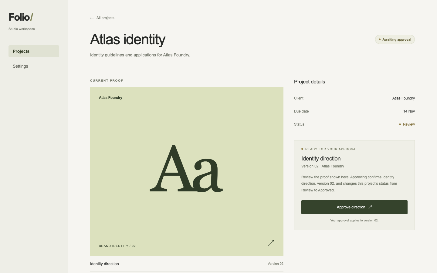
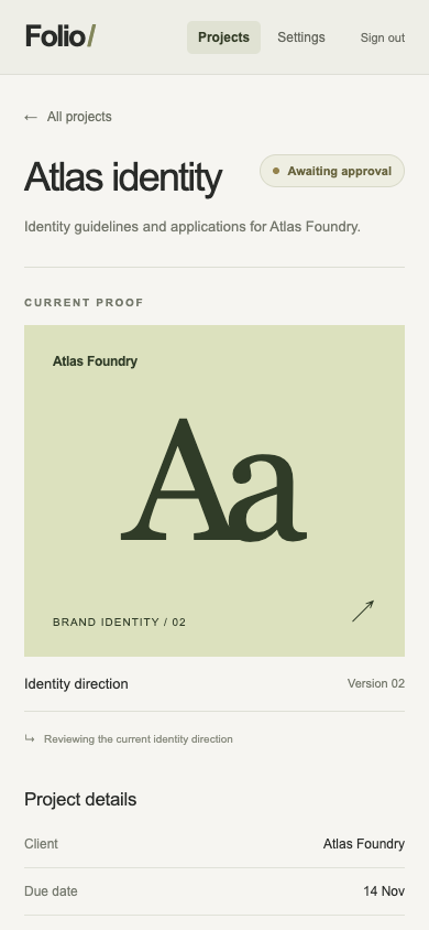
Pass 1. Left: plain; right: kit-motion. Raw preference: 6/7 (4 is neutral, higher favors right). B groups Identity direction, Version 02, the approval action and its consequence - marking both proof and project Approved - in one panel. B also keeps that action prominent on mobile, although A shows the proof earlier for inspection; reduced-motion behavior is not visible in either.

Pass 2. Left: kit-motion; right: plain. Raw preference: 3/7 (4 is neutral, higher favors right). A keeps the version, approval button and explicit Approved outcome together and visible on mobile, though its proof preview falls below the action. B presents the proof and version more clearly, but its mobile approval control falls below the visible screen; neither shows a reduced-motion path.

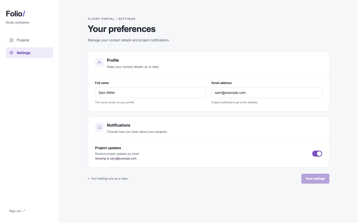
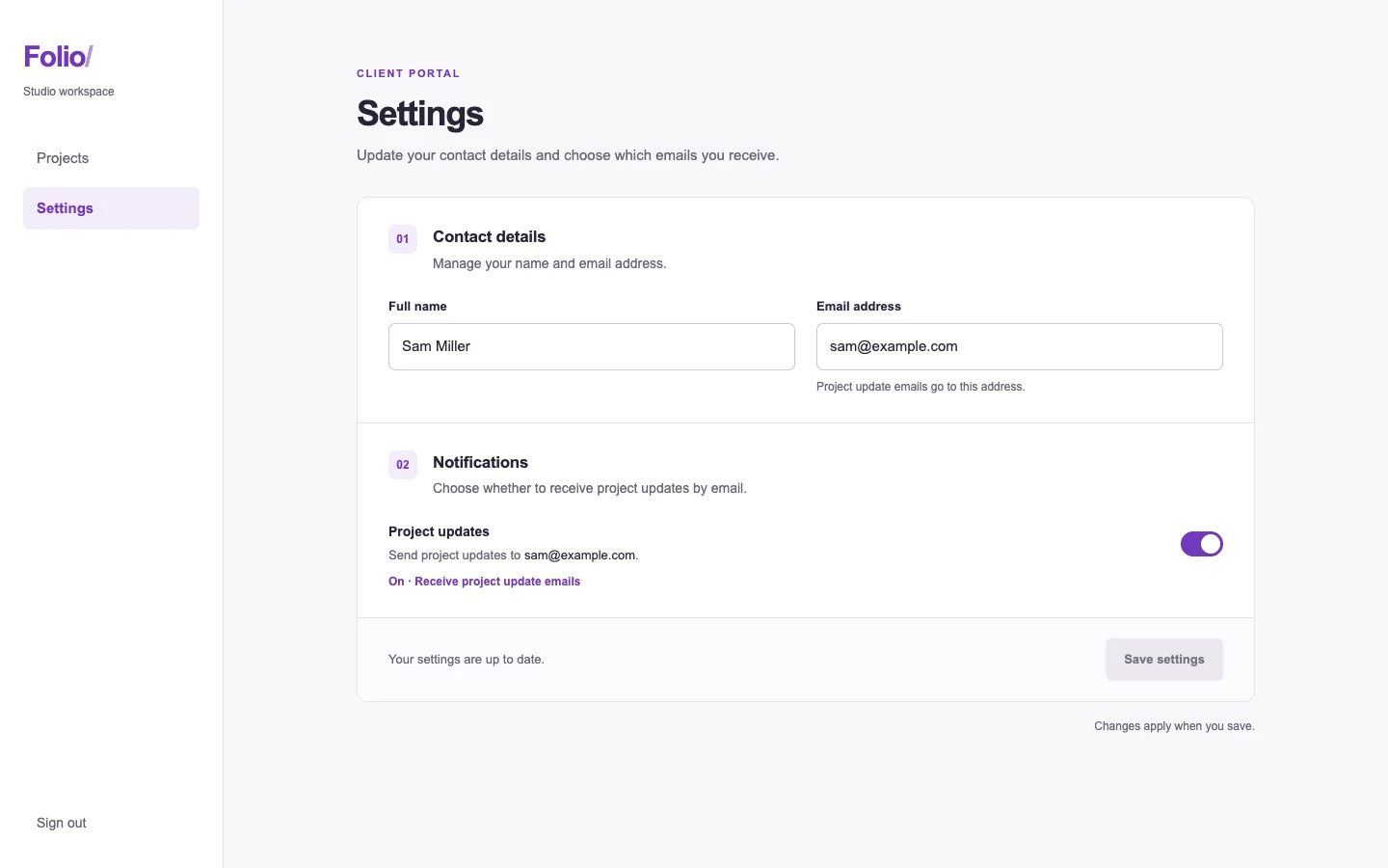
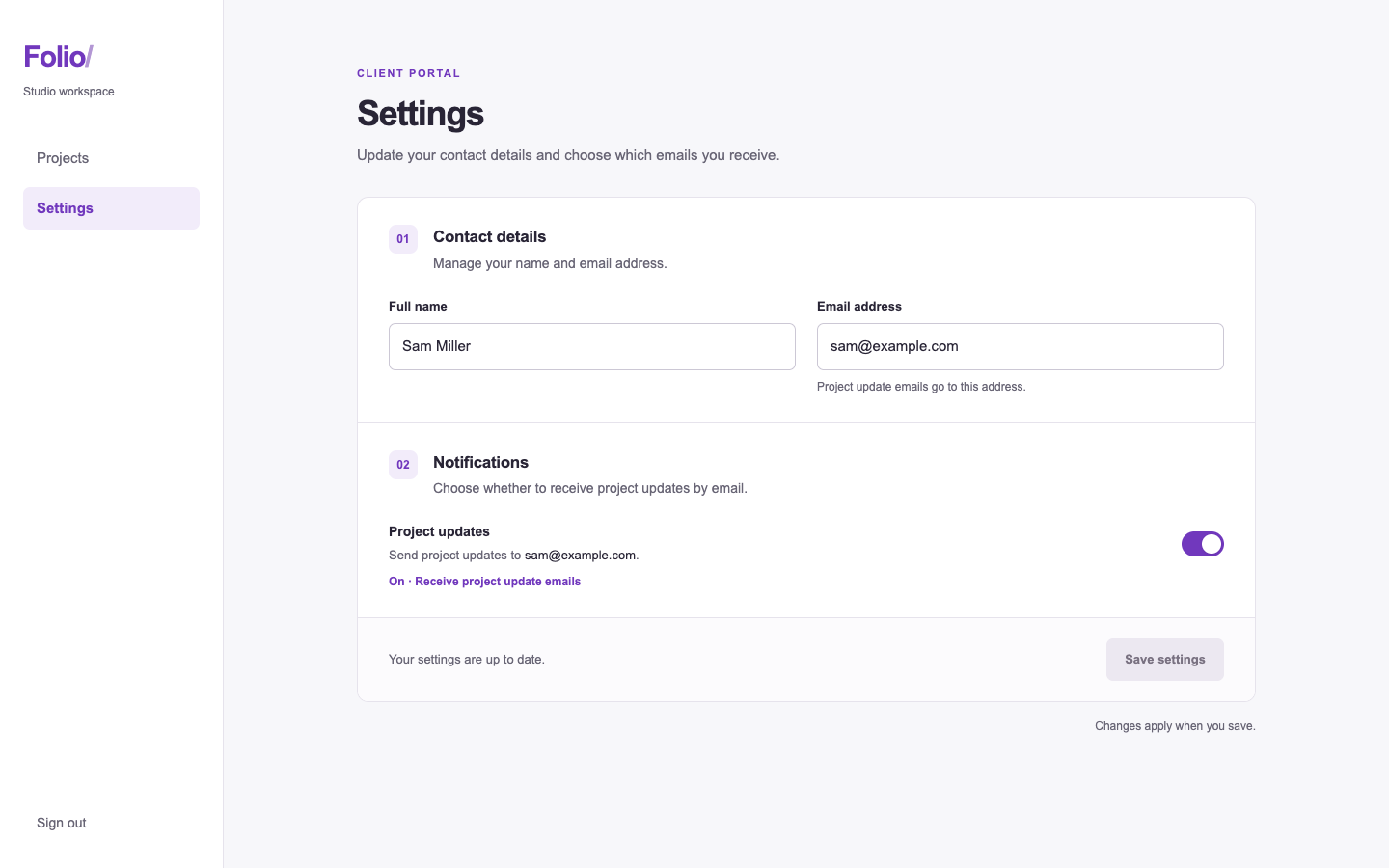
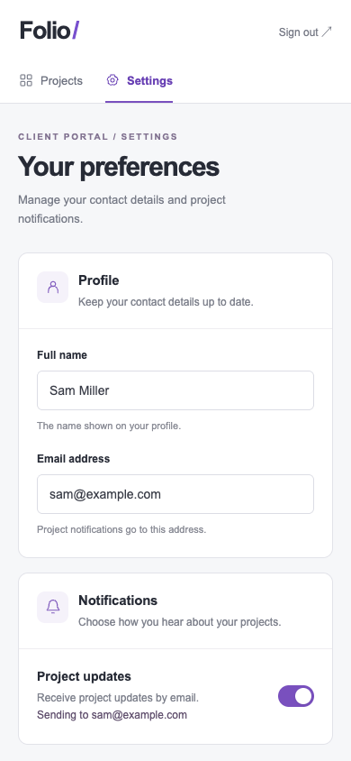
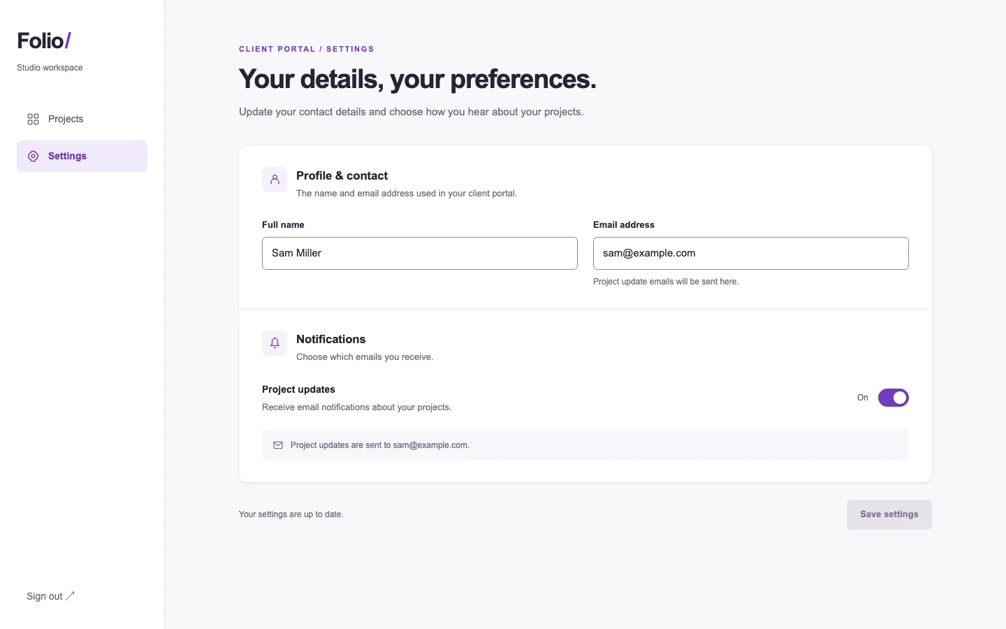
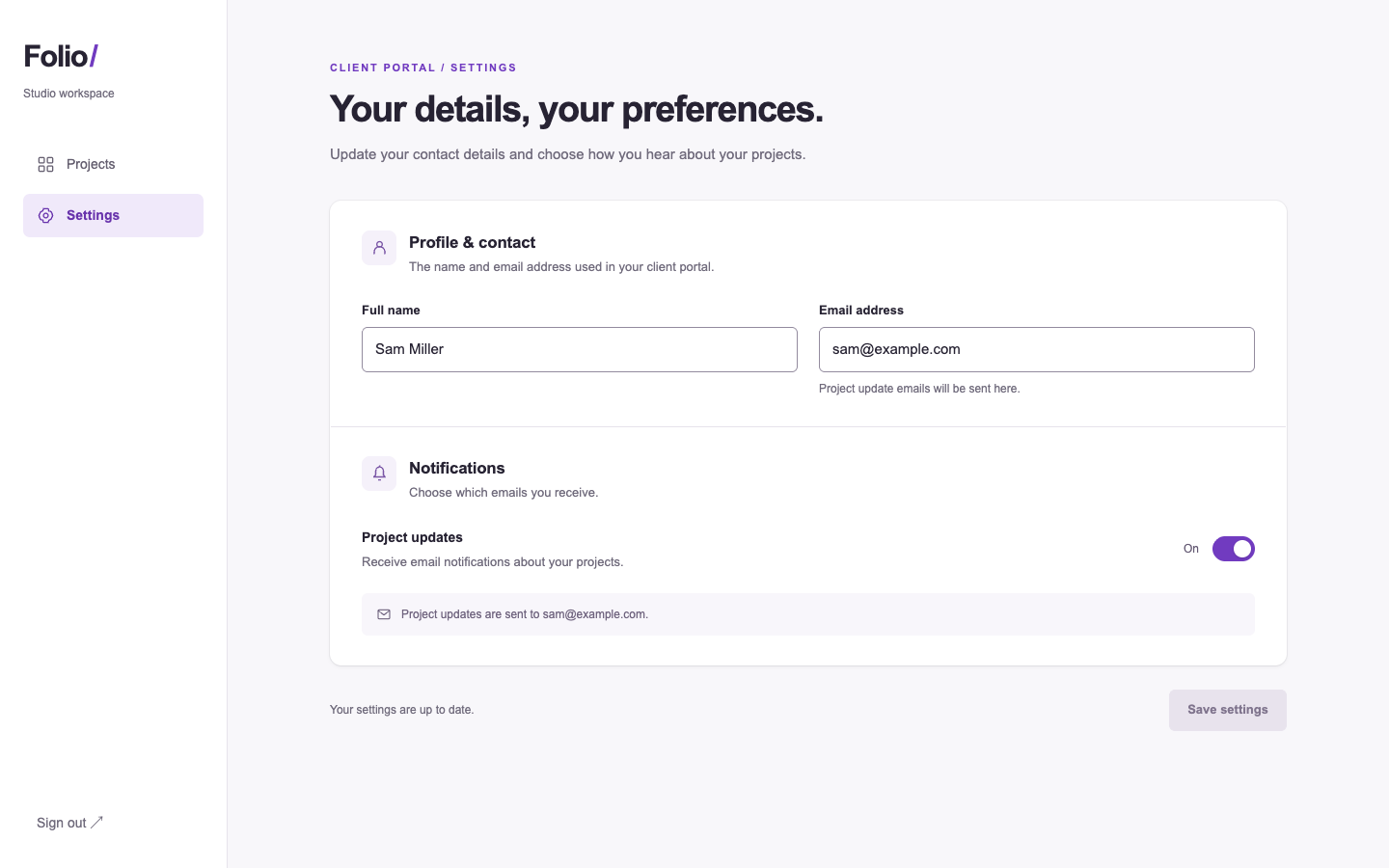
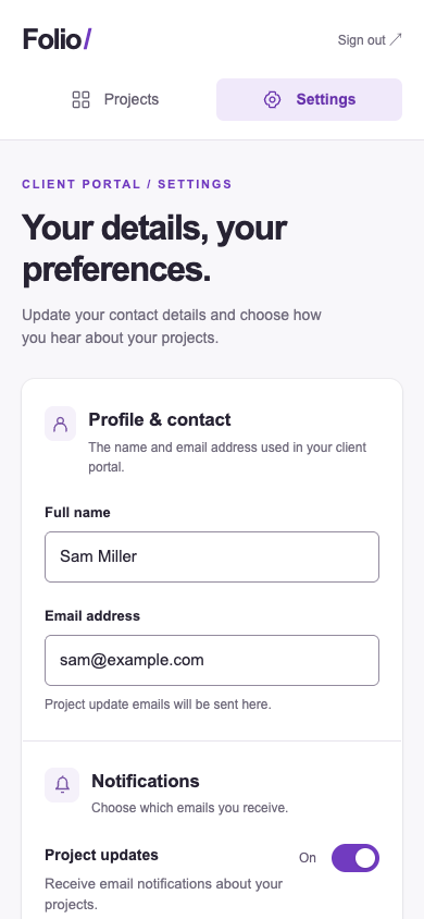
/polish · folio-settings · win

Refine the contact and notification settings so a client can tell which details will change.

desktop: Plain render (original PNG) · Procedure render (original PNG)

mobile: Plain render · Procedure render

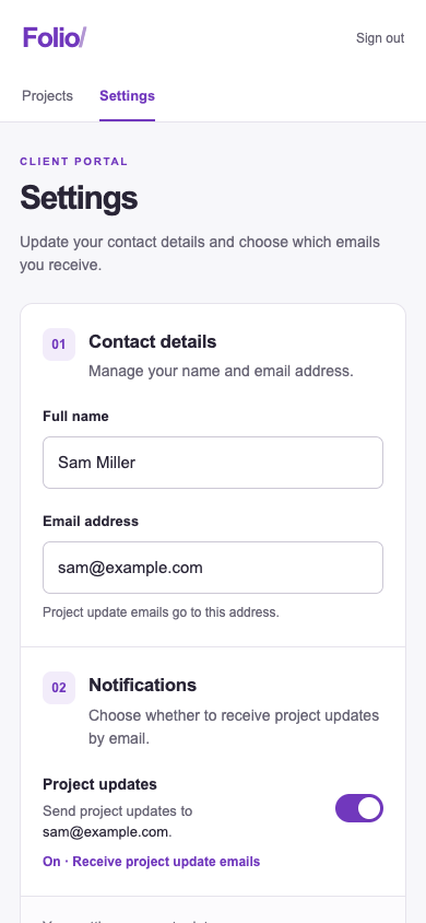
Pass 1. Left: plain; right: kit-polish. Raw preference: 6/7 (4 is neutral, higher favors right). B groups contact details, notifications and Save settings in one panel, with an explicit On label that makes the notification setting easier to interpret. A gives the sections clearer visual separation on mobile, but B’s Contact details heading and save guidance clarify what the form changes and when.

Pass 2. Left: kit-polish; right: plain. Raw preference: 3/7 (4 is neutral, higher favors right). A explicitly says changes apply when saved and labels notifications “On,” making the current state and save action clearer. B groups fields cleanly and fits the notification control more comfortably on mobile, but its generic “Your preferences” heading and less clearly disabled save button weaken task clarity.

/fix · pour-home · win

Finish a working brew calculator for someone weighing coffee at the counter. Preserve the actual brew recipe.

desktop: Plain render (original PNG) · Procedure render (original PNG)

mobile: Plain render · Procedure render

Pass 1. Left: plain; right: kit-fix. Raw preference: 6/7 (4 is neutral, higher favors right). B brings the dose control, prominent 240 g total and pour targets higher on mobile, making the counter task easier to scan. A provides a visible Save recipe action on desktop, but its larger mobile introduction pushes more of the recipe below the screen.

Pass 2. Left: kit-fix; right: plain. Raw preference: 2/7 (4 is neutral, higher favors right). A puts the dose control and cumulative pour targets higher on mobile, making the recipe easier to consult at the counter. B gives the ratio and water total clearer separation, but its larger introduction and separate dose action push the working recipe farther down.

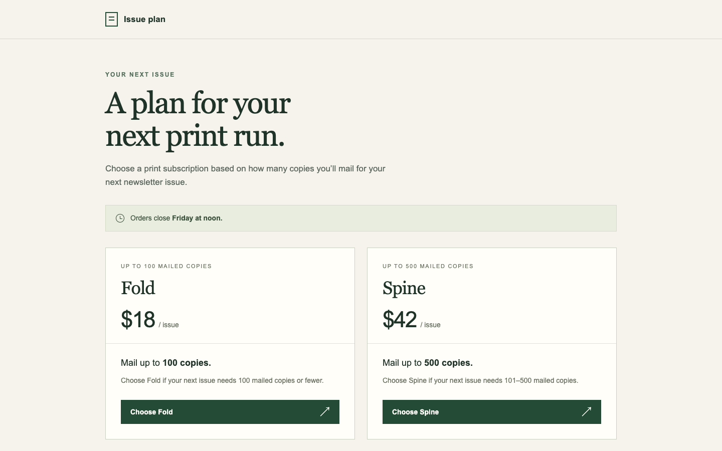
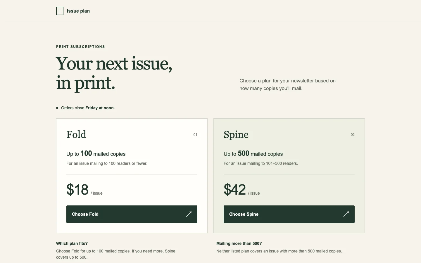
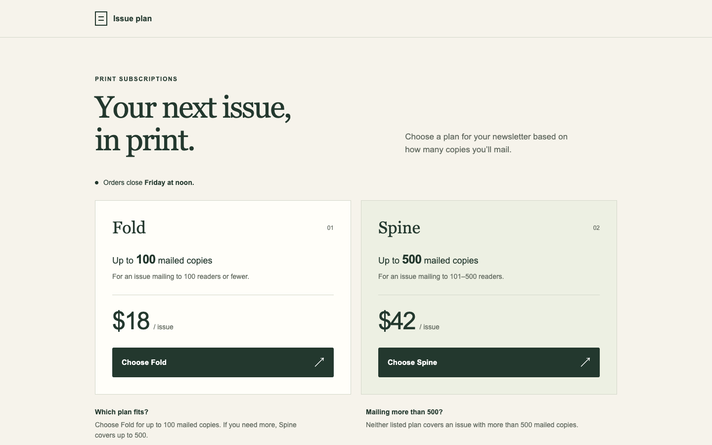
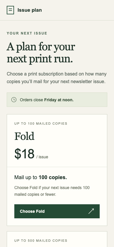
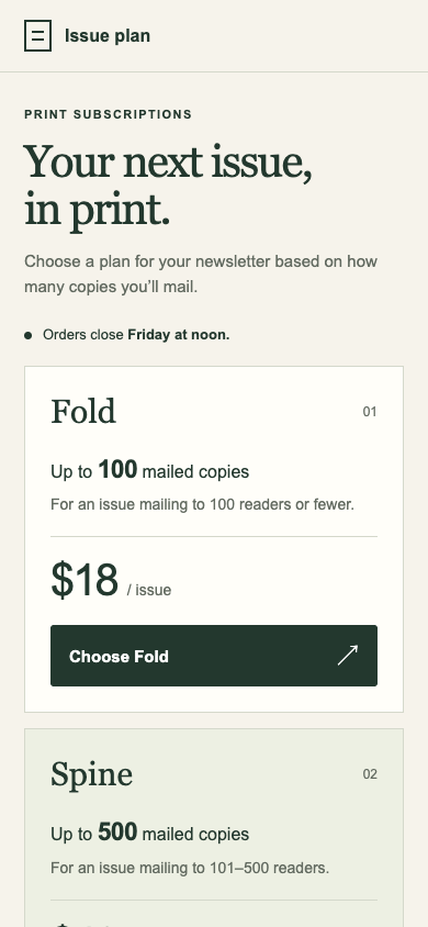
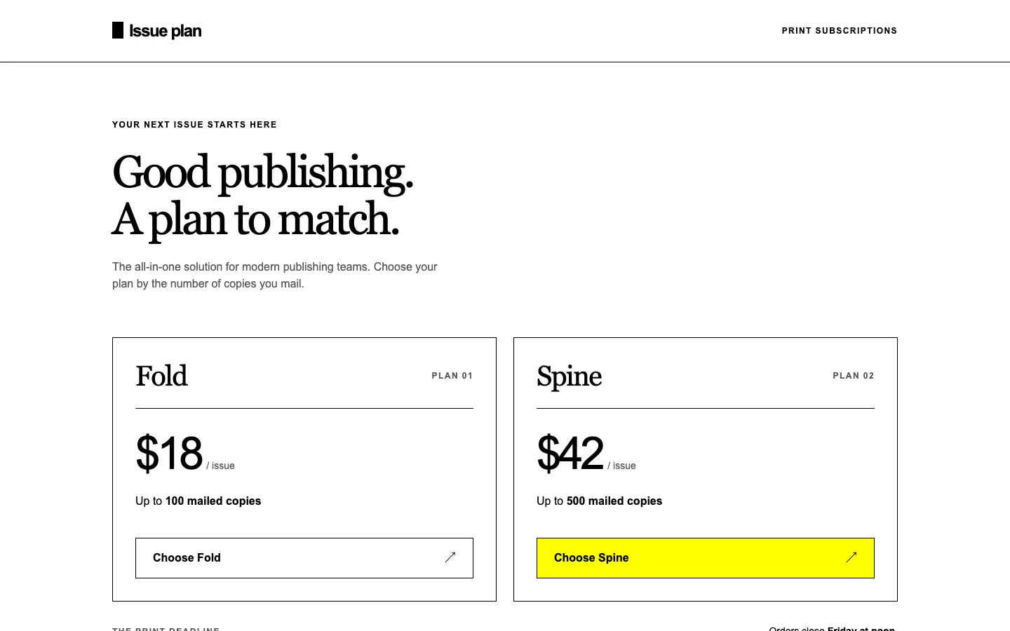
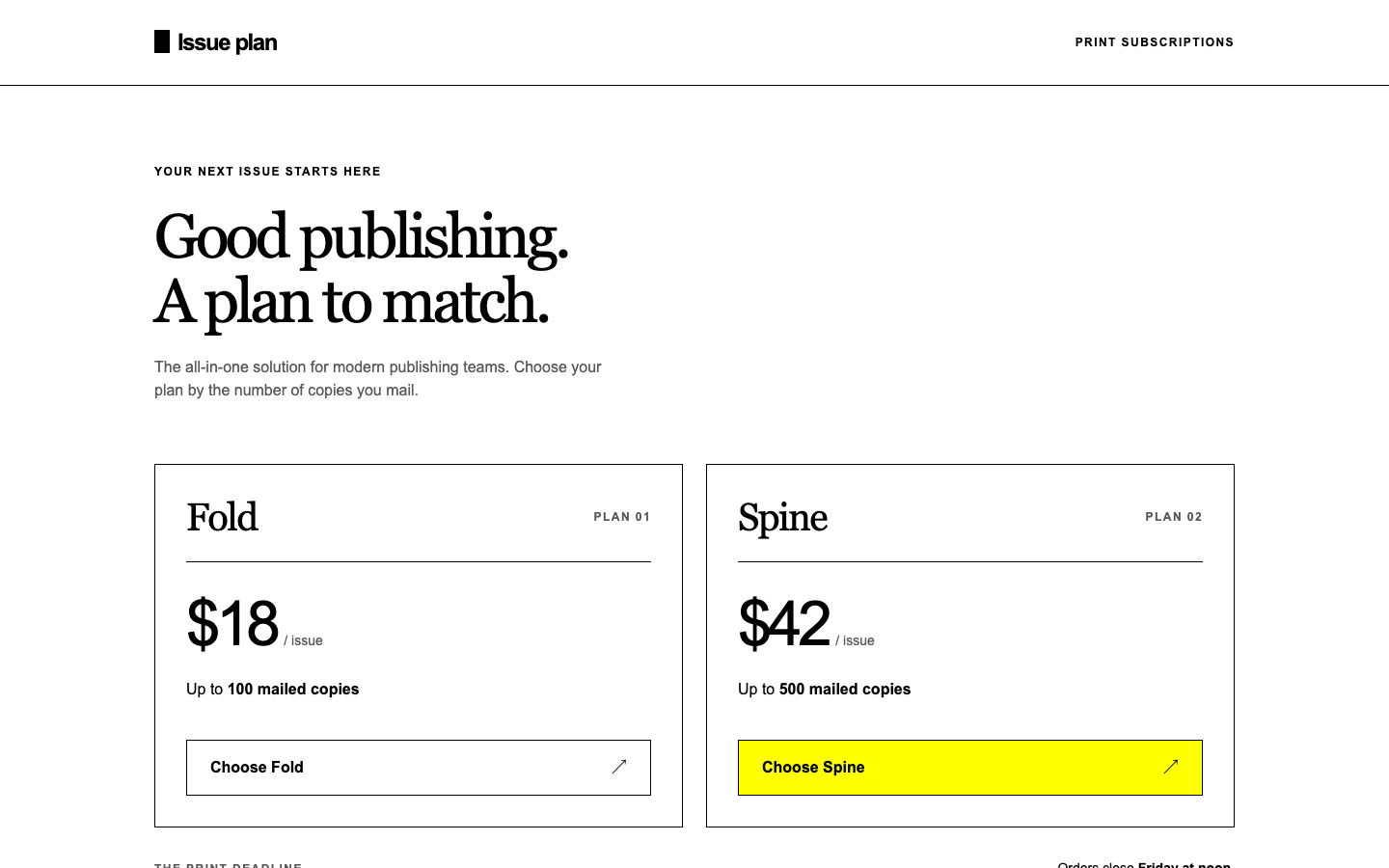
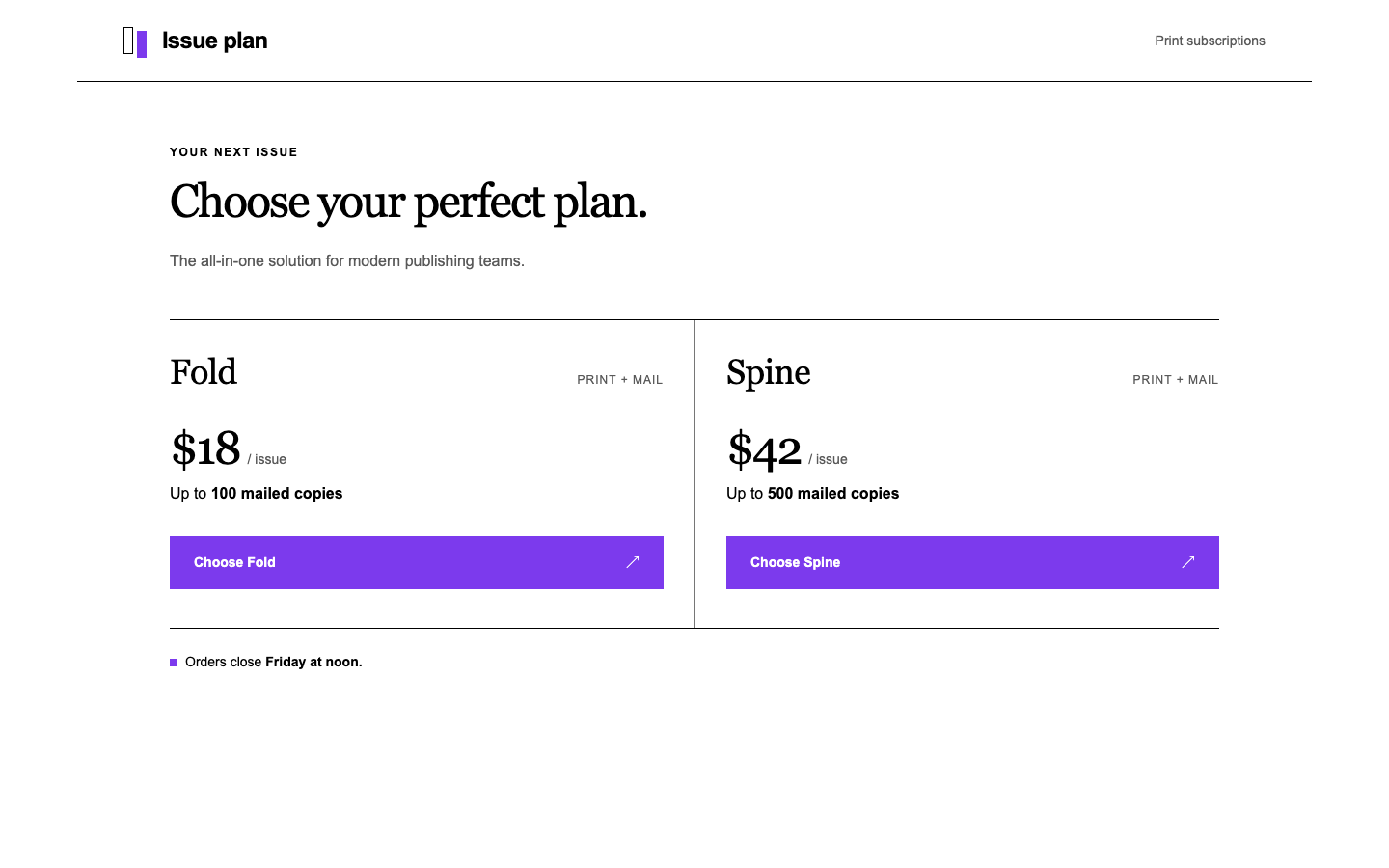
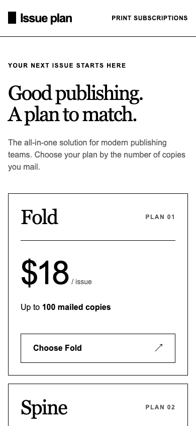
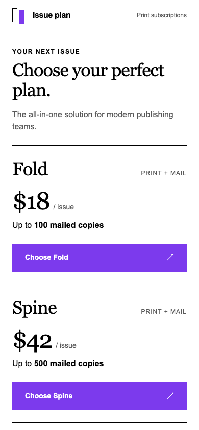
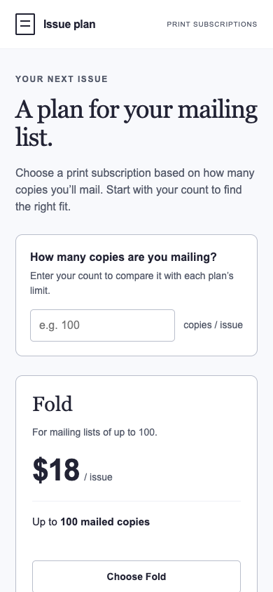
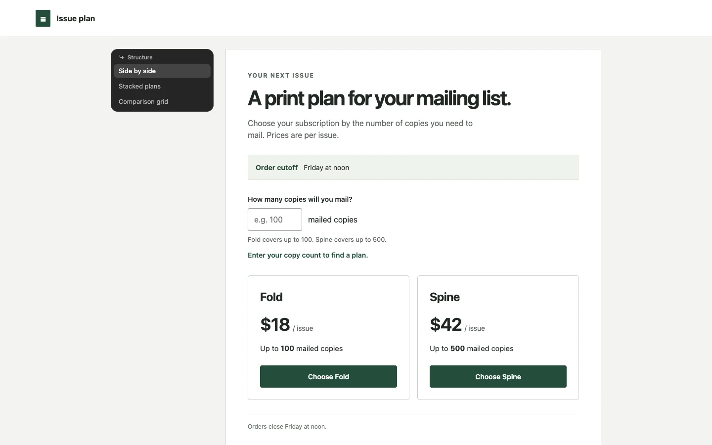
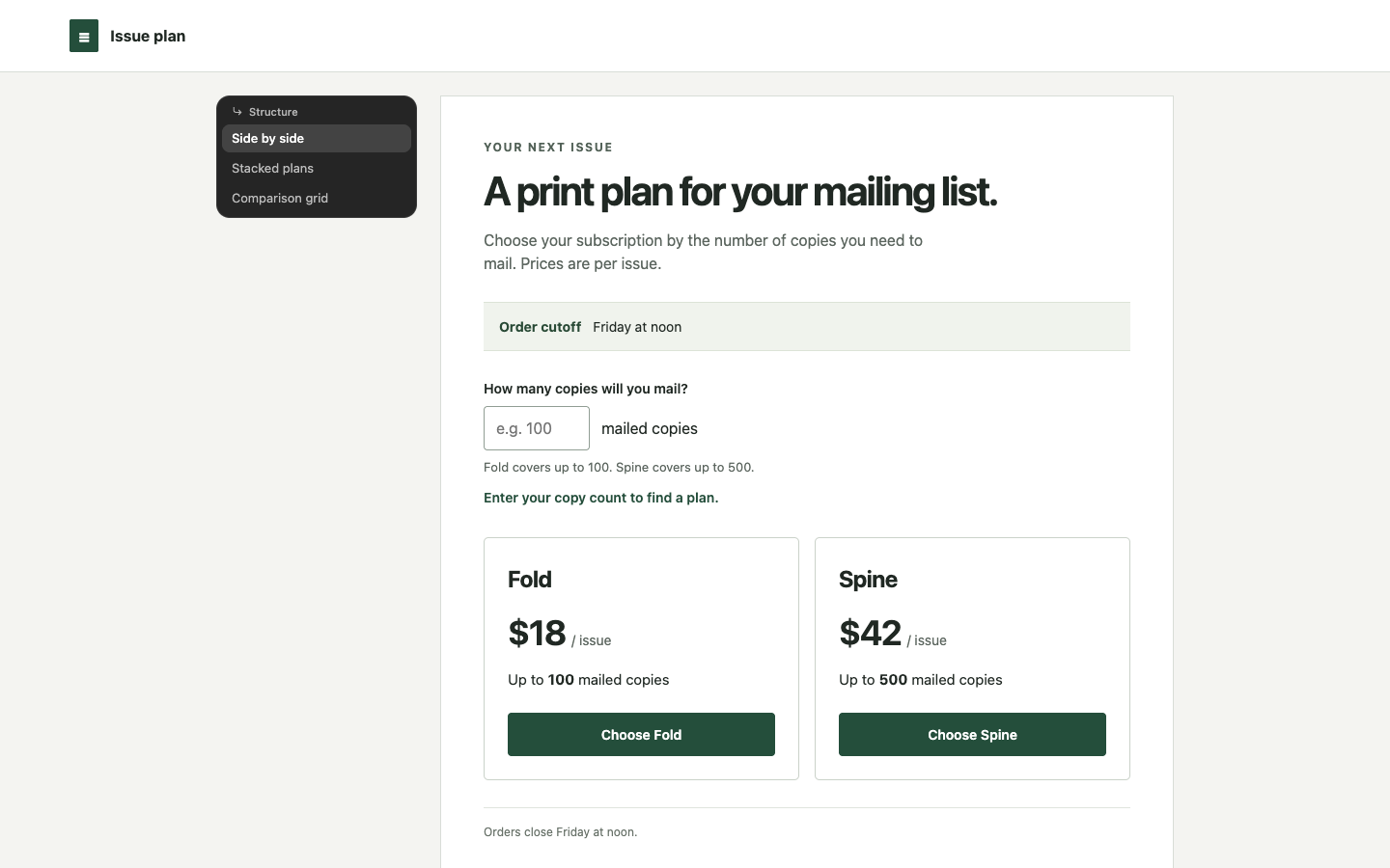
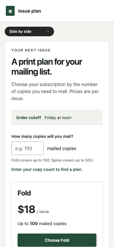
/landing · pricing · win

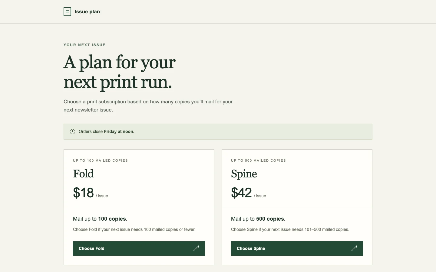
Help the owner of a newsletter choose the correct print subscription for their next issue. Keep the real prices and cutoffs.

desktop: Plain render (original PNG) · Procedure render (original PNG)

mobile: Plain render · Procedure render

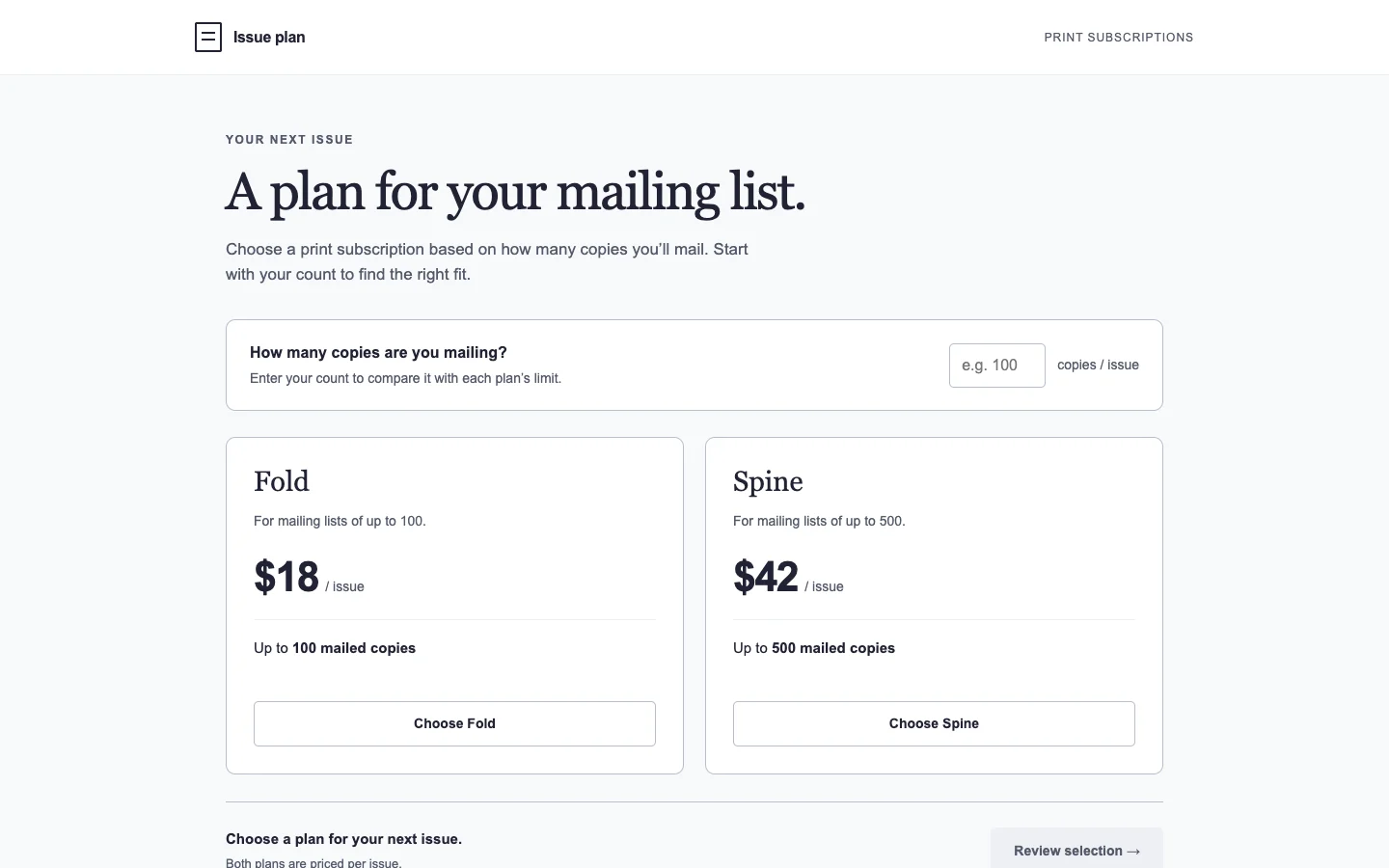
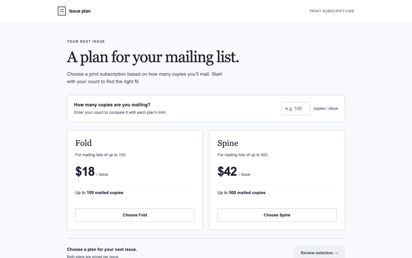
Pass 1. Left: plain; right: kit-landing. Raw preference: 6/7 (4 is neutral, higher favors right). B groups the mailing cutoff above each price and selection button, making the choice easier to scan while preserving $18 for up to 100 copies and $42 for up to 500. B also brings the Spine cutoff into view on mobile; A gives the Friday deadline stronger emphasis, but its taller Fold card delays comparison.

Pass 2. Left: kit-landing; right: plain. Raw preference: 2/7 (4 is neutral, higher favors right). A puts the mailing cutoff directly above each price and action, and explicitly explains the 101–500 range and limit beyond 500. B gives the deadline more prominence, but its taller mobile cards push the second plan farther down and repeat capacity information.

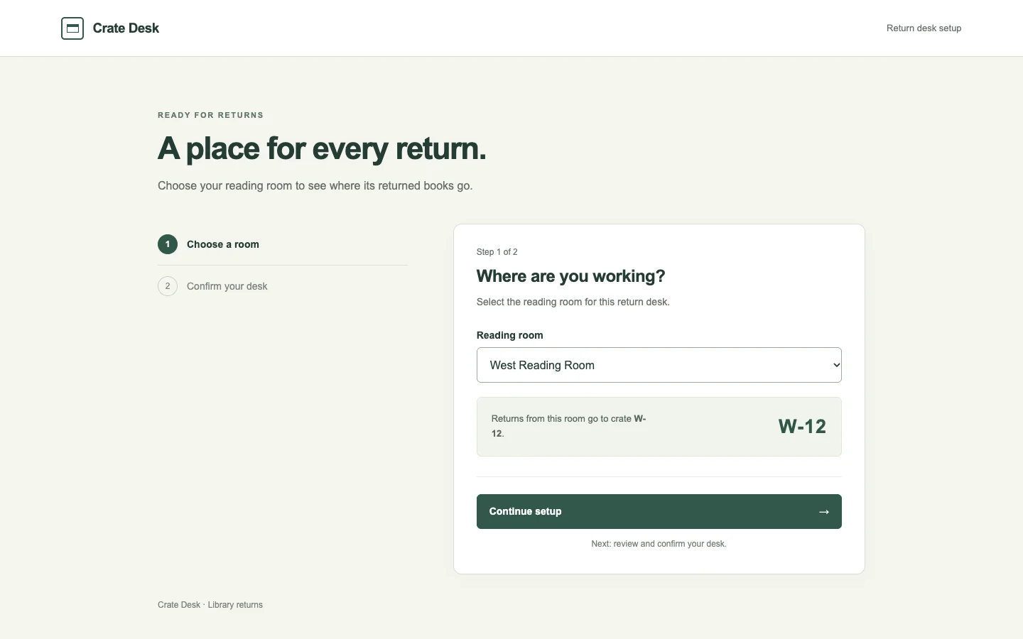
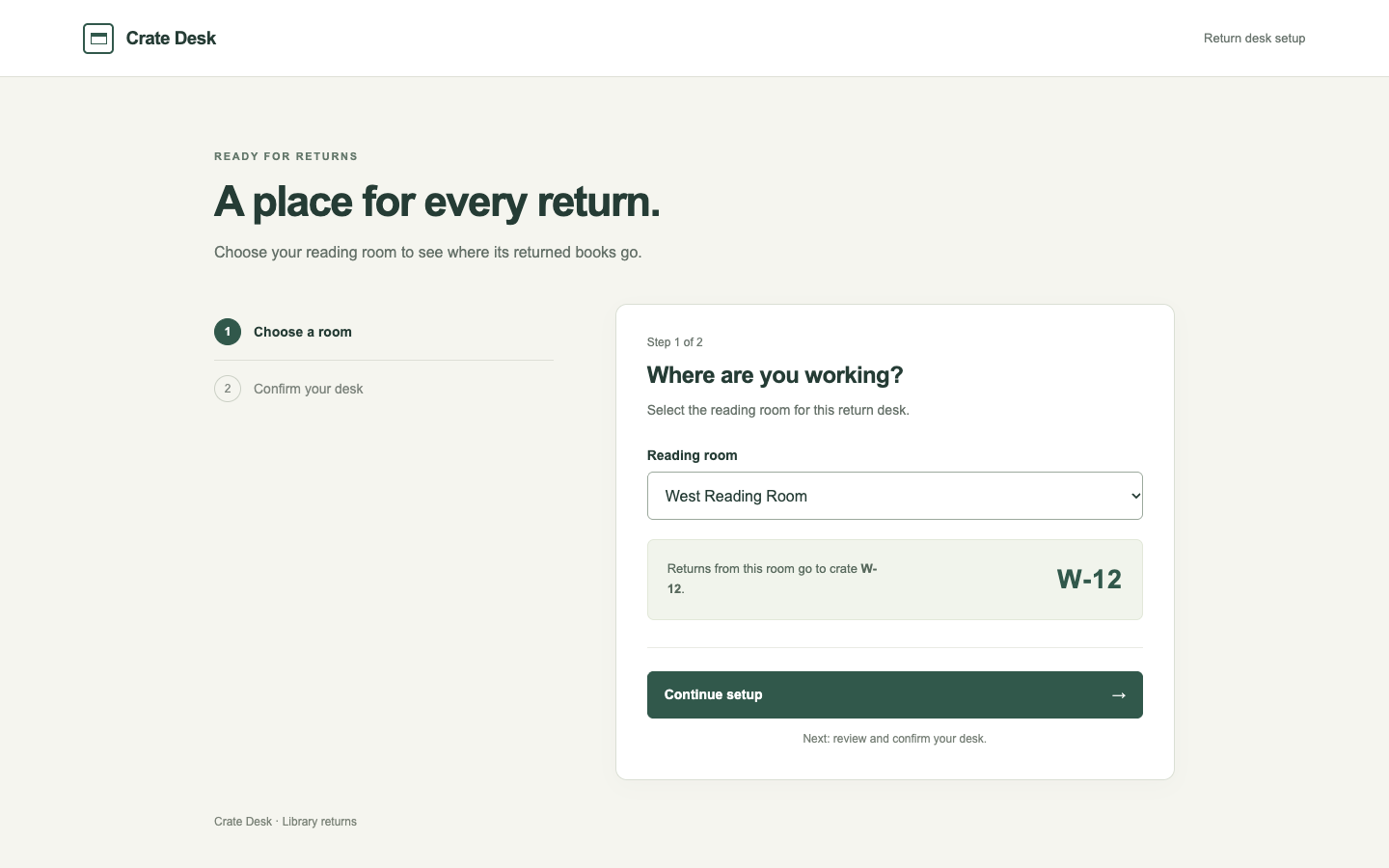
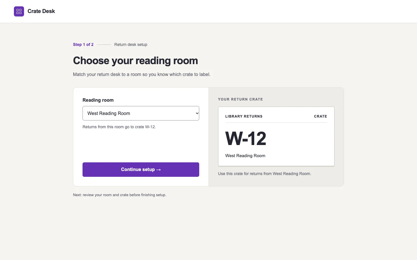
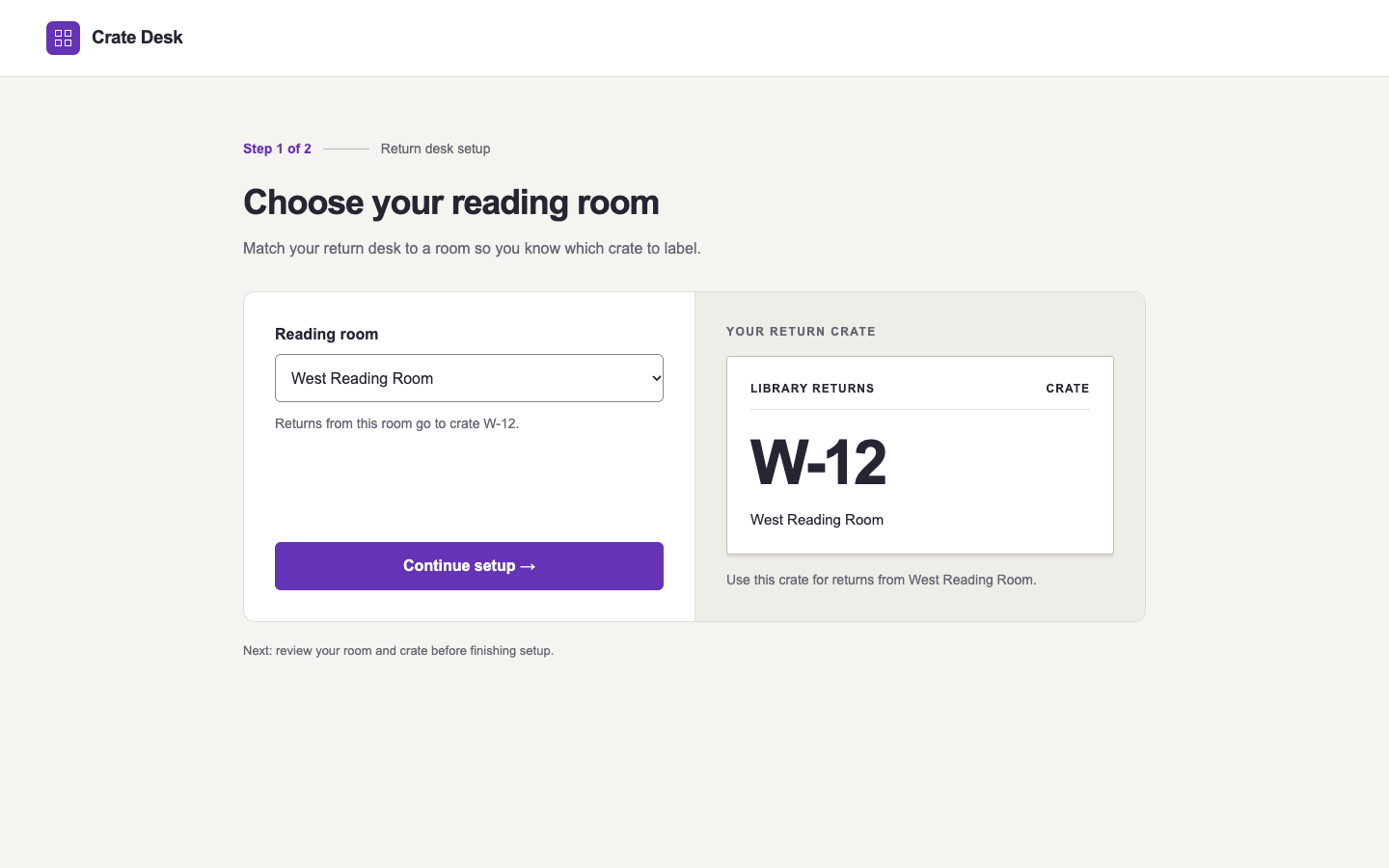
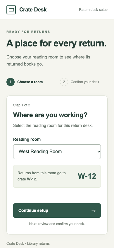
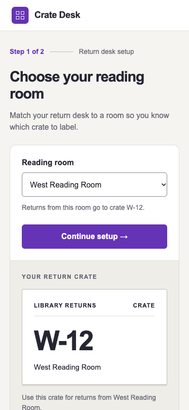
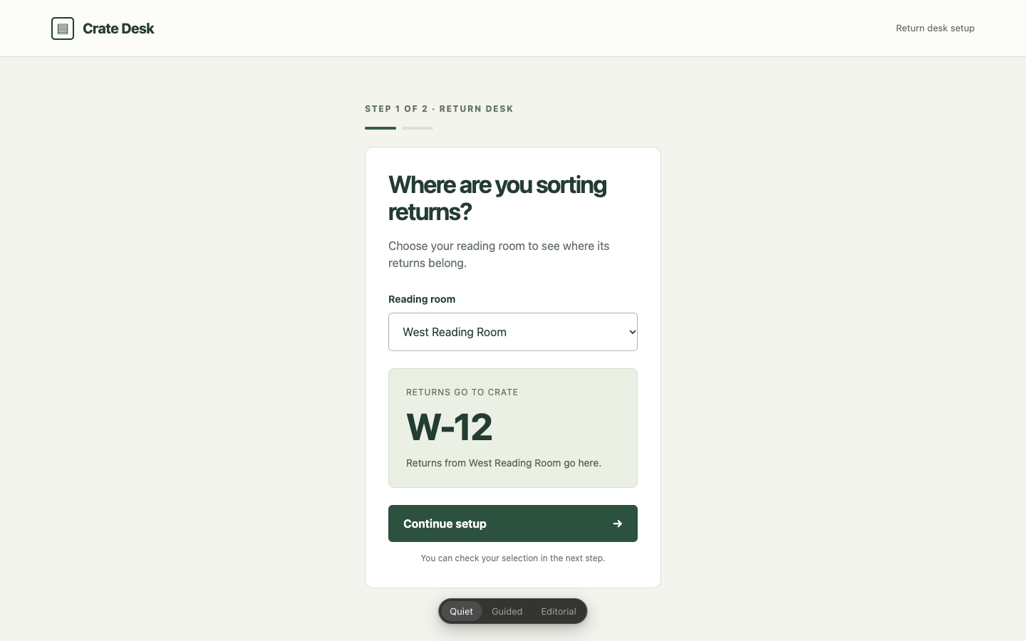
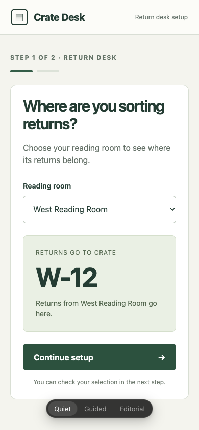
/fix · onboarding · tied or split

Finish first-run setup for a library volunteer labeling returned crates. Make the first decision easy to act on.

desktop: Plain render (original PNG) · Procedure render (original PNG)

mobile: Plain render · Procedure render

Pass 1. Left: plain; right: kit-fix. Raw preference: 5/7 (4 is neutral, higher favors right). B makes the room-to-crate mapping tangible with a prominent W-12 label preview and a direct task heading. A keeps that crate information above Continue setup on mobile, while B places its detailed preview below the action.

Pass 2. Left: kit-fix; right: plain. Raw preference: 6/7 (4 is neutral, higher favors right). B groups the room selector, crate W-12 and Continue setup action together at both widths; A puts its detailed crate preview below the action on mobile, where it extends beyond the visible screen. A has a more direct task heading and a useful label-like crate preview, while B gives more space to a promotional headline.

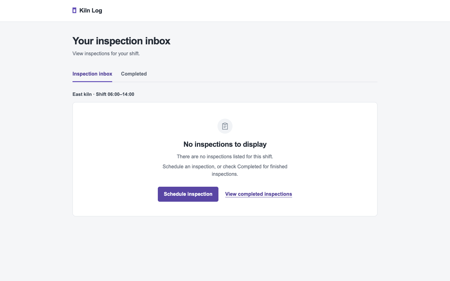
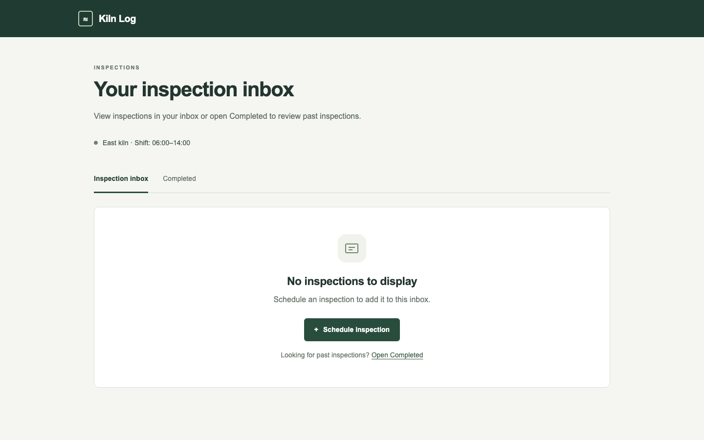
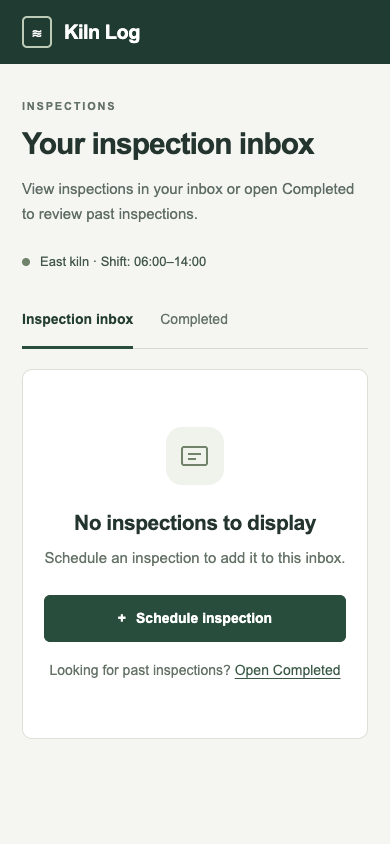
/audit · empty-inbox · win

Audit the empty inspection inbox. Explain what happened, what to do next, and which screen changes would help.

desktop: Plain render · Procedure render

mobile: Plain render · Procedure render

Pass 1. Left: plain; right: kit-audit. Raw preference: 6/7 (4 is neutral, higher favors right). B groups the empty state with the kiln and shift details, gives Schedule inspection clear priority, and separates Completed into a supporting footer. A makes the shift context easier to scan above the card and offers a wider mobile button, but its adjacent scheduling and completed actions compete more strongly.

Pass 2. Left: kit-audit; right: plain. Raw preference: 3/7 (4 is neutral, higher favors right). A groups the empty state, East kiln shift and Schedule inspection action together, with concise copy explaining the next step. B makes the shift context easier to scan above the card and gives the mobile action more width, but its repeated empty-state explanation and equally prominent completed-inspections link dilute the primary action.

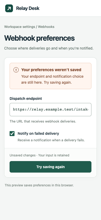
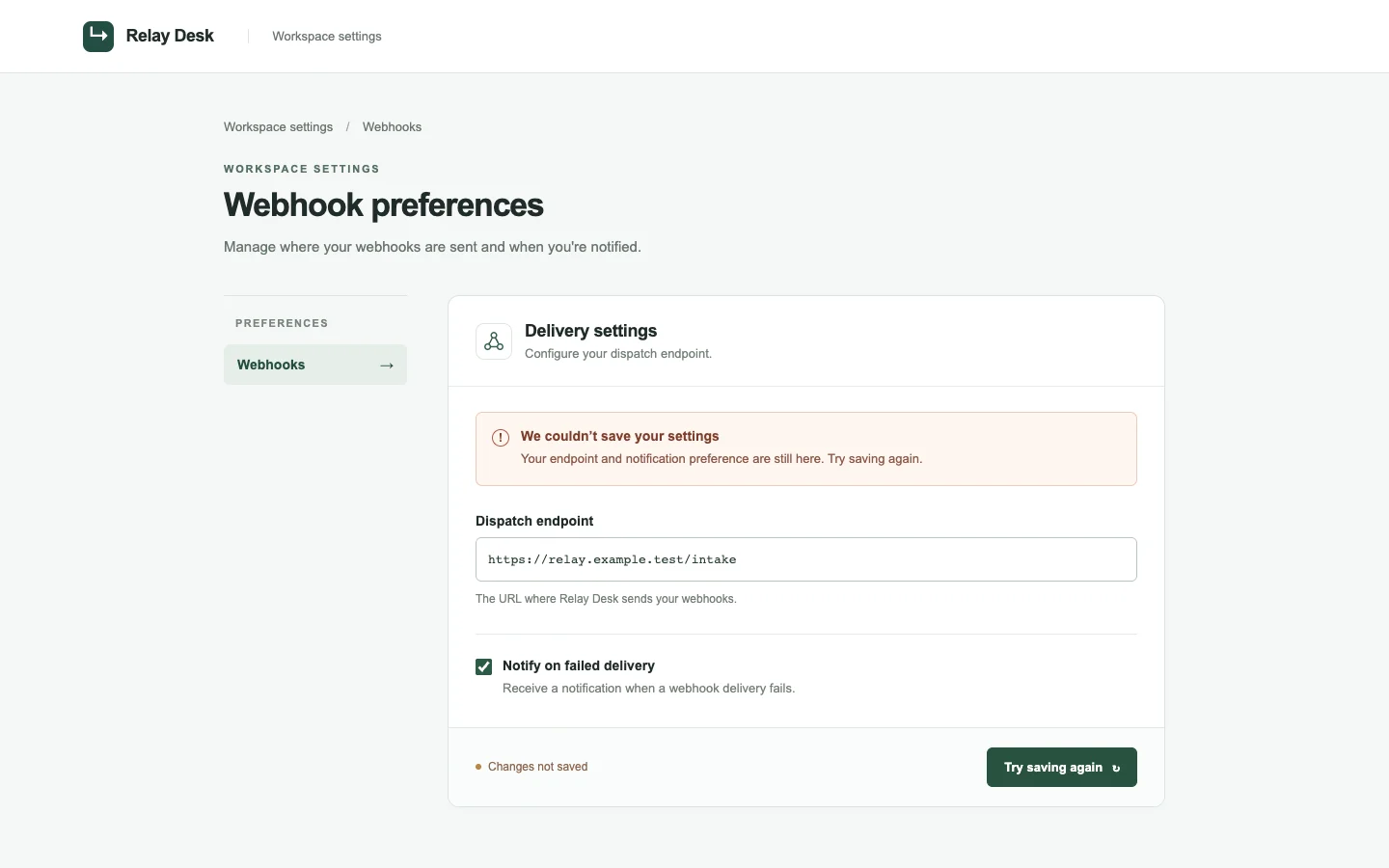
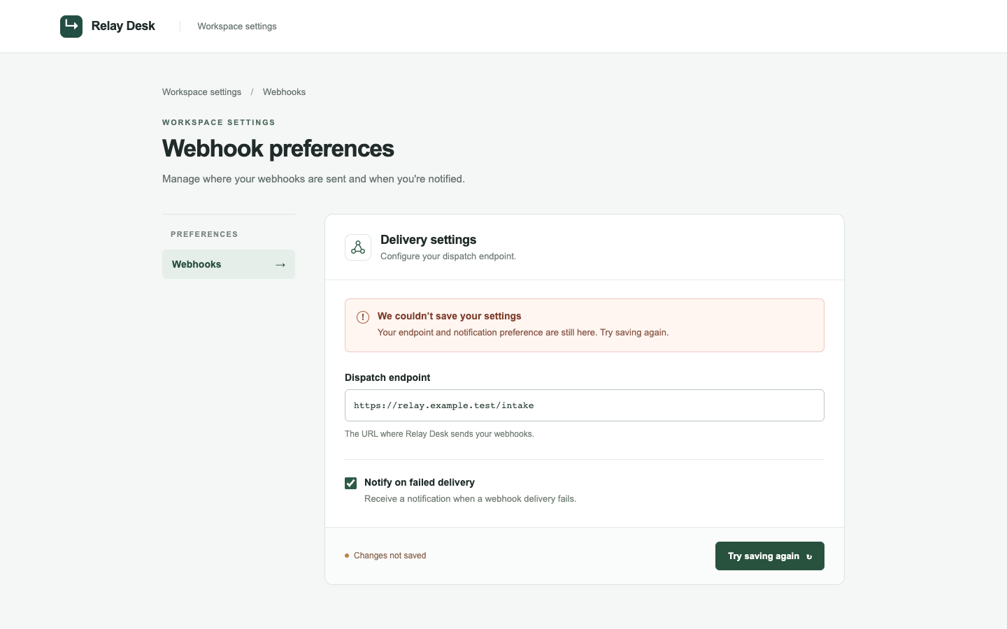
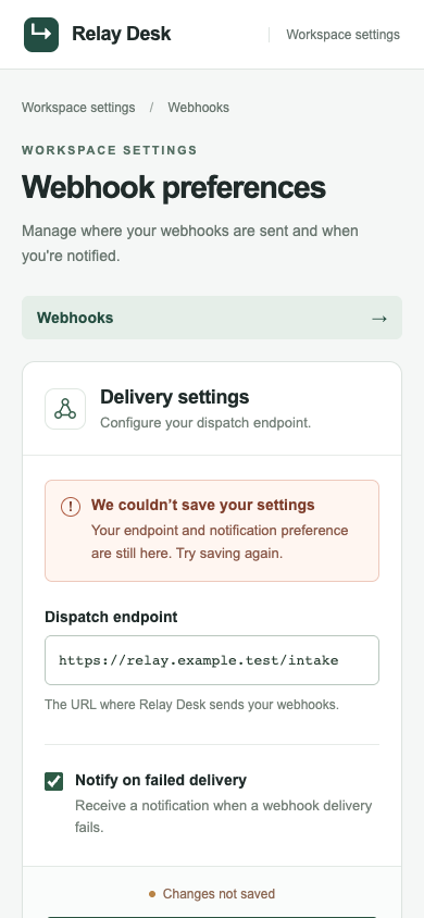
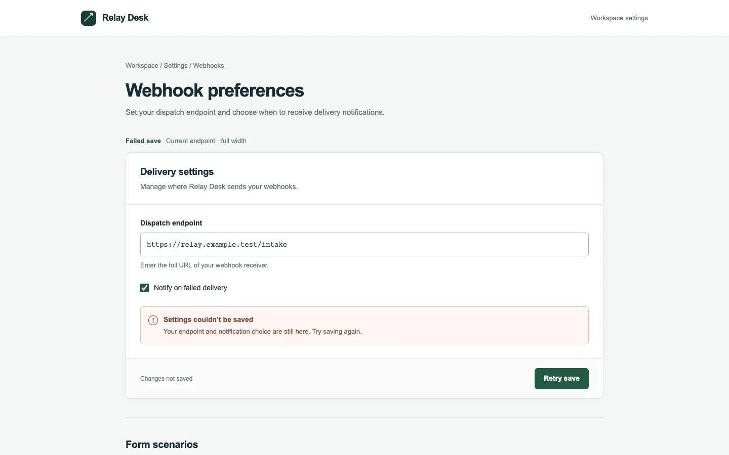
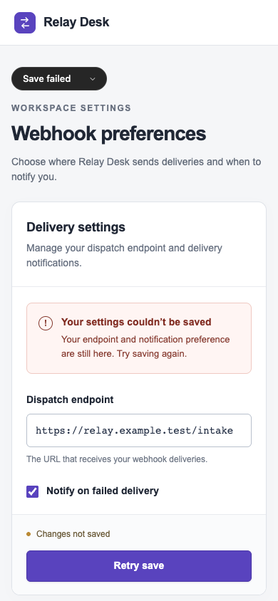
/harden · settings · win

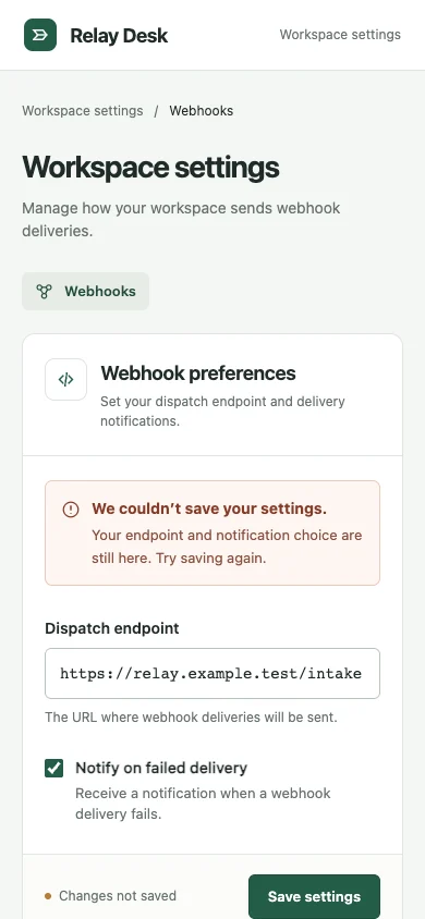
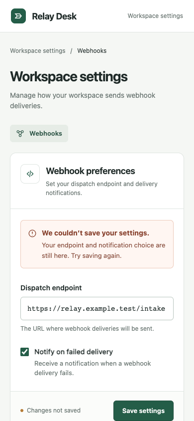
Prepare the webhook preferences form for an operator who must recover after a failed save without losing their endpoint.

desktop: Plain render (original PNG) · Procedure render (original PNG)

mobile: Plain render · Procedure render

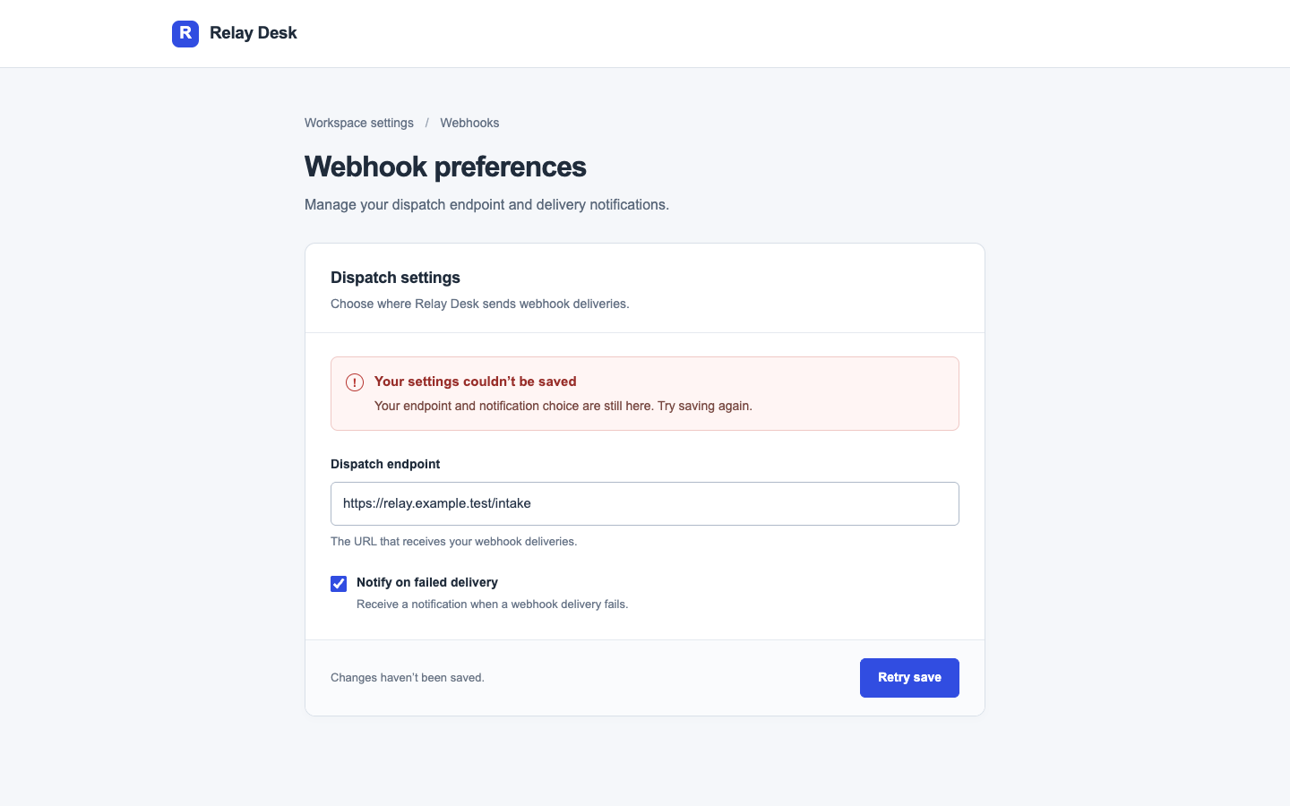
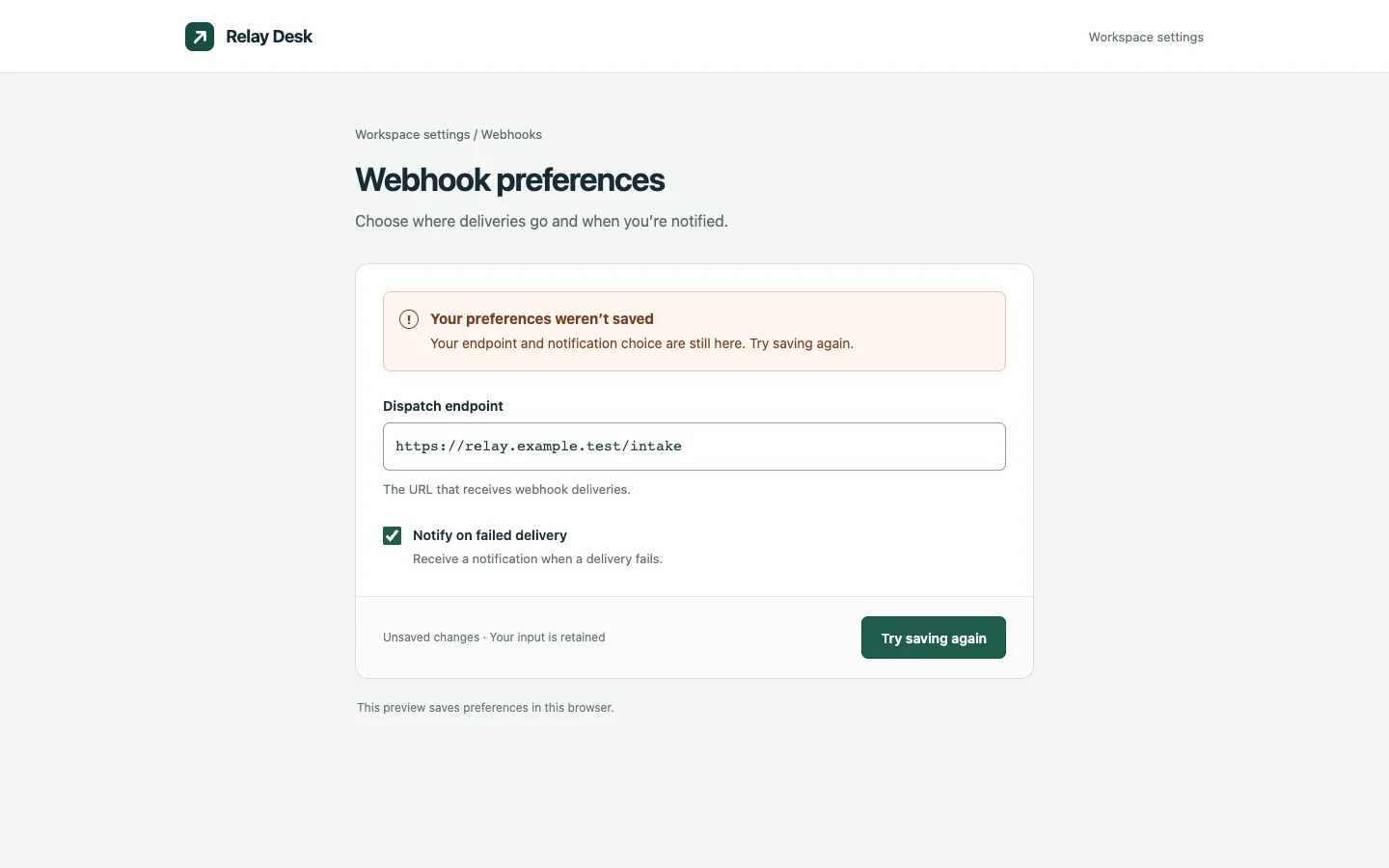
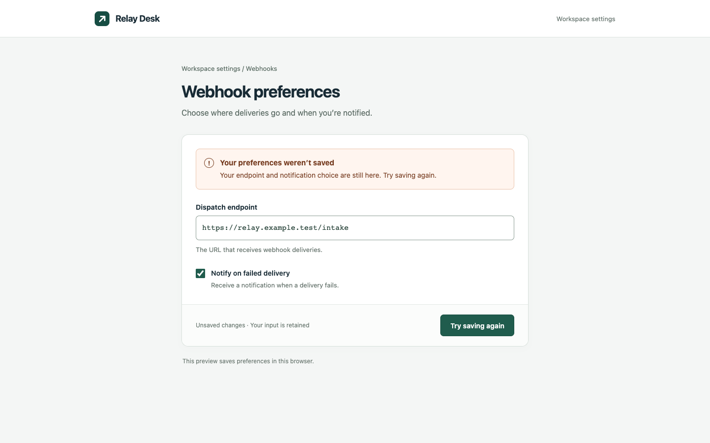
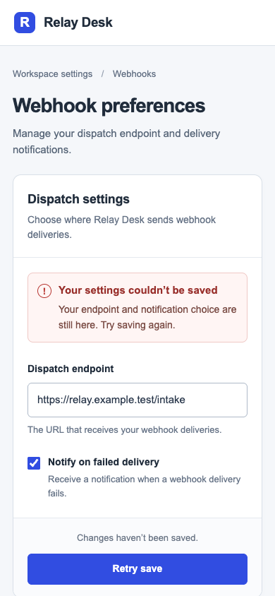
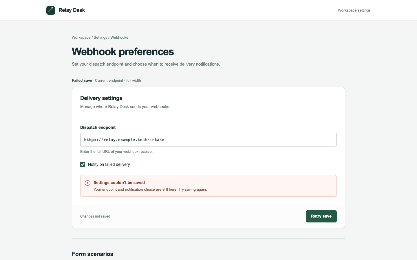
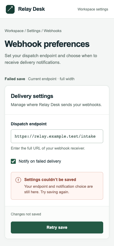
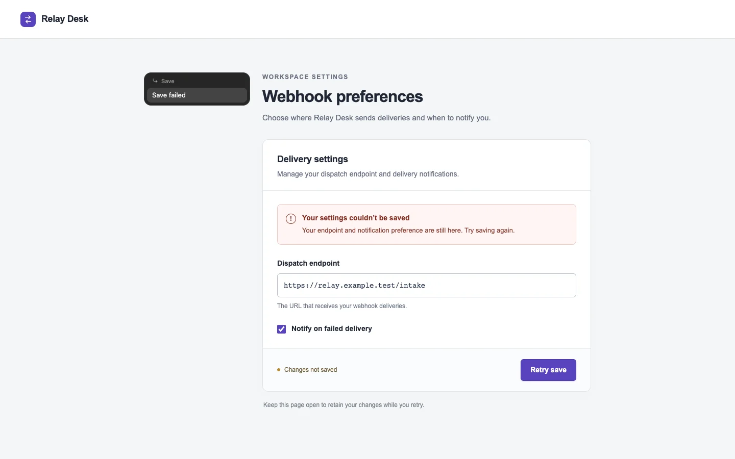
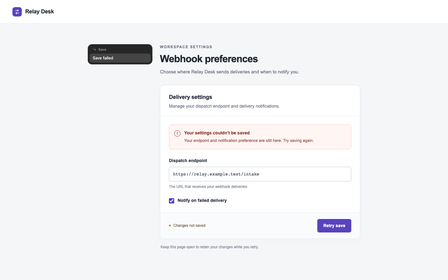
Pass 1. Left: plain; right: kit-harden. Raw preference: 5/7 (4 is neutral, higher favors right). B places the save error directly above the endpoint and pairs “Your input is retained” with the retry action, making recovery clearer. A shows the full endpoint on mobile, while B’s larger monospace field clips its ending and makes verification harder.

Pass 2. Left: kit-harden; right: plain. Raw preference: 2/7 (4 is neutral, higher favors right). A puts the failed-save message directly above the retained endpoint and pairs “Your input is retained” with “Try saving again,” making recovery clear. B shows the full endpoint on mobile, but its extra “Dispatch settings” header pushes the error and retry action farther down.

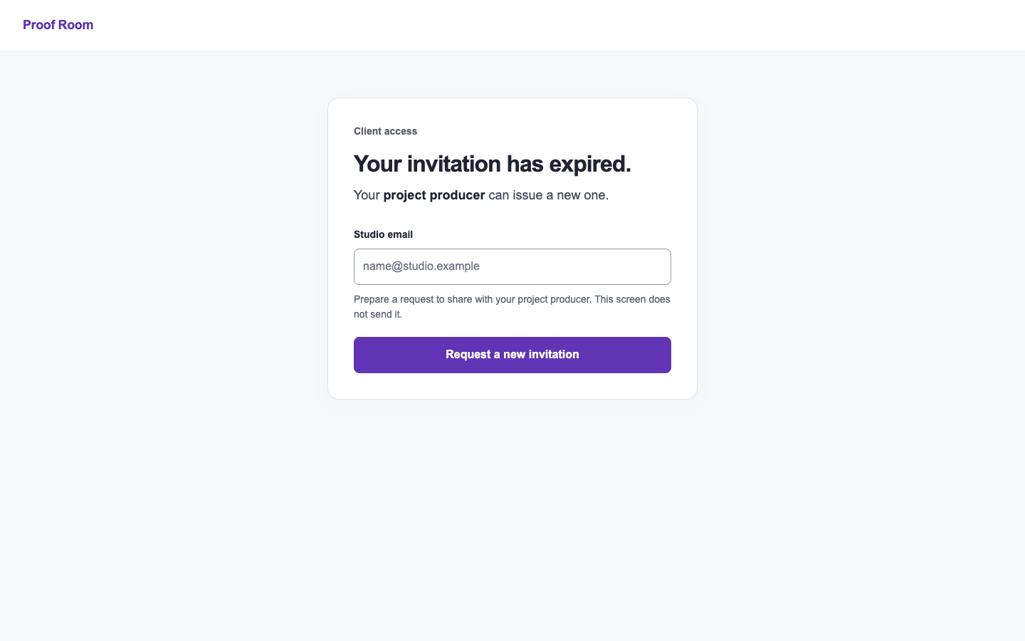
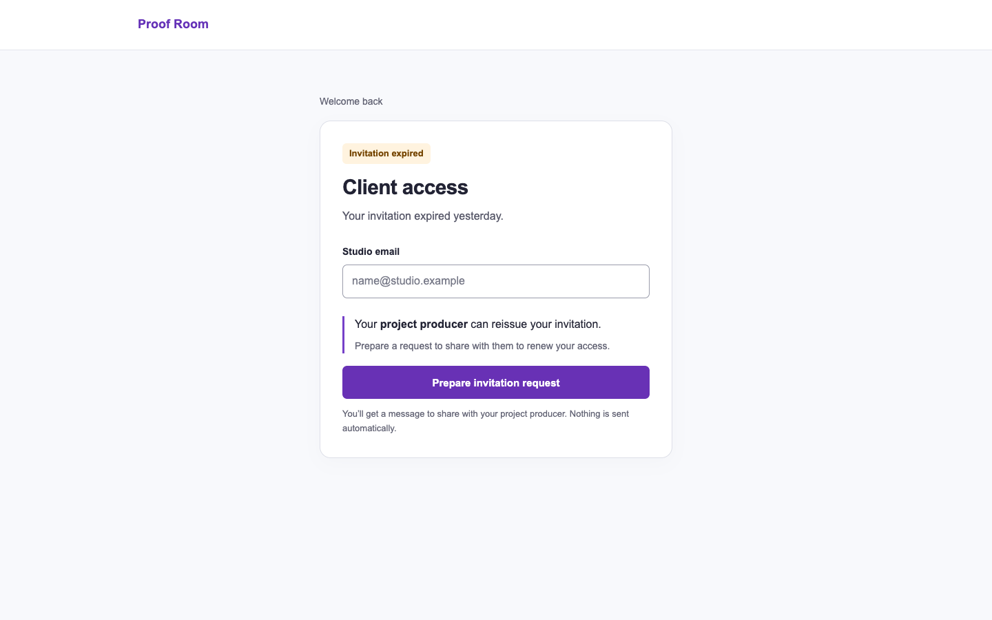
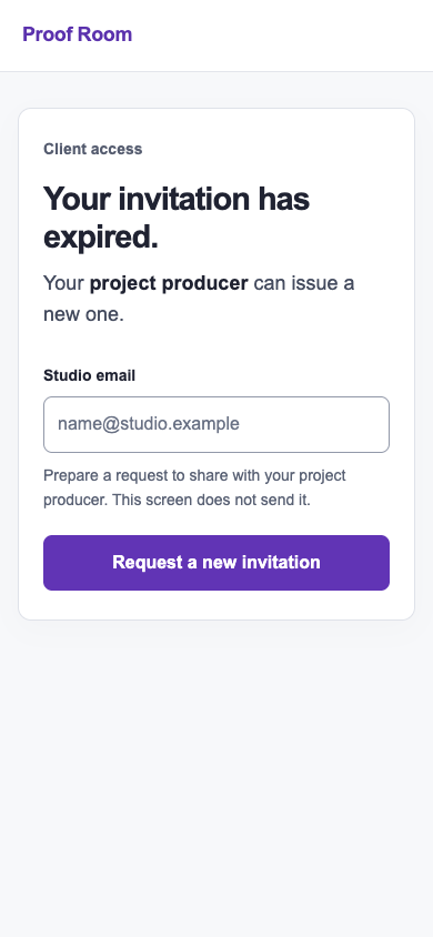
/ship · auth · tied or split

Review this access-request screen for release and address visual issues that obscure who can issue an invitation.

desktop: Plain render · Procedure render

mobile: Plain render · Procedure render

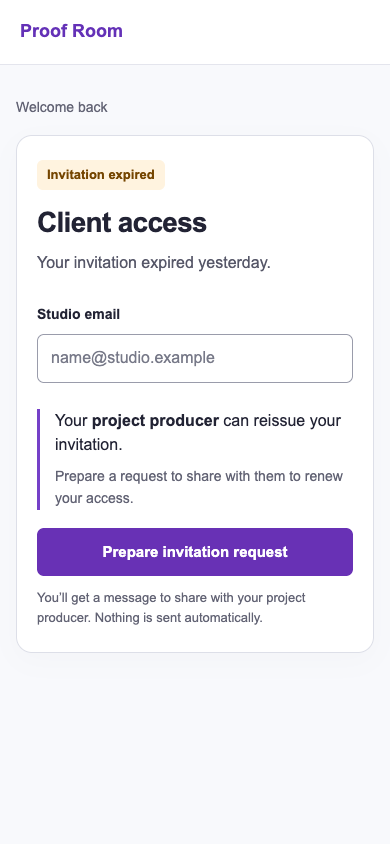
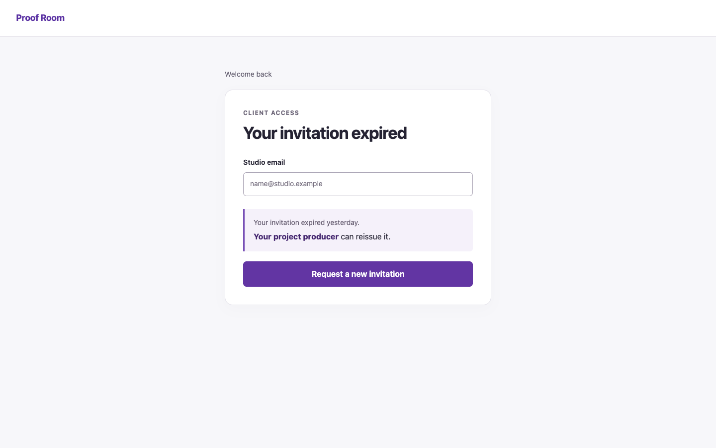
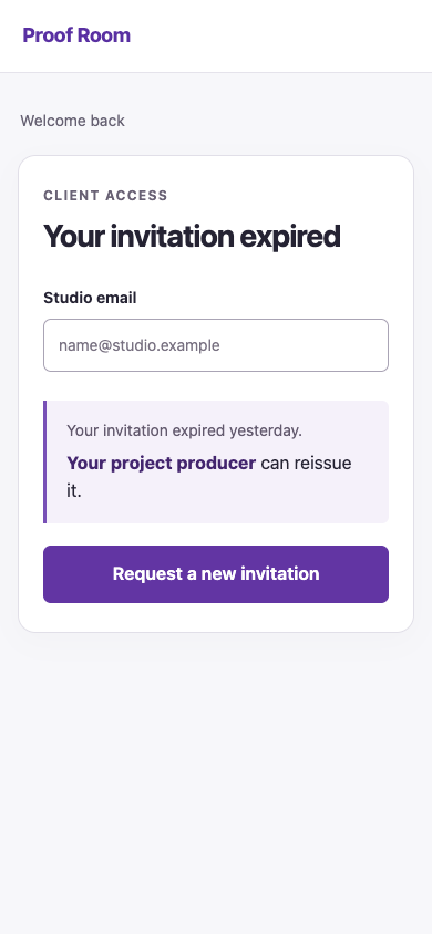
Pass 1. Left: plain; right: kit-ship. Raw preference: 2/7 (4 is neutral, higher favors right). A places the expired invitation and the project producer’s authority together at the top, making responsibility clear at both widths; B separates that fact from the status with the email field. B’s “Prepare invitation request” more accurately describes the action, but its repeated explanations and “Welcome back” weaken focus and lengthen the mobile screen.

Pass 2. Left: kit-ship; right: plain. Raw preference: 2/7 (4 is neutral, higher favors right). A highlights that the project producer can reissue the invitation and labels the action “Prepare invitation request,” clearly matching the fact that nothing is sent automatically. B places the producer explanation earlier and offers a more compact layout, but “Request a new invitation” conflicts with its preparation-only helper text.

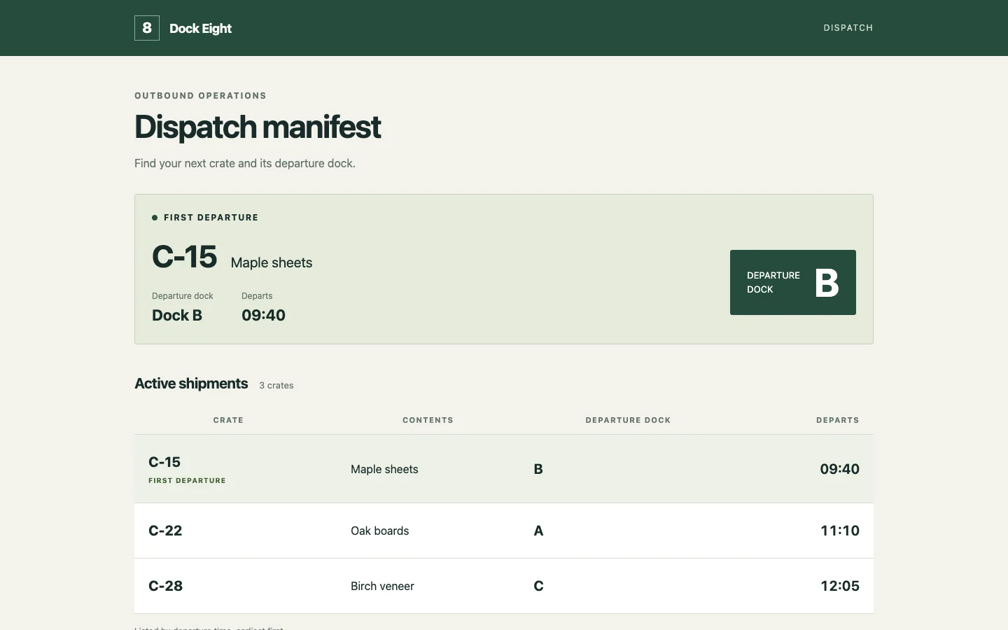
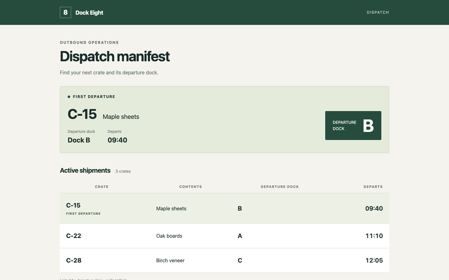
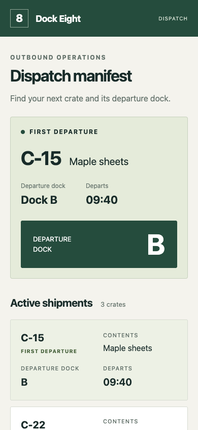
/fix · data-table · loss

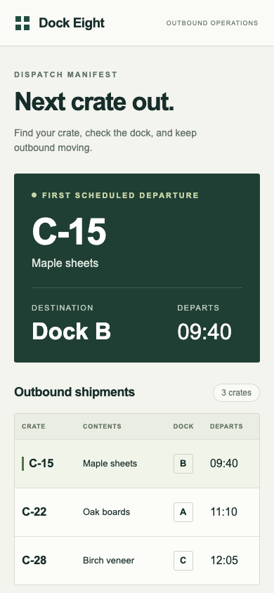
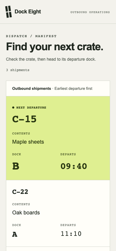
Finish a dispatch manifest for a dock worker locating the next outbound crate. Preserve every shipment and its destination.

desktop: Plain render (original PNG) · Procedure render

mobile: Plain render · Procedure render

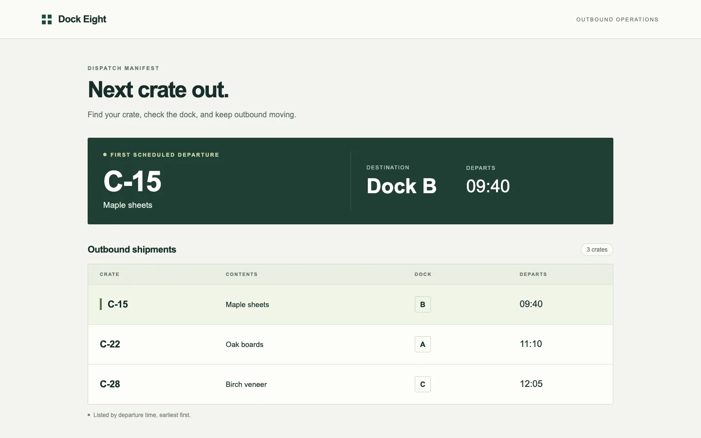
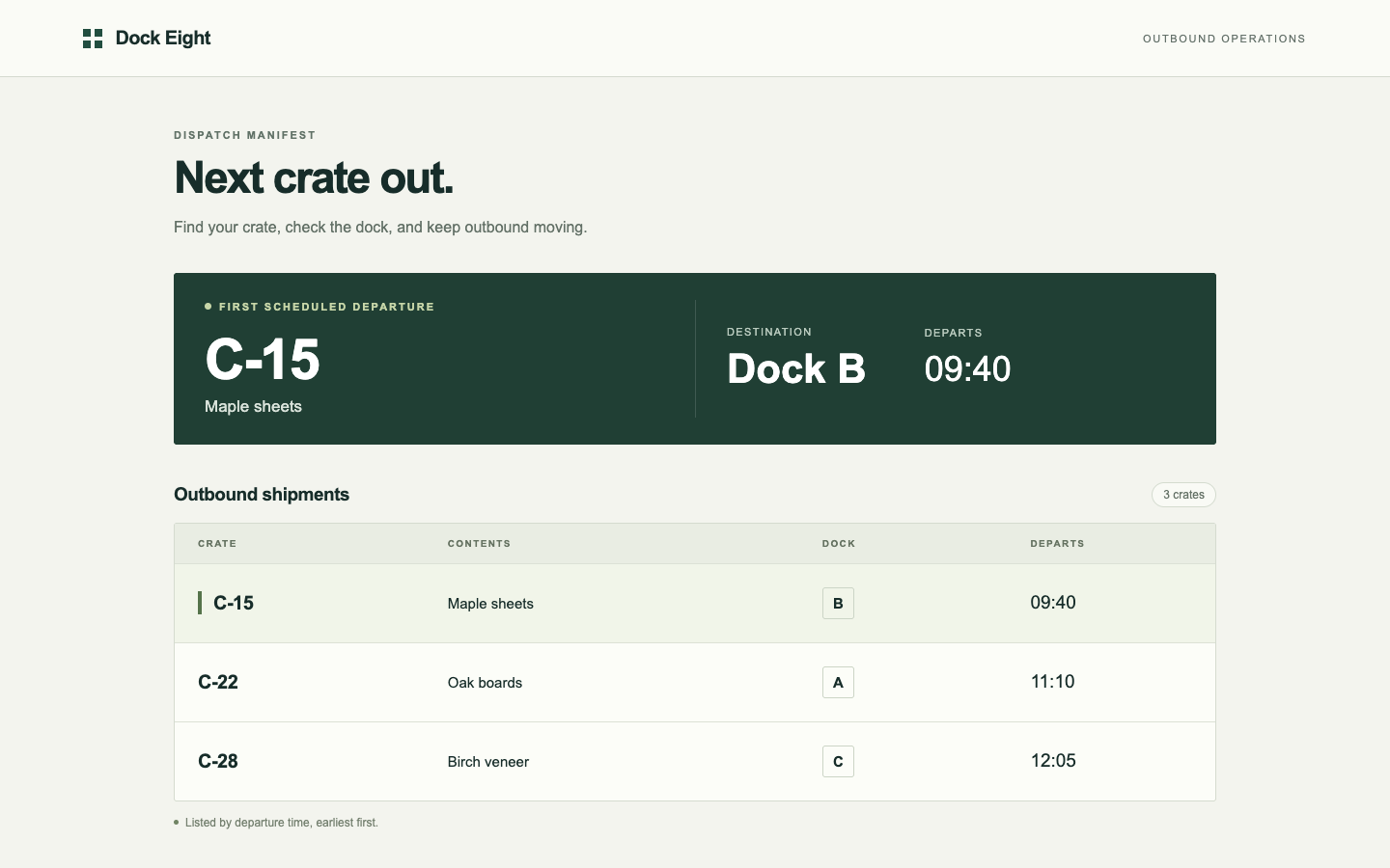
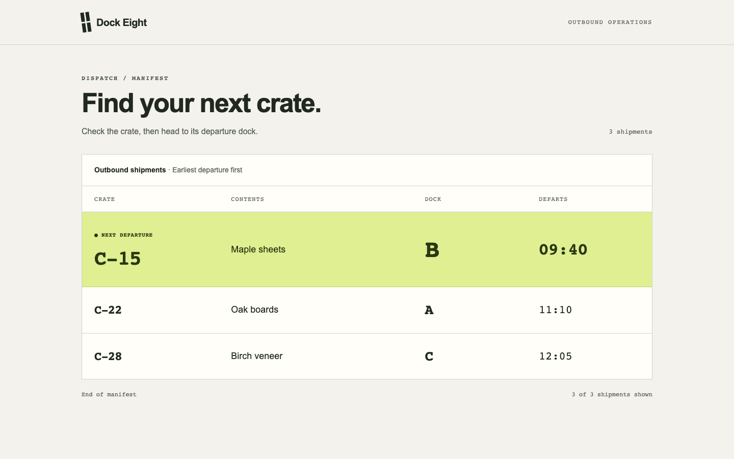
Pass 1. Left: plain; right: kit-fix. Raw preference: 2/7 (4 is neutral, higher favors right). A makes the next crate, Dock B and departure time prominent while keeping all three shipments visible on mobile. B integrates the next departure clearly into its manifest with a distinctive lime highlight, but its tall mobile entries push the third shipment below the visible area and make scanning destinations slower.

Pass 2. Left: kit-fix; right: plain. Raw preference: 6/7 (4 is neutral, higher favors right). B makes the next crate, Dock B and 09:40 immediately readable in a dedicated departure panel, while retaining all three shipments in a compact mobile table. A’s highlighted manifest row avoids duplicating shipment details and feels operationally specific, but its tall mobile entries push the remaining shipments below the visible screen.

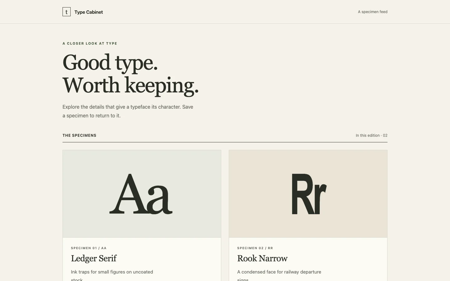
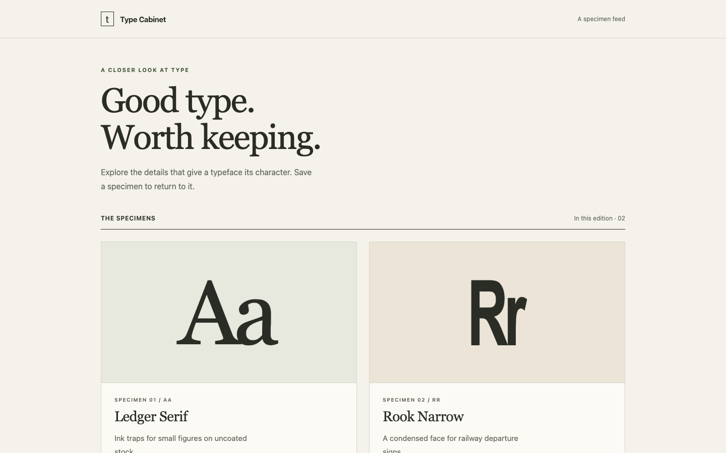
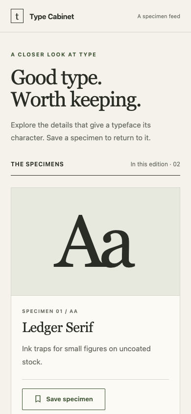
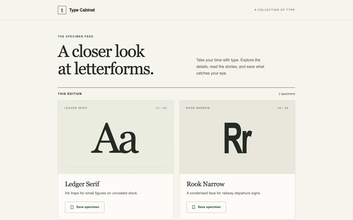
/motion · mobile-feed · win

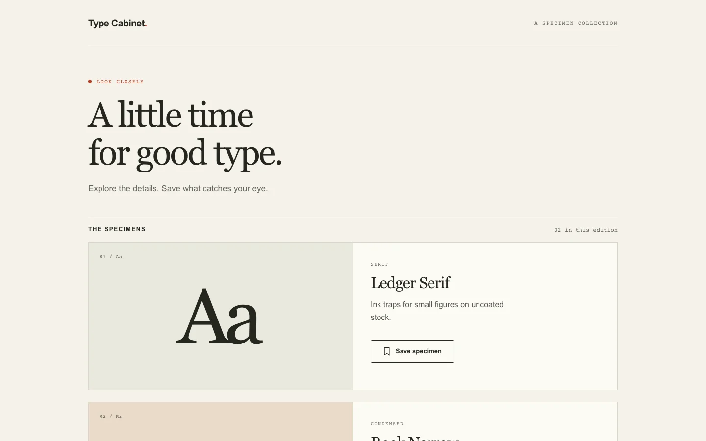
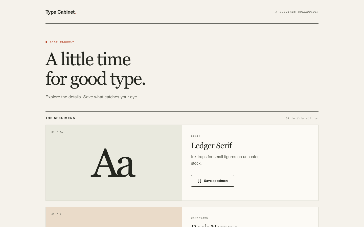
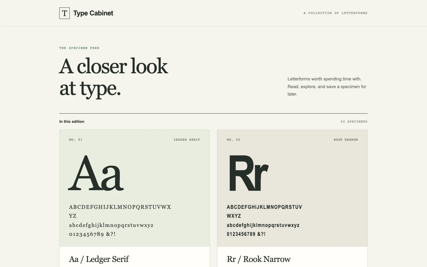
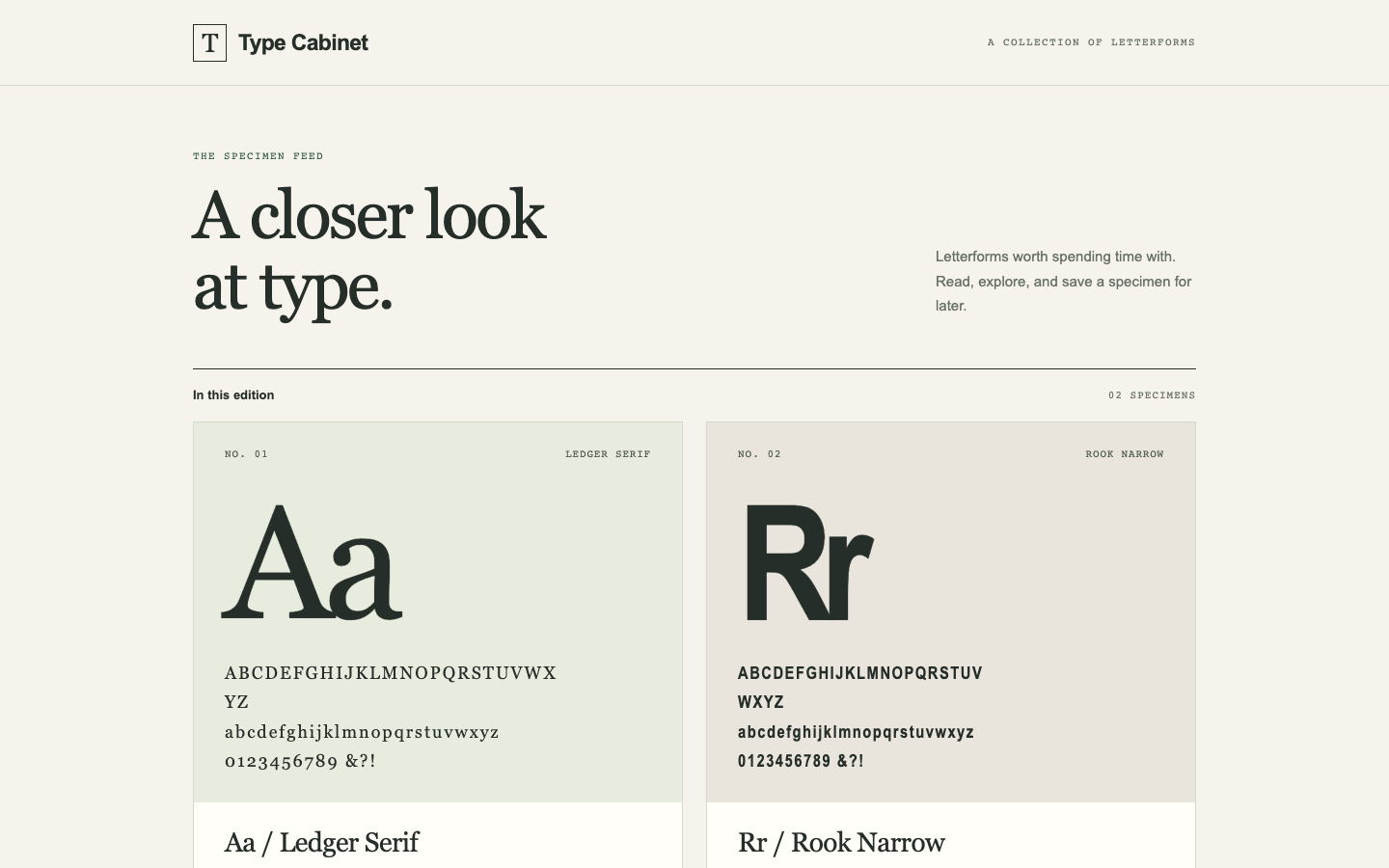
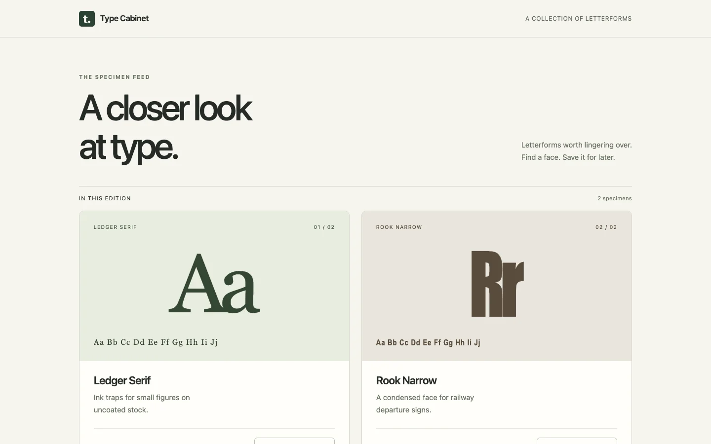
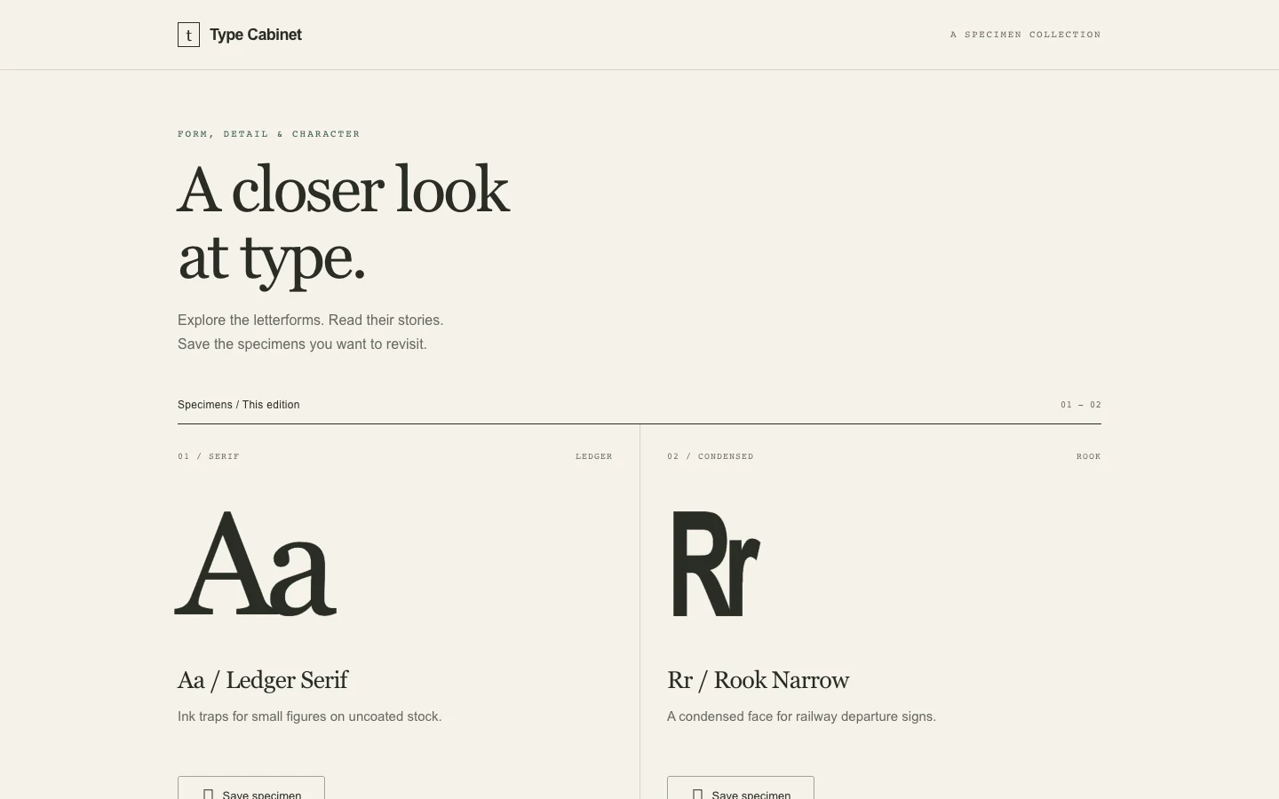
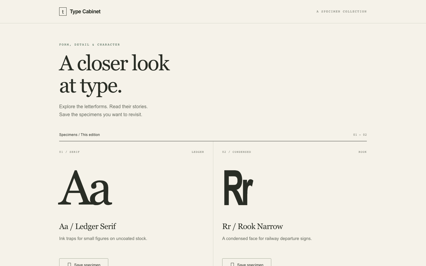
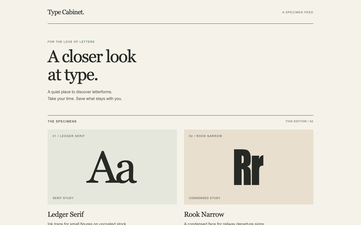
Improve reading and save feedback in a mobile typographic specimen feed. Keep the reading position stable.

desktop: Plain render (original PNG) · Procedure render

mobile: Plain render · Procedure render

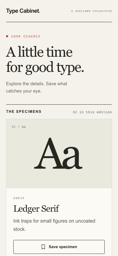
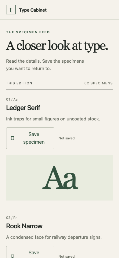
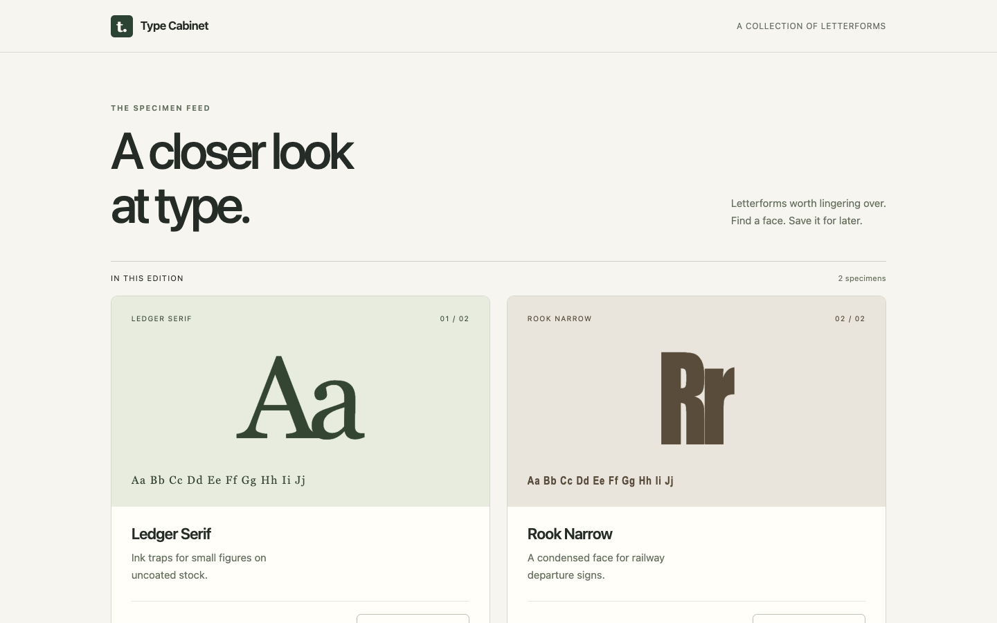
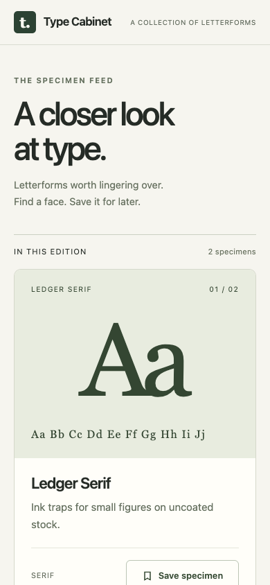
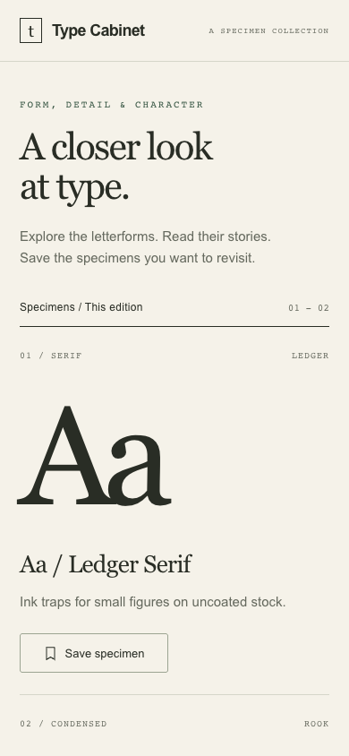
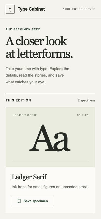
Pass 1. Left: plain; right: kit-motion. Raw preference: 6/7 (4 is neutral, higher favors right). B places the specimen name, description, Save specimen control and explicit Not saved status together before the preview, making reading and save feedback easier to scan on mobile. A gives the letterforms more visual prominence and keeps the save label on one line, but its taller cards push the action and subsequent specimens farther down.

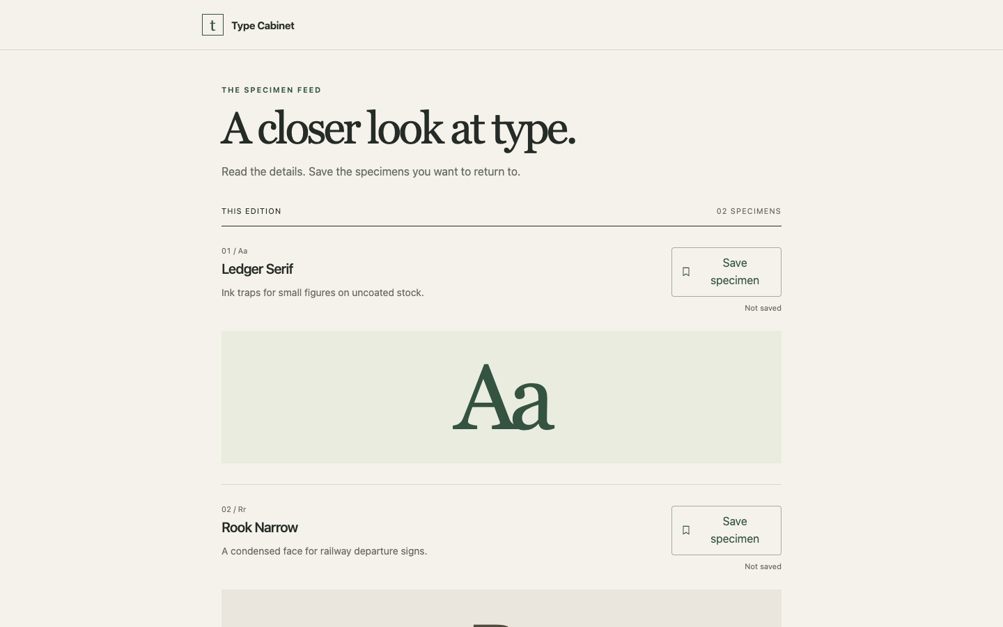
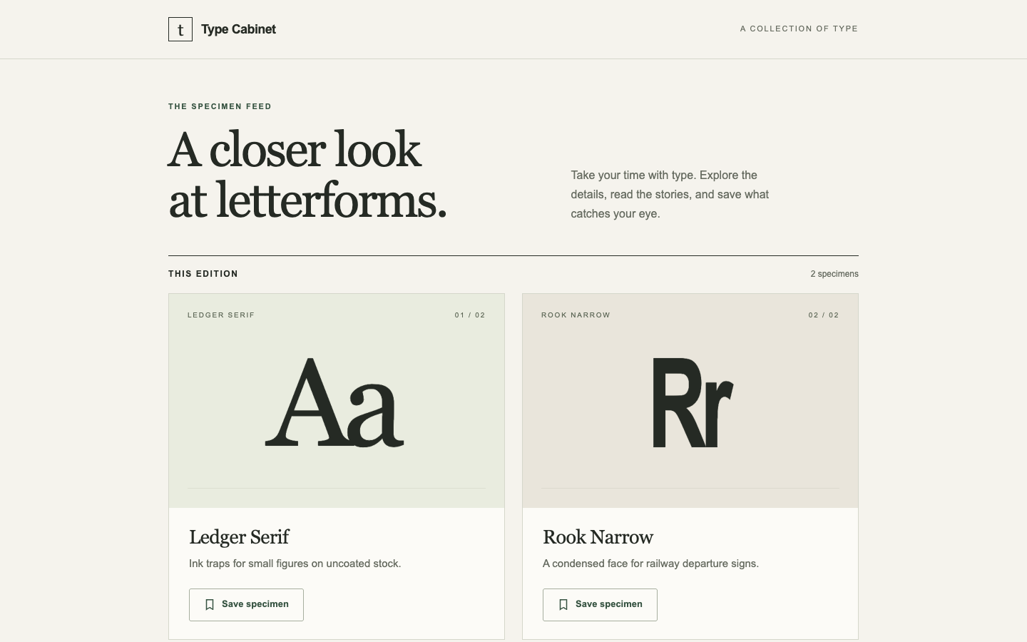
Pass 2. Left: kit-motion; right: plain. Raw preference: 3/7 (4 is neutral, higher favors right). A places Save specimen beside visible Not saved feedback and exposes the second specimen sooner on mobile. B groups each specimen into a polished preview-and-details card, but its taller mobile layout delays browsing and shows no explicit save status; reading-position stability cannot be assessed from stills.

/design-system · system-billing · win

Derive a design system for monthly studio billing. Use its components, amounts and labels as the starting material.

desktop: Plain render (original PNG) · Procedure render (original PNG)

mobile: Plain render · Procedure render

Pass 1. Left: plain; right: kit-design-system. Raw preference: 5/7 (4 is neutral, higher favors right). B groups the billing totals into one summary with a clear primary amount, though A’s separate cards give paid and awaiting payment more equal prominence. B also preserves issue dates within mobile invoice details, while A’s more compact rows omit them.

Pass 2. Left: kit-design-system; right: plain. Raw preference: 3/7 (4 is neutral, higher favors right). A keeps issued dates visible within mobile invoice rows and groups billing totals compactly, preserving useful facts and scan space. B gives payment statuses clearer colored badges and a distinctive total card, but its stacked mobile summaries push activity farther down and omit issued dates.

/design-system · system-pricing · tied or split

Derive a design system for a print subscription pricing page. Reuse its plans and quantity limits.

desktop: Plain render (original PNG) · Procedure render

mobile: Plain render · Procedure render

Pass 1. Left: plain; right: kit-design-system. Raw preference: 6/7 (4 is neutral, higher favors right). B’s compact mobile layout keeps both plans, quantity limits and selection buttons visible; A’s oversized cards push Spine’s price and action below the frame. A’s quantity-based introduction and restrained yellow accent feel more specific, while B’s consistent purple buttons give both plans equally clear actions.

Pass 2. Left: kit-design-system; right: plain. Raw preference: 5/7 (4 is neutral, higher favors right). B’s bold masthead, serif pricing and bordered plan panels give the print subscription page a more specific editorial identity while retaining the prices and quantity limits. A’s compact mobile layout exposes both plans and their choose buttons, whereas B’s larger panels push the second plan’s price and action below the visible area.

/design-system · system-projects · win

Derive a design system for a studio client proof index. Preserve projects, work status and the primary decision.

desktop: Plain render (original PNG) · Procedure render (original PNG)

mobile: Plain render · Procedure render

Pass 1. Left: plain; right: kit-design-system. Raw preference: 6/7 (4 is neutral, higher favors right). B keeps project titles, statuses, dates and review actions visible together, and its compact mobile rows preserve that context. A gives the primary review decision stronger emphasis with its dedicated banner, but its oversized mobile layout pushes the project index and supporting facts below the visible screen.

Pass 2. Left: kit-design-system; right: plain. Raw preference: 2/7 (4 is neutral, higher favors right). A keeps project names, statuses, dates and review actions visible together on desktop and mobile, supporting proof tracking and the next decision. B gives the review action stronger prominence and uses a distinctive palette, but its large mobile header and review panel push the project list and supporting facts below the visible area.

Confirmation before the last revision

/landing · confirm-price · win

A candlemaker choosing a wax quantity needs a landing page that demonstrates the calculation for a batch of moulds.

desktop: Plain render (original PNG) · Procedure render (original PNG)

mobile: Plain render · Procedure render

Pass 1. Left: plain; right: kit-landing. Raw preference: 6/7 (4 is neutral, higher favors right). B keeps the mould input, 250 g result and calculation together on mobile, while A’s result falls below the visible screen. A provides clearer minus/plus controls and separate allowance facts, but B’s compact grouping makes the batch calculation easier to follow at both widths.

Pass 2. Left: kit-landing; right: plain. Raw preference: 2/7 (4 is neutral, higher favors right). A keeps the 250 g result, the 6 × 40 g calculation and the 10 g allowance visible above the mobile action; B pushes the result below the visible mobile area. B offers clearer minus/plus controls, but A connects the input, calculation and outcome more directly.

/harden · confirm-form · tied or split

A greenhouse operator needs to recover the rejected low-stock threshold without losing the entered value.

desktop: Plain render · Procedure render

mobile: Plain render · Procedure render

Pass 1. Left: plain; right: kit-harden. Raw preference: 2/7 (4 is neutral, higher favors right). A groups Retry save with an explicit Unsaved change status and preserves the entered 12 alongside the saved 8, making recovery clear at both widths. B puts the saved-value reassurance directly in the error, but its longer mobile alert and repeated retention note make the recovery area more cumbersome.

Pass 2. Left: kit-harden; right: plain. Raw preference: 3/7 (4 is neutral, higher favors right). A’s error message keeps the entered 12 trays, saved 8 trays and retry instruction together, making recovery clearer. B has cleaner spacing and a distinct action footer, but separates the saved-threshold reassurance from the error and retry control.

/fix · confirm-sheet · win

Finish the recording studio schedule for a coordinator assigning an engineer to the next unstaffed session.

desktop: Plain render (original PNG) · Procedure render (original PNG)

mobile: Plain render · Procedure render

Pass 1. Left: plain; right: kit-fix. Raw preference: 6/7 (4 is neutral, higher favors right). B places the engineer field and assignment button directly beneath Braid Quartet, keeping the next action visible on mobile while A pushes its staffing form below the visible area. A gives both sessions a more compact overview and clearly marks the next unstaffed session, but B connects the assignment controls more directly to the session they affect.

Pass 2. Left: kit-fix; right: plain. Raw preference: 2/7 (4 is neutral, higher favors right). A places the engineer field and assignment button directly within Braid Quartet’s session, keeping the task accessible on mobile while B pushes the controls below the visible screen. B has more distinctive typography and clearer session emphasis, but A’s task-specific heading and adjacent controls better support finishing the assignment.

Confirmation after the last revision

/fix · rail-callboard · win

Finish the wardrobe callboard for a theatre dresser assigning the unfinished garment before its cue. Keep the ready garment visible as a separate state.

desktop: Plain render (original PNG) · Procedure render (original PNG)

mobile: Plain render · Procedure render

Pass 1. Left: plain; right: kit-fix. Raw preference: 5/7 (4 is neutral, higher favors right). B makes cue times, garment names and the assignment action easy to scan, and keeps the ready Wool cape visible on mobile. A provides a concrete tailor-name field, but its taller assignment card pushes the ready garment below the mobile view.

Pass 2. Left: kit-fix; right: plain. Raw preference: 3/7 (4 is neutral, higher favors right). A keeps the unfinished Brass coat, assignment action and separate ready Wool cape visible on mobile, making the callboard easier to scan. B provides a concrete tailor-name field beside its assignment button, but its large introductory headline and taller form push the ready garment below the mobile viewport.

/design-system · tile-log · tied or split

Derive a usable design system for a ceramicist distinguishing the held glaze test from the test ready for a batch. Preserve both firing records.

desktop: Plain render · Procedure render

mobile: Plain render · Procedure render

Pass 1. Left: plain; right: kit-design-system. Raw preference: 5/7 (4 is neutral, higher favors right). B’s compact mobile rows keep both firing records, results and statuses visible together, while A’s tall cards push the ready test below the fold. A has more distinctive typography and restrained status bands, but B places the held-test action directly beside its status on desktop and beneath its explanation on mobile.

Pass 2. Left: kit-design-system; right: plain. Raw preference: 6/7 (4 is neutral, higher favors right). B gives each glaze a clear status band, aligned firing facts and a well-placed held-test action, creating a more deliberate journal interface. A is more compact on mobile and shows both complete records together, while B pushes the ready record below the visible area.

/fix · tide-board · loss

Finish the harbor departure board for a dispatcher checking which vessel can leave next. Preserve the restrictions, berths and times.

desktop: Plain render (original PNG) · Procedure render

mobile: Plain render · Procedure render

Pass 1. Left: plain; right: kit-fix. Raw preference: 2/7 (4 is neutral, higher favors right). A foregrounds Petrel as the next cleared departure with its berth and 09:10 time on both widths, directly supporting the dispatcher's decision. B gives schedule rows larger type and stronger departure times, but leaves the next cleared vessel below Kittiwake; A preserves both vessels' restrictions, berths and times while making clearance priority clearer.

Pass 2. Left: kit-fix; right: plain. Raw preference: 6/7 (4 is neutral, higher favors right). B prominently identifies Petrel at North quay, 09:10 as the next cleared departure at both widths, making the dispatcher's main decision immediate. B preserves Kittiwake's hold and restriction link, though A gives departure times stronger emphasis and states more explicitly that a scheduled time does not override a restriction.

Individual skill trials

animate · folio-project · skip

Clarify which proof awaits approval and how its state changes when a client approves it, including a quiet path for reduced motion.

Source: Emil Kowalski, emilkowalski/skills.

desktop: Plain render (original PNG) · Procedure render (original PNG)

mobile: Plain render · Procedure render

Pass 1. Left: plain; right: vendor-animate. Raw preference: 2/7 (4 is neutral, higher favors right). A explicitly connects “Approve direction” to Identity direction, version 02 and the Review-to-Approved change, making the pending decision clearer. B gives the proof more space and a cleaner mobile presentation, but its “Over to you” approval panel is less direct; neither shows an approved result or a reduced-motion path.

Pass 2. Left: vendor-animate; right: plain. Raw preference: 6/7 (4 is neutral, higher favors right). B ties approval explicitly to Identity direction, version 02 and states that approval changes Review to Approved. B also groups project details and approval clearly on desktop, though its taller mobile proof card pushes approval farther down than A. Neither shows an approved result or a reduced-motion path.

animate-expo · mobile-feed · skip

Improve reading and save feedback in a mobile typographic specimen feed. Keep the reading position stable.

Source: Emil Kowalski, emilkowalski/skills.

desktop: Plain render (original PNG) · Procedure render (original PNG)

mobile: Plain render · Procedure render

Pass 1. Left: plain; right: vendor-animate-expo. Raw preference: 2/7 (4 is neutral, higher favors right). A keeps the specimen name, descriptive detail and Save specimen control visible together on mobile. B offers a richer alphabet preview, but it pushes the specimen details and save action below the visible area; neither shows save feedback or provides evidence of reading-position stability.

Pass 2. Left: vendor-animate-expo; right: plain. Raw preference: 6/7 (4 is neutral, higher favors right). B places a clearly labeled Save specimen control alongside the specimen description and keeps it visible on mobile. A exposes fuller alphabet samples for reading, but its oversized specimen panel pushes details and actions below the visible mobile area; neither shows save feedback or reading-position stability.

animation-performance · mobile-feed · skip

Improve reading and save feedback in a mobile typographic specimen feed. Keep the reading position stable.

Source: Emil Kowalski, emilkowalski/skills.

desktop: Plain render (original PNG) · Procedure render (original PNG)

mobile: Plain render · Procedure render

Pass 1. Left: plain; right: vendor-animation-performance. Raw preference: 3/7 (4 is neutral, higher favors right). A keeps the mobile header compact and reaches the first specimen sooner; B’s wrapped brand and taller introduction push reading content lower. A separates the serif classification from the specimen name, while B adds a useful character preview; neither shows save feedback or evidence of reading-position stability.

Pass 2. Left: vendor-animation-performance; right: plain. Raw preference: 5/7 (4 is neutral, higher favors right). B gives Ledger Serif a clearer title, readable description and prominent full-width save action on mobile. A fits more specimens on desktop and preserves the character-and-number sample missing from B; neither shows save feedback or establishes reading-position stability.

animation-vocabulary · folio-project · skip

Clarify which proof awaits approval and how its state changes when a client approves it, including a quiet path for reduced motion.

Source: Emil Kowalski, emilkowalski/skills.

desktop: Plain render (original PNG) · Procedure render (original PNG)

mobile: Plain render · Procedure render

Pass 1. Left: plain; right: vendor-animation-vocabulary. Raw preference: 2/7 (4 is neutral, higher favors right). A explicitly identifies version 02 in the approval copy and explains the change from Review to Approved beside the action; B groups proof and approval more tightly on desktop. A preserves readable proof labels and project details on mobile, while B visibly clips version, status and client text. Neither shows an approved outcome or a reduced-motion path.

Pass 2. Left: vendor-animation-vocabulary; right: plain. Raw preference: 6/7 (4 is neutral, higher favors right). B ties approval to Identity direction, version 02 and explicitly explains the Review-to-Approved change beside the action. B also preserves readable proof labels on mobile where A clips content, though B pushes approval below the visible mobile area; neither shows a reduced-motion path.

apple-design · mobile-feed · skip

Improve reading and save feedback in a mobile typographic specimen feed. Keep the reading position stable.

Source: Emil Kowalski, emilkowalski/skills.

desktop: Plain render (original PNG) · Procedure render (original PNG)

mobile: Plain render · Procedure render

Pass 1. Left: plain; right: vendor-apple-design. Raw preference: 3/7 (4 is neutral, higher favors right). A keeps the full Save specimen control visible on mobile immediately after the description; B places it lower, partially outside the frame. B adds a useful alphabet sample for evaluating letterforms, but its taller specimen panel delays the supporting facts and action. Neither shows save feedback or evidence of reading-position stability.

Pass 2. Left: vendor-apple-design; right: plain. Raw preference: 5/7 (4 is neutral, higher favors right). B gives the mobile save action a fully visible, full-width button directly beneath the specimen description. A provides a useful alphabet preview that B omits, but B’s clearer separation of specimen and details makes reading easier; save feedback and reading-position stability cannot be judged from these stills.

apple-design-hig · tally-settings · skip

Make the billing contact settings ready for a studio owner to edit and recover from a failed save on a phone.

Source: Dick Wu, dickwu/apple-design-skill.

desktop: Plain render (original PNG) · Procedure render (original PNG)

mobile: Plain render · Procedure render

Pass 1. Left: plain; right: vendor-apple-design-hig. Raw preference: 2/7 (4 is neutral, higher favors right). A places the failed-save alert above the editable fields on mobile and visibly offers a retry action on desktop; B places the alert below the form, beyond the visible mobile area. B has roomier field grouping, but A’s billing-contact email guidance and connection-recovery copy better support the task.

Pass 2. Left: vendor-apple-design-hig; right: plain. Raw preference: 6/7 (4 is neutral, higher favors right). B names the form “Billing contact” and places the failed-save alert before the fields, making the task and recovery context visible on mobile; A labels the form “General” and pushes the error below it. A fits more editable content on the phone, but B provides a visible desktop retry action and explicitly reassures that edits remain.

ask-sonner · settings · skip

Prepare the webhook preferences form for an operator who must recover after a failed save without losing their endpoint.

Source: Emil Kowalski, emilkowalski/skills.

desktop: Plain render (original PNG) · Procedure render (original PNG)

mobile: Plain render · Procedure render

Pass 1. Left: plain; right: vendor-ask-sonner. Raw preference: 2/7 (4 is neutral, higher favors right). A keeps the retained endpoint, failed-save explanation and full-width Retry save button visible on mobile; B’s recovery button falls below the visible area. B has more distinctive navigation and refined section grouping, but A gives the recovery task a clearer, more compact path.

Pass 2. Left: vendor-ask-sonner; right: plain. Raw preference: 6/7 (4 is neutral, higher favors right). B keeps the preserved endpoint, failed-save explanation and full Retry save button visible on mobile; A’s recovery button falls below the shown viewport. A has a more distinctive workspace navigation and delivery icon, but B gives the recovery task a clearer, more compact layout.

better-accessibility · auth · skip

Review this access-request screen for release and address visual issues that obscure who can issue an invitation.

Source: Jakub Krehel, jakubkrehel/skills.

desktop: Plain render · Procedure render

mobile: Plain render · Procedure render

Pass 1. Left: plain; right: vendor-better-accessibility. Raw preference: 2/7 (4 is neutral, higher favors right). A places who can issue an invitation directly beneath the expired-invitation heading, keeping that fact prominent at both widths; B puts it below the email field. A also explains that the request is prepared for sharing and is not sent, clarifying the button’s role, while B’s tinted notice makes the recovery guidance more visually distinct.

Pass 2. Left: vendor-better-accessibility; right: plain. Raw preference: 6/7 (4 is neutral, higher favors right). B places the project producer’s authority directly beneath the expired-invitation heading, making who can issue a replacement clearer at both widths. A preserves the useful expiry detail “yesterday” in its callout, but B removes the distracting “Welcome back” and clarifies that the request is prepared rather than sent.

better-colors · pricing · skip

Help the owner of a newsletter choose the correct print subscription for their next issue. Keep the real prices and cutoffs.

Source: Jakub Krehel, jakubkrehel/skills.

desktop: Plain render (original PNG) · Procedure render (original PNG)

mobile: Plain render · Procedure render

Pass 1. Left: plain; right: vendor-better-colors. Raw preference: 2/7 (4 is neutral, higher favors right). A pairs the $18/100-copy and $42/500-copy plans with explicit selection guidance and prominent Choose actions, making the cutoff decision clear. B adds a useful count-entry control, but its extra panel pushes the first plan’s action below the mobile viewport; A also gives a concrete ordering deadline.

Pass 2. Left: vendor-better-colors; right: plain. Raw preference: 5/7 (4 is neutral, higher favors right). B makes the $18/100-copy and $42/500-copy choices easy to scan, with prominent selection buttons and explicit guidance for 101–500 copies. A offers a useful copy-count input that B lacks, but B’s clearer typography and tighter mobile cards make choosing a plan feel more direct.

better-interface · folio-projects · skip

Audit how a client finds the Atlas proof awaiting review. Give the implementer a precise repair brief.

Source: Jakub Krehel, jakubkrehel/skills.

desktop: Plain render (original PNG) · Procedure render (original PNG)

mobile: Plain render · Procedure render

Pass 1. Left: plain; right: vendor-better-interface. Raw preference: 2/7 (4 is neutral, higher favors right). A puts Atlas in a dedicated awaiting-review section with its proof number, date and Review proof action; B leads with all projects, so add a prioritized review entry and keep its action visible on mobile. B has clearer, larger typography, but its tall mobile card pushes Review proof to the bottom edge and adds 'Date type not specified'; shorten the artwork and remove that filler while preserving the date.

Pass 2. Left: vendor-better-interface; right: plain. Raw preference: 6/7 (4 is neutral, higher favors right). B places Atlas identity, Proof 02 and Review proof in a dedicated awaiting-review section above the project list on both widths; A makes the client locate the pending card, with its action near the bottom on mobile. B repeats Atlas and replaces A’s explicit project-date qualification with the vaguer Date on record; retain B’s priority section, restore precise date meaning and include Proof 02 in the review action.

better-layout · data-table · skip

Finish a dispatch manifest for a dock worker locating the next outbound crate. Preserve every shipment and its destination.

Source: Jakub Krehel, jakubkrehel/skills.

desktop: Plain render (original PNG) · Procedure render (original PNG)

mobile: Plain render · Procedure render

Pass 1. Left: plain; right: vendor-better-layout. Raw preference: 2/7 (4 is neutral, higher favors right). A keeps all three shipments, dock destinations and departure times visible on mobile in a readable compact table, while B’s stacked shipment cards push later shipments below the frame. B emphasizes the departure dock with a large B badge, but A groups the next crate, Dock B and 09:40 clearly without repeating the dock information.

Pass 2. Left: vendor-better-layout; right: plain. Raw preference: 6/7 (4 is neutral, higher favors right). B groups the next crate, destination and departure time into one clear panel; A repeats Dock B in a separate oversized badge. B also keeps all three shipments and destinations visible on mobile, while A’s taller shipment cards push later entries below the frame, though A gives individual shipment labels more room.

better-typography · tally-dashboard · optional

Make October billing legible at a glance for the studio owner following up unpaid invoices.

Source: Jakub Krehel, jakubkrehel/skills.

desktop: Plain render (original PNG) · Procedure render (original PNG)

mobile: Plain render (original PNG) · Procedure render

Pass 1. Left: plain; right: vendor-better-typography. Raw preference: 6/7 (4 is neutral, higher favors right). B puts the overdue invoice first and preserves its amount, issue date and status on mobile, making follow-up easier to prioritize. A offers a useful “Review overdue” action and collection progress, but its invoice list starts with a paid invoice.

Pass 2. Left: vendor-better-typography; right: plain. Raw preference: 5/7 (4 is neutral, higher favors right). B makes follow-up explicit with an overdue alert showing $2,800, the invoice reference and a Review overdue action, including on mobile. A better prioritizes the invoice list by placing overdue and open invoices first; B spends its first visible row on a paid invoice.

better-ui · folio-settings · skip

Refine the contact and notification settings so a client can tell which details will change.

Source: Jakub Krehel, jakubkrehel/skills.

desktop: Plain render (original PNG) · Procedure render (original PNG)

mobile: Plain render · Procedure render

Pass 1. Left: plain; right: vendor-better-ui. Raw preference: 3/7 (4 is neutral, higher favors right). A explicitly explains where the full name appears and where notification emails go, making the effects of edits clearer. A also keeps the notification toggle and destination visible on mobile; B offers stronger input borders and an explicit On label, but its taller layout pushes notification details below the visible area.

Pass 2. Left: vendor-better-ui; right: plain. Raw preference: 5/7 (4 is neutral, higher favors right). B explains what the full name affects and where notifications go, with separate sections that keep the notification control visible on mobile. A gives the saved state clearer emphasis through its muted Save settings button and explicit On label, but its taller mobile layout pushes notification details below the visible area.

better-writing · empty-inbox · keep

Audit the empty inspection inbox. Explain what happened, what to do next, and which screen changes would help.

Source: Jakub Krehel, jakubkrehel/skills.

desktop: Plain render · Procedure render

mobile: Plain render · Procedure render

Pass 1. Left: plain; right: vendor-better-writing. Raw preference: 5/7 (4 is neutral, higher favors right). B groups the kiln and shift with the page context and separates Schedule Inspection from the quieter Completed link, making the next action clearer at both widths. A explicitly says no inspections are listed for this shift, while B’s shorter empty-state copy loses that useful scope despite reducing repetition.

Pass 2. Left: vendor-better-writing; right: plain. Raw preference: 3/7 (4 is neutral, higher favors right). A groups the empty-state explanation, Schedule inspection button and Completed link into a concise next step, with comfortable spacing on mobile. B places the kiln and shift directly above the inbox and makes Completed more prominent, but repeats the empty-state explanation and gives both destinations competing emphasis.

break · settings · skip

Prepare the webhook preferences form for an operator who must recover after a failed save without losing their endpoint.

Source: Jakub Krehel, jakubkrehel/skills.

desktop: Plain render (original PNG) · Procedure render (original PNG)

mobile: Plain render · Procedure render

Pass 1. Left: plain; right: vendor-break. Raw preference: 2/7 (4 is neutral, higher favors right). A places the failed-save alert before the fields and explicitly confirms that the endpoint and notification choice remain, making recovery clear. B gives the endpoint more horizontal room on mobile, but its extra “Failed save / Current endpoint · full width” row distracts from the form and retry action.

Pass 2. Left: vendor-break; right: plain. Raw preference: 6/7 (4 is neutral, higher favors right). B places the failed-save alert before the preserved endpoint, making the recovery context clear before editing. A keeps the alert closer to Retry save, but its visible “Failed save / Current endpoint · full width” annotation distracts from the operator’s task at both widths.

break-ui · tally-settings · skip

Make the billing contact settings ready for a studio owner to edit and recover from a failed save on a phone.

Source: Emil Kowalski, emilkowalski/skills.

desktop: Plain render (original PNG) · Procedure render (original PNG)

mobile: Plain render · Procedure render

Pass 1. Left: plain; right: vendor-break-ui. Raw preference: 2/7 (4 is neutral, higher favors right). A shows a clear “Try saving again” action and unsaved status on desktop, while B’s visible recovery guidance lacks a visible retry action. A also fits more of the form on mobile without B’s floating demo controls overlapping content, although B’s “Billing contact” navigation and studio-name limit provide more specific guidance.

Pass 2. Left: vendor-break-ui; right: plain. Raw preference: 5/7 (4 is neutral, higher favors right). B keeps more of the mobile form visible without A’s floating demo controls overlapping the content, and B shows an explicit retry action on desktop. A has the more specific “Billing contact” navigation label and preserves the 90-character studio-name limit that B omits.

build-design · folio-projects · skip

Audit how a client finds the Atlas proof awaiting review. Give the implementer a precise repair brief.

Source: Jakub Krehel, jakubkrehel/skills.

desktop: Plain render (original PNG) · Procedure render (original PNG)

mobile: Plain render · Procedure render (original PNG)

Pass 1. Left: plain; right: vendor-build-design. Raw preference: 2/7 (4 is neutral, higher favors right). A gives Atlas a dedicated awaiting-review section with its client, proof number, date and Review proof action; B keeps that action visible but removes the client name and separate review queue - restore both. B’s shorter cards reduce duplication, but its large gradient greeting delays the actionable content on mobile; replace it with A’s compact task heading and prioritize the pending proof.

Pass 2. Left: vendor-build-design; right: plain. Raw preference: 7/7 (4 is neutral, higher favors right). B puts Atlas identity in an explicit awaiting-review section with Proof 02, the recorded date and Review proof together; A places the action inside the general project list beneath a large gradient greeting. B also preserves this priority on mobile, although repeating Atlas under All projects pushes other work down. Repair B by distinguishing the repeated Atlas entry and keeping Review proof prominent in the priority card at both widths.

design-taste-frontend · tally-home · keep

A studio owner wants to see whether this invoice tool can show what clients still owe. Make the opening screen and its next step convincing.

Source: Leonxlnx, Leonxlnx/taste-skill.

desktop: Plain render (original PNG) · Procedure render (original PNG)

mobile: Plain render · Procedure render

Pass 1. Left: plain; right: vendor-design-taste-frontend. Raw preference: 6/7 (4 is neutral, higher favors right). B pairs “Know what’s still owed” with $6,550 and its open/overdue split, making the task clearer than A’s more expressive headline. B also brings the invoice summary higher on mobile; A’s framed overview has more character, but delays the supporting facts.

Pass 2. Left: vendor-design-taste-frontend; right: plain. Raw preference: 2/7 (4 is neutral, higher favors right). A pairs “Know what’s still owed” with explicit open and overdue amounts beside the total, making the task and dashboard action immediately clear. B has more expressive typography and a polished summary frame, but its taller mobile introduction pushes the invoice facts farther down and its summary omits the visible open/overdue amount breakdown.

emil-design-eng · folio-project · keep

Clarify which proof awaits approval and how its state changes when a client approves it, including a quiet path for reduced motion.

Source: Emil Kowalski, emilkowalski/skills.

desktop: Plain render (original PNG) · Procedure render (original PNG)

mobile: Plain render · Procedure render

Pass 1. Left: plain; right: vendor-emil-design-eng. Raw preference: 6/7 (4 is neutral, higher favors right). B’s approval panel names Identity direction, version 02, and explicitly connects approval to the Review → Approved change. A’s more compact mobile proof preserves more supporting context onscreen; neither A nor B demonstrates a reduced-motion path or completed approval state.

Pass 2. Left: vendor-emil-design-eng; right: plain. Raw preference: 3/7 (4 is neutral, higher favors right). A’s approval panel explicitly ties approval to Identity direction, version 02, and the Review-to-Approved transition; B communicates the same transition but leaves the proof title out of its desktop card. B makes the awaiting-client-approval badge more prominent on mobile, while neither shows the approved outcome or a reduced-motion path.

explain-interface · folio-projects · skip

Audit how a client finds the Atlas proof awaiting review. Give the implementer a precise repair brief.

Source: Jakub Krehel, jakubkrehel/skills.

desktop: Plain render (original PNG) · Procedure render (original PNG)

mobile: Plain render · Procedure render

Pass 1. Left: plain; right: vendor-explain-interface. Raw preference: 2/7 (4 is neutral, higher favors right). A exposes Atlas identity, Proof 02, the recorded date and an explicit “Review proof” action together at both widths; B’s review banner preserves the proof reference but offers only an unlabeled arrow. B’s compact banner brings All projects and search higher on mobile; retain that compact layout, but add a visible “Review proof” label and the recorded date so the priority task is self-contained.

Pass 2. Left: vendor-explain-interface; right: plain. Raw preference: 6/7 (4 is neutral, higher favors right). B makes the awaiting Atlas proof identifiable through its title, Proof 02, review status and explicit Review proof action; A compresses the same task into a banner with only an arrow. B’s expanded review card pushes All projects farther down mobile, while A keeps browsing closer. Preserve B’s explicit action and proof facts, but tighten the mobile preview height so project browsing remains easier to reach.

find-animation-opportunities · mobile-feed · keep

Improve reading and save feedback in a mobile typographic specimen feed. Keep the reading position stable.

Source: Emil Kowalski, emilkowalski/skills.

desktop: Plain render (original PNG) · Procedure render (original PNG)

mobile: Plain render · Procedure render

Pass 1. Left: plain; right: vendor-find-animation-opportunities. Raw preference: 5/7 (4 is neutral, higher favors right). B’s mobile specimen flows from letterform to name, description and save control, with the next specimen visible below, supporting feed reading. A’s boxed specimen and full-width save button make the action more prominent, but consume more vertical space; neither shows save feedback or evidence of reading-position stability.

Pass 2. Left: vendor-find-animation-opportunities; right: plain. Raw preference: 3/7 (4 is neutral, higher favors right). A keeps the specimen name, description and save action compact enough that the next specimen begins within the mobile view. B groups each specimen more explicitly and gives the save button a wider target, but its separate glyph panel consumes more reading space; neither shows save feedback or evidence of reading-position stability.

hairline-adopt · pour-home · skip

Finish a working brew calculator for someone weighing coffee at the counter. Preserve the actual brew recipe.

Source: Lucas Markes, lucasmarkes/hairline.

desktop: Plain render (original PNG) · Procedure render (original PNG)

mobile: Plain render · Procedure render

Pass 1. Left: plain; right: vendor-hairline-adopt. Raw preference: 2/7 (4 is neutral, higher favors right). A brings the dose selector and recipe quantities into view sooner on mobile, while B’s larger headline pushes the calculator lower. B gives the desktop recipe card more breathing room, but A’s cumulative-water chart label and instruction to keep the scale running better support weighing successive pours.

Pass 2. Left: vendor-hairline-adopt; right: plain. Raw preference: 6/7 (4 is neutral, higher favors right). B places the dose control and recipe higher on mobile, while A’s awkward headline wrapping delays the calculator. B also clarifies cumulative water amounts and keeping the scale running while preserving the visible recipe; A’s larger desktop recipe card offers slightly easier scanning.

hairline-create · pour-home · skip

Finish a working brew calculator for someone weighing coffee at the counter. Preserve the actual brew recipe.

Source: Lucas Markes, lucasmarkes/hairline.

desktop: Plain render (original PNG) · Procedure render (original PNG)

mobile: Plain render · Procedure render

Pass 1. Left: plain; right: vendor-hairline-create. Raw preference: 3/7 (4 is neutral, higher favors right). A explicitly labels cumulative water and tells users to keep the scale running, making the preserved 45 g, 144 g and 240 g recipe clearer at the counter. B has calmer card spacing and stronger grouping of ratio and water, but A brings the dose control and more of the pour graph into view on mobile.

Pass 2. Left: vendor-hairline-create; right: plain. Raw preference: 6/7 (4 is neutral, higher favors right). B makes the counter task clearer with cumulative scale readings, an explicit instruction to keep the scale running, and a dose-focused primary action while preserving the recipe. A has a more compact mobile card and larger chart labels, but B more clearly distinguishes the ratio, total water and pour schedule.

hallmark · tally-home · keep

A studio owner wants to see whether this invoice tool can show what clients still owe. Make the opening screen and its next step convincing.

Source: Nutlope, Nutlope/hallmark.

desktop: Plain render (original PNG) · Procedure render (original PNG)

mobile: Plain render · Procedure render

Pass 1. Left: plain; right: vendor-hallmark. Raw preference: 6/7 (4 is neutral, higher favors right). B directly connects “Know what’s still owed” to $6,550 and an explicit $2,800 overdue amount, making the task and dashboard action clearer. A has more distinctive typography and studio framing, but its taller mobile introduction pushes the invoice facts farther down.

Pass 2. Left: vendor-hallmark; right: plain. Raw preference: 2/7 (4 is neutral, higher favors right). A directly connects “Know what’s still owed” to the dashboard action and the $6,550 balance, explicitly identifying $2,800 overdue. B has distinctive typography and a cohesive summary panel, but its taller mobile introduction pushes the balance and invoice breakdown farther below the opening view.

impeccable · folio-projects · skip

Audit how a client finds the Atlas proof awaiting review. Give the implementer a precise repair brief.

Source: Paul Bakaus, pbakaus/impeccable.

desktop: Plain render (original PNG) · Procedure render (original PNG)

mobile: Plain render · Procedure render

Pass 1. Left: plain; right: vendor-impeccable. Raw preference: 2/7 (4 is neutral, higher favors right). A identifies Atlas Foundry · Proof 02 and keeps Review proof visible sooner on mobile; B omits the proof number and says the action opens the project - restore Proof 02 and clarify the action’s destination. B gives Review proof stronger button treatment and avoids A’s repeated Atlas card; give A a solid primary button and exclude the awaiting-review item from the lower project list.

Pass 2. Left: vendor-impeccable; right: plain. Raw preference: 6/7 (4 is neutral, higher favors right). B places Atlas identity, Proof 02, review status and Review proof together in a compact priority card; A omits an explicit proof number and adds redundant helper copy, although its filled action is more prominent. B gets the mobile review action onscreen sooner, but repeats Atlas under All projects; retain that compact grouping and strengthen the action’s visual emphasis.

improve-animations · folio-project · skip

Clarify which proof awaits approval and how its state changes when a client approves it, including a quiet path for reduced motion.

Source: Emil Kowalski, emilkowalski/skills.

desktop: Plain render (original PNG) · Procedure render (original PNG)

mobile: Plain render · Procedure render

Pass 1. Left: plain; right: vendor-improve-animations. Raw preference: 2/7 (4 is neutral, higher favors right). A explicitly ties “Approve direction” to version 02 and explains the Review-to-Approved change; B’s project-status wording makes the approval scope less precise. B gives the proof more visual prominence, but A’s compact mobile card brings supporting details closer; neither shows a reduced-motion path.

Pass 2. Left: vendor-improve-animations; right: plain. Raw preference: 6/7 (4 is neutral, higher favors right). B groups the approval action with explicit Review-to-Approved copy and scopes approval to version 02. B also keeps the proof title and version together on mobile, although A gives the artwork more space; neither shows an approved result or a reduced-motion path.

interface-review · folio-projects · skip

Audit how a client finds the Atlas proof awaiting review. Give the implementer a precise repair brief.

Source: Jakub Krehel, jakubkrehel/skills.

desktop: Plain render (original PNG) · Procedure render (original PNG)

mobile: Plain render · Procedure render

Pass 1. Left: plain; right: vendor-interface-review. Raw preference: 2/7 (4 is neutral, higher favors right). A gives Atlas a dedicated “Awaiting your review” section with Proof 02 and a visible “Review proof” action on mobile; B buries that action below a large preview, so move it beside the proof identity and status. B avoids A’s duplicated Atlas card and gives the project grid more room; preserve A’s priority treatment while showing Atlas only once and keeping search available.

Pass 2. Left: vendor-interface-review; right: plain. Raw preference: 6/7 (4 is neutral, higher favors right). B puts Atlas identity, Proof 02 and Review proof together in a dedicated awaiting-review section on both widths; A leaves the action beneath the project card’s supporting details. B repeats Atlas under All projects, pushing the remaining projects farther down mobile: keep the prominent review action, reduce that duplication, and replace the vague Date on record label with a precise date meaning.

mobile-native · mobile-feed · skip

Improve reading and save feedback in a mobile typographic specimen feed. Keep the reading position stable.

Source: Emil Kowalski, emilkowalski/skills.

desktop: Plain render (original PNG) · Procedure render (original PNG)

mobile: Plain render · Procedure render

Pass 1. Left: plain; right: vendor-mobile-native. Raw preference: 3/7 (4 is neutral, higher favors right). A groups the specimen, description and full-width save action within one mobile card, making their relationship clearer. B gives the letterform more space and names it directly in the image label, but its detached description and smaller save control weaken the grouping; neither shows save feedback or evidence of reading-position stability.

Pass 2. Left: vendor-mobile-native; right: plain. Raw preference: 5/7 (4 is neutral, higher favors right). B groups each specimen, description and Save specimen action within one bordered unit, with a wider mobile save control. A shows both specimens side by side on desktop, making comparison faster; neither shows save feedback or provides evidence of reading-position stability.

pick-ui-library · settings · skip

Prepare the webhook preferences form for an operator who must recover after a failed save without losing their endpoint.

Source: Emil Kowalski, emilkowalski/skills.

desktop: Plain render (original PNG) · Procedure render (original PNG)

mobile: Plain render · Procedure render (original PNG)

Pass 1. Left: plain; right: vendor-pick-ui-library. Raw preference: 2/7 (4 is neutral, higher favors right). A keeps the retained endpoint visible and labels the recovery action “Retry save”; B retains the endpoint too, but uses the less specific “Save settings.” B offers clearer workspace navigation, but it pushes the form lower on mobile, where A’s full-width recovery button remains fully visible.

Pass 2. Left: vendor-pick-ui-library; right: plain. Raw preference: 6/7 (4 is neutral, higher favors right). B makes recovery explicit with “Retry save” and preserves the endpoint visibly beside the failed-save message. B also keeps a full-width recovery action visible on mobile; A offers stronger workspace context, but its generic “Save settings” action communicates recovery less clearly.

prototype · onboarding · keep

Finish first-run setup for a library volunteer labeling returned crates. Make the first decision easy to act on.

Source: Emil Kowalski, emilkowalski/skills.

desktop: Plain render (original PNG) · Procedure render

mobile: Plain render · Procedure render

Pass 1. Left: plain; right: vendor-prototype. Raw preference: 6/7 (4 is neutral, higher favors right). B puts the reading-room selector directly above a prominent W-12 destination and Continue setup action, making the first decision easier to scan at both widths. A gives a clearer overview of both setup steps, while B’s Quiet/Guided/Editorial control adds an unexplained distraction beneath the form.

Pass 2. Left: vendor-prototype; right: plain. Raw preference: 2/7 (4 is neutral, higher favors right). A places the reading-room choice directly beneath the task heading and makes crate W-12 prominent, helping connect the selection to sorting returns. B provides a clearer two-step overview, but its introductory headline pushes the working form farther down on mobile and gives the crate destination less emphasis.

remove-animations · mobile-feed · optional

Improve reading and save feedback in a mobile typographic specimen feed. Keep the reading position stable.

Source: Emil Kowalski, emilkowalski/skills.

desktop: Plain render (original PNG) · Procedure render (original PNG)

mobile: Plain render · Procedure render

Pass 1. Left: plain; right: vendor-remove-animations. Raw preference: 5/7 (4 is neutral, higher favors right). B groups the mobile specimen identifier, title and description clearly, with a divider separating the save action. A offers a wider save target, while B uses a more compact control; neither shows save feedback or evidence that reading position stays stable.

Pass 2. Left: vendor-remove-animations; right: plain. Raw preference: 5/7 (4 is neutral, higher favors right). B gives the mobile Save specimen action a full-width button directly below the description, making it easier to find and target. B also pairs each desktop specimen with its details in one row, though A shows more specimens at once; neither shows save feedback or proves reading-position stability.

review-animations · folio-project · skip

Clarify which proof awaits approval and how its state changes when a client approves it, including a quiet path for reduced motion.

Source: Emil Kowalski, emilkowalski/skills.

desktop: Plain render (original PNG) · Procedure render (original PNG)

mobile: Plain render · Procedure render

Pass 1. Left: plain; right: vendor-review-animations. Raw preference: 2/7 (4 is neutral, higher favors right). A explicitly connects approval to Identity direction, version 02 and the Review-to-Approved change beside its action. B gives the proof more space and a cleaner mobile presentation, but shortens the approval status and separates the version from the proof heading. Neither shows a reduced-motion path or an approved result.

Pass 2. Left: vendor-review-animations; right: plain. Raw preference: 6/7 (4 is neutral, higher favors right). B labels the proof as version 02 and explicitly connects approval to the change from Review to Approved, making the pending decision clearer. B also preserves a readable mobile title and status, though its taller proof card pushes the approval action farther down; neither A nor B visibly establishes a reduced-motion path.

state-machine · settings · skip

Prepare the webhook preferences form for an operator who must recover after a failed save without losing their endpoint.

Source: Jakub Krehel, jakubkrehel/skills.

desktop: Plain render (original PNG) · Procedure render (original PNG)

mobile: Plain render · Procedure render

Pass 1. Left: plain; right: vendor-state-machine. Raw preference: 2/7 (4 is neutral, higher favors right). A keeps the retained endpoint, failed-save explanation and Retry save action in a clear recovery flow, while B adds a detached Save failed control that competes with the form. B explicitly advises keeping the page open, but A preserves the notification explanation on mobile and gives the retry action clearer separation.

Pass 2. Left: vendor-state-machine; right: plain. Raw preference: 5/7 (4 is neutral, higher favors right). B gives the notification checkbox a useful explanation and keeps the error, retained endpoint and Retry save action clearly grouped at both widths. A provides more specific recovery guidance with its keep-page-open note, but its additional Save failed indicator competes with the inline error, especially on mobile.

teardown · pour-home · skip

Finish a working brew calculator for someone weighing coffee at the counter. Preserve the actual brew recipe.

Source: Jakub Krehel, jakubkrehel/skills.

desktop: Plain render (original PNG) · Procedure render (original PNG)

mobile: Plain render · Procedure render

Pass 1. Left: plain; right: vendor-teardown. Raw preference: 2/7 (4 is neutral, higher favors right). A brings the dose control and pour profile higher on mobile and explains that water amounts are cumulative, useful when weighing each pour. B has a calmer visual hierarchy and larger recipe figures, but its taller headline delays the calculator and it omits A’s explicit instruction to keep the scale running.

Pass 2. Left: vendor-teardown; right: plain. Raw preference: 6/7 (4 is neutral, higher favors right). B gives the dose selector a clear scale-related prompt and labels pour targets as scale readings while preserving the visible ratio, amounts and timings. B also brings the calculator higher on mobile with a shorter headline, though A’s quieter green chart feels more cohesive with its palette.

variant · pricing · skip

Help the owner of a newsletter choose the correct print subscription for their next issue. Keep the real prices and cutoffs.

Source: Jakub Krehel, jakubkrehel/skills.

desktop: Plain render (original PNG) · Procedure render (original PNG)

mobile: Plain render · Procedure render

Pass 1. Left: plain; right: vendor-variant. Raw preference: 2/7 (4 is neutral, higher favors right). A groups the $18/$42 prices, 100/500-copy cutoffs and choice buttons into clear plan cards with precise eligibility copy. B adds a useful copy-count input and visible prompt, but its unrelated structure selector distracts from choosing a subscription and pushes the plans farther down on mobile.

Pass 2. Left: vendor-variant; right: plain. Raw preference: 6/7 (4 is neutral, higher favors right). B clearly pairs Fold’s $18 price and 100-copy cutoff with Spine’s $42 price and 101–500 range, making the choice direct. B also preserves a clearer mobile hierarchy; A offers useful copy-count guidance, but its structure selector distracts from choosing a subscription.

write-swift · mobile-feed · keep

Improve reading and save feedback in a mobile typographic specimen feed. Keep the reading position stable.

Source: Emil Kowalski, emilkowalski/skills.

desktop: Plain render (original PNG) · Procedure render (original PNG)

mobile: Plain render · Procedure render

Pass 1. Left: plain; right: vendor-write-swift. Raw preference: 5/7 (4 is neutral, higher favors right). B places specimen names above the letterforms and keeps the mobile save action fully visible, making browsing and saving easier to scan. A offers a larger mobile save target and more compact introduction, but neither A nor B shows save feedback or evidence that reading position stays stable.

Pass 2. Left: vendor-write-swift; right: plain. Raw preference: 3/7 (4 is neutral, higher favors right). A fits the specimen name, description and complete save control within the mobile view; B’s save control sits against the bottom edge. B offers a wider mobile save target and clearer category labeling, but A also exposes both specimens on desktop. Neither shows save feedback or establishes reading-position stability.