Licensed case study / After audit
Money Kalkulačka
Fintech · Nov 8, 2026
7 measured views. Local app. Design grades compare the actual screen with published product references. N/A means there was no applicable sample. Unverified means evidence was insufficient.
Product specificity and generic signals · B
Both widths identify a Czech money calculator, ask for current age and explain its effect on investment growth. Financial-independence content adds concrete context. The opening step shows no calculated result or comparison yet. (/plan)
Visual specificity before deductions B. Weighted design base B. Distinct signal deductions 0.
Product specificity supplies 55% of the base, and the five visual design dimensions share 45%. Round the base to the nearest letter. Each distinct verified generic signal lowers it by one letter, down to F. Foundations are reported separately. The detector ceiling is A. Vision reviewed 3 of 3 measured routes.
- Template copy · not observed
- No instance was identified in the reviewed views.
- Gradient hero · not observed
- No instance was identified in the reviewed views.
- Emoji bullets · not observed
- No instance was identified in the reviewed views.
- Default shadcn grays · not observed
- No instance was identified in the reviewed views.
- Purple on white · not observed
- No instance was identified in the reviewed views.
- Centered everything · not observed
- No instance was identified in the reviewed views.
Compared with the 2026 references
- /invest · Like fintech-1’s separation of payments and deposits, the desktop calculator separates invested capital from growth with explicit totals and chart layers. At 390px, only final value is initially visible, delaying that useful distinction. Actual Budget · account register
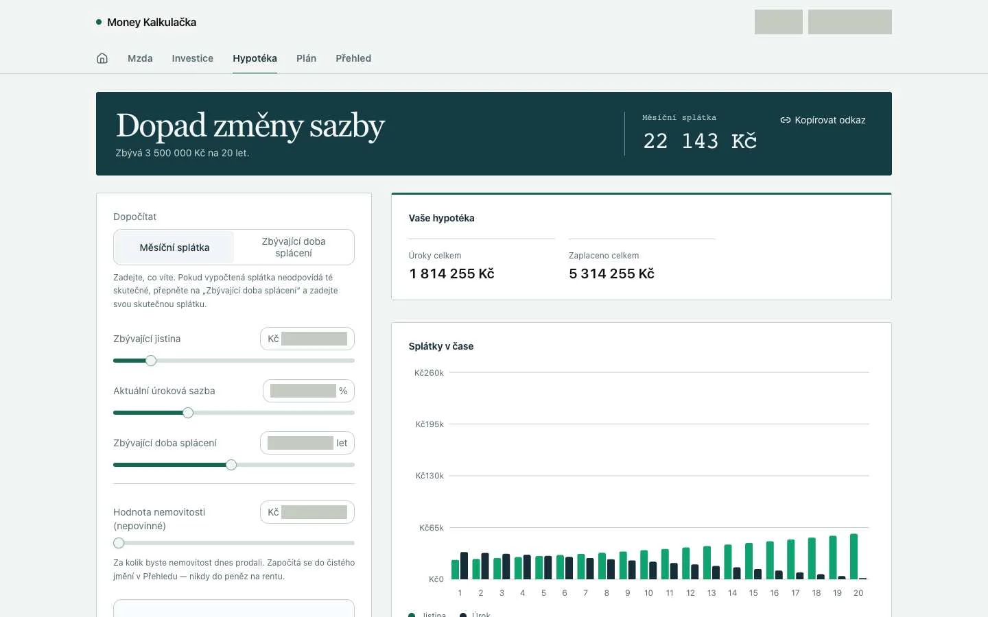
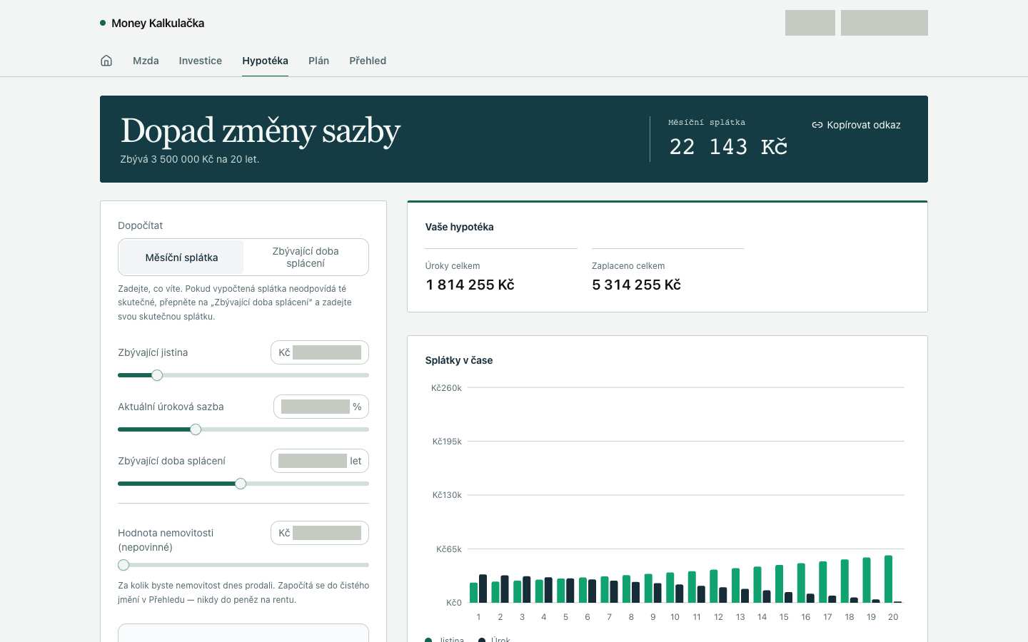
- /mortgage · Like fintech-2’s separated monthly columns, the desktop interest and total-paid blocks make distinct financial quantities easy to compare. The mortgage chart lacks the visible data needed to follow repayment across years; the phone opening view does not yet expose that comparison. Actual Budget · monthly allocation
- /plan · Like fintech-2’s monthly allocation view, this wizard groups information around a financial decision. Its numbered progress clarifies sequence at both widths, but the captures do not show the inputs and calculated consequence together, so comparison quality remains unverified. Actual Budget · monthly allocation


Visual design
- Hierarchy
- C
- 1440: the dark payment banner gives the key result strong priority, but the empty chart consumes substantial space. 390: the banner adapts clearly; the long input panel pushes supporting results beyond the opening view. (/mortgage)
- Typography
- B
- Both widths distinguish the serif projection title, numeric result and restrained field labels. Desktop chart labels and supporting annotations are relatively small; phone navigation loses its final label at the edge. (/invest)
- Spacing
- B
- 1440: consistent card padding and column gaps keep inputs and chart distinct. 390: comfortable control spacing survives, while the long vertical input stack delays the result breakdown. (/invest)
- Copy and labels
- B
- Both widths use specific Czech investment labels and explicit currency, percent and year units. The assumption line uses '7.0%' while surrounding content is Czech; desktop chart ticks mix Kč with M/k abbreviations. (/invest)
- Imagery
- N/A
- This calculator needs no decorative artwork. Its desktop area chart supplies relevant financial information; the phone chart is outside the supplied capture.
Foundations · B
Contrast, responsive layout and keyboard reach are sampled separately. The foundations grade is the lowest verified result in this group.
- Color contrast
- Unverified
- No comparable solid-background text samples were available.
- Responsive layout
- A
- All sampled viewports fit without horizontal overflow and contained readable text. Verified across 7 measured views.
- Keyboard access
- B
- Checked 7 Tab probes reaching a visible target across the captured views. No issue detected by this check.
Fix these first
No repair could be verified from these views.
Evidence from the screens
Gray blocks conceal form values or sensitive text. Numbered outlines identify measured issues.
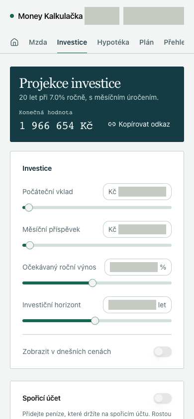
No issue was detected in this view.
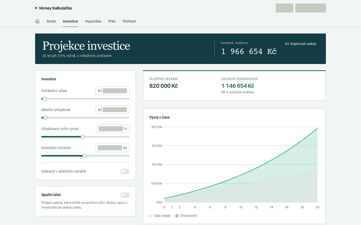
No issue was detected in this view.
No issue was detected in this view.
Independent task review
The reviewer assesses each route against its user task using desktop and phone evidence. Its task grades describe the interaction evidence available for that route.
/invest
Audit /invest in Money Kalkulačka: adjust investment assumptions, inspect projected value and growth, and navigate to related calculators. The active record is the investment projection; its next action is changing a contribution, return or horizon.
Reviewed at 1440 × 900 and 390 × 844.
- Task hierarchy
- B
- 1440: inputs, final value, contribution totals and chart are visible together. 390: final value remains prominent, but the breakdown and chart fall below the inputs and savings card, separating adjustments from supporting results.
- Landing message
- N/A
- This is a working investment calculator, not a public acquisition page. Both widths identify the projection, duration and assumed return.
- Interaction feedback
- Unverified
- Both checks report 16 visible controls and a reached focus target. No recorded input change, recalculation, toggle outcome or copy-link confirmation establishes feedback behavior.
- Access and recovery
- B
- 1440: readable labels accompany sliders, fields and toggles. 390: inputs fit, but the rightmost navigation label is clipped. A focus target was reached at both widths; complete keyboard operation and recovery were not exercised.
- Release evidence
- Unverified
- The supplied local renders establish the sampled layouts at 1440 × 900 and 390 × 844. Browser checks establish a reached focus target only. Calculation accuracy, persistence, sharing, error recovery and deployed behavior remain unverified.
First action
At 390px, make the navigation’s overflow discoverable so the clipped Přehled destination can be found and selected.
How to verify At 390 × 844, confirm every navigation destination is discoverable and reachable by touch and keyboard with visible focus. Separately change an investment input at both widths and observe the final value, breakdown and chart update. Contrast is unmeasured; responsiveness is visually sampled; keyboard reach is only partially checked.
/mortgage
The audited interface is Money Kalkulačka’s /mortgage calculator. The relevant record is a mortgage with 3,500,000 Kč remaining over 20 years. The immediate task is to adjust its rate, principal or term and compare the payment and total cost; the displayed monthly payment is 22,143 Kč.
Reviewed at 1440 × 900 and 390 × 844.
- Task hierarchy
- C
- 1440: inputs, payment and totals are clearly grouped, but the large repayment chart shows axes and a legend without plotted data. 390: the payment remains prominent, while totals and chart fall below the captured viewport, separating edits from supporting results.
- Landing message
- N/A
- This is a working mortgage calculator. Public acquisition messaging, audience proof and a promotional primary action do not apply.
- Interaction feedback
- Unverified
- Both widths show controls and a copy-link action, but supplied checks record no calculation change or copy outcome. Recalculation, confirmation, persistence and retry behavior remain unobserved.
- Access and recovery
- C
- 390: the navigation clips the Přehled label at the right edge, weakening discovery of the cross-calculator overview. Both checks report a visible Tab target, but do not establish complete keyboard reach, slider operation or recovery. 1440: navigation labels fit.
- Release evidence
- Unverified
- Local captures establish the route’s appearance at 1440 × 900 and 390 × 844; checks report one primary heading and 16 visible controls at each width. Calculation accuracy, complete keyboard operation, saved state and deployed behavior were not established.
First action
First investigate the empty repayment chart at 1440. With the displayed mortgage inputs, render the principal and interest series, or show an explicit unavailable state with a recovery action.
How to verify At 1440 × 900, change the interest rate and confirm the monthly payment, totals and plotted series update consistently. At 390 × 844, scroll to the same results and repeat. Separately verify navigation reach and all controls by keyboard. Contrast measurements remain unverified; mobile responsiveness is only partially established because navigation clips.
/plan
Audit Money Kalkulačka’s /plan working interface: enter the user’s current age at step 1 of 5, then select “Pokračovat” to continue a financial-independence plan. Savings and mortgage comparisons are not visible in these captures.
Reviewed at 1440 × 900 and 390 × 844.
- Task hierarchy
- B
- 1440: the age question, explanatory text and green Continue button establish a clear sequence. 390: the same sequence remains readable, but the navigation clips “Přehled,” weakening discovery of adjacent calculations.
- Landing message
- N/A
- This is a working planning wizard. Both widths explain the immediate age-entry task; public acquisition messaging is not the applicable standard.
- Interaction feedback
- Unverified
- Both checks report a visible Tab-focus target. Neither records age submission, validation, step advancement or the outcome of “Zatím přeskočit.” Still images cannot establish those behaviors.
- Access and recovery
- C
- 390: the rightmost navigation label is visibly clipped, making its destination harder to identify. 1440: navigation fits. Both checks reached a visible focus target, but full keyboard traversal and skip recovery were not recorded. Opaque areas prevent inspection of the age control’s contents.
- Release evidence
- Unverified
- Evidence establishes local renders at 1440 × 900 and 390 × 844, one primary heading and 12 visible controls at each width, plus a visible Tab target. Calculation correctness, completion, persistence and deployment remain unobserved.
First action
Repair the 390px navigation so every destination, including “Přehled,” is fully readable and reachable; use wrapping or a clearly discoverable overflow treatment.
How to verify At 390 × 844, verify all navigation labels and focus indicators remain visible and each destination can be reached by keyboard. Separately submit a valid age, an invalid age and Skip at both widths to observe advancement and recovery. Contrast measurements and complete keyboard reach remain unverified.
What a repair could look like
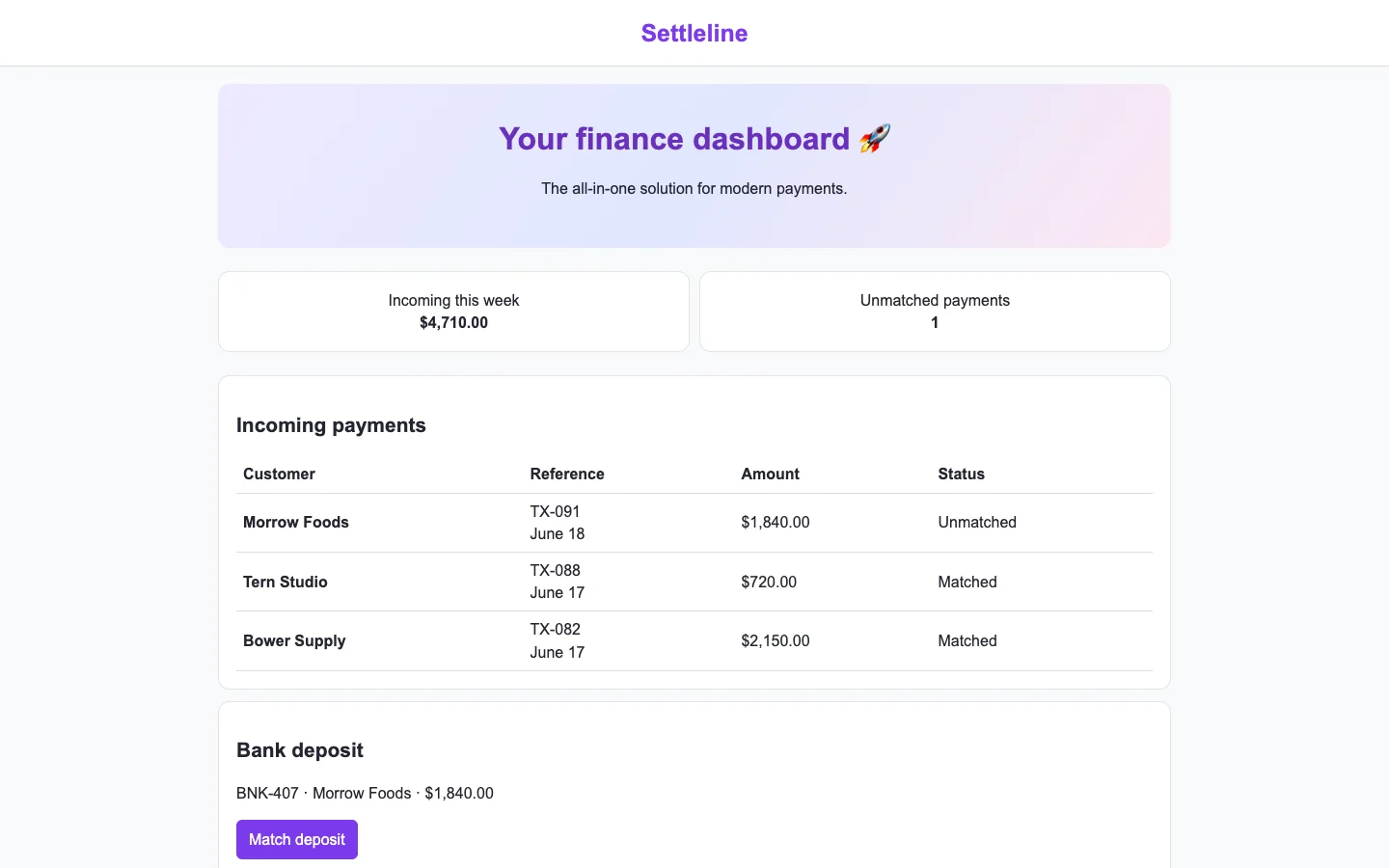
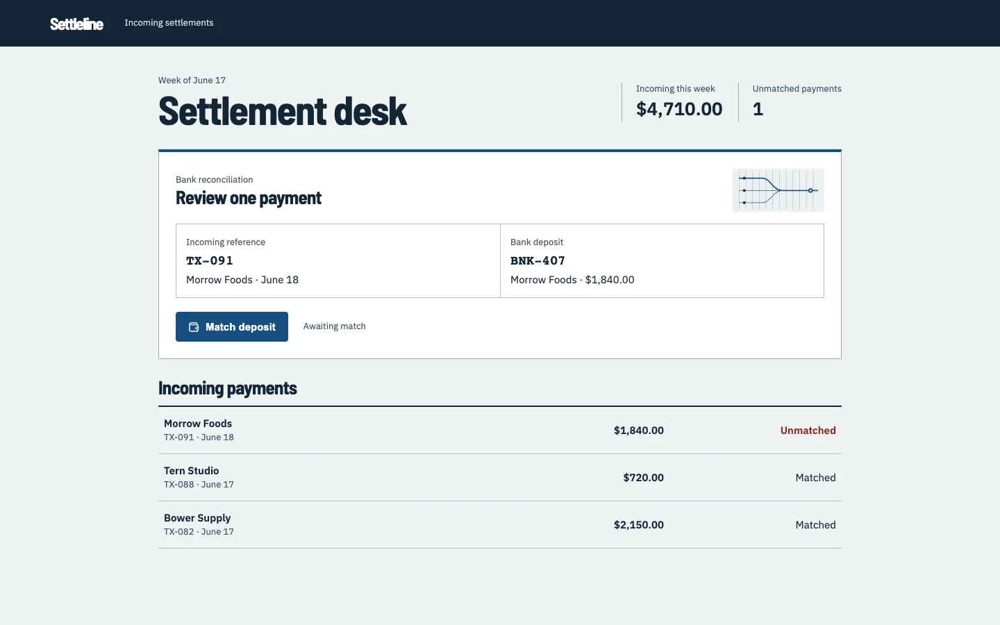
Settleline is an agent-built fintech settlements demo. Both captures show the same task.