Licensed case study / Before audit
Money Kalkulačka
Fintech · Nov 8, 2026
7 measured views. Local app. Design grades compare the actual screen with published product references. N/A means there was no applicable sample. Unverified means evidence was insufficient.
Product specificity and generic signals · C
1440: initial deposit, monthly contribution, annual return and horizon lead to a concrete Kč projection and contribution/gain breakdown. 390: those same investment controls identify the task immediately, but its monetary result is below the opening viewport. (/invest)
Visual specificity before deductions B. Weighted design base B. Distinct signal deductions 1.
Product specificity supplies 55% of the base, and the five visual design dimensions share 45%. Round the base to the nearest letter. Each distinct verified generic signal lowers it by one letter, down to F. Foundations are reported separately. The detector ceiling is B. Vision reviewed 3 of 3 measured routes.
- Template copy · not observed
- No instance was identified in the reviewed views.
- Gradient hero · not observed
- No instance was identified in the reviewed views.
- Emoji bullets · not observed
- No instance was identified in the reviewed views.
- Default shadcn grays · −1
- 5 separate visible panels repeat the same near-default neutral border, fill, width and corner treatment. (/invest, 1440 px, Detector.)
- Purple on white · not observed
- No instance was identified in the reviewed views.
- Centered everything · not observed
- No instance was identified in the reviewed views.
Compared with the 2026 references
- /invest · Like fintech-1's separated payment and deposit columns, the desktop calculator separates contributions from gains so monetary direction is explicit. At 390, that useful breakdown is absent from the opening view, delaying the comparison. Actual Budget · account register
- /mortgage · Like fintech-2's adjacent monthly allocation columns, the 1440 mortgage view keeps inputs and consequences within one view. The 390 opening view loses that comparison: users see the assumptions without the resulting payment. Actual Budget · monthly allocation
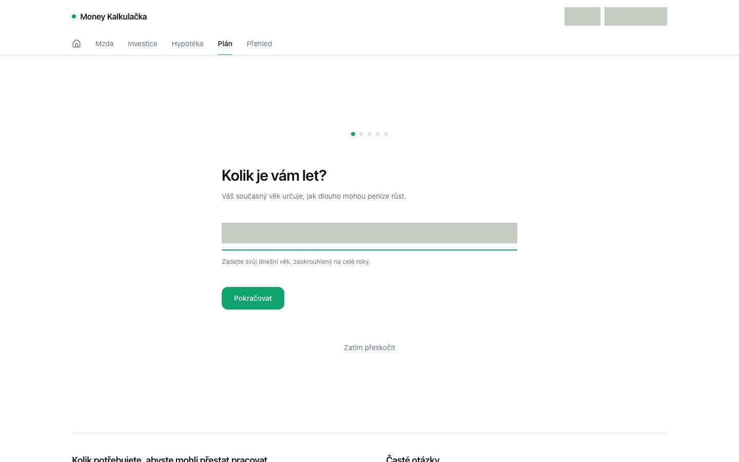
- /plan · Unlike fintech-2’s explicit month groups and shared category rows, this screen exposes only a preliminary input. Its restrained grouping supports one-step entry, but the captures cannot show whether the eventual savings, mortgage and plan results support comparison. Actual Budget · monthly allocation


Visual design
- Hierarchy
- C
- 1440: the large final value anchors a useful input/result split. 390: the savings option precedes the investment result, delaying the primary decision evidence. (/invest)
- Typography
- B
- 1440: large monetary totals, compact uppercase metric labels and clear section titles distinguish levels. 390: labels remain readable, though Copy link wraps and the projection subtitle spans two lines. (/invest)
- Spacing
- B
- 1440: consistent card padding and a clear column gap support scanning. 390: cards retain comfortable spacing and fit the viewport, but their cumulative height pushes results below the fold. (/invest)
- Copy and labels
- B
- Both widths use concrete Czech investment labels and explain the savings-account option. 1440 clearly states the 20-year, 7.0% scenario; the chart uses mixed Kč/M/k formatting that is less consistent with the fully formatted totals. (/invest)
- Imagery
- B
- 1440: the area chart distinguishes contributions from gains with a legend and labeled axes. 390: the chart is outside the supplied capture, limiting evidence of its narrow-screen presentation. (/invest)
Foundations · B
Contrast, responsive layout and keyboard reach are sampled separately. The foundations grade is the lowest verified result in this group.
- Color contrast
- Unverified
- No comparable solid-background text samples were available.
- Responsive layout
- A
- All sampled viewports fit without horizontal overflow and contained readable text. Verified across 7 measured views.
- Keyboard access
- B
- Checked 7 Tab probes reaching a visible target across the captured views. No issue detected by this check.
Fix these first
- Give the primary task, supporting information and actions distinct visual roles.Product specificity · /invest · 1440 px
- Give the screen a visible heading that names its task.Hierarchy · /mortgage · 390 px
Evidence from the screens
Gray blocks conceal form values or sensitive text. Numbered outlines identify measured issues.
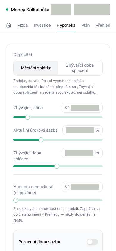
- No level-one heading is visible in this viewport.
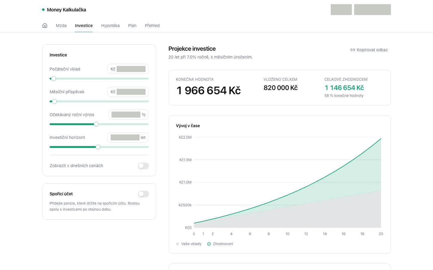
- 5 separate visible panels repeat the same near-default neutral border, fill, width and corner treatment.
No issue was detected in this view.
Independent task review
The reviewer assesses each route against its user task using desktop and phone evidence. Its task grades describe the interaction evidence available for that route.
/invest
Audit /invest, the Money Kalkulačka investment calculator. Adjust the investment scenario and compare projected value, contributions and gains; savings, mortgage and plan tools are also visible in navigation.
Reviewed at 1440 × 900 and 390 × 844.
- Task hierarchy
- C
- 1440: inputs sit beside a clear projection showing 1 966 654 Kč, with contributions and gains separated. 390: input and savings cards occupy most of the opening screen; the projection starts at the bottom and its totals require scrolling, making scenario comparison harder.
- Landing message
- N/A
- This is a working calculator, not a public acquisition page. Its investment labels and projection establish the immediate task.
- Interaction feedback
- Unverified
- Both captures show sliders, numeric fields, toggles and Copy link. No recorded input change or copy outcome establishes recalculation, confirmation, persistence or recovery.
- Access and recovery
- B
- 1440 and 390: inputs have visible labels, navigation remains visible, and supplied checks report a visible Tab focus target reached. The phone stacks cards within its width. Full keyboard operation, slider announcements and invalid-input recovery remain unverified.
- Release evidence
- Unverified
- Supplied local captures establish rendering at 1440 × 900 and 390 × 844. Checks report one primary heading and 16 visible controls at each width. Calculation correctness, interaction outcomes and deployed behavior were not established.
First action
At 390 px, add a compact projected-value summary above the input cards so users can see the scenario outcome immediately.
How to verify At 390 × 844, confirm the projected total appears in the opening viewport, then change the monthly contribution and verify the summary updates consistently with the detailed result. Separately check measured contrast and complete keyboard operation at both widths; neither is established by the captures.
/mortgage
Audit /mortgage, the working Money Kalkulačka mortgage calculator. The relevant record is the remaining mortgage balance, current rate and term; the next action is to adjust these or enable “Porovnat jinou sazbu” to compare payments and interest.
Reviewed at 1440 × 900 and 390 × 844.
- Task hierarchy
- C
- At 1440, inputs sit beside a clear payment summary and principal/interest chart. At 390, the opening view contains only inputs: the mortgage outcome and page heading are absent. This delays connecting an adjustment to its financial consequence.
- Landing message
- N/A
- This is a working mortgage calculation screen, not a public acquisition page.
- Interaction feedback
- Unverified
- Neither supplied check records changing a mortgage value or enabling rate comparison. The images establish displayed results, but cannot establish recalculation, toggle feedback or persistence.
- Access and recovery
- B
- Labels and units are visible at both widths; the 390 layout fits the viewport and wraps longer labels. Both checks reached a visible Tab-focus target. Full keyboard operation, focus order, invalid-value recovery and measured contrast remain unverified.
- Release evidence
- Unverified
- The samples establish local renders at 1440 × 900 and 390 × 844, with 18 and 16 visible controls respectively. Checks found one desktop primary heading and none on phone. Calculation accuracy, complete flows and deployed behavior were not established.
First action
At 390, place a compact mortgage payment summary and descriptive heading before the long input panel, so the current outcome is visible alongside the start of the task.
How to verify At 390 × 844, confirm the heading and monthly payment appear in the opening viewport. Change the interest rate and verify the summary updates correctly; enable rate comparison and check its result and keyboard access. At 1440 × 900, confirm the existing side-by-side summary remains legible.
/plan
The audited interface is Money Kalkulačka’s /plan age-entry step. The relevant record is the user’s current age in whole years; the next action is “Pokračovat,” with “Zatím přeskočit” as an alternative. Savings, mortgage and plan comparison results are not visible.
Reviewed at 1440 × 900 and 390 × 844.
- Task hierarchy
- B
- At 1440, the age question, explanation, input and green Continue button form a clear left-aligned sequence within a central column. At 390, that order remains readable. Five progress dots lack step labels, so the remaining work and connection to comparison are unclear.
- Landing message
- N/A
- This is a working financial-plan step, not a public landing page. Both widths explain why age matters: it determines how long money can grow.
- Interaction feedback
- Unverified
- Neither supplied check records entering an age, submitting, skipping or receiving validation. Screenshots cannot establish whether Continue advances or preserves the value.
- Access and recovery
- B
- Both checks report reaching a visible Tab-focus target. At 390, the question, helper text, Continue and Skip fit without visible horizontal clipping. Full keyboard order, input labeling, validation and skip recovery remain unverified; gray-covered regions prevent inspecting the input content.
- Release evidence
- Unverified
- The supplied local captures establish rendering at 1440 × 900 and 390 × 844. Checks report one primary heading and 12 visible controls at each width. Calculation correctness, completed navigation, persistence and deployed behavior were not established.
First action
First, observe the age-entry transition at both widths: enter a valid whole-year age and activate “Pokračovat.” This resolves whether the visible first step actually leads toward the requested financial comparison.
How to verify Repeat at 1440 × 900 and 390 × 844 using the keyboard. Confirm advancement, retained age and visible focus; then submit an empty or invalid age and exercise Skip. Separately measure text contrast; the captures establish only the sampled responsive layout and one reachable focus target.
What a repair could look like
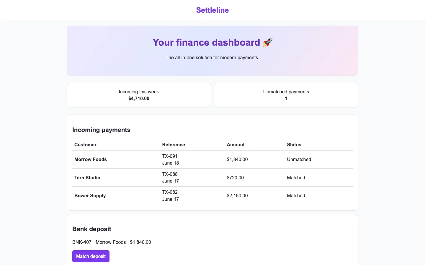
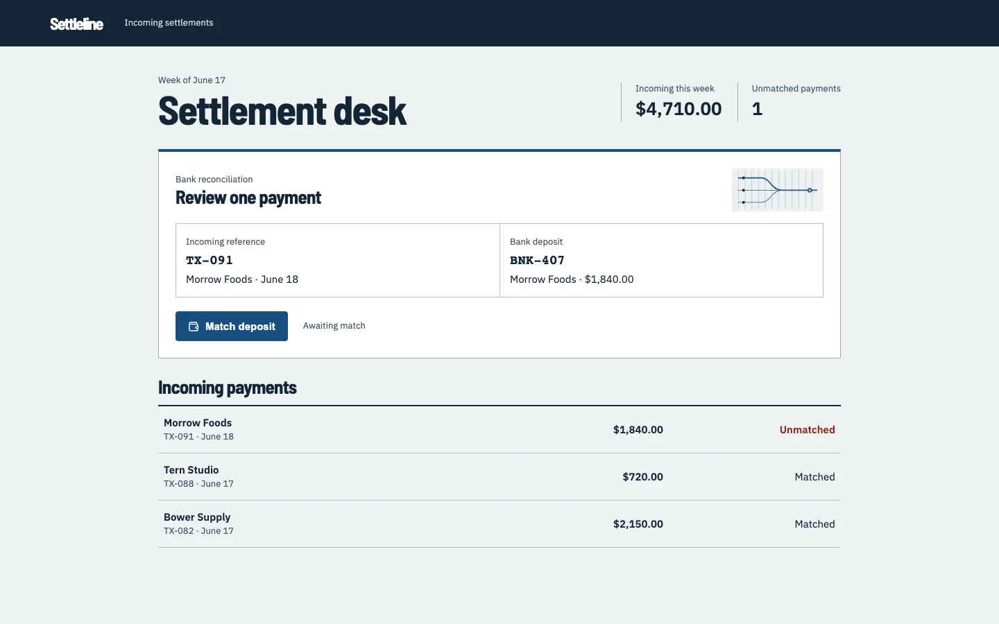
Settleline is an agent-built fintech settlements demo. Both captures show the same task.