UI design directions.
Compare sixteen original studies on desktop and phone. Open a direction to try its palette and type pairing against the same invoice, then see how it fits a real screen.
Utility
Operators comparing records, exceptions, dates and totals.
Explore utility UI designOpen full-size desktop study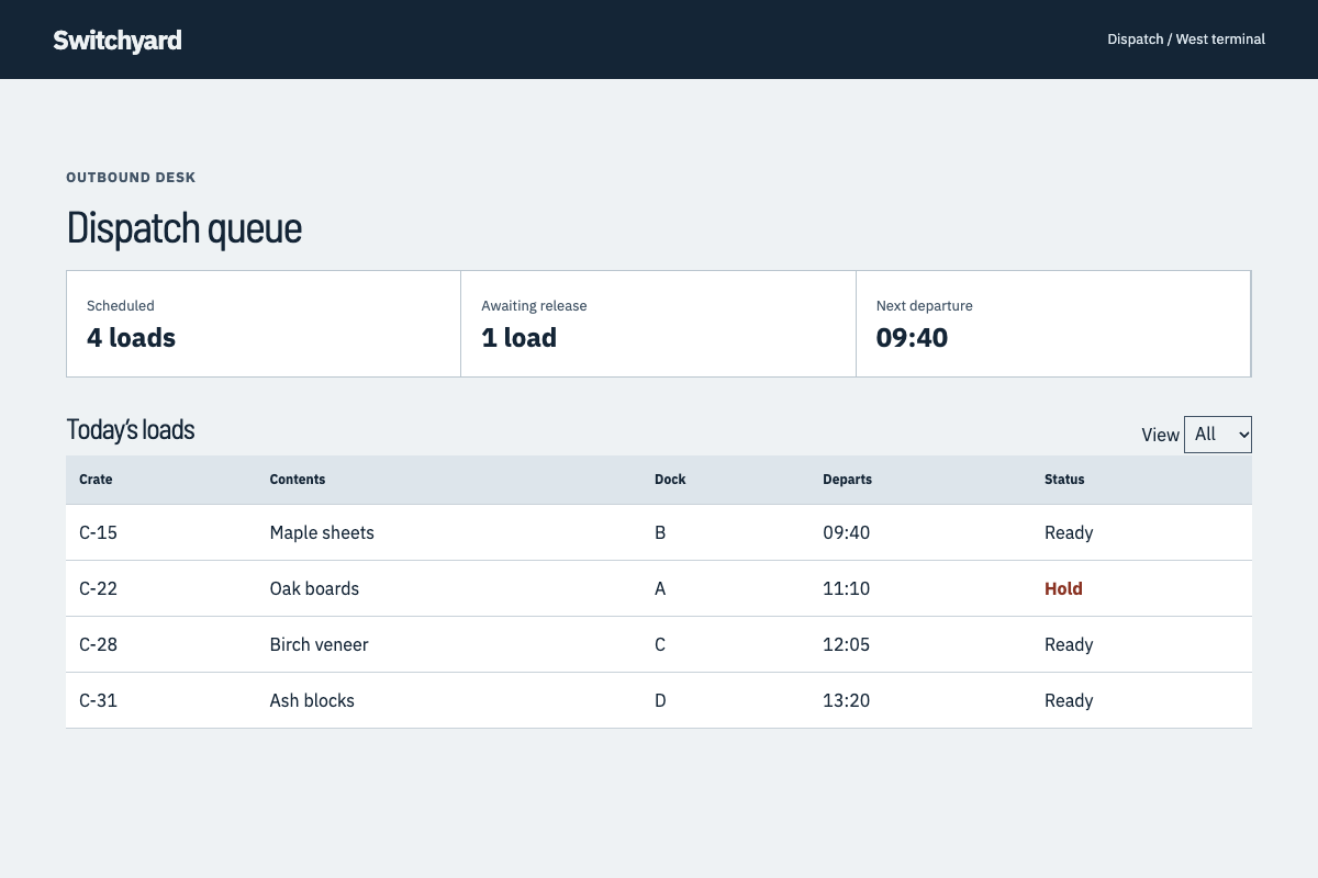
Browse all sixteen studies
- Editorial
Reading, publishing and considered product explanations.
- Utility
Operators comparing records, exceptions, dates and totals.
- Soft
Supportive consumer choices, routines and personal planning.
- Mono
Technical tools, trace inspectors and structured operational details.
- Bold
One public proposition, launch or ticketed event with a decisive next step.
- Quiet luxury
Premium client services, commissioned work and high-consideration choices.
- Playful
Creative communities, collections and discovery feeds.
- Dark
Dark-first workbenches, media tools and focused reading sessions.
- Neo-brutalism
Independent events, print exchanges and civic calls to act with a direct, low-risk transaction.
- Swiss
Schedules, directories and public information that depend on disciplined alignment and fast comparison.
- Bento
Home screens that combine differently sized but related measurements and a clear primary decision.
- Claymorphism
Supportive learning and care routines where tactile objects explain a small, forgiving action.
- Wabi-sabi
Repair journals, craft records and slow considered purchases where material condition matters.
- Maximalism
Culture, programming and festivals where abundant expression belongs to the material being discovered.
- Luxury typography
Type-led catalogs and high-consideration work where proportion, language and provenance carry the value.
- Scrapbook
Field collections, personal notes and community records where authorship and provenance aid discovery.
Styles that need an explicit brief
These styles carry a “reads as AI-generated” risk flag. We discuss them when a client asks for one.
- Glassmorphism
- Repeated translucent panels and blurred gradients can hide real hierarchy and make unrelated products look alike.
- Neumorphism
- Soft inset shadows repeat a familiar template and can leave editable and pressed states hard to distinguish.
- Synthwave
- A generic neon sunset, grid and glow can eclipse the product's own evidence and purpose.
- Y2K
- Unmotivated chrome, pixel stickers and novelty cursors can resemble a preset instead of a product identity.
- Cyberpunk
- Scanlines, neon HUD panels and fictitious telemetry often decorate a task without helping a person complete it.
- Ethereal
- Pastel haze and floating glass shapes can obscure actions and produce an interchangeable hero.