Agent-built demo / Before audit
Folio
Client portal · Nov 8, 2026
3 measured views. Local app. Design grades compare the actual screen with published product references. N/A means there was no applicable sample. Unverified means evidence was insufficient.
Product specificity and generic signals · F
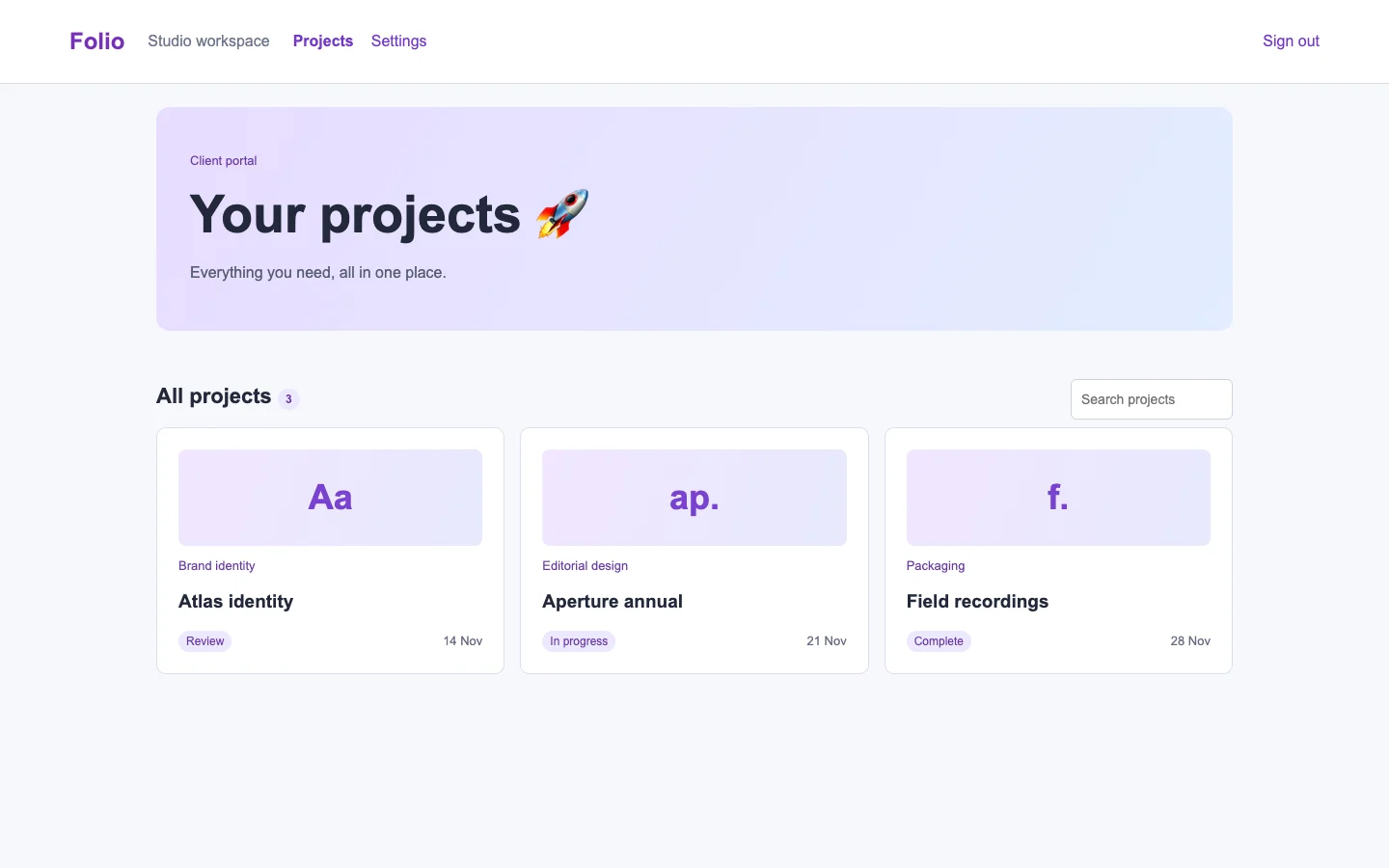
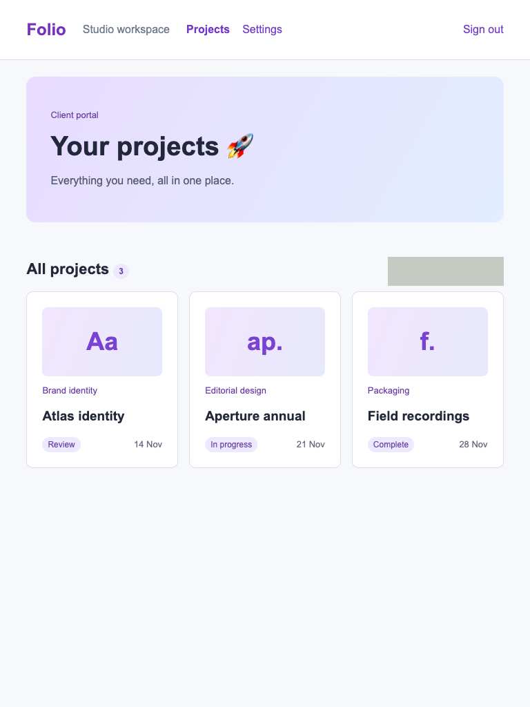
Both widths identify a client portal with named design projects, disciplines, statuses, and dates. Atlas identity supplies a concrete review candidate, but no proof, revision, requested decision, or explicit review action explains what the client should do. (/projects)
Visual specificity before deductions C. Weighted design base C. Distinct signal deductions 3.
Product specificity supplies 55% of the base, and the five visual design dimensions share 45%. Round the base to the nearest letter. Each distinct verified generic signal lowers it by one letter, down to F. Foundations are reported separately. The detector ceiling is D. Vision reviewed 1 of 1 measured routes.
- Template copy · −1
- “Everything you need, all in one place” does not identify a product task or outcome. (/projects, 1440 px, Detector and vision.)
- Gradient hero · −1
- A gradient fills the opening section around the visible heading. (/projects, 1440 px, Detector and vision.)
- Emoji bullets · not observed
- No instance was identified in the reviewed views.
- Default shadcn grays · not observed
- No instance was identified in the reviewed views.
- Purple on white · −1
- A prominent purple action or heading sits on a white surface. (/projects, 1440 px, Detector and vision.)
- Centered everything · not observed
- No instance was identified in the reviewed views.
Compared with the 2026 references
- /projects · Like client-portal-2, Folio groups project context under clear headings. It lacks the reference’s contextual controls beside the relevant content: Atlas identity needs a direct proof-review action. Commercial grade F after three observed signal deductions from a C baseline; contrast and full keyboard access remain unverified. OpenProject · project workspace overview

Visual design
- Hierarchy
- C
- At 1440, the oversized Your projects hero dominates the small Review cue. At 390, the hero still precedes the actionable record, although Atlas remains the first card. Equal card treatment does little to prioritize pending review. (/projects)
- Typography
- B
- Both widths distinguish page title, section heading, project names, disciplines, and metadata clearly. The desktop title is disproportionately large for this task, while the small status labels understate the decision. (/projects)
- Spacing
- B
- At 1440, consistent gutters align three cards cleanly. At 390, generous card padding and consistent side margins preserve readability. Hero height and the gap before All projects consume space before review work. (/projects)
- Copy and labels
- D
- Both widths use the interchangeable line Everything you need, all in one place. Review names a status without an explicit action; dates lack a meaning such as due date. The gray rectangle has no visible label at either width. (/projects)
- Imagery
- C
- At 1440, Aa, ap., and f. occupy matching decorative panels; at 390, the first two are visible. These distinguish cards minimally but provide no proof preview to help the client recognize the work awaiting review. (/projects)
Foundations · A
Contrast, responsive layout and keyboard reach are sampled separately. The foundations grade is the lowest verified result in this group.
- Color contrast
- A
- At least four opaque text samples per view passed the contrast threshold. Verified across 3 measured views.
- Responsive layout
- A
- All sampled viewports fit without horizontal overflow and contained readable text. Verified across 3 measured views.
- Keyboard access
- A
- Tab reached two visibly focused controls and Shift+Tab returned to the first. Verified across 3 measured views.
Fix these first
- Name the object, action and result in the heading.Product specificity · /projects · 1440 px
- Replace the opening gradient with a view of the product doing its work.Product specificity · /projects · 1440 px
- Choose an action color grounded in the product and separate it from status colors.Product specificity · /projects · 1440 px
Evidence from the screens
Gray blocks conceal form values or sensitive text. Numbered outlines identify measured issues.
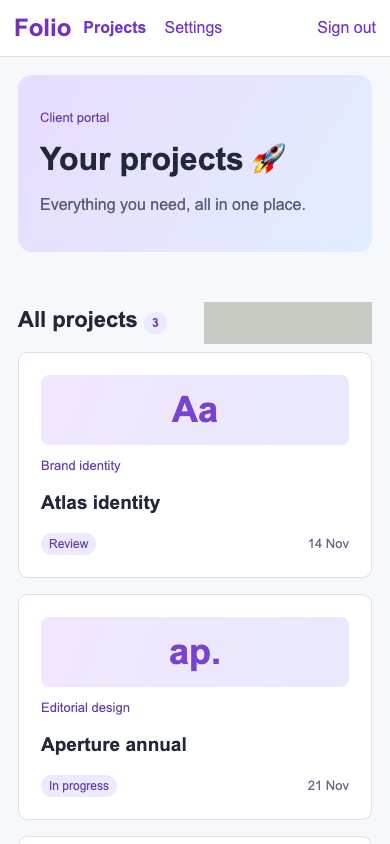
- “Everything you need, all in one place” does not identify a product task or outcome.
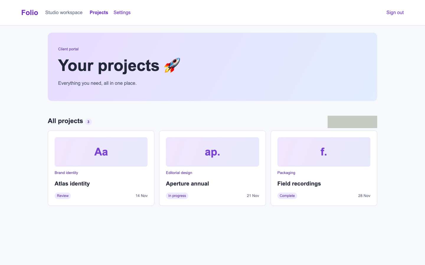
- A prominent purple action or heading sits on a white surface.
- A gradient fills the opening section around the visible heading.
- “Everything you need, all in one place” does not identify a product task or outcome.
- “Everything you need, all in one place” does not identify a product task or outcome.
Independent task review
The reviewer assesses each route against its user task using desktop and phone evidence. Its task grades describe the interaction evidence available for that route.
/projects
Audit Folio’s /projects working interface: find the proof awaiting review. Atlas identity is the relevant record because it carries the Review status; opening its proof is the next action, but no explicit proof action is visible.
Reviewed at 1440 × 900 and 390 × 844.
- Task hierarchy
- D
- At 1440, the large hero precedes three equally weighted projects; Atlas identity’s small Review badge is the only review cue. At 390, Atlas appears first, but still lacks a labeled proof action. Both widths show an unlabeled gray rectangle beside All projects. The essential next step is visually unclear.
- Landing message
- N/A
- This is an internal client project workspace, not a public acquisition page.
- Interaction feedback
- Unverified
- Both browser checks report a visible Tab target. Neither records activating Atlas identity or Review, opening a proof, receiving confirmation, or recovering from failure.
- Access and recovery
- C
- At 1440, all three cards are visible. At 390, cards stack without visible horizontal clipping, with the third below the fold. Both checks reached a visible focus target, but its identity and activation are unknown. The unlabeled rectangle at both widths leaves its purpose unclear; recovery was not exercised.
- Release evidence
- Unverified
- Local captures establish the sampled layouts at 1440 and 390; checks report one primary heading, eight visible controls, and a visible Tab target at each width. Proof access, complete keyboard traversal, error recovery, persistence, and deployment remain unobserved.
First action
Give Atlas identity an explicit “Review proof” action at both widths and identify or remove the unlabeled rectangle beside All projects.
How to verify At 1440 and 390, Tab to the named Review proof action and activate it. Confirm that it opens the Atlas identity proof with review controls and a return path. Inspect the rectangle’s visible label and accessible name. Measure contrast separately; these images establish neither contrast compliance nor complete keyboard reach.
What a repair could look like
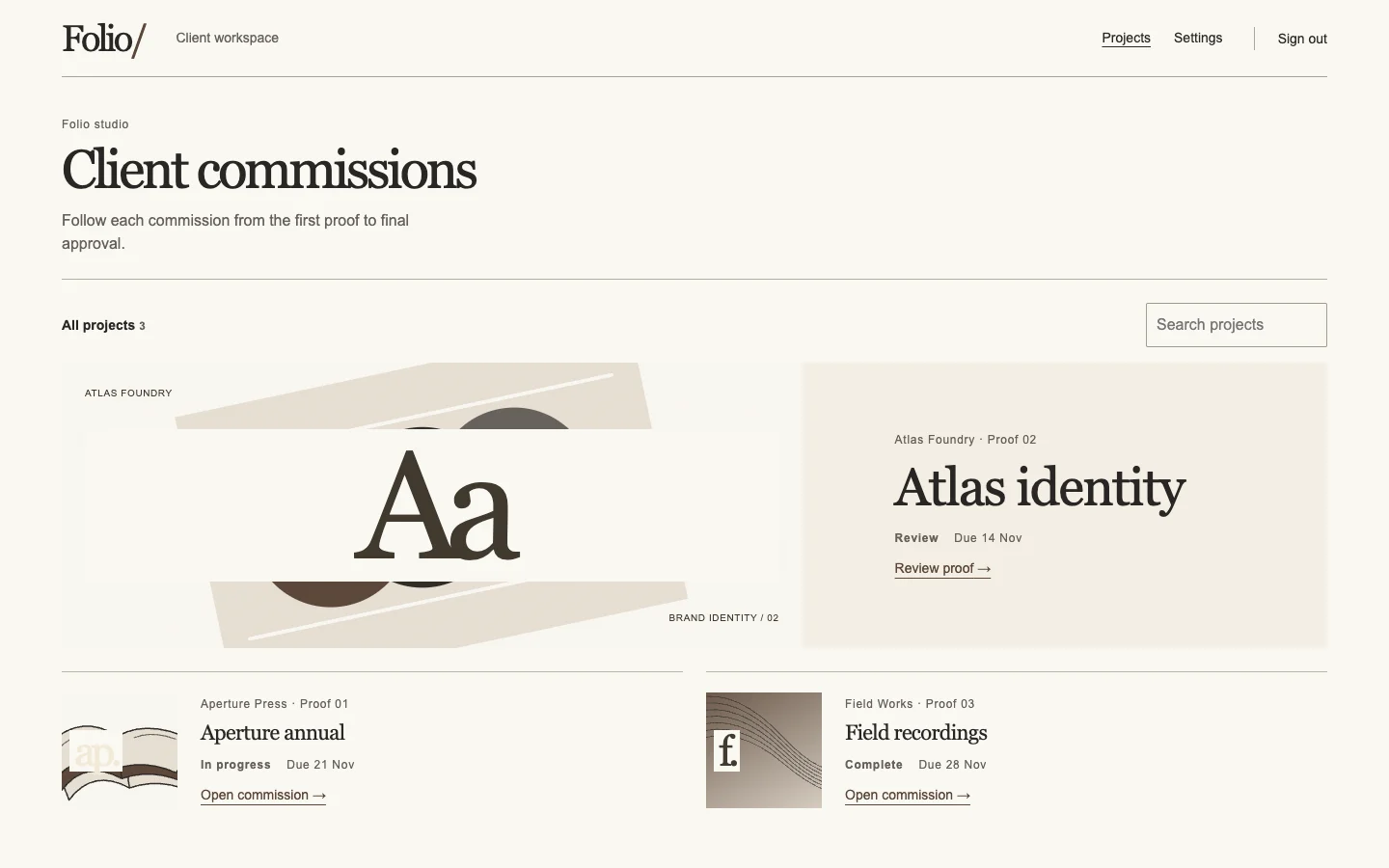
Folio is an agent-built client portal demo. Both captures show the same task.