Agent-built demo / Before audit
Margin
AI chat and copilots · Nov 8, 2026
3 measured views. Local app. Design grades compare the actual screen with published product references. N/A means there was no applicable sample. Unverified means evidence was insufficient.
Product specificity and generic signals · D
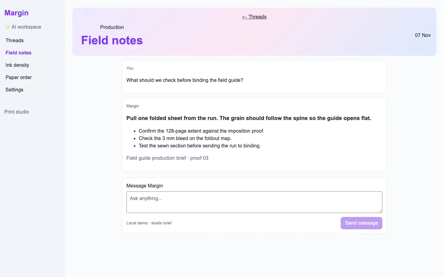
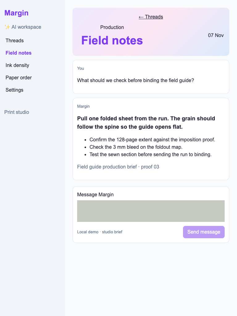
Both widths identify a field guide production task through grain direction, a 128-page extent, 3 mm bleed and a sewn section. The production brief · proof 03 anchors the answer to a concrete record, and Message Margin identifies the next action. (/chat/field-notes)
Visual specificity before deductions A. Weighted design base B. Distinct signal deductions 3.
Product specificity supplies 55% of the base, and the five visual design dimensions share 45%. Round the base to the nearest letter. Each distinct verified generic signal lowers it by one letter, down to F. Foundations are reported separately. The detector ceiling is D. Vision reviewed 1 of 1 measured routes.
- Template copy · not observed
- No instance was identified in the reviewed views.
- Gradient hero · −1
- A gradient fills the opening section around the visible heading. (/chat/field-notes, 1440 px, Detector and vision.)
- Emoji bullets · not observed
- No instance was identified in the reviewed views.
- Default shadcn grays · −1
- 3 separate visible panels repeat the same near-default neutral border, fill, width and corner treatment. (/chat/field-notes, 1440 px, Detector.)
- Purple on white · −1
- A prominent purple action or heading sits on a white surface. (/chat/field-notes, 1440 px, Detector and vision.)
- Centered everything · not observed
- No instance was identified in the reviewed views.
Compared with the 2026 references
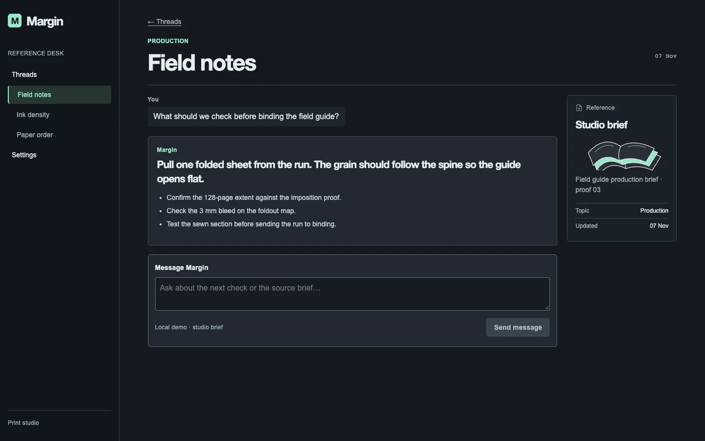
- /chat/field-notes · Like the reference, Margin keeps the answer in a narrow conversation column. The reference places feedback beside the exact answer; Margin’s mobile continuation action falls below the opening view. Commercial grade: D, from a B foundation after one-letter deductions for the gradient hero and prominent purple on white. Open WebUI · evaluating an arena response

Visual design
- Hierarchy
- C
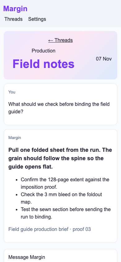
- 1440: the oversized Field notes banner receives more emphasis than the production decision. 390: the banner consumes substantial vertical space and the composer extends below the opening view. (/chat/field-notes)
- Typography
- B
- Both widths distinguish speaker labels, a bold recommendation and a readable checklist. At 390, the bold lead spans three lines and the checklist wraps cleanly; the oversized purple title has disproportionate emphasis. (/chat/field-notes)
- Spacing
- C
- 1440: cards have clear internal padding, with substantial unused space around the narrow thread. 390: card gutters remain consistent, but header height and card padding push the next action below the viewport. (/chat/field-notes)
- Copy and labels
- B
- Both widths contain concrete binding instructions and an identifiable proof reference. Message Margin and Send message are clear at 1440. The reference names its source but provides no visible way to inspect that proof. (/chat/field-notes)
- Imagery
- N/A
- This text-based production conversation requires no illustration to communicate its visible task.
Foundations · C
Contrast, responsive layout and keyboard reach are sampled separately. The foundations grade is the lowest verified result in this group.
- Color contrast
- C
- Opaque text measures 4.34:1 against its solid background (4.5:1 target). (/chat/field-notes, 1440 px.)
- Responsive layout
- A
- All sampled viewports fit without horizontal overflow and contained readable text. Verified across 3 measured views.
- Keyboard access
- A
- Tab reached two visibly focused controls and Shift+Tab returned to the first. Verified across 3 measured views.
Fix these first
- Replace the opening gradient with a view of the product doing its work.Product specificity · /chat/field-notes · 1440 px
- Give the primary task, supporting information and actions distinct visual roles.Product specificity · /chat/field-notes · 1440 px
- Choose an action color grounded in the product and separate it from status colors.Product specificity · /chat/field-notes · 1440 px
- Adjust the foreground or its solid background, then remeasure this label.Color contrast · /chat/field-notes · 1440 px
Evidence from the screens
Gray blocks conceal form values or sensitive text. Numbered outlines identify measured issues.
No issue was detected in this view.
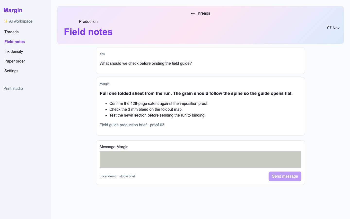
- A prominent purple action or heading sits on a white surface.
- 3 separate visible panels repeat the same near-default neutral border, fill, width and corner treatment.
- A gradient fills the opening section around the visible heading.
- Opaque text measures 4.34:1 against its solid background (4.5:1 target).
- Opaque text measures 4.34:1 against its solid background (4.5:1 target).
Independent task review
The reviewer assesses each route against its user task using desktop and phone evidence. Its task grades describe the interaction evidence available for that route.
/chat/field-notes
Audit Margin’s working chat interface at /chat/field-notes. Read the field guide binding advice, identify the production brief · proof 03, and continue through Message Margin.
Reviewed at 1440 × 900 and 390 × 844.
- Task hierarchy
- C
- 1440: the binding checklist and Send message action are visible, but the large gradient header competes with the conversation. 390: the answer remains readable, while only the composer label reaches the opening viewport; continuing requires scrolling.
- Landing message
- N/A
- This is an internal conversation screen, not a public product landing page.
- Interaction feedback
- Unverified
- The supplied checks record focus reaching a visible target at both widths. No message submission, loading, success, failure or retry outcome was recorded.
- Access and recovery
- C
- 1440: Message Margin and Send message are visible. 390: text wraps within the viewport, but the input and send control are below the capture. Focus reached a visible target at each width; full keyboard traversal and recovery remain unverified.
- Release evidence
- Unverified
- Local captures and checks establish one primary heading at each width, nine visible desktop controls, four mobile controls and a reachable visible focus target. They do not establish successful submission, persistence, error recovery or deployment readiness.
First action
At 390, reduce the decorative Field notes header height so the next conversation action appears sooner without compressing the binding advice.
How to verify Recapture at 390 × 844 and check the composer’s position. At both widths, tab through the complete composer, submit a follow-up about proof 03, and record pending, success and recoverable failure states. Measure contrast separately; screenshots establish no contrast ratio.
What a repair could look like
Margin is an agent-built chat workspace demo. Both captures show the same task.